New Release
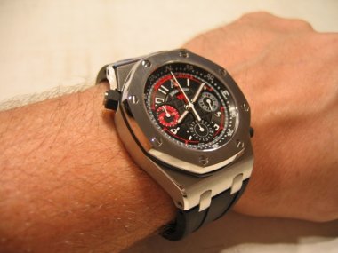
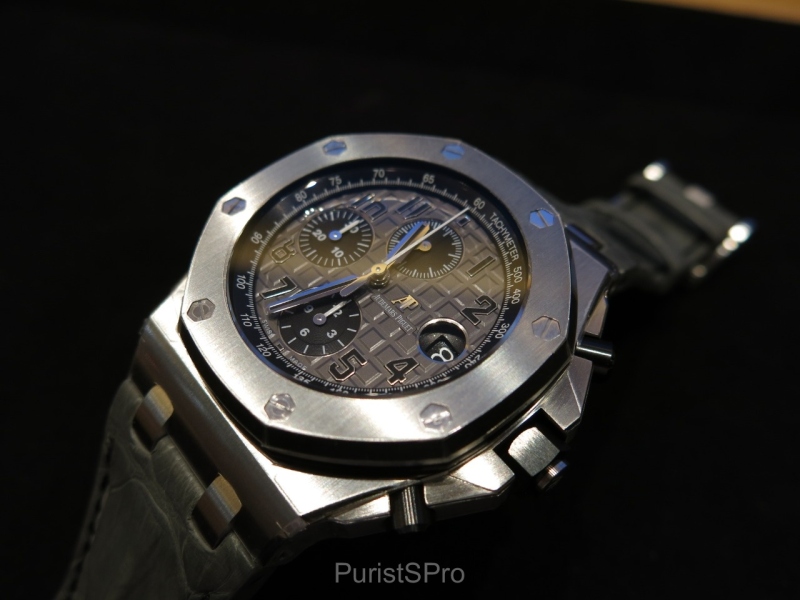
MichaelC offers a detailed look at Audemars Piguet's 2014 Royal Oak Offshore 42mm collection, specifically highlighting the grey and black dial variants. His initial preference for the discreet grey dial is explored, alongside an appreciation for the black dial with red accents. This post provides valuable insights into the aesthetic choices and design elements that define these robust chronographs.


 Seriously though, it looks very good, and the black stitching continues the design theme.


The grey and blue versions get my vote. And I'm still thinking about the grey! Thanks for your post and pics. Fx
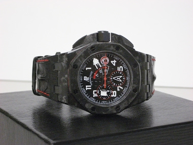
I will also look forward to your thoughts on the 44mm black ceramic / anthracite dial Offshore, which I will soon post on. With regards to the 42mm collection Royal Oak Offshores, I would opt for the Safari model first and the grey dial second.
I have opined already that I think AP did a credible evolutionary revision of the iconic 42mm Offshore with these new introductions. Still, though, I find myself asking "what if," and specifically what if they had taken the ceramic elements one step further and added a ceramic bezel to go along with the ceramic pushers and crown? I think that would have capped off the model update in exceptional fashion, especially on the grey and black dial pieces you review here. It's well known, Michael, that
BTW, I love your new "agent" like handle :-) I think others have wondered the same about the bezel. And it would not surprise me at all if AP already has this option planned in the pipeline. Perhaps in a year or two we will see a ceramic bezel or maybe even cermet offered on one of these standard collection 42mm Offshores. I could even see a cermet bezeled / titanium cased piece getting matching cermet pushers and crown... and having stick markers instead of numerals... on a black strap... hmmm.
Just some months before the launch of the 2014 collection, AP released a 42mm ROO LE dedicated to Doha with a titanium case and ceramic bezel. Never saw the watch in person, but it looks great on the few pictures I found on the Internet.
I recently purchased a new ROO 42mm and was trying to decide between the black and grey dials. I really liked the grey one for the reasons you mention. I also think it is quite unique in terms of color. I went back and forth in trying to decide what to do. In the end, I went with the black dial. THe reason is two fold. I like the red accents but probably even more importantly--- My eyes are not what they used to be and I like dials with better contrast. This makes it possible for me to read the
This thread is active on the Audemars Piguet forum with 12 replies. Share your knowledge with fellow collectors.
Join the Discussion →