Manufacture
Kong's report from BaselWorld 2014 highlights Chopard's L.U.C Qualité Fleurier chronometer, celebrating 10 years of this rigorous certification. His detailed account underscores the demanding nature of the Fleurier Quality Foundation label and Chopard's consistent commitment to Haute Horlogerie, offering valuable insights into watch certification for collectors.


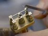
I hope i am not nitpicking, but the QF logo looks out of place here.
I especially like the case which looks like a modern interpretation of the tear drop lugged cases on the 1950's. I think it is fair to mention L.U.Chopard in the same breath as Patek, Vacheron, AL&S and AP. Understood the FQF cert, but between this and the recently released limited L.U.C 1963, it'll be a tough choice but I think I would go for the 1963 just for the sheer beautiful execution of the movement. Dean
indeed a tough fight! Kong
Agree with you. Perhaps just the logo 'Q' is sufficient, but to have it balance it got to be placed after Chronometer. But in term of 'ranking', QF is higher and more stringent, so it may need to place just below the brand logo. Perhaps the 'Q' could be inside the small-second subdial. Where would you place it? Kong
If it was up to me, I will prefer just L.U.Chopard printed on the dial. No 'chronometer', no other logo. Don't Need to advertise qualite fleurier on the dial.
Certainly snapping at the heels of Patek and a few others .... The writing on the dial is a tad busy but nowhere like the mini essays on the faces of some watches , ala Rolex . Any indication of price ?
This thread is active on the Chopard forum with 15 replies. Share your knowledge with fellow collectors.
Join the Discussion →