As Chopard celebrates the 25th anniversary of its L.U.C. Quattro line, forum member 'quattro' (Emmanuel) provides an invaluable historical overview, tracing the evolution of this iconic collection from its inaugural reference to the newly redesigned Mark IV. Emmanuel's detailed post, enriched with high-quality images, serves as a definitive guide for collectors seeking to understand the technical prowess and aesthetic journey of the L.U.C. Quattro, highlighting why this series remains a cornerstone of haute horlogerie.
As
Chopard is celebrating the
25th anniversary of the
L.U.C. Quattro with two variants of an entirely redesigned model, the
Mark IV, I thought it would be interesting to trace the
whole story of this line.
The caliber 1.98, later named 98.01-L, comes with double-stacked twin mainspring barrels containing exactly 1.885 metres of springs and enabling 9 days of power reserve (216 hours). It displays a power reserve indicator at 12 o'clock and a sub-seconds dial at 6 with a date indicator. Vibrating at 28,800 vph, it features a black polished Swan neck regulator, 39 jewels, a COSC certification, the Geneva Seal, five positions adjustment, and complete hand-finishing throughout.
It was introduced in 2000 with the LU.C. Quattro ref. 16/1863, which can be considered as the Mark I. Then came:
- In 2007, the Mark II, ref. 16/1903 (or maybe even late 2006)
- In 2011, the Mark III, ref. 16/1926
- In 2025, the Mark IV, ref. 16/1954, with a new variant of the caliber (98.09-L) placing the power reserve indicator on the back instead of on the dial.
Let's have a look!
Best,
Emmanuel
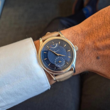
A/ L.U.C. Quattro Mark I, ref. 16/1863 (introduced in 2000)
38 x 9,8 mm case, caliber 1.98. Variants presented below: blue, black and silver dial in white, yellow and rose gold.

credit: @so.frech


credit: @elprimerolove


credit: mr watchley

credit: @trail_brake


credit: s.song
B/ L.U.C. Quattro Mark II, ref. 16/1903 (introduced in
2007 or maybe late 2006)
39.5 x 9.10 mm case, caliber 1.98.
Variants presented below: ref.
161903-5001 (
rose gold) & ref.
161903-1001 (
white gold)


credit: @umsv.watches

credit: @datimeninja


credit: touch of modern
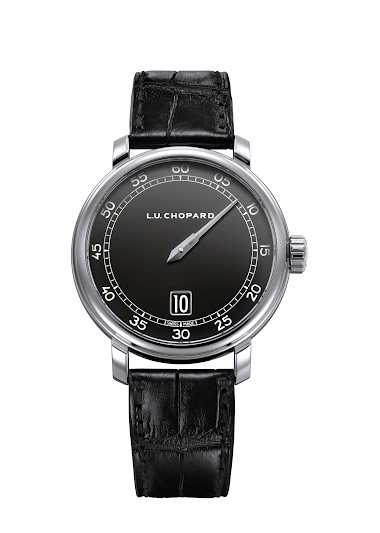
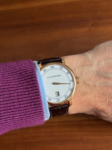
C/ L.U.C. Quattro Mark III, ref. 16/1926 (introduced in 2011)
43 x 8.87 mm case
& caliber
98.01-L (the
platinum version of this model has been presented
here by
foversta and
here by
amanico)
1/ Rose gold & silver dial (ref. 161926-5001, from 2011)


credit: ablogtowatch
2/ Rose gold & brown dial (ref. 161926-5003, from 2015) 


credit: personal photo (1) & European watch company
3/ Arabic numerals, ref. 161926-5004, from 2018 (limited to
50 pieces)

credit: @jayh997


 4/ Arabic numerals, ref. 161926-1002, from 2019
 (limited to
50 pieces)


credit: horobox
D / L.U.C. Quattro Mark IV, ref. 16/1954 (introduced in 2025)
39 x 10.40 mm case, new caliber 98.01-L with power reserve indicator on the back and quick interchangeable strap system
1/ Ref. 161954-9001 in platinum with a dial in frosted-textured brass featuring a light blue colour


credit: @swisswatches


credit: @yohann_martinez & david_roditi_at_chopard

The
bee engraved between the lugs is/will be the
distinctive sign of L.U.C.
platinum cases (credit: revolution)
2/ Ref. 161954-5001 in rose gold with dial in frosted-textured brass featuring a deep blue colour


credit: monochrome & david_roditi_at_chopard (last photo)


credit: watchadvisor
E/ BONUSES
1/ Some images of the making of the 98 caliber in its variant (ref. 98.06-L) for the Quattro Spirit 25 Jump Hour model


 2/ The 2012 L.U.C. Quattro Table Clock
credit: chopard