Review
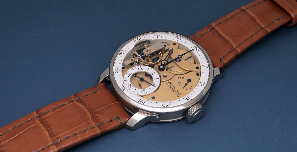
Nicolas (amanico) brings the Ferdinand Berthoud Chronomètre FB 3SPC in white gold and rose gold into focus, inviting collectors to appreciate its unique aesthetic. His post highlights how this reference offers a contemporary interpretation of traditional horological displays. This article synthesizes community insights on its wearability, design nuances, and horological significance.


I prefer the rose gold combination 😊👌
I guess the hands are blued on the white version but dosnt really pop in that pic like i know they can?
The WG is delicious. Might be in minority here but like the modern take and the color scheme here. Ps: wasn’t aware of the Chopard ownership until I saw in which forum it was posted and looked it up online. Interesting move to not “integrate “ it but rather keep it autonomous …
and went all the way to Art in Time, Monaco to try it on. It's the most wearable FB and it's wonderful from a horological standpoint. But the more I see it, the less it speaks to me. I respond less and less to these watches which are all about displaying watchmaking mastery on the dial side. FB 2RE.1 is far from being as wearable, unfortunately, but the solid enamel dial is just something else for me. And the movement displayed on the reverse side is just as magical. Best, Emmanuel PS: great sho
Not like i have the best or color acurate screen either thoug so my look better for others.
I wonder how the "smiley face" bridge from11 to 1 looks in person. I fixate on it in photos for some reason but still find the watch quite appealing.
This thread is active on the Chopard forum with 26 replies. Share your knowledge with fellow collectors.
Join the Discussion →


