New Release
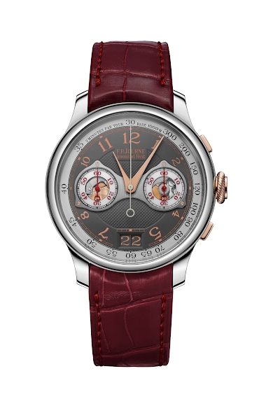
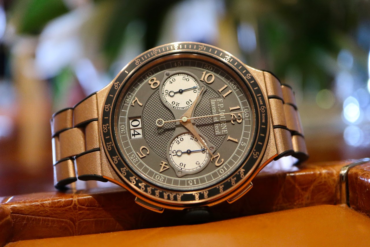
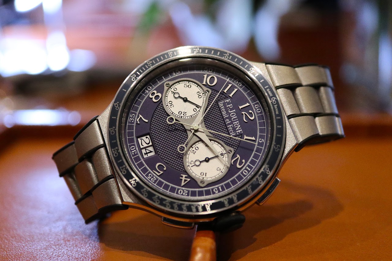
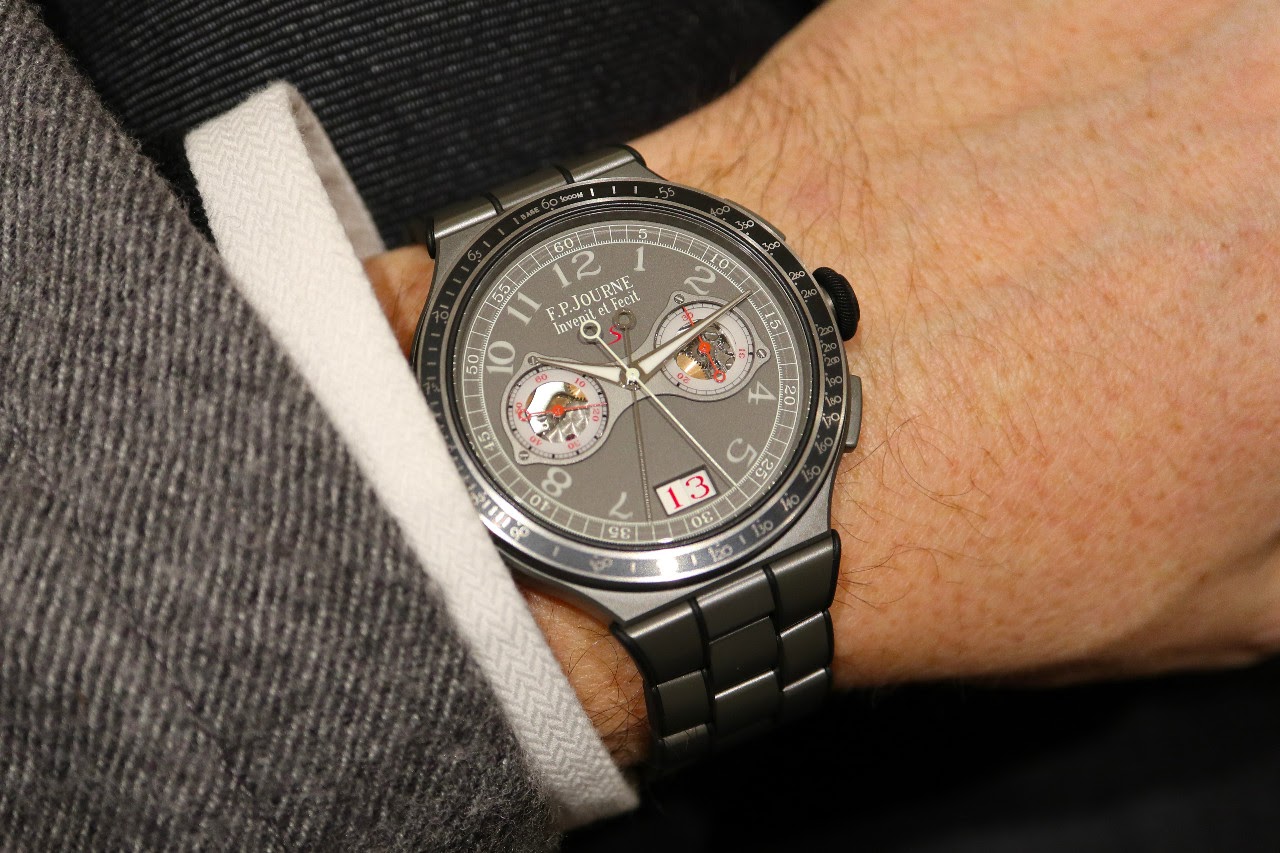
Andrew Luff offers an exclusive first look at the F.P. Journe Chronographe Monopoussoir Rattrapante from Geneva 2018, showcasing live images of the gold, platinum, and titanium versions. His initial impressions highlight the distinct characteristics of each metal and spark a lively community discussion on aesthetics and wearability. This post provides valuable insights into a significant F.P. Journe release.


 )
)I've seen a few wrist shots already and it seems the watch does wear smaller than the measurements would suggest, I guess the lack of a traditional lug helps. While I could not wear it, not my style, the RG is a winner for me. It's full on RG but with the finish and mix of materials it comes across far less in your face than some others. Re your comment on the mix and match (dial and case), I too would agree that the dial on the Ti like its predecessor let the watch down a little. But why no swi
For my mind, there is something “Not quite right” about the aesthetics - maybe it’s the bezel. Intriguing complication but the whole package doesn’t quite grab me. (I could be in the monitory though) Cheers
It seems as though plum is in...
This thread is active on the F.P. Journe forum with 26 replies. Share your knowledge with fellow collectors.
Join the Discussion →