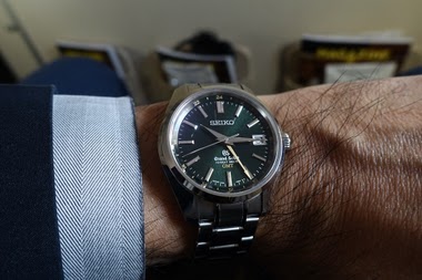
Vintage
Jay (Eire) shares his insights on a vintage Grand Seiko 56GS, reflecting on its design characteristics compared to the 61GS. His post delves into the aesthetic impact of lug design, offering a collector's perspective on what makes certain vintage references more appealing.

Another vintage GS today, this time the 56GS. One of the more common vintage GS I think one sees around.
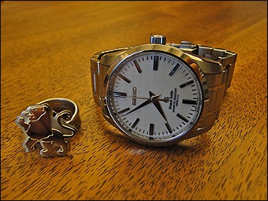
These don’t hold the same pull over me as the 61GS, see previous post, and the main reason for this is the additional metal between the lugs on these 56s which is not there on the 61GS.
I think its absence gives one a better appreciation of the contrast between polished (case side) and brushed (top of lugs) and the lines on the case as a whole.
Still, another cool and accessible watch.


Kanji always the first option, but that’s really only a question with the modern ones. With the old ones that’s all there was.
This thread is active on the Seiko forum with 7 replies. Share your knowledge with fellow collectors.
Join the Discussion →