Manufacture
Cazalea's insightful post delves into the core philosophy behind Grand Seiko's distinctive aesthetic, exploring how traditional Japanese concepts of light, shadow, and flatness translate into their watch designs. This article is essential for understanding the subtle yet profound artistry that defines Grand Seiko's 'conservative' yet richly detailed style. Cazalea invites readers to look beyond surface impressions and appreciate the nuanced design language.


For Japanese, black and white are seldom expressed in their extremes; there are numerous gradations between light and shadow. Shadow is as important as light because only with shadow can light be expressed. (Notice the shadow on this text)
On a perfectly polished surface, the play of light and shadow creates beautiful harmony. This interaction can be seen in traditional Japanese Shoji sliding doors. Even though these screen doors are constructed with simple straight lines and flat surfaces of paper and wood, the ever-changing interplay of light and shadow creates endless expressions of character.
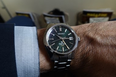
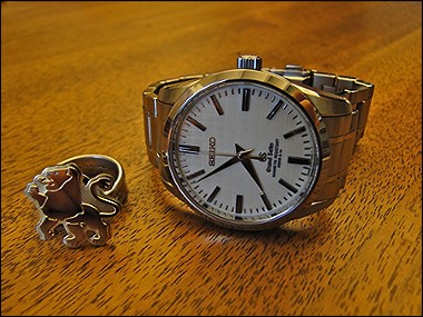
The Grand Seiko Style is based on this Japanese sense of aesthetic. It is crystallized in an unique design language with highly polished smooth surface areas as the principle element. Today, even after half a century, the appeal of this aesthetic endures, attracting the admiration of watch enthusiasts around the world.


Great, detailed account. Thanks, John. (Seikoholic).
thank you for this! It further continues my interest in GS...
Gr8 info ! Best, mahesh.,
It\'s a shame this information isn\'t more directly referenced on the Australian website. This made the design make even more sense. It already made sense because it looks great, but understanding really does aid appreciating. I\'m excited to spend more Tom with my GS now!
Would like to see if other brands could do something similar Suggests a coherent design ethos. Has it evolved over time as technology has developed? Cheers JML
Thank you for sharing Cazalea. Best Regards Edward
This thread is active on the Seiko forum with 18 replies. Share your knowledge with fellow collectors.
Join the Discussion →