Meislergeisler offers a detailed 'live pics' comparison of the Linde Werdelin Oktopus II Rosegold with the original Oktopus Moonphase. This post provides valuable insights into the evolution of Linde Werdelin's design philosophy, focusing on case complexity, functionality, and the brand's unique approach to luxury mechanical sport watches combined with digital instruments.
Dear Purists,
if you - like myself - prefer live pictures instead of computer renderings AND are interested in the latest offerings from Danish watch company Linde Werdelin, then this post might interest you.
As some of you know I have been a long-time Paneristi but have discovered that there are many other great brands with good stories and fascinating products out there. One of the young brands that have gotten my love and attention is Danish Linde Werdelin, that I personally think does an excellent job in developing their specific idea of luxury mechanical sport watches combined with in house engineered digital instruments.
One of the latest new products presented is the Oktopus II rosegold, which I now had the opportunity to take a closer real-life look at. Being the proud owner of an Oktopus Moonphase from the first series I took the chance to take a few pictures side-by-side that hopefully give a good picture of the similarities as well as the differences between the two. To my own surprise there are more differences that I initially thought, but as always "it's in the details". So here we go:
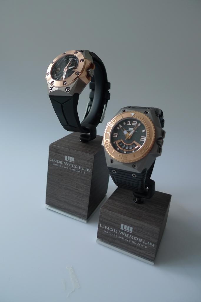
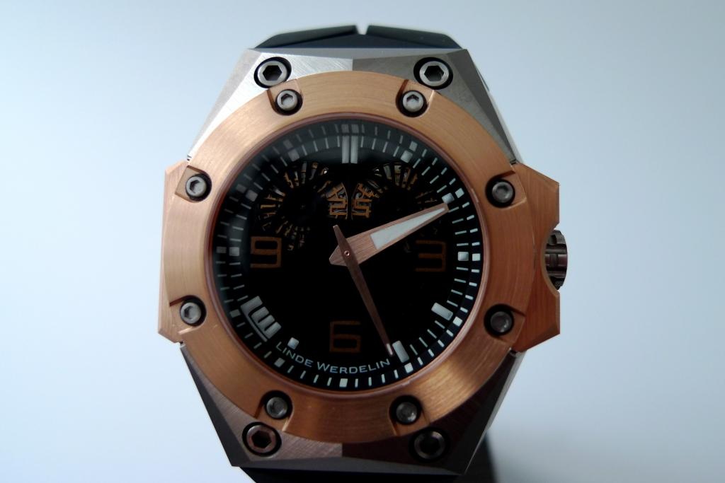
Oktopus II RG and Oktopus Moonphase, to my knowledge the first dive watch with moonphase complication (please correct me if I'm wrong!)
My first impression: the new Okto II feels much 'cleaner' than anticipated, most likely because of the symmetrical, non-rotating bezel. In direct comparison, the rotating bezel of the first generation Moonphase feels much busier as does the dial with the large white numerals and markers.
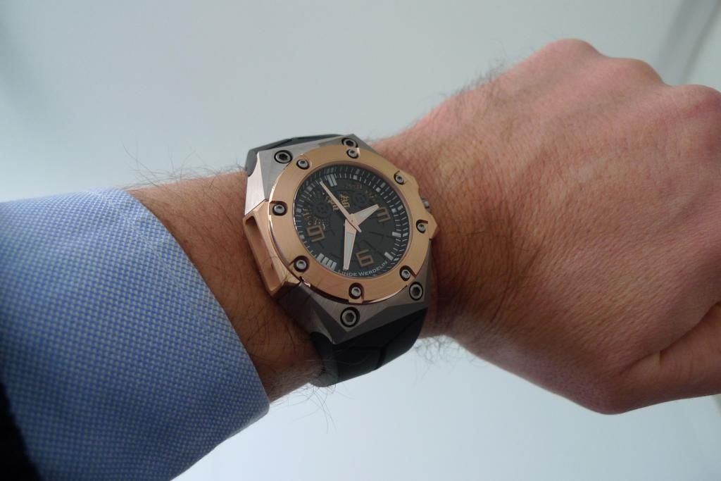
My apologies, I'm clearly not a hand model... Hard to believe that both watches have the same 'footprint' but they do of course to fit the same digital instrument, in case of the Oktopus this will be the dive computer aka "The Reef". Unfortunately I forgot take a picture with it.
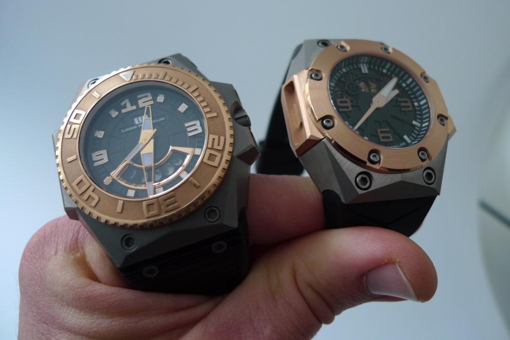
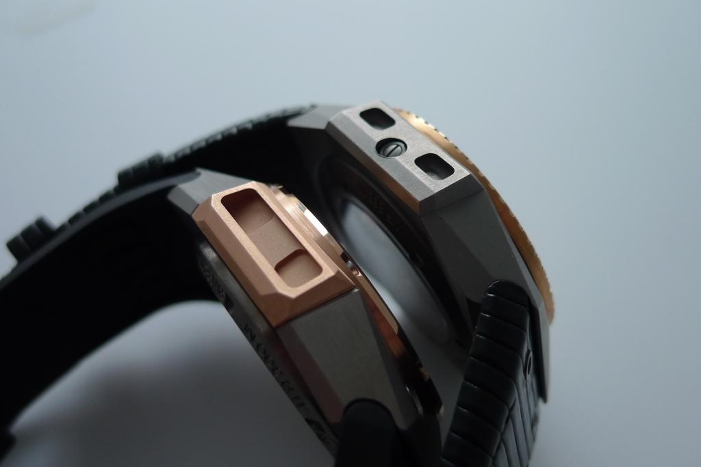
Here you can see the two generations of Oktopus side by side. Despite following the same design philosophy and LW-specific footprint, the case of the Okto II is much more complex and adds more facets, angles and fine details to the equation. As someone said elsewhere, the real innovation of Linde Werdelin lies in the extremely well-crafted cases that must be extremely hard to manufacture.
The Okto II adds some height due to the thick and beautifully engraved caseback but still wears as comfortably as the Moonphase - no noticable difference there. What is clearly visible is the enlarged crown (with the stylish oktopus logo engraved) and the additional cut-outs on the bottom which makes operating the crown much easier. The circular groove around the side of the crown adds to the functionality which shows that Morten and Jorn take customer feedback very serious and act on reasonable feedback.
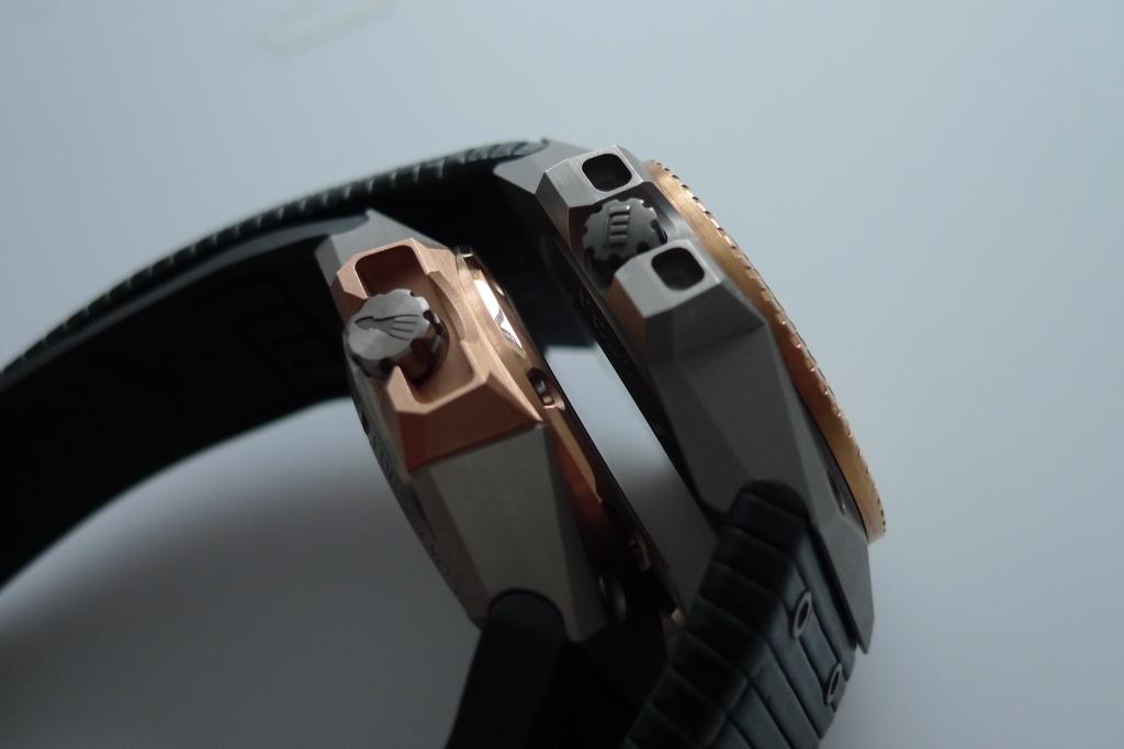
Here's the same shot from the other side. As you can see, the Helium escape valve from the first series (that looks like a screw on the side of the case) has been removed. A consequent move that has to be seen in conjunction with Linde Werdelin's decision not to equip the Okto II with a rotating bezel but instead offer the combination of solid mechanical watch and state-of-art digital instrument that offers all the necessary data and functions. Helium escape valves to my knowledge only make sense for super-mega-hardcore-professional divers and I doubt that this piece of titanium and rosegold will ever make it to the wrists of such Pro's...
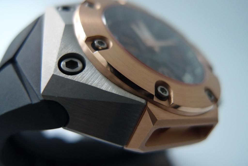
The following picture is one of my favorites as I shows the variety of shapes, angles and other details such as the screws holding the bezel (with black rubber rings which add to the clean look). Also notice the various surface decorations: while the bezel is brushed circular, the side is polished. The titanium surfaces facing upwards are brushed like the sides, however each in different directions. The triangular facets are sandblasted / 'micro-bille' treated. It's a fascinating watch to sit with and admire close-up all these details whose expression change in relation to the light. I can't help but think that almost as much time & delicate craftmanship must have gone into this case as other brands put into finishing their movements - just to be hidden it behind a solid caseback...
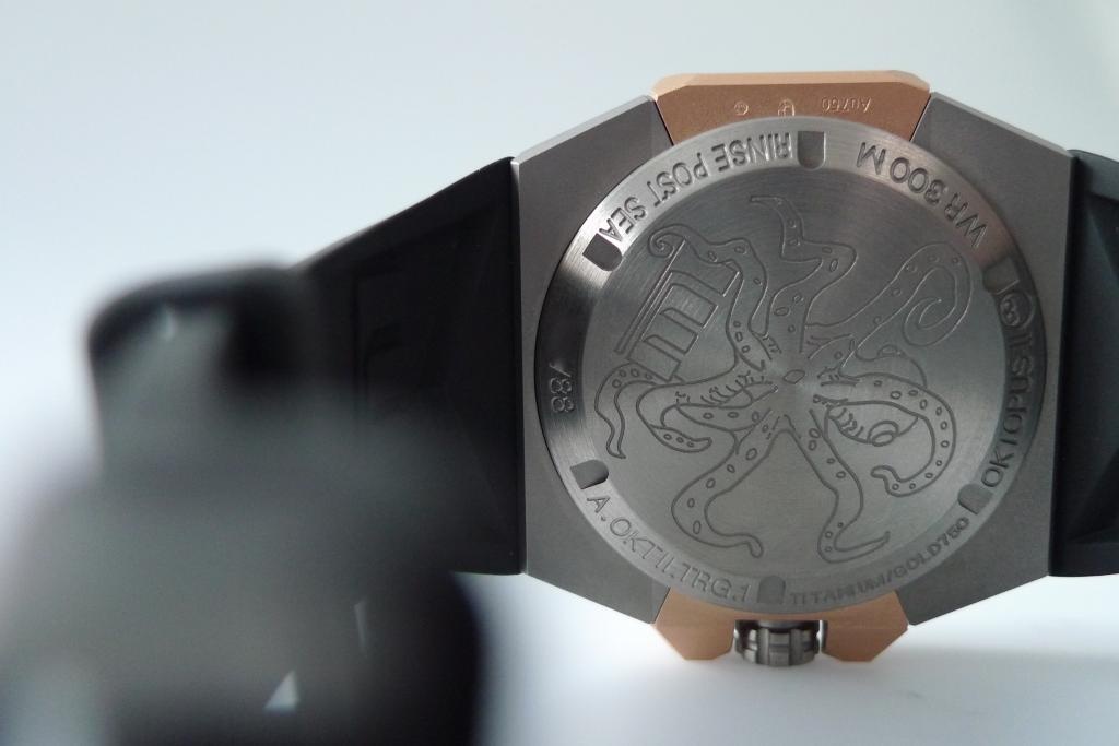
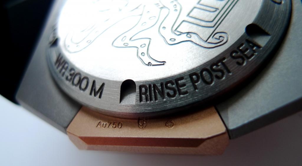
Speaking of which: as mentioned the solid case back has been neatly engraved with a stylish depiction of an oktopus, designed of course by Morten Linde himself. Other info to be found on the caseback are: serial number (xx/88 - yes, only 88 ever to be made of this model), model code (A.OKTII.TRG.1), material (Titanium/Gold750), name (Oktopus II), water resistance (WR300m) and - if you like - "instructions for use" (Rinse post sea). As an owner of a Panerai Bronzo I can full-heartedly agree with this advice as the Bronzo will clearly display signs of the aggressive salt water if you don't. And although titanium and especially gold aren't nearly as reactive as bronze, it still makes sense.
Also, there are the obligatory gold stamps to be found on one of the golden side pieces:
Oh yes, then there is the dial! According to Morten they have created a unique variation of Luminova that matches the gold tone of the case as well as the gold hands. To me, the dial seemed much more harmonious than on the previous blue and yellow versions of this watch. Notice also the date display that actually was quite easy to read.
In this picture the date display is even more clear (no photoshop I swear! Just fortunate lighting...). It also shows the good contrast of the gold hands and the black dial which, despite being semi-skeletonised, seems harmonious and simple with it's white minuterie and markers.
All in all this is a fascinating watch! It looks special without being too "funky", with a very modern yet luxurious expression which is not screaming for attention. And it wears well!
Thank you for your interest! I look forward to your comments and/or questions.
Best regards from Copenhagen,
Martin