
Review
jlc.thomsen's original post highlights a common dilemma for collectors: appreciating a watch's overall brilliance while scrutinizing specific design choices. His detailed observations on a Montblanc Minerva chronograph, particularly regarding movement finishing and case-to-movement ratios, spark a rich discussion on brand perception, historical context, and the nuances of high-end watchmaking. This article delves into the community's perspective on Montblanc's Minerva integration and compares it to other horological giants.


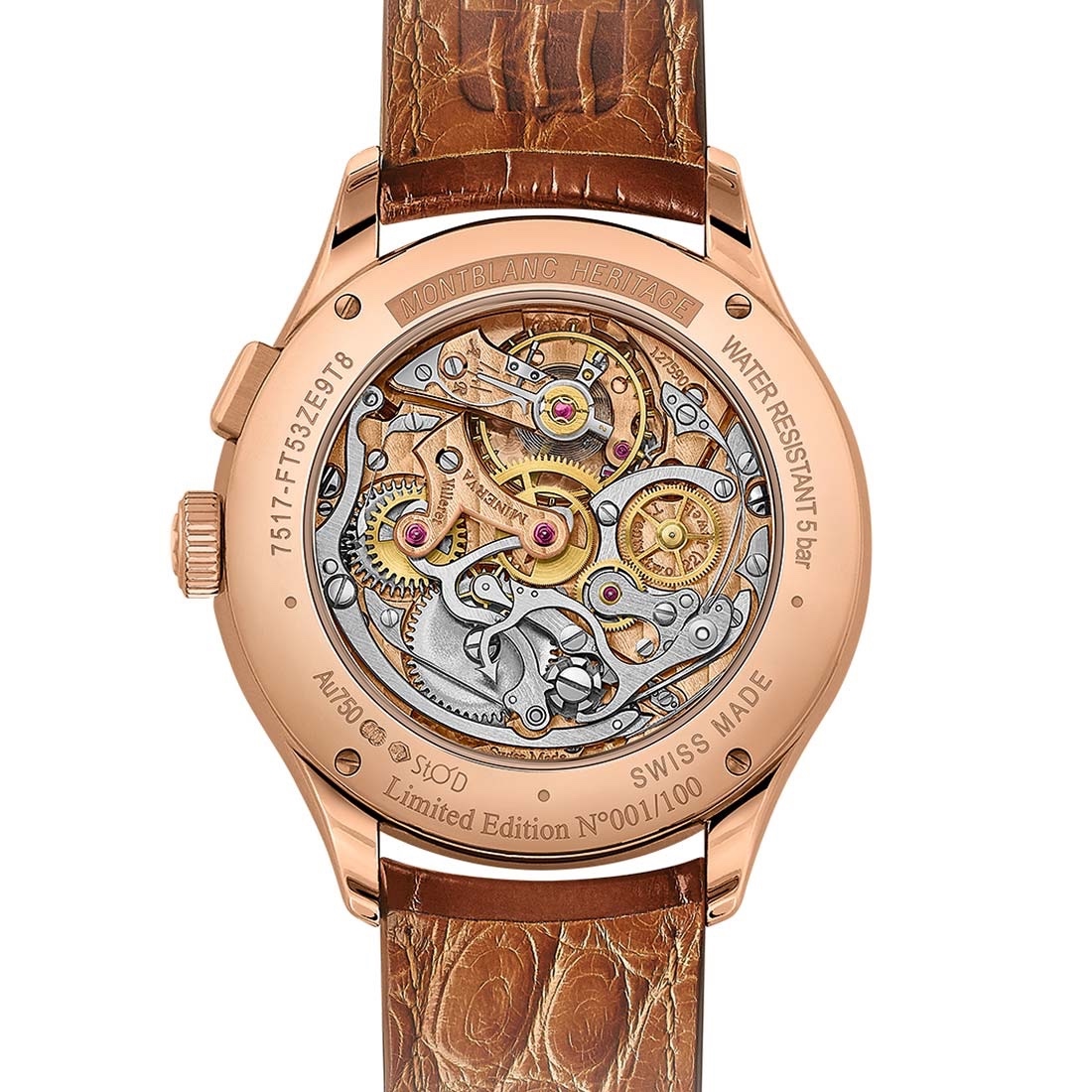
and subsequently sub-dials too close together. It's probably not evident when wearing the watch, but in large photos the way the chrono second hand intersects with the logo and the '12' looks imbalanced...
But I think they solved it well on this new edition. What i really want is this guy. But when it was out I couldn’t afford it. It was available at an AD, I tried it on and they had even discounted it. And now I can’t find it anywhere.
Other than those unique piece only watch
(from European Watch)... I saw one in the metal in Sydney and was very tempted. I really liked the off-white dial. It was a bit on the thick side (41mm, 12.6mm) for a simple chrono though.
I may be biased as I have the WG model. The dial is very clean too as clean as a Pulsographe can be, with only the text Montblanc on it and nothing else. I not sure whether you can still find one in the market now. I know the WG model does pop up from time to time but the RG seems to be even rarer. At least in Singapore, I know of only one collector who has the RG model. But for the WG, there are at least two including myself.
This thread is active on the Montblanc forum with 29 replies. Share your knowledge with fellow collectors.
Join the Discussion →