
Collection
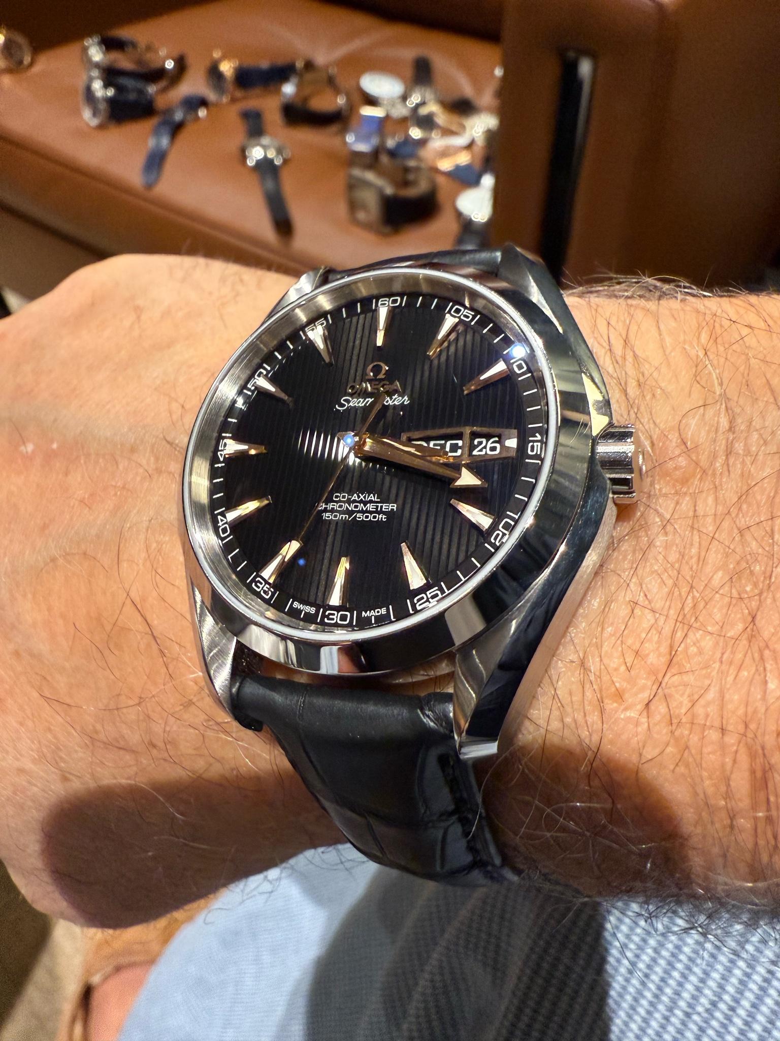
Chicolini's post highlights the enduring appeal of a classic Omega, showcasing how specific design elements like rose gold indexes and a black dial can elevate a timepiece to an elegant statement. His appreciation for its substantial feel on the wrist underscores the tactile experience that is often as important as visual aesthetics for collectors. This piece invites readers to consider the subtle details that define a watch's character and its lasting impact.


the mobile website. It posts all the photos sideways. They are upright photos. I don’t know what’s going on but it’s a glitch of some sort. Just started happening. Sorry.
Mine’s just a steel quartz and not precious metal but the look is consistent, even with the day in front of the date (which I also like). What reference and size is that one?
I think it has an annual calendar complication. I rarely forget which h month it is but day or date can sometimes be a challenge, a month date display doesn't make sense to me without the day. Lovely otherwise.
This thread is active on the Omega forum with 20 replies. Share your knowledge with fellow collectors.
Join the Discussion →