Mark in Paris offers an early look at the Patek Philippe Ref. 5327R Perpetual Calendar, a significant Baselworld 2016 novelty. He emphasizes the importance of seeing new references in person to truly appreciate their design and how they fit within the brand's legacy, particularly comparing it to previous perpetual calendar generations.
Hi everyone,
I could handle several of Baselworld 2016's novelties lately and I will prepare some reviews for later in the year but I will try to select a few pictures showing what the watches are about.
When we are flooded during two weeks with hundreds of pictures on the net, mixing everything and having sometimes a very quick look at them, it is difficult to judge what they bring and what they would communicate from an owner perspective and regarding the brand's history. We'll have the whole year to think about them and see them in the metal. This last point is mandatory to judge them accurately and I hope that the feedback we have here and that I'll try to give will help people who don't have easily access to them.
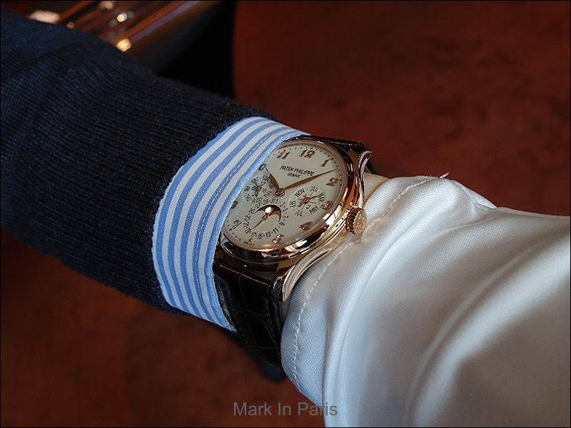
I'll start with a reference I like a lot (my favorite with the 5204R and the two new WT refeences to be frank).
I already told you how much I think the 5227 case is a work of art and that it was natural that the case was used for the new Perpetual Calendar generation.
Believe me, the result is breathtaking, very elegant and refined in the metal. It brings a little more modernity from the last 3940 and 5140 generations . Furthermore, the Breguet numerals are maybe the reference on which it works the best.
Here is a wristshot to open the show:

Cheers, Mark
About the Patek Philippe Grand Complications Ref. 3940
The Patek Philippe Reference 3940 is a perpetual calendar wristwatch that was introduced in 1985, succeeding the Reference 3450. It is notable for its relatively slim profile and the integration of a perpetual calendar complication in a refined case. This reference became a cornerstone of Patek Philippe's complicated watch offerings for nearly two decades, establishing a design language for subsequent perpetual calendar models. It represents a significant period in the brand's modern history of complicated timepieces.
The watch features a 36mm case, typically crafted from yellow gold, rose gold, white gold, or platinum. It houses the self-winding Caliber 240 Q movement, which is known for its micro-rotor construction, contributing to the movement's thinness and allowing for a slimmer case profile. The movement provides a power reserve of approximately 48 hours. The dial is protected by a sapphire crystal, often accompanied by an interchangeable solid case back and a sapphire display back.
Reference 3940 is highly regarded by collectors for its classic proportions and the enduring appeal of its perpetual calendar display, which includes day, date, month, leap year cycle, and moon phases. It was produced in several series, with subtle variations in dial layout and typography, making early series examples particularly sought after. The reference is considered a benchmark for perpetual calendar watches and remains a significant piece for those appreciating traditional horological complications.
Specifications
- Caliber
- 240 Q
- Case
- Yellow Gold, Rose Gold, White Gold, Platinum
- Diameter
- 36mm
- Dial
- Silver, White, Opaline
- Crystal
- Sapphire
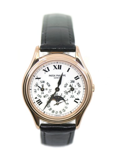
About the Patek Philippe Perpetual Calendar Ref. 5140
The Patek Philippe Reference 5140 is a perpetual calendar wristwatch, succeeding the highly regarded Reference 3940. It maintains the classic Patek Philippe perpetual calendar layout, featuring day, date, month, leap year, and moon phase indications. The 5140 was introduced with a slightly larger case diameter than its predecessor, reflecting contemporary preferences while retaining a traditional aesthetic.
This reference is powered by the ultra-thin self-winding Caliber 240 Q, known for its micro-rotor construction which allows for a slender case profile. The movement provides a power reserve of 48 hours. The watch is presented in 18k white gold, rose gold, or yellow gold cases, measuring 39 mm in diameter, and is fitted with a sapphire crystal. It offers water resistance to 30 meters.
The 5140 appeals to collectors seeking a modern perpetual calendar with a direct lineage to Patek Philippe's established complications. Its production run from 2006 to 2019 saw various dial configurations, including opaline and silvery finishes. The watch is typically paired with a leather strap and a deployant clasp, consistent with Patek Philippe's classic offerings.
Specifications
- Caliber
- 240 Q
- Case
- 18k White Gold, Rose Gold, or Yellow Gold
- Diameter
- 39 mm
- Dial
- Opaline, Silvery
- Water Resist.
- 30m
- Crystal
- Sapphire
About the Patek Philippe Split-Seconds Chronograph Perpetual Calendar Ref. 5204
Patek Philippe Reference 5204 Split-Seconds Chronograph Perpetual Calendar
The Reference 5204 combines split-seconds chronograph functionality with perpetual calendar complications in a 40mm case format. This reference represents Patek Philippe's approach to integrating dual chronograph timing capabilities with complete calendar functions, positioning it as a grand complication within the manufacture's lineup.
The 40mm case is available in 18k white gold or rose gold with polished bezel treatment and sapphire crystal. The manual-winding Caliber R CH 27 PS QI provides 48 hours of power reserve. Dial options include silvery-gray or silvery-opaline finishes, paired with alligator leather straps. Water resistance is rated to 30 meters.
Produced from 2012 to 2019, the 5204 appeals to collectors seeking complications beyond standard chronographs or simple perpetual calendars. The split-seconds function adds timing versatility while maintaining the traditional manual-winding operation characteristic of high-end chronograph manufacture. The reference serves collectors prioritizing mechanical complexity and dual precious metal case options.
Specifications
- Caliber
- R CH 27 PS QI
- Case
- 18k White Gold or Rose Gold
- Diameter
- 40 mm
- Dial
- Silvery-gray or Silvery-opaline
- Water Resist.
- 30m
- Crystal
- Sapphire
About the Patek Philippe Ref. 5227
The Patek Philippe Reference 5227, introduced in 2013, is characterized by its officer's style case with an invisibly-hinged dust cover, a feature that distinguishes it within the brand's Calatrava collection. This design element provides a protective cover for the sapphire case back, offering a blend of traditional watchmaking aesthetics and modern functionality. The reference maintains a classic Patek Philippe design language, appealing to collectors who appreciate understated elegance and technical refinement without overt display.
The watch features a 39 mm case with scalloped lugs, housing the automatic caliber 26-330 S C, which provides central seconds and a date display. The movement is visible through a sapphire crystal case back, which is protected by the aforementioned hinged dust cover. The case thickness is 9.24 mm. The power reserve for this caliber is between 35 and 45 hours. The reference has been produced in various precious metals, including white gold, yellow gold, and rose gold.
Reference 5227 appeals to collectors seeking a discreet yet technically accomplished timepiece. Its design lineage connects it to other significant Patek Philippe models, such as the Perpetual Calendar Reference 5327, through shared case characteristics. The white gold variant, Reference 5227G-001, was discontinued in 2019, while other metal versions remain in the current catalog, indicating its continued relevance and appeal within the brand's offerings.
Specifications
- Caliber
- 26-330 S C
- Case
- White gold, Yellow gold, Rose gold
- Diameter
- 39 mm
- Dial
- Ivory lacquered, Black lacquered, Brown lacquered
- Water Resist.
- 30 m
- Crystal
- Sapphire
About the Breguet Classique Ref. 5327
The Breguet Classique reference 5327 represents the Date Moonphase series within the model range, distinguished by its combination of calendar and lunar phase complications. This reference positions itself as a dress watch offering within the Classique lineup, incorporating both practical and astronomical display functions.
The watch features a 39mm case constructed from 18k white gold, fitted with a sapphire crystal and fixed bezel configuration. The silver dial houses the date and moonphase displays, while an automatic movement provides the mechanical foundation. Water resistance extends to 30 meters, suitable for daily wear scenarios.
This reference appeals to collectors seeking a complications-focused dress watch in precious metal construction. The 39mm case size accommodates contemporary sizing preferences while maintaining formal proportions. The white gold case material and silver dial combination creates a monochromatic aesthetic that suits both the Date Moonphase series identity and broader Classique collection positioning.
Specifications
- Caliber
- 591DRL
- Case
- 18k White Gold
- Diameter
- 39 mm
- Dial
- Silver
- Water Resist.
- 30m
- Crystal
- Sapphire