Reference Guide
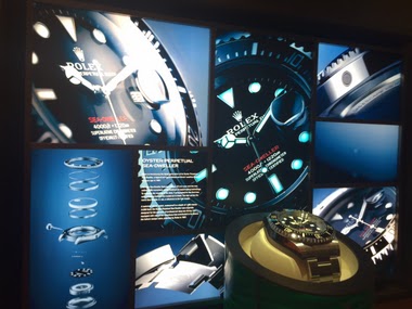
Amanico's striking photography of the Rolex Daytona Platinum offers a fresh perspective on a reference often debated for its unique aesthetic. His images highlight the uncommon color combination that defines this special edition. This article delves into the community's varied reactions, exploring why this particular Daytona continues to captivate and divide collectors.


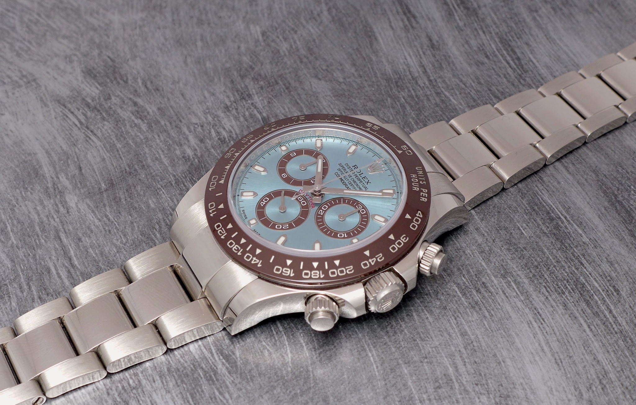


Overall, I think the color combo works very nicely. Thanks for these lovely pics 👌🏼
Initially, I found the colour scheme comically ugly, but after having seen a couple in the wild I consider it works. And having a platinum Rolex on the wrist tends to affect one's perspective anyways. I hence vote in favour!
but even more the DD40 in platinum as you know
I saw this version in an AD in Portofino a few years ago. If I only knew then what I know now.
...that it would be hard to choose, assuming one could actually purchase one. I particularly love the Daytonaa in yellow gold with the flex bracelet. I'm afraid (besides the price) the platinum version might be a bit too hefty.
I guess i would have to feel it in the flesh. I thought it weight close to 500gr, maybe i am wrong! This is an issue for me for example for photography as even if I have a "small" Sony camera (I have the A1), as soone as I put a heavy prime of it (like a 50mm f1.2, or a 85mm f1.4) i need to back belt to make sure i dont "fatigue" my back
This thread is active on the Rolex forum with 43 replies. Share your knowledge with fellow collectors.
Join the Discussion →