Vintage
DrStrong provides an insightful historical overview of the Rolex Explorer II Ref. 1655, affectionately known as the "Freccione." This article meticulously details the watch's evolution through its production period, highlighting subtle yet significant changes in its dial, hands, bezel, and case, making it an invaluable resource for collectors and enthusiasts.


Our dear Amanico has already made a great in depth review of the Freccione a couple of months ago:
but I wanted to add a few personal comments as well as pictures of this watch and its evolution during its production period.
The Rolex Explorer II ref. 1655 has been produced from 1971 to 1984. Compared to the already existing Explorer I, the watch has been upgraded with the date feature and a 24 hours indication using an additional orange hand and an external graduated bezel. The movement used in this watch is cal. 1575.
From 1971 to 1974, the watch was fitted with a straight sweep second hand (without a tritium dot) and a case with almost “pointed” crown guards; the crown guards were not as small as on the first Submariner or GMT-master, but they were definitely smaller than on the other Rolex sports models of 1971 and than on the later case version of ref. 1655. The bezel used thick font with the numbers close to the dial ("thick font top").
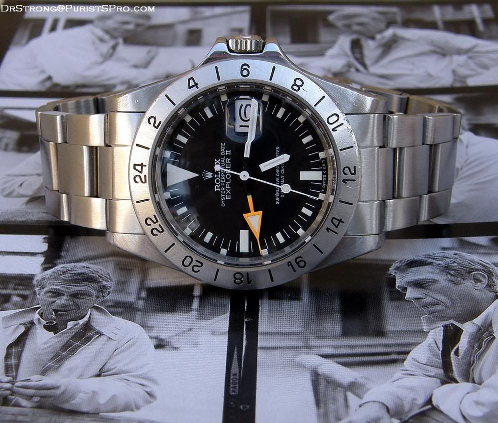
Here’s an early example of a Freccione, where you notice the specific “swiss” dial, the straight second hand and the first type of bezel:
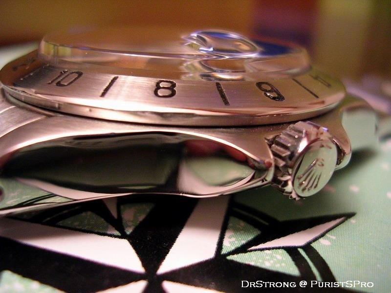
here’s a view where you notice the specific shape of the early crown guards:
and a different angle to appreciate the various aspects of the watch:

In 1974, the design of the watch is slightly modified: the crown guards get bigger and a new type of dial (rail dial) is fitted to the watch.
In 1974/75, a new bezel appears (thick font centered) until 1977 when it changes again ("thin font full").
Between 1977 and 1978, the dial is changed again, especially the shape of the coronet and the bottom of the dial which now reads t swiss < 25 t.
A final version of the dial is introduced in 1979 and a final version of the bezel ("thin font reduced") in 1980.
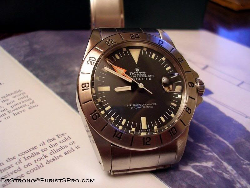
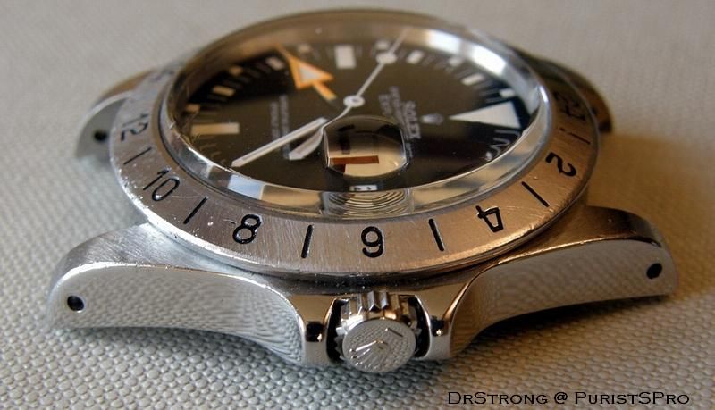
Here’s a late 1970’s watch, where you see the Mk4 t swiss < 25t dial and "thin font full" bezel.

it is obvious on this picture that the crown guards are much thicker than on the early 1970’s watch:
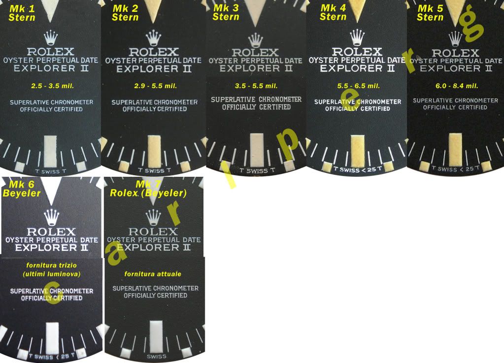
Here’s a detailed chronological list of the dial versions that has been established by Carlo Pergola and Antonello Niceta:
• Mk1 1971-1973
• Mk2 1972-1977
• Mk3 ( rail dial) 1974-1977
• Mk4 1977-1980
• Mk5 1979 – 1984
• Mk6 replacement, tritium
• Mk7 replacement, luminova
And a picture by these authors to illustrate the differences between the dials:
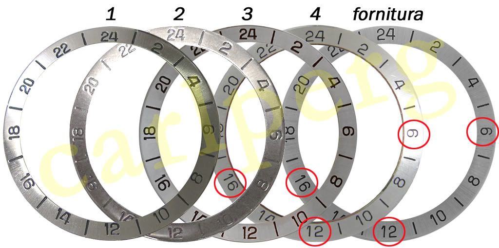
Here’s a summary of the evolution of the bezel:
1. thick font top, seen with Mk1 and Mk2 dials between 1971 and 1973
2. thick font centered, seen with Mk1, Mk2, Mk3 dials between 1973 and 1977.
3. thin font full, seen with Mk4 dial between 1977 and 1980
4. thin font reduced, seen with Mk5 dials after 1980
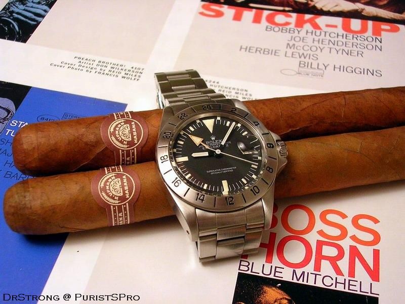
To conclude, here are the mandatory vintage ads featuring the Explorer II, that illustrate so well the philosophy of the watch:

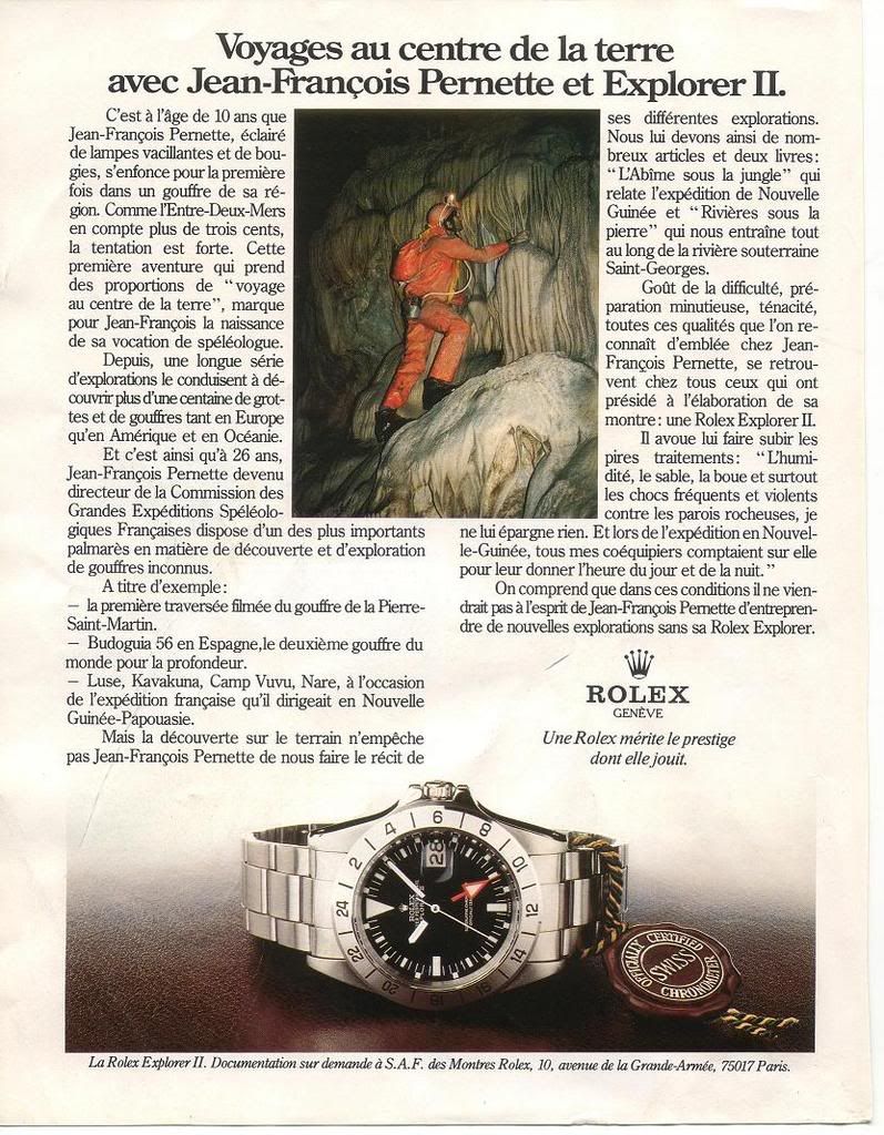
The Rolex Explorer II reference 1655, often recognized by its distinctive orange 24-hour hand, was introduced as a tool watch for speleologists and polar explorers. It offered enhanced legibility in low-light conditions and a fixed 24-hour bezel to distinguish between AM and PM in environments where day and night cycles are obscured. This model stands apart from its GMT-Master sibling by focusing on a specific utility rather than multiple time zones, making it a specialized instrument within the Rolex professional line.
This reference features a 39 mm stainless steel case, housing the automatic Caliber 1575 movement. The movement provides a power reserve of approximately 42 hours. A robust acrylic crystal protects the black dial, which is characterized by its luminous hour markers and the prominent orange 24-hour hand. The watch is water-resistant to 100 meters, suitable for its intended robust use.
Collectors value the 1655 for its unique aesthetic and its position as the original Explorer II. Its fixed bezel and distinctive hand set differentiate it from later Explorer II iterations and other Rolex sports models. The reference appeals to those who appreciate purpose-built watches and the early design language of Rolex's professional series, representing a specific chapter in the brand's history.
All the best for 2010!! regards Philipp
It is great to see how the writings, the bezels, and the hands changed... Another interesting point is to see how the patina on the tritium indexes changed. On some generations, it is darker than on others, even older. I'm very happy with my 1655, even if I would have preferred bigger fonts on the bezel ,and a bigger crown, too. Hey, by the way, is that 1655 first generation yours? Best, and thanks for this informative post! Nicolas
Thanks Jeff, they are real beauty Wish you great harvest in 2010
I learnt more about my Freccione here and love it even more. Mine is a MK1 (3.3mil) watch but had its dial/hands/bezel changed at servicing around 1979 (MK4?) Still a beauty to accompany me into 2010. Sorry for poor photo skill. Another clearer pic. rolex.watchprosite.com
.. Thankyou, thats the way it should be done. Very informative and good on details. Beszt regards Hans
Thank you for sharing. Here is my straigh-hand McQueen (3.0 mil ) with early bezel. Both you and Nicolas opened my eyes for this model.
This thread is active on the Rolex forum with 43 replies. Share your knowledge with fellow collectors.
Join the Discussion →