
Review
Ornatus-Mundi provides a detailed hands-on review of the Zenith El Primero 36,000 VpH with the new anthracite dial, a subtle yet impactful addition to the collection. His keen eye for design nuances and legibility issues offers valuable insights for collectors considering this reference. This article explores how a dial color change can dramatically alter a watch's presence and functionality.


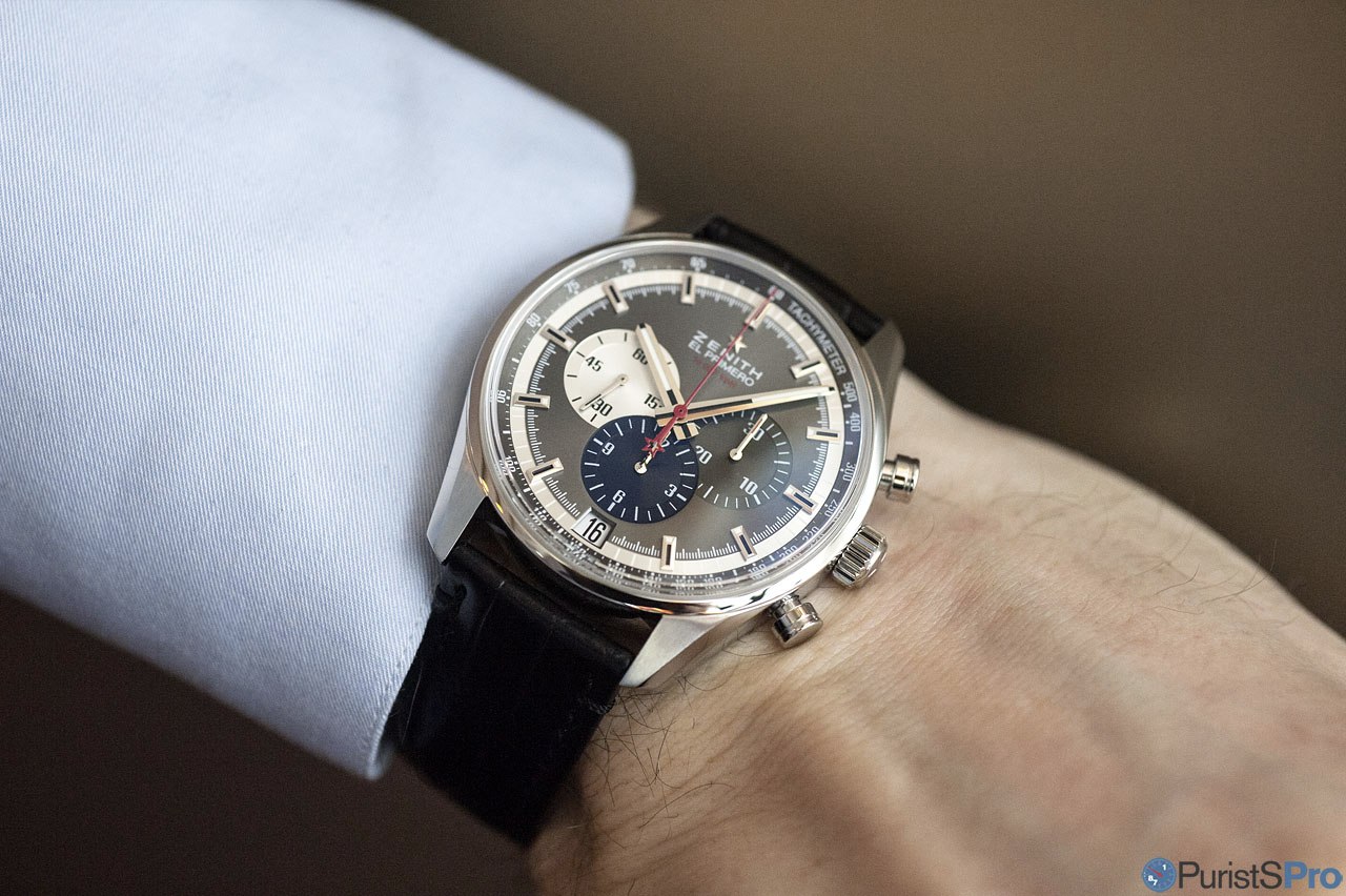
The new anthracite dial Zenith El Primero 36,000 VpH is another one of those silent additions to the collection. Actually, I believe it's very attractive, thus I chose to present it in more detail (and with more images than I would usually do):
Available in exactly the same 42mm stainless steel case as the iconic silver model (which was introduced here on PPro recently - click HERE ), the new darker colour scheme adds a touch of drama to an eminently classical and timeless chronograph design.


Again, the colour scheme is inconsistent with the functions of the
hands: permanent seconds and chronograph hour counters come in
contrasting colours, whereas the chronograph minute counter in the same
colour as the base dial. See above, the comparative images
illustrates this quite well, it was - in my opinion - more adequate in
the silver version?


In general, the new design shifts the emphasis on the structural aspects of the dial:

I assume it is exactly that, which, adds to the sheer presence this watch has on the wrist:


Overall, a very welcome addition to Zenith’s El Primero 36,000 VpH collection. It adds a powerful expression while still being perfectly a member amongst the ranks of its collection’s peers. The design is timeless and greatly endowed with beautiful details which ensure long-term pleasure. There are few minor imperfections though, but those are only an issue for the die-hard puristic chronograph devotees.
Well done (almost perfectly so), Zenith! 
Thanks for reading,
Magnus
I still prefer the silver dial - as you said, we tend to nitpick, and the subdial that shares the color with the rest of the dial causes the whole look to be a little "heavy" to the right when viewed from a distance out. Overlapping dials not my preference, but one thing I really like about Zenith is that they do ensure that the date is highly legible. Most chronographs have a date window that is almost not visible for normal use. Wears well too!
create sufficient contrast, though. However, it depends on the light! Best, Magnus
Thank you for this report, Maguns! Best Blomman
The Anthracite dial makes the watch looks smaller than it is. Probably it will be better if it is in 38mm. Thanks for the sharing.
This thread is active on the Zenith forum with 7 replies. Share your knowledge with fellow collectors.
Join the Discussion →


