Reference Guide
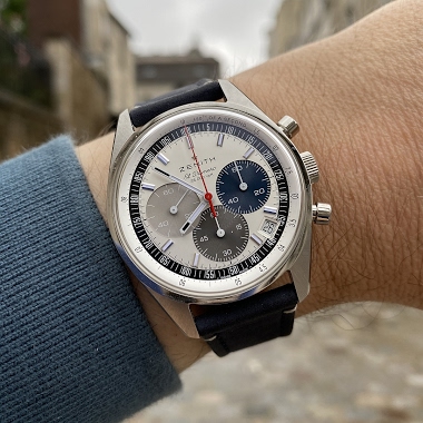
Brice de Norfer initiates a compelling comparison between two 38mm Zenith El Primero chronographs, both featuring the now-discontinued Caliber 400 movement. His post invites collectors to weigh in on the aesthetic and functional differences, particularly between the iconic tricolor dial with 100m water resistance and the A386 Revival 'Manufacture Edition' with its distinctive three shades of blue and 50m water resistance. This discussion highlights the nuances that define collector preference within the esteemed Zenith El Primero lineage.

The Zenith A386 is a significant reference within the El Primero lineage, recognized for its tri-color sub-dials and robust chronograph functionality. It was among the earliest watches to house the groundbreaking El Primero high-frequency automatic chronograph movement, setting a benchmark for precision and performance in its era. This reference is a foundational piece that established many of the design codes and technical capabilities that would define Zenith's chronograph offerings for decades.
The A386 features a distinctive stainless steel case, often characterized by its tonneau-shaped profile and pump-style pushers. Encased within is the celebrated El Primero caliber, an integrated automatic chronograph movement operating at a high beat rate. The watch typically includes a domed crystal, contributing to its vintage aesthetic and providing clear legibility of the dial.
For collectors, the A386 holds considerable appeal as an original example of a historically important chronograph. Its enduring design and technical innovation make it a sought-after reference, representing a pivotal moment in watchmaking history. The various dial executions and case finishes across its production run offer collectors a range of options, each contributing to the rich narrative of this iconic model.
The reason being, although I've never been attracted to Zenith watches, the one on the right is a more balanced "panda" look from 3 feet away. The font on the subdials I also like. I prefer the pushers on the left one, but the washed out silver dial and the unbalanced sub dials don't work for me. I see it as just a blah looking watch. Zenith was a darling on TimeZone back in the day, when I was there but it just didn't ever appeal to me.
This thread is active on the Zenith forum with 27 replies. Share your knowledge with fellow collectors.
Join the Discussion →