Ornatus-Mundi presents a compelling 'Coffee House Tales' installment, revisiting the iconic Zenith El Primero. This article offers a direct comparison between the original 1969 Zenith El Primero and its 42mm contemporary reincarnation, meticulously detailing how Zenith's modern approach subtly updates the historic ancestor while maintaining its core design integrity.
In this and the upcoming Coffee House Tales
Miss R and myself tried to revisit the two fundamentally different approaches 'current' Zenith has in respect to its heritage. Like in
my report on the
Zenith Type 20 "Extra Special", we met at the
Café Drechsler for a direct comparison of the
original 1969 Zenith El Primero and its contemporary reincarnation
Zenith El Primero 36000 VPH 42mm, introduced
45 years later:

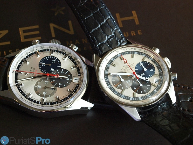
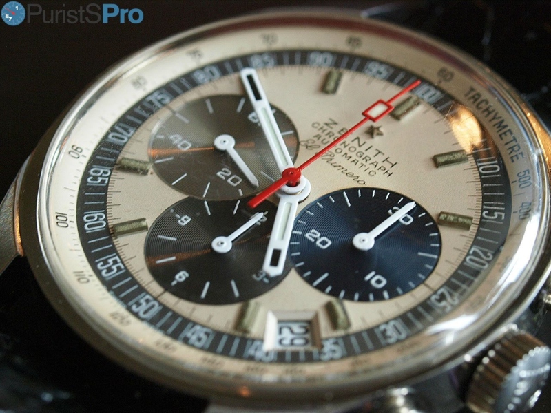
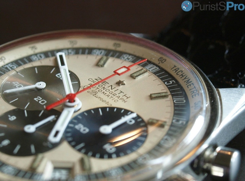
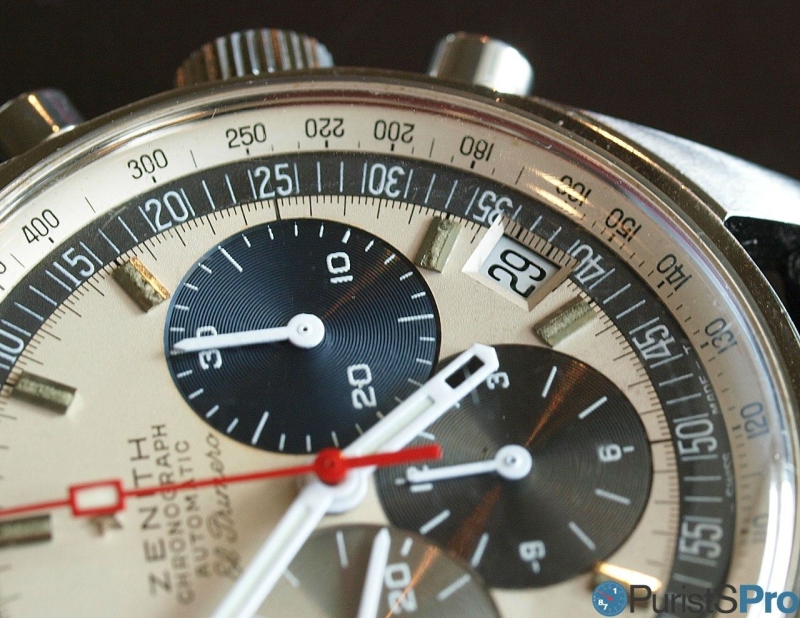
Zenith has chosen an approach which closely follows the design of the historic ancestor and only added subtle modernisations (well, they are subtle except for the increase in size from 38 to 42mm). The colour scheme is almost exactly the same. So from a distance the watch appears to be like a male/female couple. A bit closer, and differences are more obvious. At first sight the vintage model excels in the legibility department:

This is in part due to the starker execution of the finishing elements as well as the design of the hands:


Both watches feature an opaque/silver dial with a dark outer ring home of 1/100 of a minute or minute indications, respectively, and in both cases adjacent to the inwards directing seconds partitions. Also the hour indices share their strong brick shaped theme:

In respect to differences we first notice the design of the subdials. While the original El Primero has its seconds and minutes counters overlapping the hours counter...


... it's exactly the opposite with the modern version: here, the hours counter cuts into both other subdials. What is also obvious is the much more refined execution of the counter dials on the current watch, with very fine concentric rings and an additional flatter outer section missing on the original. Lastly, Zenith opted in favour of a 60-15-30-45 section instead of the 60-20-40 division found on the archetype. This is probably a concession to the larger size. It has however an interesting consequence: more symmetric in respect to the subdial in question, but less symmetric in the context of the entire dial:

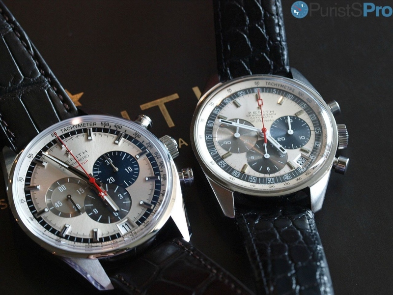
A very interesting and educating endeavour is the comparison of the hands. While appearing quite different at a glance there are obvious commonalities such as the choice of a red seconds counter hand as well as the selection of three absolutely identical hands for the remaining counters (often, brands introduce tiny differences between the continuous seconds and the rest of the counter hands).

While the exact shape of the hands appear different they in fact have a lot in common: the chronograph counter hands are rather straightforward affairs with only a restrained black accent on the modern watch. The hours and minute hands however have dark accents as well at their tip, something that again is shared between the two. The hands of the current timepiece appear more detailed with and additional inlay towards the center; however, this again might be necessitated by the large size.
Overall, the vintage El Primero clearly wins the legibility discipline!

Also, both watches proudly sport the
Zenith star!
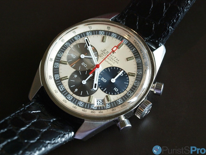
An idiosyncratic characteristic of the
El Primero was its date position at 4:30 which is of course present on the vintage model. Its a hate-it-or-love-it feature (I am in the latter camp) but this arrangement certainly has merits in the context of the chronograph counters - it simply does not interfere! The flanks have a rather flat inclination and carry the 5/s scale. I also love how close the date disk sits beneath the dial, facilitating legibility.

The placement of the date below the 12h counter in my opinion emphasises the difference in size between the movement and the case. The generous aperture ensures that one can read the date instantly.

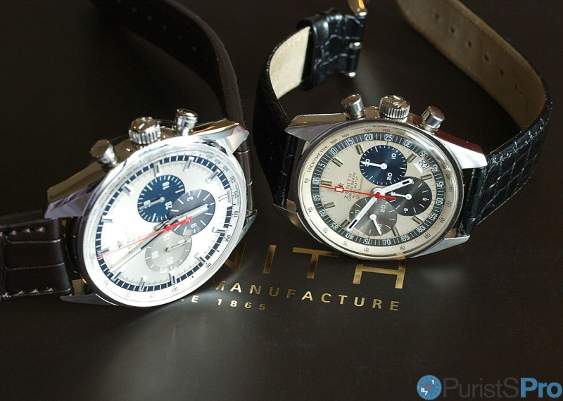
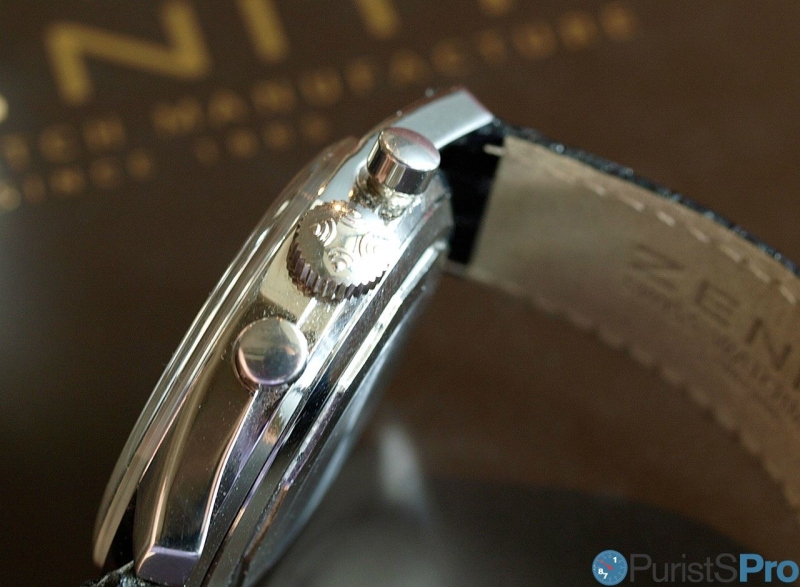
So far about the dial, but how does the rest of the watches compare? So here is the case side:

I am quite impressed how similar they look. The size difference is difficult to make out, both watches carry a domed crystal (in sapphire and perspex, respectively). I thought a bit about the reason for this similarity, and I concluded it might be due to the fact that the lugs are relatively more pronounced on the vintage version than on the current one. This might account for the difference in diameter if you view it from the side.
Crown and pushers are both quite equal, with the characteristic matte engraved ring on the 36,000 VPH:

Classic
Zenith logo on a very easy to operate crown:

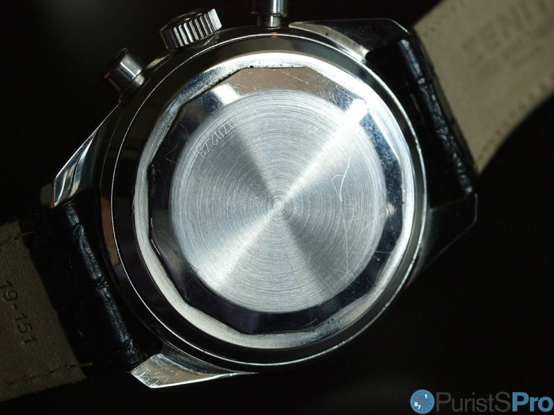
Well, here we have a token for the change watch appreciation underwent throughout the decades. In 1969, performance was certainly more important than a view of the movement (as mechanical movements were standard). Also, the composition of oils made them more susceptible to UV irradiation, thus a solid back cover was preferable. Times have certainly changed, and with it tastes, preferences and paradigms. Technology as well: oils are much more resilient, and watertightness easier and more reliably to achieve. Plus the El Primero movement certainly is an icon today, in 1969 it was not (yet):

The case back of 1969's original version is a plain circular brushed affair with central mount screw nut (for lack of the correct technical term...) and the serial number engraved:

The El Primero Cal. 410 hidden by the case back watch technically superbly finished, but aesthetically it received only minimal attention (image credit: Crazywatches):

What a difference fast forward 45 years! The base is still the same, but the rest?

Just as we like it today with beautiful decoration and a display back. My only criticism is the lasered-on serial number, which looks (a bit) cheap compared to the engraving around.
On the wrist, the vintage version has a certain tactility thanks to its rather 'coarse' dial finishings. These provide for a sensational landscaping and make the watch a fascinating and entertaining wrist-companion:
The contemporary version has its own magic which it derives from the very subtle brushings and grainings on an overall quite larger dial surface.

The allure here does not stem from the finishing patterns
per se but rather from the play of light they enable. Really a great accomplishment and a visible consequence of subtle modernisation efforts. Well done, Zenith!

Both watches are similarly unobtrusive on the wrist, quite surprising considering how different they are in size:


The Bottom Line:
Zenith revived an icon not only of the brand but for the history of watchmaking overall. The manufacture took its essence and thought to transport it into a contemporary watch with much care and a lot of well executed changes. While both are immediately recognised as members of the same family, the new version ticks all the boxes of a contemporary watch collector' wish list: pedigree and historic roots, but with a focus that has shifted from core watchmaking achievements (taken as given) to the meta-level of design and subtle finishing.
So in the end we have two watches which are so similar and yet so different. Zenith has done an impressive job in realising the above transition. This is not a re-edition of the VW beetle in modern clothes, this is a continued development that has not lost its technological appeal.
Kudos to Zenith, this is a great watch!

I have said it already, this is one example on how Zenith tried to bridge past, present and future. Here they tried to modernise. I have another example where they followed a different approach - stay tuned!
Thanks for reading,
Magnus
P.S.: Special thanks to Miss R for reading my mind with the vintage watch - the report would be less than half as insightful without!
P.P.S.: Please excuse the image quality. I know you are used to better ones here, but I did not properly test my equipment in the given location. Sorry for that!
This message has been edited by Dr No on 2014-07-19 13:45:27