
A new dial for the Quantième Perpétuel with Gold applied numerals and apertures.
ChristianDK


A new dial for the Quantième Perpétuel has been announced
I think the new dial looks more modern and lighter than the previous which, I btw, also quite like.
I love the rhodium plated hands and the applied numerals.
Our very own cmmnsens recently posted some nice live pictures of it. Thank you for that - we really appreciate it.
see his post here:
There will be two versions of this watch. A blue gillouche dial, which is only available in F.P. Journe Boutiqes and a silver gillouche dial.
both versions will be avialable in 40 & 42 mm cases. Platinum or red gold. height 11 mm.
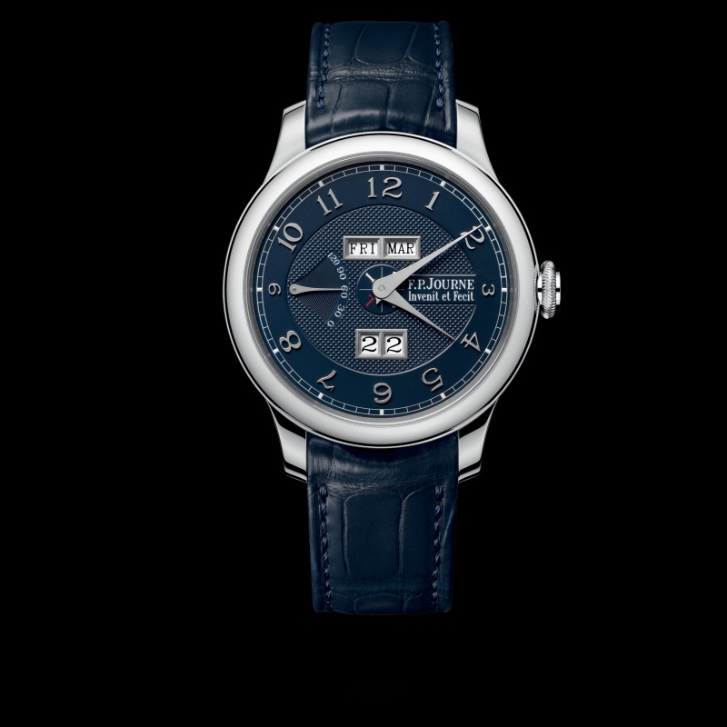
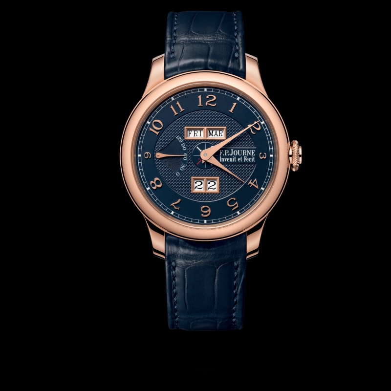
Boutique version, red gold 42 mm
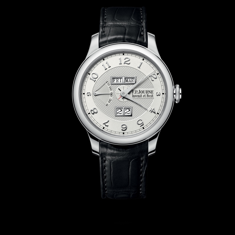
Regular version, Platinum 42 mm
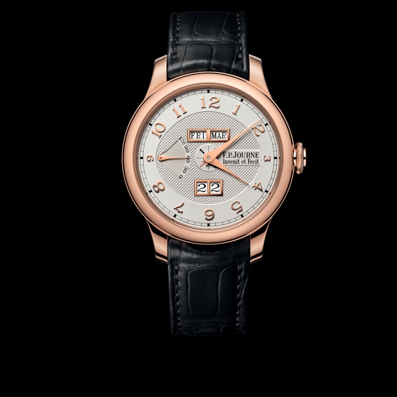
Regular version, red gold 42 mm
Here is the first version.
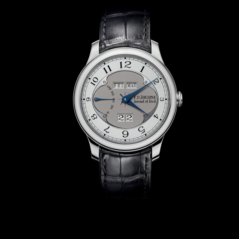
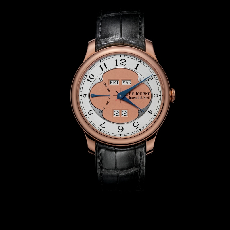
I think the orignal dial is a really nice design, so I was surprised to see such a radial redesign. FPJ sometimes does facelifts to dials but I dont recall such a radial redesign. Can anyone remind me or is it a first?
What do you think of the new one? which one do you prefer and why?
Comments:

Mohannad (aka Riddler) May 4th, 2020-11:55
I personally love the new QP dial and case I prefer it to the older models Thanks Christian

ChristianDK May 4th, 2020-12:19
Interesting you ike both as well Im on the fence I could mix them, I would take the applied numerals on to the old dial Thanks MO
mdg May 4th, 2020-11:58
I like this version... ...but the day and month apertures are too low on the dial. The old version had the same problem but the design did a better job of hiding it.

ChristianDK May 4th, 2020-12:22
I think you have a very good point on the aperture. I dont feel it was ever a problem on the old one, but is a bit in the new Its interesting how small details can change the perception. I almost think it is a different movement, which it obviesly isnt.

TeutonicCarFan May 4th, 2020-14:43
Good observation I believe the chunky frame in the apertures for the new variant accentuates how the upper bank is closer to midline than the lower. The raised leap indicator doesn't help in that regard.

Spangles - Dr. Tabby May 4th, 2020-16:03
The 40mm models may be a bit better in this, at least perceptually.
dustin.wu May 5th, 2020-18:23
Interesting Exactly the same comments I told my boutique guy when I saw the new one!!!
dustin.wu May 5th, 2020-18:33
Old clover on the dial I believe the old clover shape is to hide and compromise the fact that the two window being lower than their optimized positions due to mechanical limitation. It’s not for everyone but it does work. The circle is more classic but then the windows issue sh...

Lankysudanese May 4th, 2020-12:06
I, personally, really liked the older version. I know that several FPJ collectors here didn’t see it as a prominent piece in the collection, but I was always wowed by it when I checked it at boutiques. The dial presentation was very different from everything else in the dress watch FPJ collection. The new version looks closer, in design, to the CS and that line of dress watches from FPJ. In re...

ChristianDK May 4th, 2020-12:35
I think it has always been given respect by the FPJ collectors It is the first PC watch to have an instant change calendar. This can seem like an insignificant detail but required a huge technical effort and a lot of research. It is also one of the most difficult watches in the entire FPJ collection to build as it ha...
0-10-10
Load More Comments
Next Article
keks


5960 PuristS roll call...
keks


Calling out to PuristS that have in their collection any version of a 5960.... would love to know how many owners we have here. Ideally also which iteration.... I will start with my A...
© 2017 - WatchProZine