
Hands on review of the HYT H0
foversta

What is the most impressive with HYT is that since the launch of the first piece, the H1 in 2012, the brand has found its identity: the various models are easily recognizable at first glance what is a remarkable achievement for a young brand. It is due in large part to the uniqueness of the time display based on the use of liquids and which revisits in an original way the concept of a retrograde single hand. If I put aside the H3 which is a kind of UFO among the UFOs, the H1, H2, H4 could give time without their auxiliary minutes displays. With a little practice, you only have to consider the position of the colored liquid in the capillary tube to guess the minutes of the current time. And actually, HYT took the concept to its conclusion with the Skull: this collection removed the specific minutes display, the eyes of the skull are used to offer an indication that the watch is running (left eye) and a power reserve gauge (right eye).
While independent brands are generally tempted to expand their catalogues of complications to maintain the collectors' interest, HYT operates with its latest watch a return to fundamentals. Indeed, H0 is distinguished by its very refined approach while playing with the H1 codes. But be careful, the H0 is not a simpler H1, on the contrary. Rather, it appears to me as a sign of maturity on the part of HYT which seems here to find a good balance between the audacity of the beginnings and a reasonable approach further to the analysis of these early years.
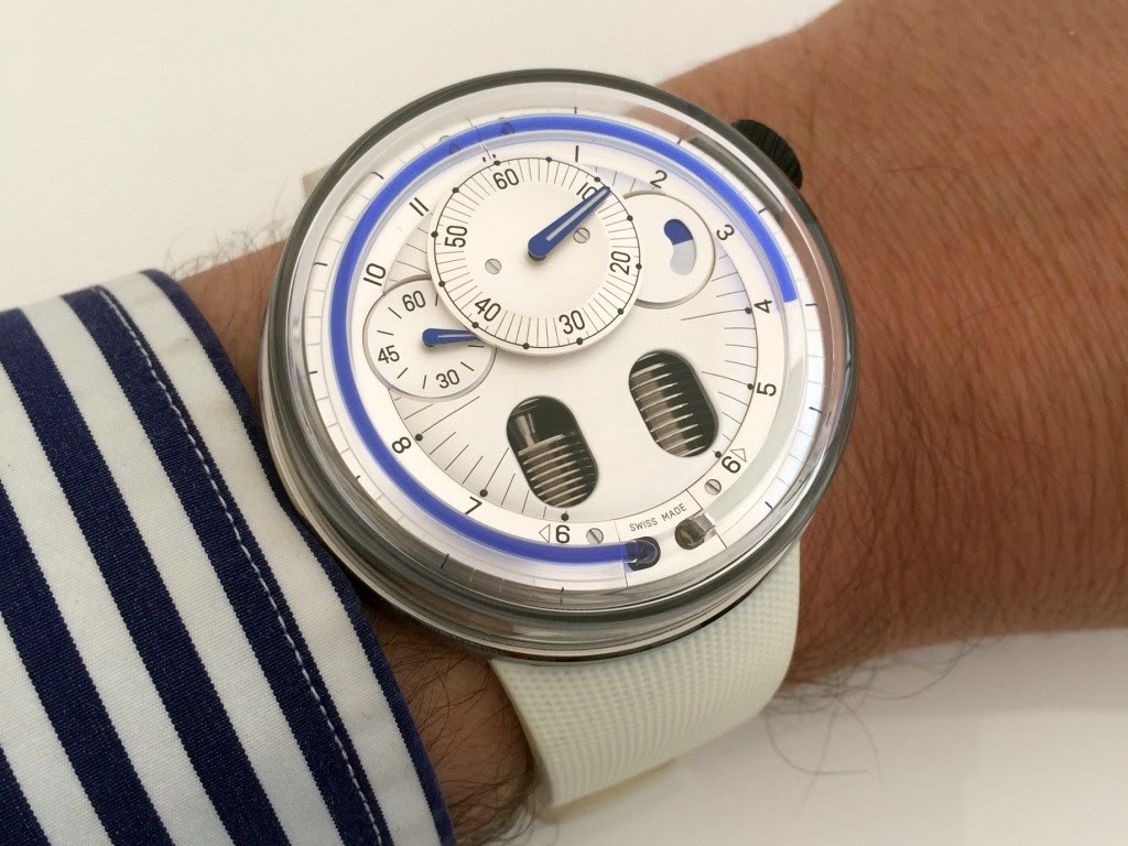
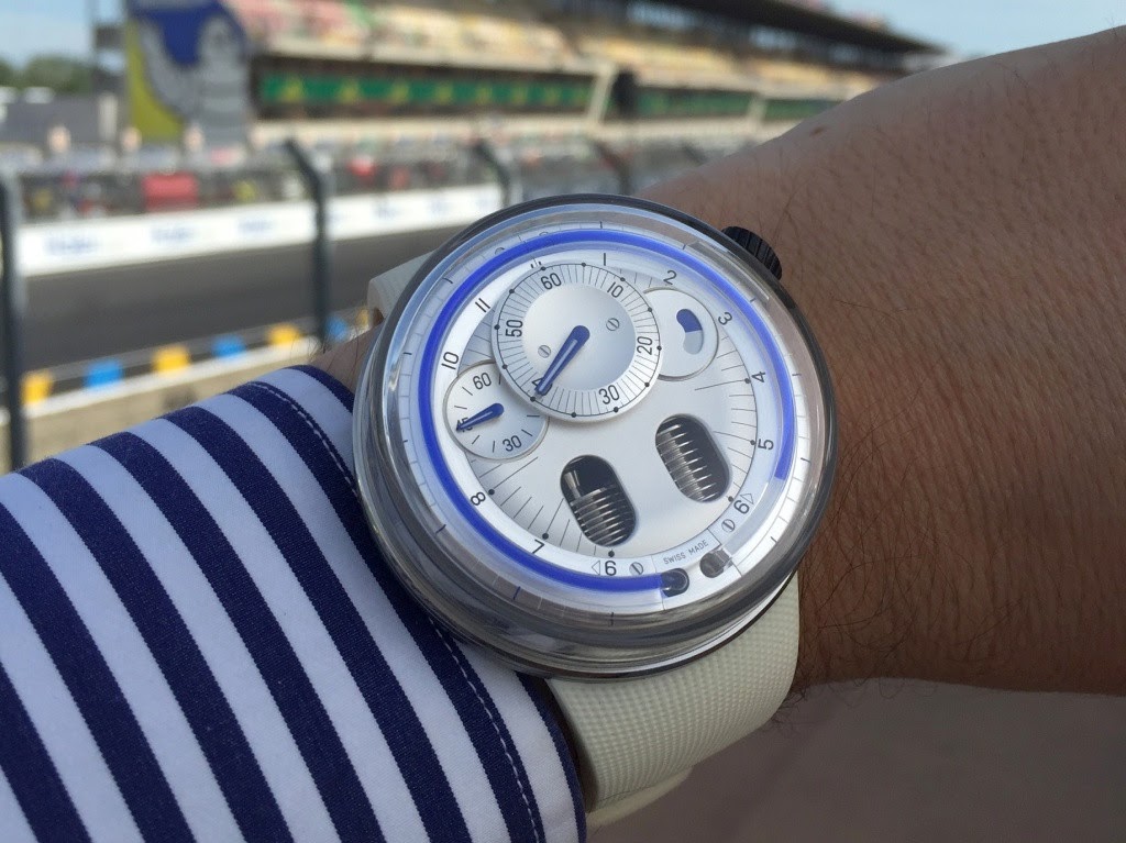
3 main differences distinguish the H0 to H1. The first one is the case. While the diameter and thickness remain the same (48,8mm and 17,9mm) the H0 is much easier to wear thanks to the removal of the lugs that significantly increase the perceived size of the H1. The strap fasteners are indeed located under the case and beyond the will to make the design "lighter", the style effect contributes to the fluidity of the whole.
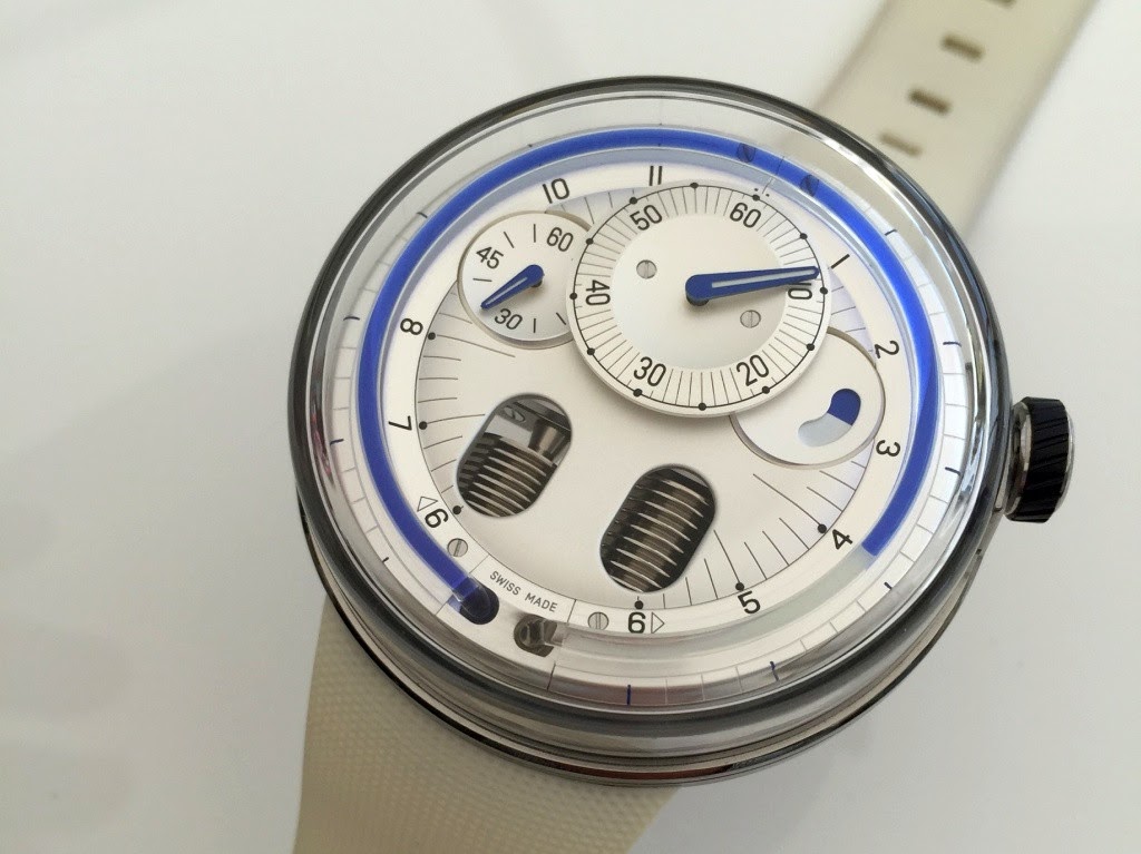
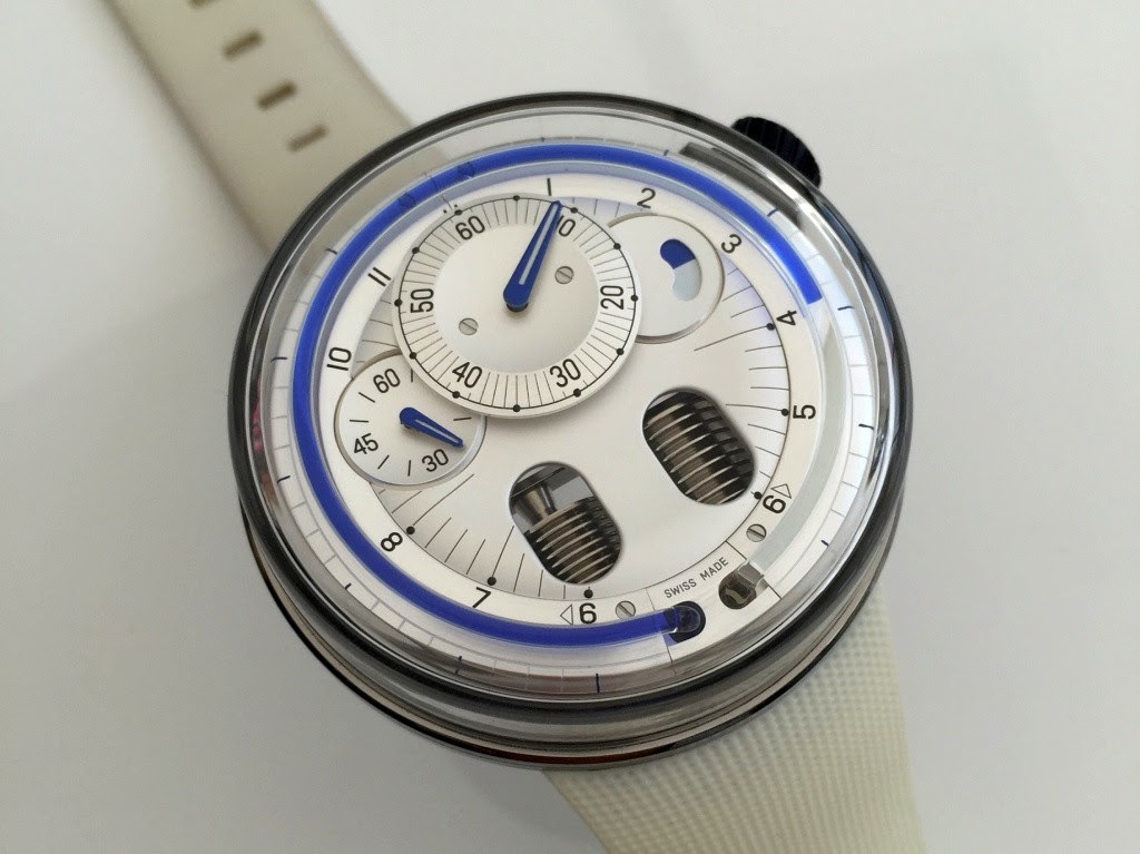
The second difference is perhaps the most important: the peripheral bezel that contributes to ease of the time reading on the H1 disappears and is replaced by a domed sapphire glass that gets the leading role since it wraps the entire upper part of the watch, including the caseband. The numerals don't disappear because they are now located on an inner flange. The time reading and the legibility are not altered. This glass has two functions. An aesthetic one and a practical one. From the aesthetic point of view, it makes the H0 brighter and perhaps "lighter" visually speaking. From a practical point of view, it allows HYT to insert along the caseband a second scale from 12 to 24 hours to make possible the time reading on the side. One way to make the watch legible from every angle!
The last fundamental difference is the treatment of the dial. The H1 features a very open dial, widely revealing its mechanism what makes sense because as the first piece in the collection, it had a teaching role to understand the HYT specificities. The H0 is not in the same context as I have expressed previously, it symbolizes the maturity of the brand. The dial becomes almost fully solid and unveils only the famous two bellow-shaped tanks which are the cornerstone of the display mechanism. I remind you that they contain the neutral liquid and the colored liquid and that with the flow of time, the colored liquid pushes the neutral liquid (without mixing together obviously) in the clockwise way. When the colored liquid reaches six o'clock, the neutral liquid sends back the colored liquid in its tank with a fast retrograde effect. The colored liquid then resumes its slow move instantly.
The dial of the H0, whatever its version, emphasizes the accessibility to the displayed information and minutes, seconds and power reserve are easily read. Finally, by closing its dial ... the H0 opens itself to customers who were not seduced by the too radical style of the H1 or of the Skull.
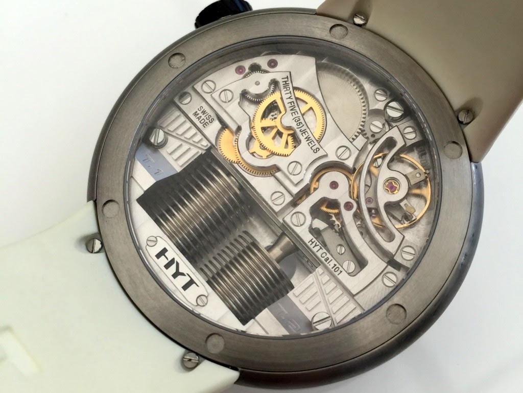
The movement that powers the H0 is the same than the H1. This is an exclusive handwind movement developed in partnership with Chronode: it was required at its creation, to make converge the watchmaking mechanical part (provided by Chronode) and the one particularly dedicated to the display and the mechanics of fluids (provided by Preciflex, the HYT teams company specializing in these technologies). The architecture of the movement is very contemporary and I love its presentation consistent with the style of the watch. Obviously, the presence of both bellow-shaped tanks enhances the uniqueness of the movement but the shape of the bridges also contributes to the visual success. The frequency of the movement is 4hz and the power reserve is 65 hours, which constitute a great performance due to the energy required to intervene continuously on the bellow-shaped tanks.
The H0 is available in three versions: Black (black DLC titanium), Orange and Silver (the latter two with brushed titanium cases). It is the Silver version that I prefer (it is the pictured version in this article). I find that its silver color particularly benefits from the impact of the glass wrapping. The other two versions are successful and the HYT fans will have the pleasure to find again with the Black version of the H0 the "traditional" brand colors.
So I was very convinced and seduced by this H0. While the case remains large (it is especially the thickness that is more disturbing than the diameter as such), I found it easier to live with than the H1 on a daily basis. HYT is now close to end the first chapter of its history and we can feel it. The H0 is definitely a more mature watch, less radical and in this context it can attract new customers. But HYT will need to continue to innovate, to make its technology available in more reasonable cases to really be in position to maintain its growth.
Thanks a lot to the HYT team.
Pros:
+ A sleeker and lighter design that makes the watch more contemporary and timeless
+ The readability of the information
+ The H0 case is easier to wear than the H1 one
+ The technical features of the basic caliber
Cons:
- the thickness remains significant
Fr.Xavier
While independent brands are generally tempted to expand their catalogues of complications to maintain the collectors' interest, HYT operates with its latest watch a return to fundamentals. Indeed, H0 is distinguished by its very refined approach while playing with the H1 codes. But be careful, the H0 is not a simpler H1, on the contrary. Rather, it appears to me as a sign of maturity on the part of HYT which seems here to find a good balance between the audacity of the beginnings and a reasonable approach further to the analysis of these early years.
3 main differences distinguish the H0 to H1. The first one is the case. While the diameter and thickness remain the same (48,8mm and 17,9mm) the H0 is much easier to wear thanks to the removal of the lugs that significantly increase the perceived size of the H1. The strap fasteners are indeed located under the case and beyond the will to make the design "lighter", the style effect contributes to the fluidity of the whole.
The second difference is perhaps the most important: the peripheral bezel that contributes to ease of the time reading on the H1 disappears and is replaced by a domed sapphire glass that gets the leading role since it wraps the entire upper part of the watch, including the caseband. The numerals don't disappear because they are now located on an inner flange. The time reading and the legibility are not altered. This glass has two functions. An aesthetic one and a practical one. From the aesthetic point of view, it makes the H0 brighter and perhaps "lighter" visually speaking. From a practical point of view, it allows HYT to insert along the caseband a second scale from 12 to 24 hours to make possible the time reading on the side. One way to make the watch legible from every angle!
The last fundamental difference is the treatment of the dial. The H1 features a very open dial, widely revealing its mechanism what makes sense because as the first piece in the collection, it had a teaching role to understand the HYT specificities. The H0 is not in the same context as I have expressed previously, it symbolizes the maturity of the brand. The dial becomes almost fully solid and unveils only the famous two bellow-shaped tanks which are the cornerstone of the display mechanism. I remind you that they contain the neutral liquid and the colored liquid and that with the flow of time, the colored liquid pushes the neutral liquid (without mixing together obviously) in the clockwise way. When the colored liquid reaches six o'clock, the neutral liquid sends back the colored liquid in its tank with a fast retrograde effect. The colored liquid then resumes its slow move instantly.
The dial of the H0, whatever its version, emphasizes the accessibility to the displayed information and minutes, seconds and power reserve are easily read. Finally, by closing its dial ... the H0 opens itself to customers who were not seduced by the too radical style of the H1 or of the Skull.
The movement that powers the H0 is the same than the H1. This is an exclusive handwind movement developed in partnership with Chronode: it was required at its creation, to make converge the watchmaking mechanical part (provided by Chronode) and the one particularly dedicated to the display and the mechanics of fluids (provided by Preciflex, the HYT teams company specializing in these technologies). The architecture of the movement is very contemporary and I love its presentation consistent with the style of the watch. Obviously, the presence of both bellow-shaped tanks enhances the uniqueness of the movement but the shape of the bridges also contributes to the visual success. The frequency of the movement is 4hz and the power reserve is 65 hours, which constitute a great performance due to the energy required to intervene continuously on the bellow-shaped tanks.
The H0 is available in three versions: Black (black DLC titanium), Orange and Silver (the latter two with brushed titanium cases). It is the Silver version that I prefer (it is the pictured version in this article). I find that its silver color particularly benefits from the impact of the glass wrapping. The other two versions are successful and the HYT fans will have the pleasure to find again with the Black version of the H0 the "traditional" brand colors.
So I was very convinced and seduced by this H0. While the case remains large (it is especially the thickness that is more disturbing than the diameter as such), I found it easier to live with than the H1 on a daily basis. HYT is now close to end the first chapter of its history and we can feel it. The H0 is definitely a more mature watch, less radical and in this context it can attract new customers. But HYT will need to continue to innovate, to make its technology available in more reasonable cases to really be in position to maintain its growth.
Thanks a lot to the HYT team.
Pros:
+ A sleeker and lighter design that makes the watch more contemporary and timeless
+ The readability of the information
+ The H0 case is easier to wear than the H1 one
+ The technical features of the basic caliber
Cons:
- the thickness remains significant
Fr.Xavier
Comments:

Watchonthewrists July 14th, 2017-15:37
Great post . Really like the brand but like you said it isnt a easy watch to wear daily . I bit to bold imo . Hope they make a smaller watch and a bit cheaper .

Alkiro1 July 14th, 2017-15:54
Thank you FX for this interesting analysis of this timepiece I've liked this brand as soon as I saw their first model few years ago. Nevertheless, I have two big concerns about it. First, the size of their watches (as you mentioned) which is obviously too big for me. Like Watchonthewrist wrote, a smaller case size ...

JFT July 15th, 2017-05:52
The other different things beside the removal of the lugs is..... The strap "only" attached with a mere tiny 2 screws!!!!!!! I thought that there might be a more clever way to secure the strap with the case, but the thing is if it was held only with those screws the chance of wear and tear is high due to not enough stra...


DonCorson July 17th, 2017-07:12
That is a big jump for HYT... and finally a (IMHO) good looking watch. FX, do you have any pictures from the side? Don
0-10-5
Load More Comments
Next Article
skyeriding

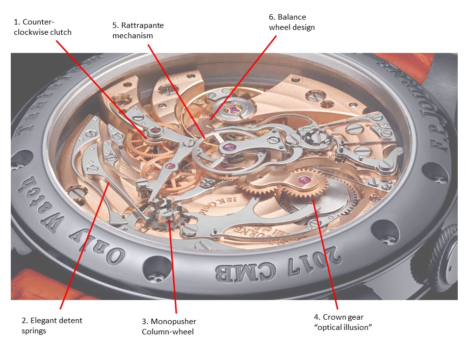
F.P. Journe Monopusher Split Seconds Chronograph – a Movement Analysis
skyeriding
Disclaimer: This article does not intend to promote or to undermine any aspects of the watch, and is purely a study of the movement out of interest by a non-professional hobbyist. Credit where its due that FP Journe made a new split-second watch for Only Watch 2017, and (unlikely) might see the possibility that this may appear as a regular production piece! With the recent announcement of Only Watch 2017, it comes as no surprise to expect a feast of interesting timepieces up for viewing. Typically, most brands ... .
© 2017 - WatchProZine