
amanico
[JLC Moderator]
340677

Watches and Wonders 2021: A quick review on the Jaeger Lecoultre Reverso Tribute Nonantième.
It is very welcome, as we had a Soixantième in 1991, a Septantième in 2001, but no official " Huitantième " in 201, even if the Tribute To Reverso 1931 can be considered as an Anniversary piece.
Let's have a look at the illustrious predecessors, first.
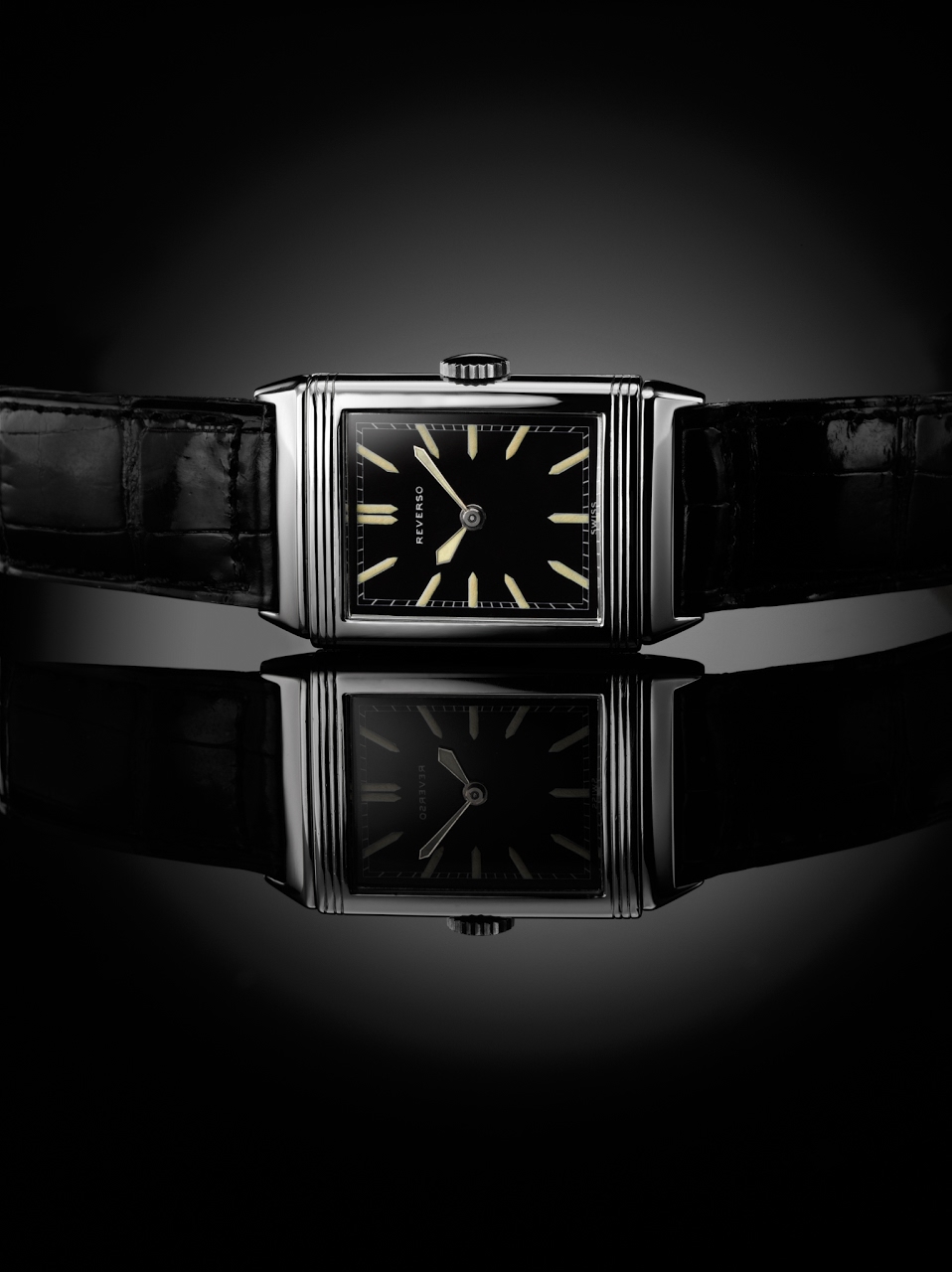
The original Reverso was a small watch ,with a 38 x 23 mm case. Small but powerful with its " less is more " dial:
The Reverso Soixantième offered a totally different approach, with some important firsts:
- First movement in 14Kt Rose Gold.
- First Reverso to use the slightly GT case ( 42, 25 x 26 x 9 mm ).
- First Reverso to house complications ( date and power reserve ).
- First Reverso to use a display case back.
- And last but not least, the first of a wonderful saga of 6 sublime limited editions.

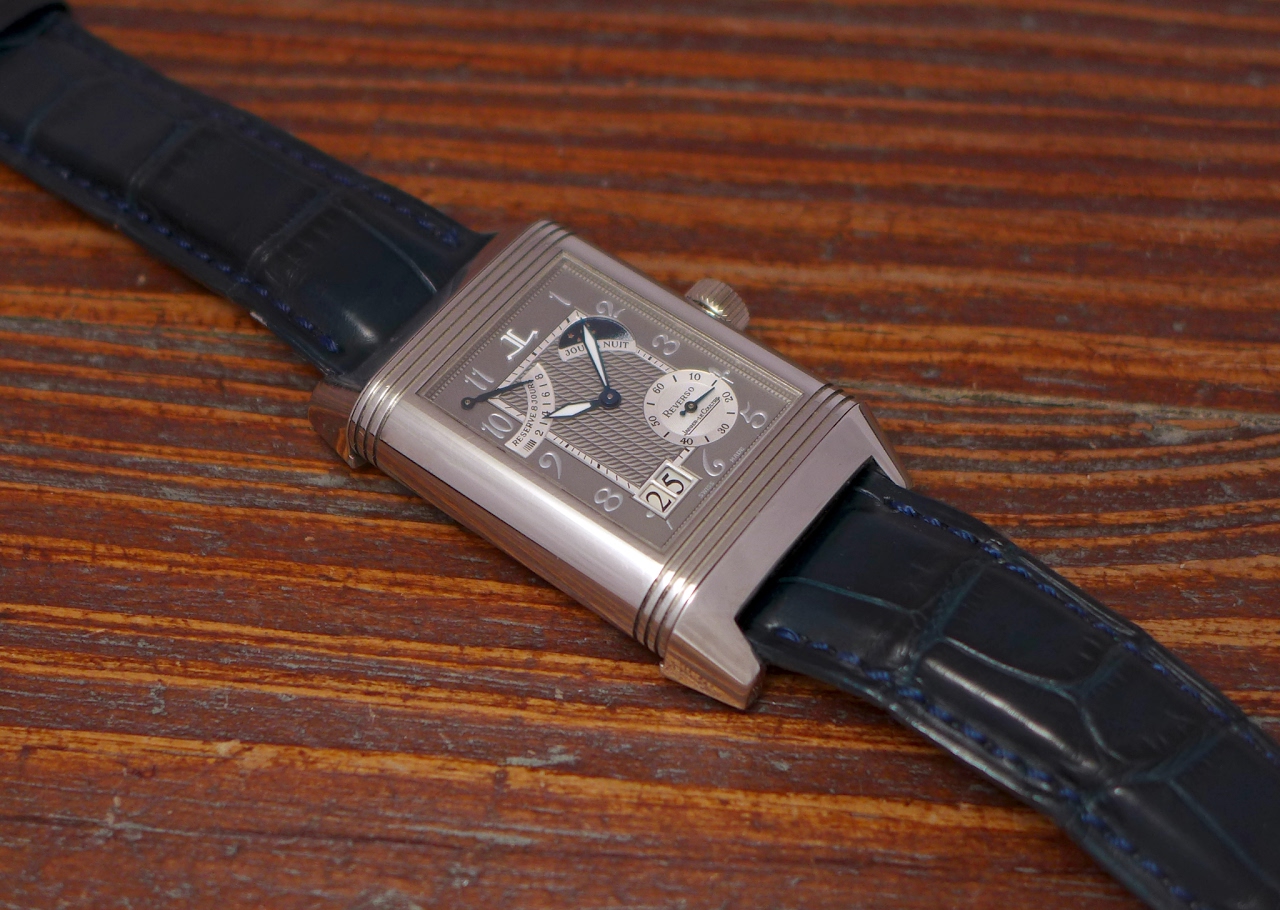
The Reverso Septantième offered its lot of innovations, too:
- First movement in 18 Kt White Gold.
- First Reverso to use the XGT case ( 46 x 29 x 12 mm ) in platinum.
- First 8 Days manual winding movement.
- First Grande Date.
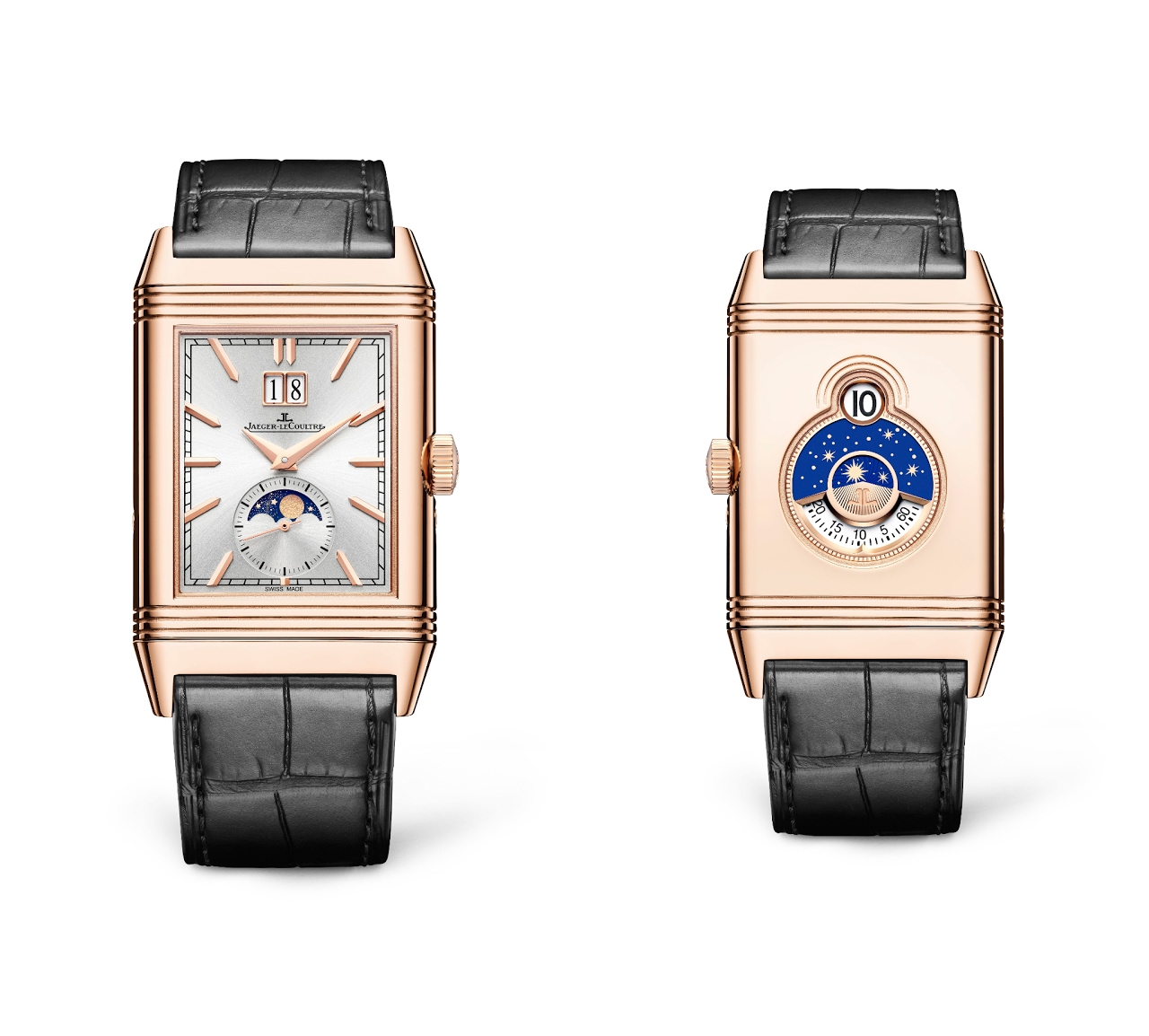
The Reverso Tribute Nonantième had to distinguish itself from the other Reverso, and you know that with Jaeger Lecoultre, everything is possible.
Jaeger Lecoultre played the card of the discretion, for the Nonantième.
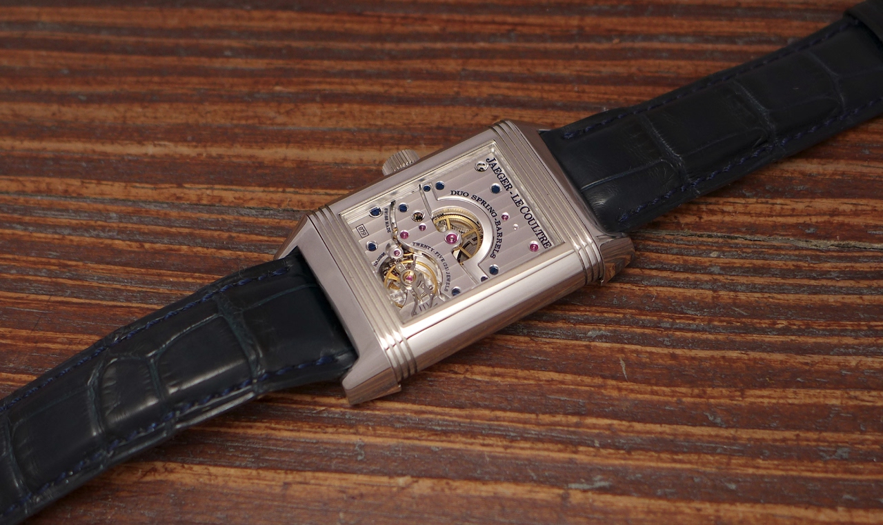
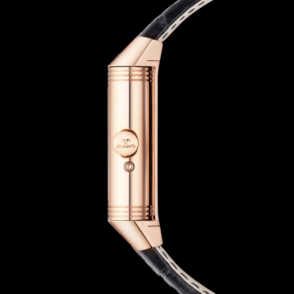
Indeed, they used the case of the Reverso Tribute Moon , issued in 2017, which has exactly the same size ( 49, 4 x 29, 9 mm ), The Tribute Nonantième being slightly thicker ( 11, 72 mm versus 10, 9 mm ), and they opted for pink gold:
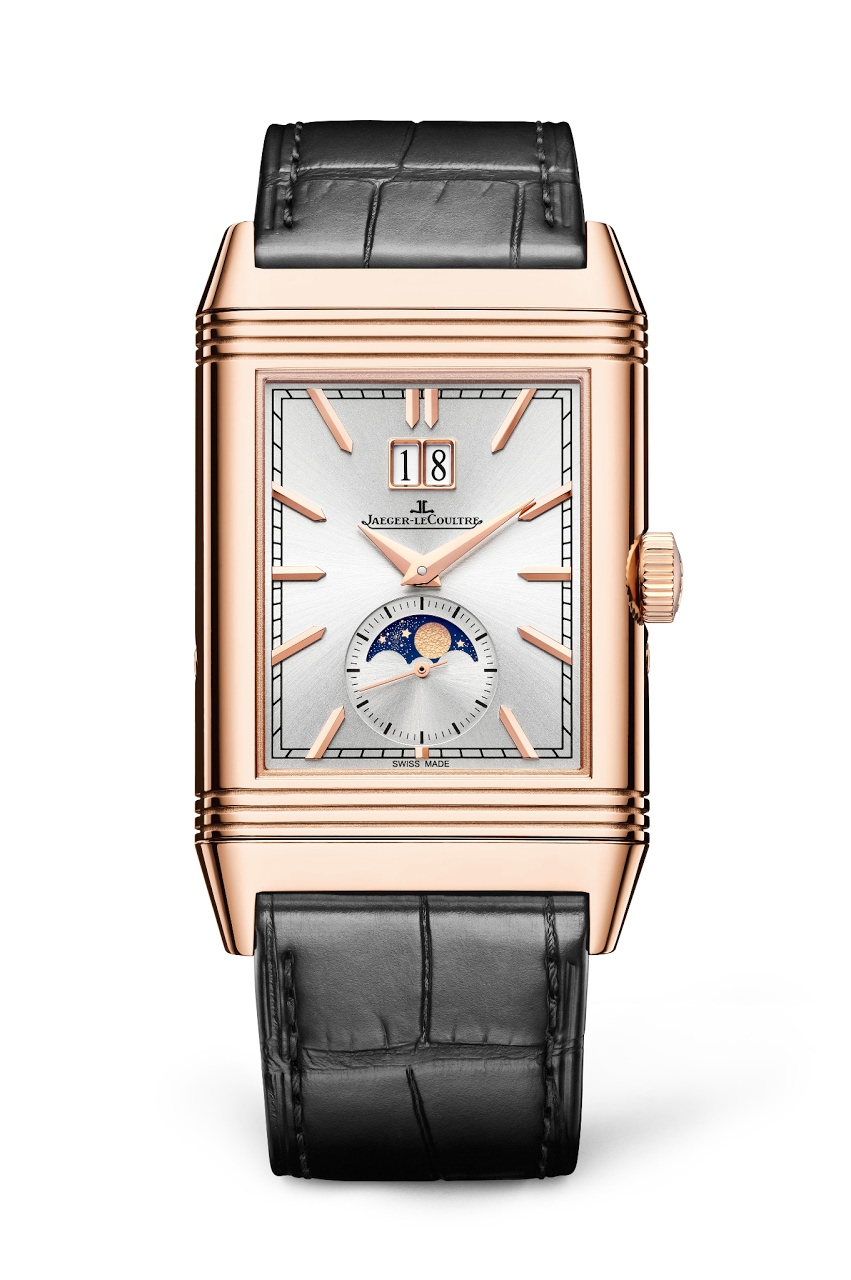
The Recto makes us think of the Tribute Moon, treated in a different way ( the grained dial has been replaced by a silver sunray dial, applied indices but in rose gold, same changes for the hands ), and a major addition is that the circular date of the Tribute Moon has been changed for a Grande Date, and they added a small seconds around the moon phase.
The raison d'être of the Nonantième is on the verso.
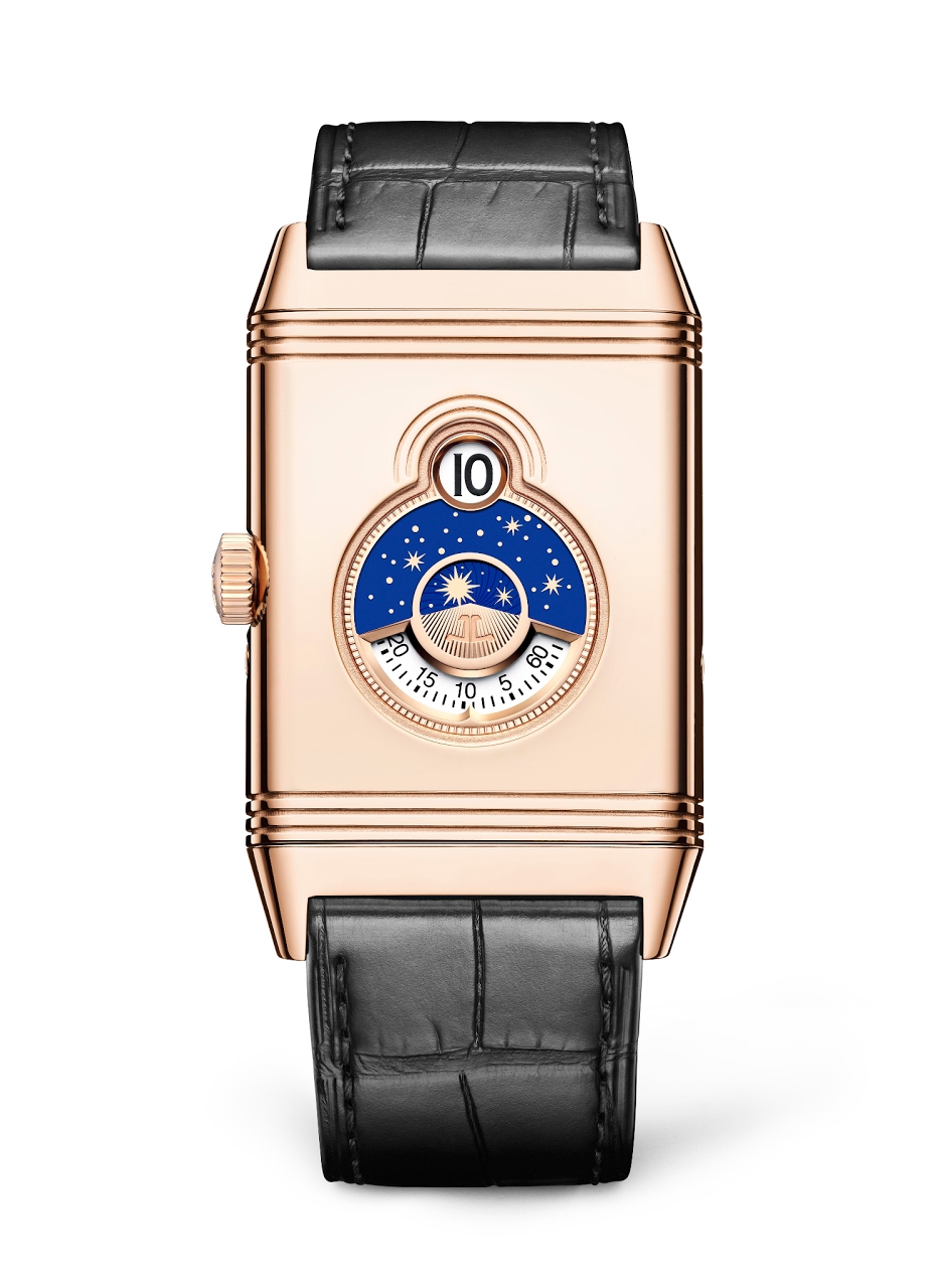
Here you have a digital semi jumping hour hand, minutes on a rotating disc, and a night and day indicator, all these informations being displayed in a sublime decorum, with golden stars on lacquered blue disc, surrounded in a sculptural way, thanks to gadroons shaped like an " 8 ". Gadroons are part of the Reverso DNA, but it is the first time it surrounds the time functions.

To avoid any confusion, the time displayed on the verso is not a dual time. It gives the same time as the recto, but in a different way.
So, now that we explained all that, we still have to understand what's a digital semi jumping hour.
A jumping hour is an hour which instantaneously changes at 12. A semi jumping hour is an hour which takes some time to change.
Here is the explanation I got from the Manufacture:
" Our team of constructors and engineers have had the brilliant idea to integrate a blocking-lever between the arms of the hour starwheel. This allows for a jumping display of the hour, while guaranteeing the accuracy of the rotating hour disc. This blocking-lever is integrated between the arms of the hour starwheel through a small notch, which only frees the disc when passing from one hour to the next. This indentation system, however, does not allow it to be precise down to the second. This is why it is a semi-instantaneous display, which takes a total of 6 minutes to switch from one indication to the next. "
I would also add that it doesn't " eat " the power reserve of the movement, like it is the case with a traditional / classic jumping hour.
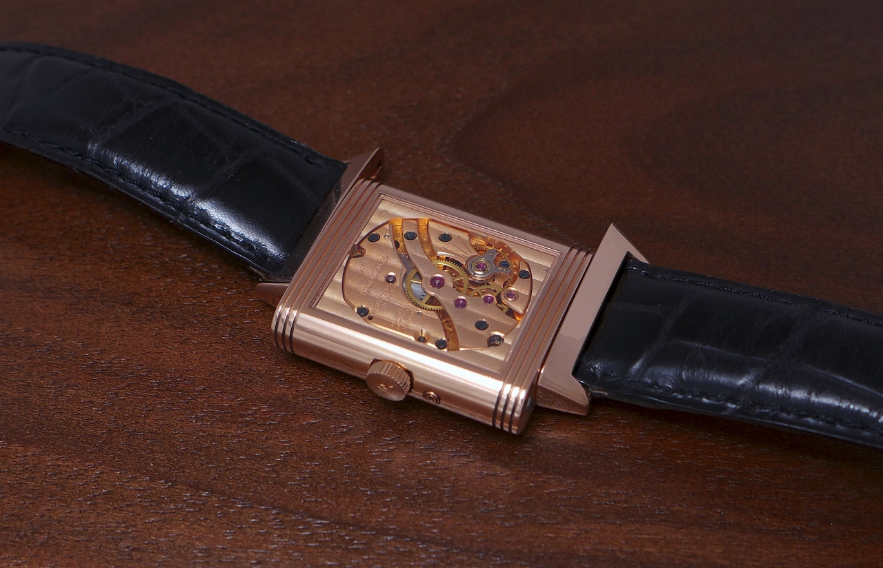
This Reverso Tribute Nonantième houses a new movement, the Cal 826, which is manual winding, with a power reserve of 42 hours, made of 230 parts.
The Reverso Tribute Nonantième is a limited edition of 190 pieces, exclusively available at the Jaeger Lecoultre Boutiques.
Looking forward to reading your comments and thoughts,
Best.
Nicolas
More posts:
Watches and Wonders 2021: A quick review on the Jaeger Lecoultre Reverso Tribute Nonantième.
Here it is, finally, this Reverso Tribute Nonantième , the Anniversary piece from Jaeger Lecoultre to celebrate the 90th birthday of THE Icon. It is very welcome, as we had a Soixantième in 1991, a Septantième in 2001, but no official " Huitantième " in 2...

Will read it properly later
but I’m glad you’re not the only one that has seen somewhere that this is exactly the same width and length as Tribute Moon and Calendars but the JLC website now shows them as being 49.7mm 🤔
Great article and images
Thanks. Great watch, albeit it’s huge in size for a reverso.
Was at JLC MBS
Was told the Nonantieme piece will arrive in Singapore next Wednesday.


Great writeup, Nico.
Very interesting. One I will need to see IRL to see how I like. But a very nice concept.
Thanks for the confirmation
will be interesting to see if Reverso will become a mainstream watch with these 90th’s.....

Beautiful watch and a fitting tribute.
I particularly like the verso side; the blue and white look wonderful with the rose gold and the unusual complication of the semi-jumping hour is the cherry on the cake. Thank you for the description and great pictures. Regards Kev.

A great write up 👏🏻...
But I am disappointed that the jumping hour is not a second time zone but the same as Recto face... a Reverso function that is not fully utilized....


My honest take?
Yawn. Yep. It looks nice enough. Probably wouldn’t say no if someone gave me one. Special? Not really, to my eyes at least. It feels a bit like a special edition for the sake of having a special edition. “Guys, we’ve got the big complicated one. And we’ll...

the modesty of JLC shows by putting the jump hour + disc on the other side of the timepiece...
i wish it is in white metal but may be JLC reserve that for the 100th anniv ! thanks for sharing Nico ! cdt, mahesh.,

Thank you for the article! Finally...
Someone explains that semi-jump means on this watch.

Thank you for your review.
I wish they had made it in white metals in a smaller case with a dual time indicator on the back, but that would be a different watch. With the large size and in rose gold, this loses the discrete sophistication of prior anniversary pieces. Still, an impr...

I love the look of this one !
But was told some time back it's probably too big for me by someone in JLC... hence I passed. If only it's smaller Cheers Robin

Interesting! I like the big date
Time on the back is definitely different - at first thought it was power reserve indicator, like they did in an XGT case a few years ago. Only slight disappointment is the jump hour times does show a different time like like the Reverso tribute moon. Stil...
Is there another Reverso to be announced today?
I’m hoping for a Tribute to Tribute 1931 Reverso...aka Tribute to 2011 Reverso

Thank you for this informative review, Nico
You clarified two factors that I’ve not seen in any other report on this new watch: 1. The verso dial time cannot be set independently of the recto. I find that disappointing in a Duoface model. 2. You explained what JLC did not — the meaning of “semi-jum...

I adore the semi-circular tiers around the semi-jumping hour window.
I don't know much about Art Deco design, but these details do seem very appropriate for the Reverso. I''d love to see a single-sided Reverso with (semi) jumping hour, something akin to the Cartier Tank à Guichets, but with a bit more decoration such as en...
I wonder if it would be possible...
to have (semi) jumping hours displayed in two separate windows on one face? And whether that would make for a legible way to display multiple time zones in a small space?
I think it looks great. I'd actually like to see...
a version with just the front dial with the big date and moon (without the jump hour dial). I think that would look very nice.

2 thoughts...
(1) I would really have loved this to be a DuoFace, somehow. (2) I see the future, but in steel...Grande Date with Moonphase, and something really nice on the back - either a flat-back for engraving or a DuoFace. -Dean

Such a beautiful offering from JLC
Almost every Reverso poses the problem of having one side better than the other. Here I appreciate both equally but for different reasons. Well done JLC and thanks for the info Sir Nicolas

Thanks!
Thanks Nicolas for the review, particularly the technical side! I really find the appearance attractive. The moon face is really nice for example. Few points: - a second time zone at the back would have make sense, particularly with the day/night indicato...
Thanks for your comments and questions, my friend. Here are some answers.
As for the second time zone, I totally agree with you. I would have preferred one, too. The Septantième is a hell of a heavy watch. I think the 90eme is less heavy. And don't forget that the 70eme is way thicker. Yes, I will try to get a video to show you...

Thanks Nico
Once again JLC have produced a thoughtful and interesting design. Well done JLC! All the best Jon

The verso should be the recto! Nothing wrong with the verso side. It’s fantastic. The improvements could have been done on the recto side..
1) different dial color. If it’s not going to be dual time, at least give me 2 differently toned dials. 2) simple time only. As much as i like moonphases and that the date window is well-executed, i prefer that it give way to the verso side. 3) white meta...
I totally agree with your points one and three. Platinum was the way to go and yes, at least two different toned dials would have been welcome.
Now on your point two, you have the moonphases on the recto and the day night indicator on the verso. Two different complications. Why not?
JLC blew a great opportunity
The digital hour change should have been instantaneous. A dragging hour seems such a major compromise and a poor horological choice. The entire sense of anticipation of that milli-second flash of digital display changing is denied when the hour will now c...


An undeniably beautiful Reverso. BUT
unfortunately only a “superficial” beauty! It bothers me that function follows design here. I can live with the fact that the change of the hour on the back does not take place instantly, but I find it a real shame that the time on the verso is always the...

I think you misunderstood what I said. I didn't say I was disappointed with the Reverso HM nor do I want one. I would much rather have the Gyro 5. The Reverso HM is UNWEARABLE for me in any case...
As for the Nonantième, although I find it nice looking, I have zero interest to own one. So from the 3 Reversos released, I have zero desire to own any of them. This is my disappointment. Hope that was clear. Guess another year goes by without having any ...
My type of guy then but he must have a MONSTER wrist to wear a Gyro 2 since that thing is HUGE 😳
I could probably wear it around my forearm, bicep, or ankle 😜🤣
JLC should be ashamed of themselves
It is clearly not possible to tell the time for about 4 of those transition minutes.


Yes, indeed Fabrizio,
I would 'sell my soul' for the Quadriptyque as well ........ (or my marital partner for that matter xP)
It's difficult for me to....
have a firm stance on this one. In my mind, it somehow manages to be both interesting and uninteresting at the same time.... Very few pieces from anyone manage to strike that odd balance of features........
I think....
that Nico's suggestion of a greyish blue dial would be optimal for this color combination you proposed. Darker and subtler than the moonphase blue so that it doesn't overwhelm and render the moonphase reading difficult! Cheers, Filip