Deliberations on Dials, Part 2: Form vs Function
cazalea

This is the second in a series on Dials and the significant role they play in our watch appreciation. As shown in Deliberations on Dials, Part 1 (CLICK TO VIEW), dials can act as the "Marketing Department" of the watch. They not only draw us in with their beauty, but can also reveal technical details about the watch. Although you might think of the dial as primarily cosmetic, the dial performs important functions, which I hope to unveil later in this series.

EXTREME COMPLEXITY
Please let me know if you want to read more about dials, because there is an enormous amount more that could be said... in Part 3 (CLICK TO VIEW)
Cheers,
Today I will focus on normal and wild diversions in the FORM and FUNCTION of the dial. In my case, I prefer to have FORM follow the FUNCTION. You may think otherwise, and prefer FUNCTION to be subservient to FORM. Do you want a subtle and beautiful dial? OR Would you prefer to have detailed information at whatever price?
NOTE: The images in this article are taken from my files and other articles previously published here on WatchProSite. I thank those authors in advance for the reuse of their photos. The drawings and tables are my own constructions.

CASE STUDIES
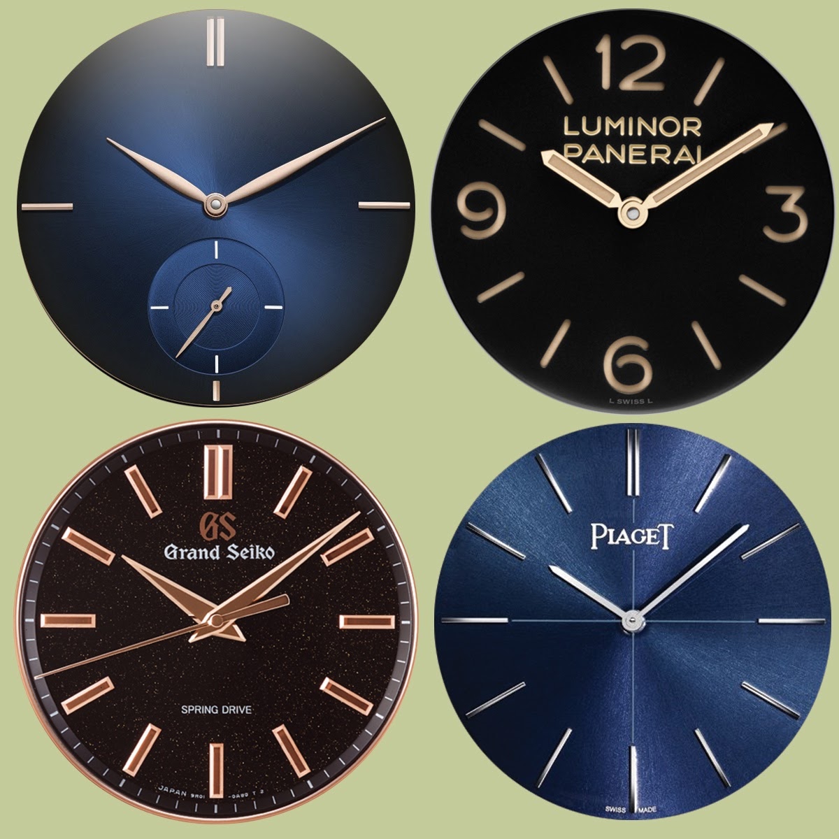
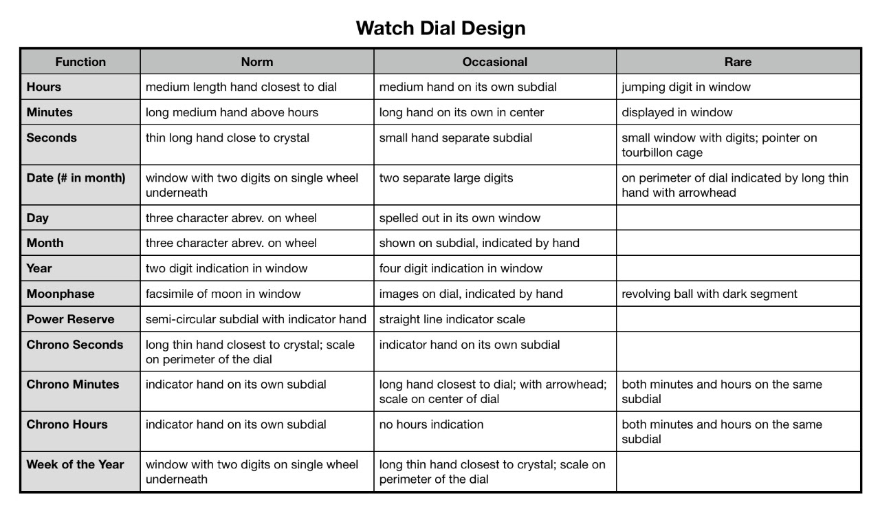
Here are four dials that all subscribe to the ROUND shape LIGHT color group. All show their country of manufacture, and the time, but they differ greatly in the rest of the details:
- The GS chrono places chrono subdials on the right, date window at 3, power reserve at 7, running seconds at 9, and a GMT hand close to the dial. It has NO hour numerals, and no 24-hour scale for the GMT hand.
- This Czapek has a "normal" hour hand, while the minutes hand is deceivingly thin, appearing (to me) like a second hand (but that is in the subdial at 7:30). A curious double-ended hand provides a day of the week/power reserve indication on the subdial at 4:30.
- The cutaway dial of the Chopard Full Strike shows its striking system, while "normal" hands display hours, minutes and on a subdial at 6 are the seconds. Two stacked power reserve hands give you status of timekeeping (gold) and striking (blue). Roman numerals 12-7 indicate hours.
- The Habring2 dial shows hours and minutes with the usual hands, and seconds appear on the subdial at 9. A scale on the outer edge provides the date, a smaller scale is used with the split second hands, and the subdial at 3 keeps track of a maximum 30-minute timing interval. A lone Arabic 12 appears at the top of the dial. I feel there are too many hands on this dial!
DIAL "NORMAL" DESIGN
The diversity of FUNCTIONAL watch dial design is almost unlimited, yet there are certain conventions that we expect (and designers either support wholeheartedly or abandon completely). Here is my analysis of what we are used to seeing:
NORMAL BUT ...
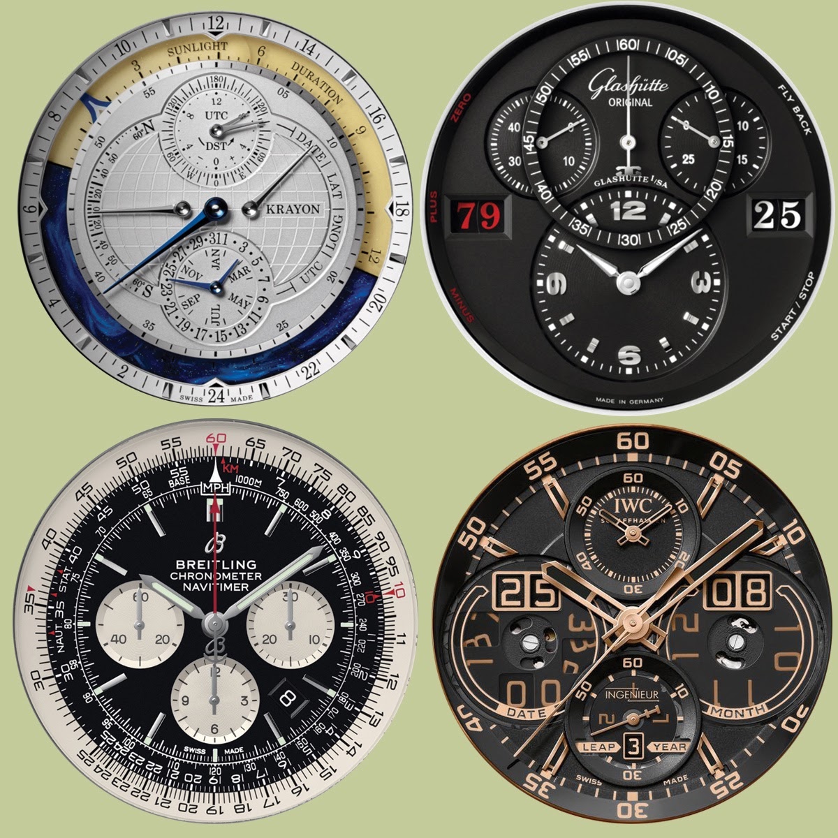
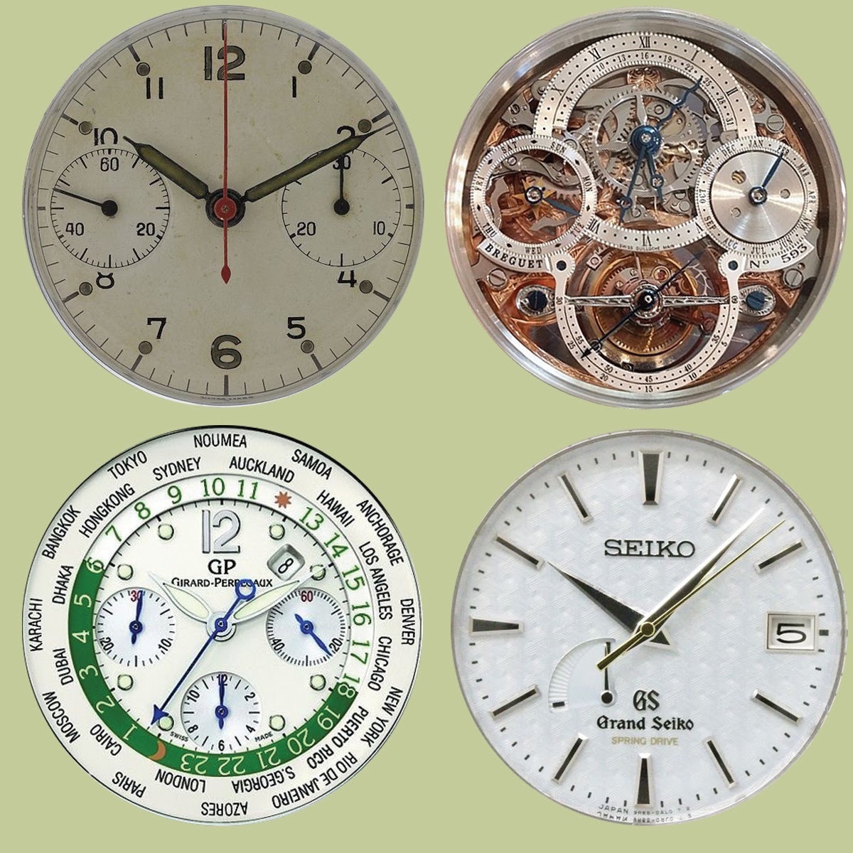
Here are four light-colored round dials that provide a variety of impressions:
- Nicolas provided this image of a military chronograph. I consider this clean, simple, classic dial design. Wonderful to look at and easy to read with the fine-tipped hands.
- The skeletonized Breguet is very busy. An abbreviated dial at 12 deals with hours and minutes and encircles a 150º scale with retrograde "snake" hand showing the date. The months are at 3, the second hand is on the tourbillion at 6, and the days of the week are at 9. It seems curiously assymetrical and complicated.
- This GP ww.tc dial follows the format of its dozens of variants - hours, minutes and chrono seconds in the center, with date at 1:30, running seconds at 3, chrono hours at 6, and chrono minutes at 9. The World Time indication is on a revolving ring marked with Arabic numerals for hours, a dark background/moon for night, and a light background/sun for daylight hours. City names are printed on the outer portion of the dial. The white-green-blue-red color scheme is highly unusual.
- The Grand Seiko is very modern but also quite peaceful with a hexagonal "woven" pattern, three hands, a date window at 3 and power indicator at 7.
PRECISION OR PEACE
I don't need to say too much on this subject, only ask the question "How peaceful do you want your dial?" Using these dark dials as examples, do you want second hand or not? The company name on the dial? The location of manufacture? Hour markers? Textures or patterns? Bold or graceful hands?
The choice of which type of indicator to use on which dial is a complex blend of aesthetics, function and technical capability - the designer can't place things where the underlying movement is unable to deliver the required motion (rotate hand, revolve wheel, etc.) or specify a design that his/her company is incapable of producing (or marketing). And in many cases, "house style" may forbid too much "creativity" on the part of the imaginative watchmaker. Thus he or she goes off on their own to develop their individual style -- and that can be a good thing, for both the house and the individual.
Here are a few more examples of unusual dial designs.
Please let me know if you want to read more about dials, because there is an enormous amount more that could be said... in Part 3 (CLICK TO VIEW)
Cheers,
Cazalea
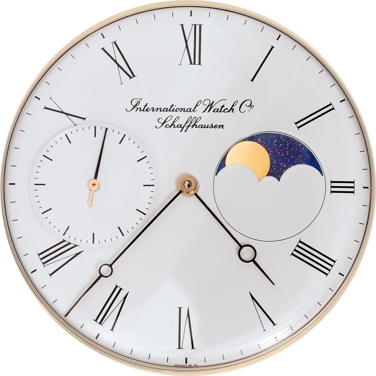
PS - can I leave you with this image of an IWC moonphase (photographed by SteveG):
PS - can I leave you with this image of an IWC moonphase (photographed by SteveG):
Comments:

Ron_W May 30th, 2018-13:19
Thank you again for this interesting view on dials. I like sunray dials because of the way the spraid the light like this ; ...

Watchonthewrists May 30th, 2018-13:40
Thanks for the interesting read 🙏🏻 For me the dail is very importend . It has to be interesting in every way , can be ,,less is more ,, or busy but it must have a huge attraction on me .

cazalea May 30th, 2018-14:17
I think the dial is the deciding feature for many of us me included. Not just the design but also the legibility of dial and hands. What good is a watch if I can't read it without squinting for 30 seconds? Mike
jim vancouver May 30th, 2018-15:21
What about pictorial dials? A picture is better than a thousand words... ...
cazalea May 30th, 2018-16:01
I might call those "Works of Art on a Dial" We could consider this to be ART INSIDE THE DIAL (and crawling out of it) Just before you wrote in I was thinking about how to categorize this dial - it is ART as DIAL and HANDS ...

0-10-6
Load More Comments
Next Article
cazalea
Overview of the Seiko Presage Series, Part 2 The Movements
cazalea
Welcome to part 2 of the Seiko Presage comparison INTRODUCTION This post has some minor technical information about the Presage movements. If you are looking for jewel counts and when the plastic date wheel finger was replaced with metal, this is the wrong article. You will have to search elsewhere on an even more nerdy Seiko repair site. As you read along, it won't take too keen of an eye to see that the accuracy is not claiming to be Grand Seiko quality.
© 2017 - WatchProZine