Review
SJX's review critically examines Cartier's perpetual calendar offerings, specifically comparing its implementation in the elegant Tortue case versus the sportier Calibre de Cartier. His analysis highlights how the same sophisticated retrograde perpetual calendar module, powered by the in-house 1904 MC movement, presents differently across distinct case designs. This comparison provides valuable insights into how case aesthetics can impact the perception and wearability of a complex complication.
The perpetual calendar in the Fine Watchmaking line was originally launched in the Tortue case. Though it has a well proportioned face, the perpetual calendar in that case is too thick and presents an inelegant profile in my opinion.

The Tortue Quantieme Perpetuel
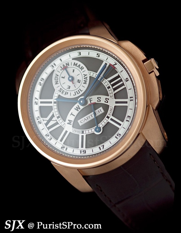
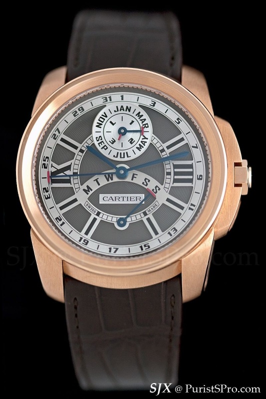
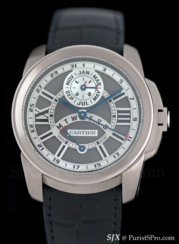
Instead the perpetual calendar in the sporty and chunky Calibre de Cartier case works much better. Sporty perpetual calendar is a bit of an oxymoron functionally, but this watch isn't a true sports watch, it's more of lounging on the deck of a yacht than getting in the water.

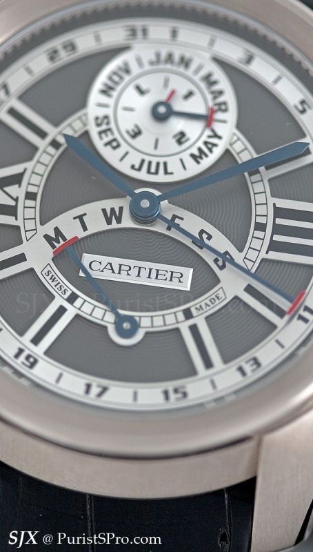
Both the Calibre and Tortue perpetuals are mechanically identical, with a retrograde perpetual calendar module fitted to the in-house 1904 MC movement. The overall height of the movement and module is 5.88 mm high, which explains the thickness of the case.
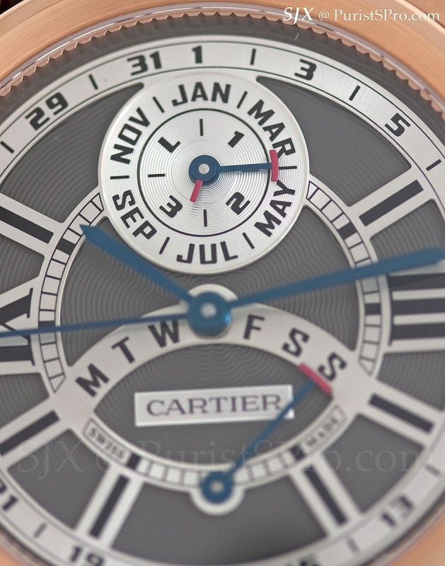
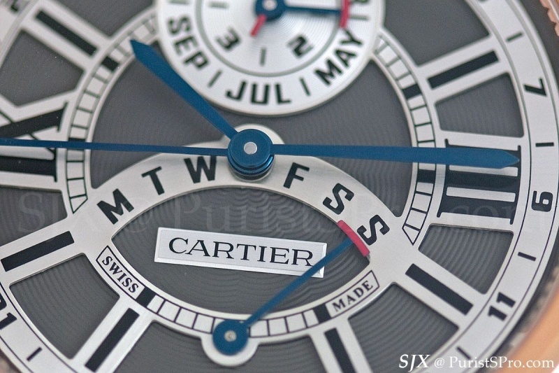
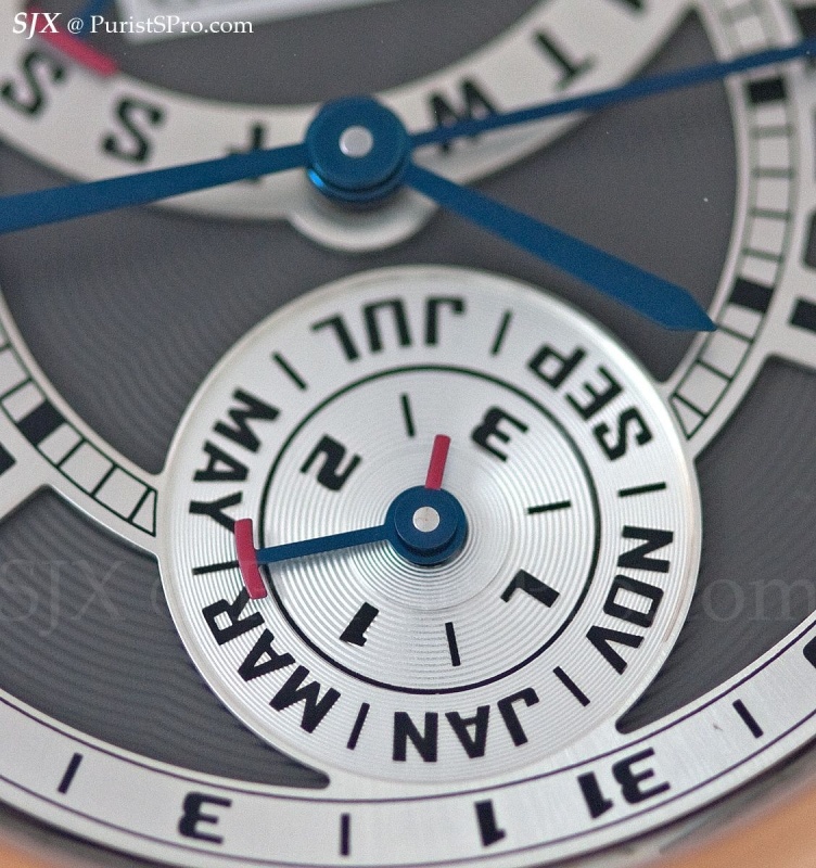
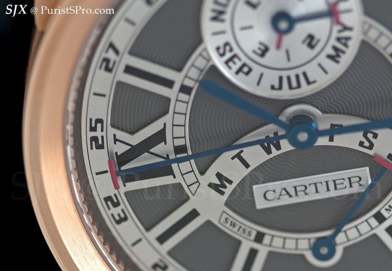
The month and leap year are displayed in the subdial at noon while the day is on a retrograde scale at six. The date is around the perimeter of the dial. All are indicated by red tipped hands that remind me of a croupier’s rake. Generally it is all very legible, though there are only date numerals are odd-numbered dates.

Month and leap year indicator

Day of week display

Date - takes a second to read sometimes

I very much prefer the Calibre de Cartier QP because the proportions work much better. It’s not a very large watch at 42 mm in diameter, but dense and heavy thanks to the massive case. Though it’s thick at 16.5 mm, it works well for this style of case, especially with the large lugs and crown guard. Even though the Calibre de Cartier seems like a more massive watch, it’s actually more compact compared to the Tortue. In contrast the Tortue is 45.6 mm wide and 51 mm long.

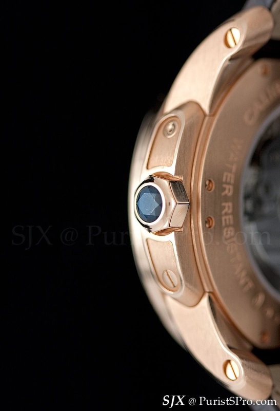
Prominent lugs and crown guards with trademark sapphire on top of crown
The dial is unusual fusion of old and new. Blue steel sword hands, guilloche dial and Roman numerals, but the font on the dial is modern looking and designed for the Calibre de Cartier and used in all watches of the line. The typeface is especially obvious in the subdial at 12 o’clock with the letters for the month and numbers for the leap year.


If Cartier used an open dial, like that on the Tortue QP, I think it would be perfect; the looks fits better with the contemporary case than with the Tortue.


Tortue QP with open dial
And so now the question is: Calibre de Cartier or Tortue QP? In an earlier straw poll the guilloche dial Tortue QP won by a large margin.
This...


or this?
- SJX
This message has been edited by SJX on 2011-08-21 08:29:23I prefer the Calibre case for this complication but I don't like the font which is used... it seems to be too "computerized". Fx
just a matter of taste....... J
Looks fantastic in the Calibre case. Definitely must check that one out. Thanks for posting, SJX.
That is the right description Foversta. It reminds me of the so-called "computer" dial of Rolex. - SJX
plus they could save all that fancy dial engraving and give us air instead. A great solution except for the obvious problem of how to support the Cartier name placque Cheers Cazalea
I am usually not a fan of skeletonized cases, so I am not sure I would like a skeletonized Calibre better than the models shown. Thanks for the pictures and report. Stewart
This thread is active on the Cartier forum with 9 replies. Share your knowledge with fellow collectors.
Join the Discussion →