Comparison
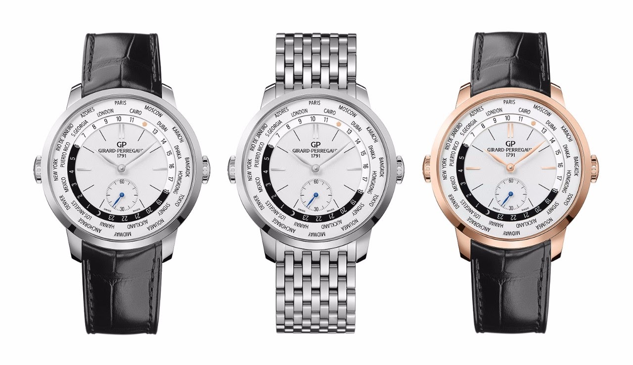
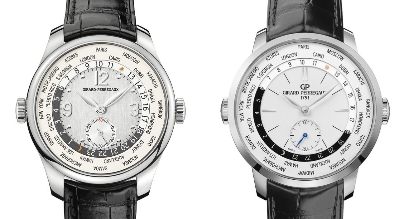
Nicolas's comparison of the Girard-Perregaux WW TC Small Seconds and the 1966 WW TC offers a critical look at the evolution of GP's world time complications. His analysis delves into case dimensions, dial aesthetics, and overall design philosophy, providing valuable insights for collectors interested in these sophisticated travel watches. The post encourages a discussion on what makes a world timer truly compelling, especially in the context of GP's historical offerings.


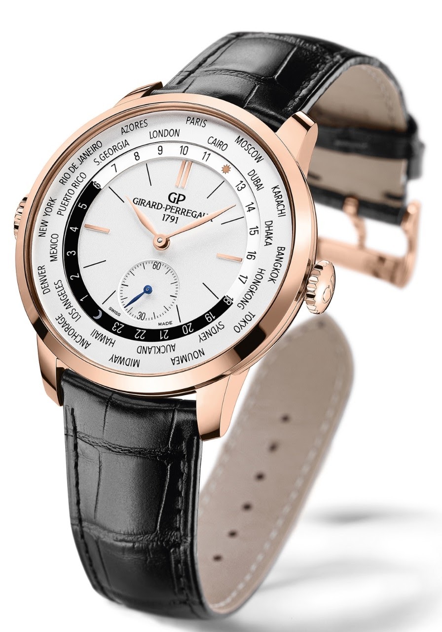
The light dial WW TC small seconds is my favorite (first version). A second-hand bargain at this point. Cheers, John
And, oh, well, a Jaeger Lecoultre Geophysic UT, and, in case of serious greediness, Montlblanc Orbis Terrarum, and Chopard Traveler...
To me, those arabic and dotted hour markers are one of the visual appeals of the WW TC. The 1966 WW TC is nice, but a little underwhelming to my eyes.
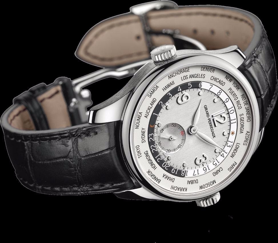
Tried on the world time chrono but it’s a bit thick and bulky. The small seconds is perfect in my opinion.
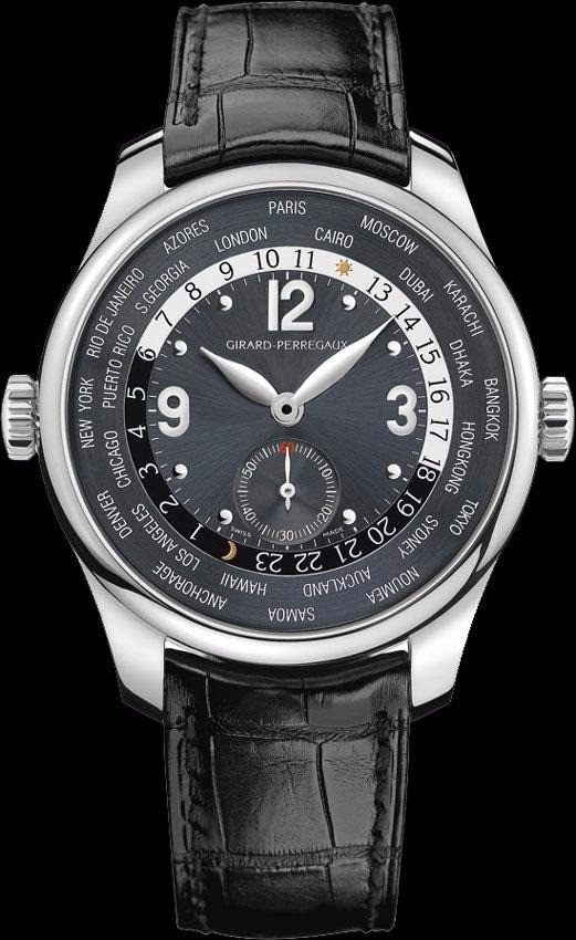
Seeing the 1966 model presented side by side with the Small Seconds, I realise how much the older design with the "busy" graphic dial elements so much centred already gives a hint of what you see from the back side. With the case diameter increased to 43 mm and well filled with a nice movement, the proportions of the design elements of Ref. 99350 do not really look different compared to Ref. 49865 (Small Seconds). The reference cities are even further spaced out, with the increased white spaces
I find the dial of the 1966 version a bit flat. Perhaps it's the font of the chapter ring and general lack of life emanating from the dial. Thanks for the comparison piece. The original version is quite appealing.
This thread is active on the Girard Perregaux forum with 25 replies. Share your knowledge with fellow collectors.
Join the Discussion →