Jaeger-LeCoultre Duometre à Chronographe 2013
New Release

Jaeger-LeCoultre Duometre à Chronographe 2013

By amanico · May 10, 2013 · 53 replies
amanico
WPS member · Jaeger-LeCoultre forum
53 replies10237 views0 photos
f 𝕏 in 💬 🔗

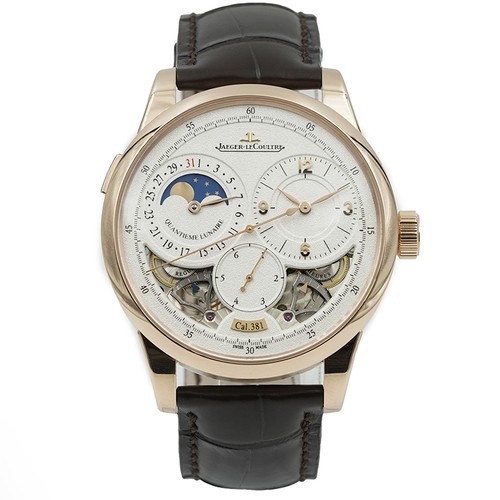
Nicolas (amanico) introduces a new iteration of the Jaeger-LeCoultre Duometre à Chronographe from SIHH 2013, sparking a discussion about its updated dial and bezel design. He invites the community to share their opinions on the evolution of this beloved Duometre family.

53 collectors discussing this on the WatchProSite forumJoin the Conversation →
Let me start with a picture.


We were in 2010, when Jaeger-Lecoultre unveiled a new Duometre, the Quantieme Lunaire.

Aesthetically very close to the " A Chronographe ", born in 2007, the Quantieme Lunaire showed another face, another spirit, with these apertures at 5 and 7 o'clock.

At least for the colored gold versions, as the white gold, which came one year after, in 2011, had a plain dial.

The Duometre à Chronographe, as it was unveiled in 2007:


At the SIHH, this year, I had the surprise to see an evolutioon of the Duometre à Chronographe.


The case is still 42 mm big, and 0, 15 mm thicker ( 13, 62 instead of 13, 47 for the previous one ), with a slightly re designed bezel, such as the one you can see on the Duometre Unique Travel Time.

Honestly, I diidn't see the change about the case, and yes, when you know the Duometres well, you can notice the new bezel, more " round ".

No, the real new thing is this dial

It seems that we'll more often see this kind of dial, in the future ( Sssshhhh, I said nothing, this is a secret between you and me ).

It is the opportunity to have a good and passionate discussion, here.

As you know, I am a big fan of the Duometre Family, since the very first day I saw it ( Geneva, April 2007, when the SIHH was in April ).

I love the plain grained dial a lot, as well as the black dial.

I am not very keen on the apertures, to say all, as it was the case with the first Quantème Lunaire.

I don't know why, maybe because it desorients me a bit?

Because it ruins the simple and very appealing look of the plain dial?

What do you think, here?

Best,

Nicolas.

Key Points from the Discussion

Advertisement
The Discussion
IM
ImranLondon
May 10, 2013
I agree , it's trying too hard, like a gorgeous model with cheap jewellery [nt]

AM
amanico
May 11, 2013
Viril, but correct. ;)

MI
MichaelC
May 10, 2013
Did the Duo really launch in 2007?

Wow, it does not seem that long ago to me! I think dial cutouts and apertures are becoming a bit like the black watch trend - more and more we see them offered. Here, in the case of the Duometre Chrono, I'm afraid I prefer the purity of the original dial. And frankly it is unique enough to my eyes to not need the new views offered by the cutouts. Interesting look for sure, but I'm not sure I like them without having more of a purpose.

AM
amanico
May 11, 2013
Yes, SIHH April 2007, at, at that time SIHH was in April.

It looks like an eternity, eeeh? Best, Nicolas.

EL
elliot55
May 10, 2013
I still love the..

... original with mono-pusher chronograph. The new one almost looks like it is trying too hard. Missed you in Basel, my friend. I will fill you in more about my conversation with Kari V at a later time. - Scott

AM
amanico
May 11, 2013
Hey, Scott! Yes, a pity I couldn't do it! But we'll find other opportunities!

Available on the marketplace

Continue the conversation

This thread is active on the Jaeger-LeCoultre forum with 53 replies. Share your knowledge with fellow collectors.

Join the Discussion →