Review
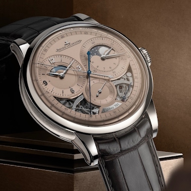
Amanico shares a captivating image of the Jaeger-LeCoultre Geophysic Universal Time, highlighting its intricate dial and case finishing. This post invites enthusiasts to appreciate the aesthetic details that make this reference stand out. His 'Geophysic Saga' work provides valuable context for understanding JLC's modern interpretations of its historic Geophysic line.

It’s a strong looking watch.
This one ticks the box except that the legibility is not optimal IMO. The hands sometimes looks to be lost in the dial (a beautiful dial, I must say). Cheers
If it came in a sweep seconds, it probably would have taken off. (Most people didn't get it.) -Dean
and it sits really well on the wrist with its compact lugs. I love the contrasting brushed and polished surfaces. The dial of course is terrific--one of JLC's best in recent years. The strap doesn't bother me because there is so much going on with the dial already. Do we need a Baroque picture frame to feature an already spectacular painting? Simple matte black works well here, IMO, although it would have been better with a tapered strap to 18mm rather than 21mm un-tapered dimensions. Cheers, Jo
now THAT would've been killer! -Dean
... Not an easy watch to shoot. JLC has the tourbillon version at the Beverly Hills Boutique and I put it on the other day. How do you say in French? Ooh, la la? Wow, what a watch. Tres magnifique. - Scott
This thread is active on the Jaeger-LeCoultre forum with 42 replies. Share your knowledge with fellow collectors.
Join the Discussion →