amanico explores the evolving trend of dial colors in luxury watches, posing the question: 'Is grey the new black?' He delves into Jaeger-LeCoultre's historical use of blue, red, and brown dials, then specifically highlights the brand's less common, yet significant, application of grey dials across various iconic models, from vintage Reversos to modern Master and Compressor lines.
Traditionally, we think that a watch must have a white / sliver or black dial.
We see more and more watches with salmon or blue dials, which seems to be nowadays tendance for the brands, even if some brands had blue or salmon dialed watched in their catalogues for some decades. Red dials are also used by several brands, and of course, brown / chocolate / tobacco.
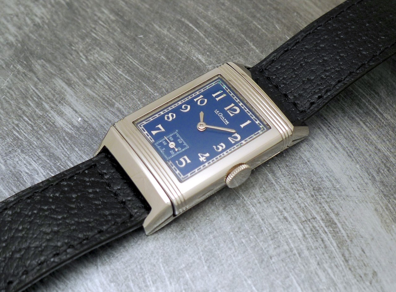
For instance, Jaeger Lecoultre had blue dials in the catalogue for a very long time. In the 30's, with the Reverso, but also in the 60's and 70's with some Memovox and Chronographs, with a come back in the last 90's and early 2000's with the Master line, in platinum.
A Reverso from the early 30's:
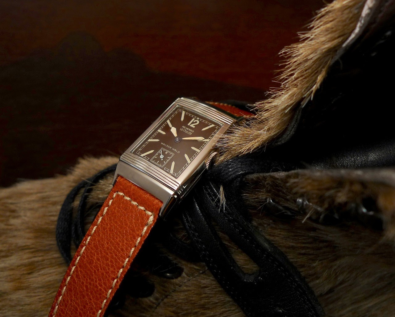
The Red was used in some Reversos, as well as brown, in the 30's too.
We more rarely see grey dials. Well, at first thought, because we have to remember some facts...
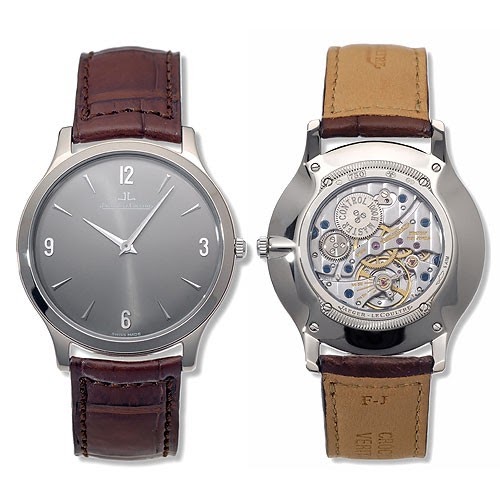
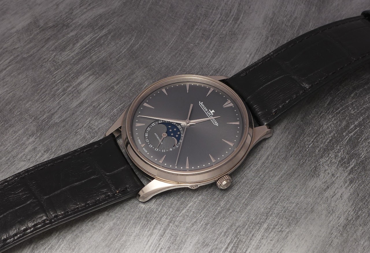
Indeed,Grey was used by Jaeger Lecoultre, in some of their white gold watches in the late 90's / early 2000's, with the Master Ultra Thin, Master Date, Master Moon, Master Geographic, Master Perpetual and Grande Memovox, without forgetting the Master Compressor Memovox and Geographic. And the Extreme World Compressor in platinum, too!
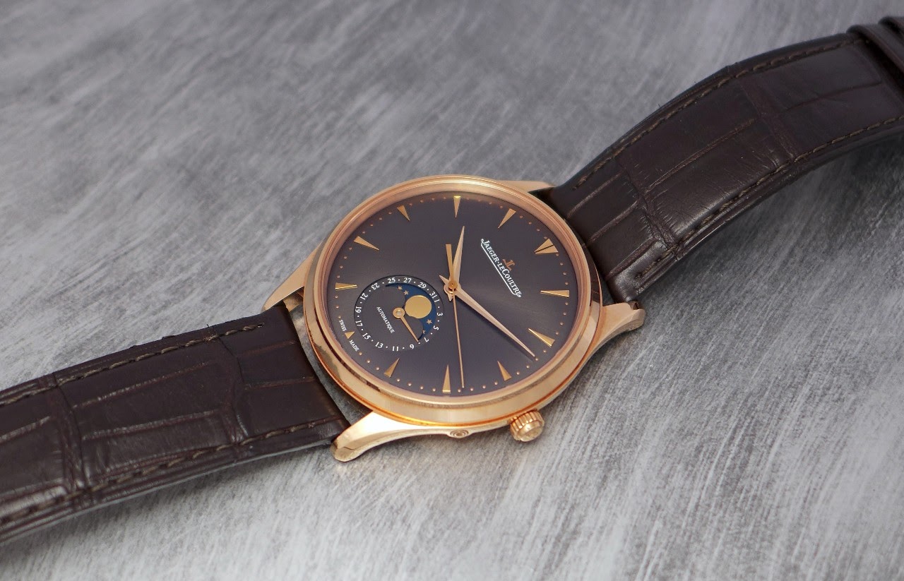
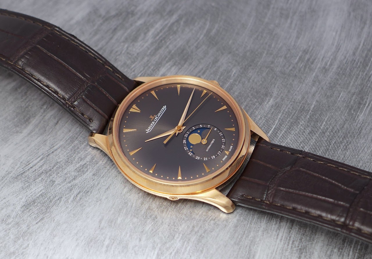
Here the Master Ultra Thin in white gold:
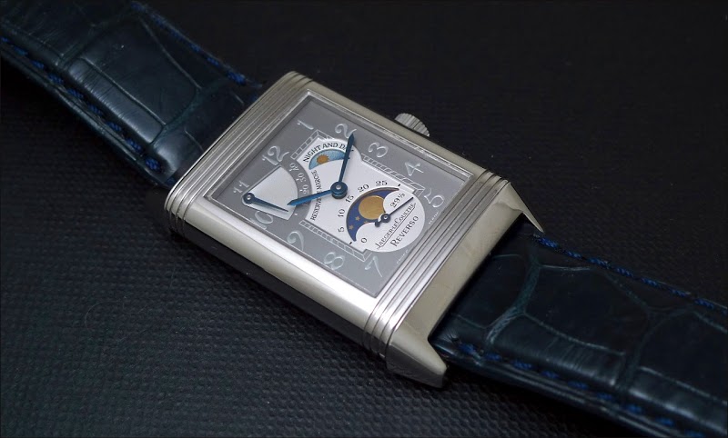
The Reverso opted for a grey dial coupled to a platinum case: Reverso Reserve de Marche, Sun Moon, Septantième and Platinum Nr 2 Tourbillon.
The Reverso Sun Moon in platinum, limited to 125 pieces:
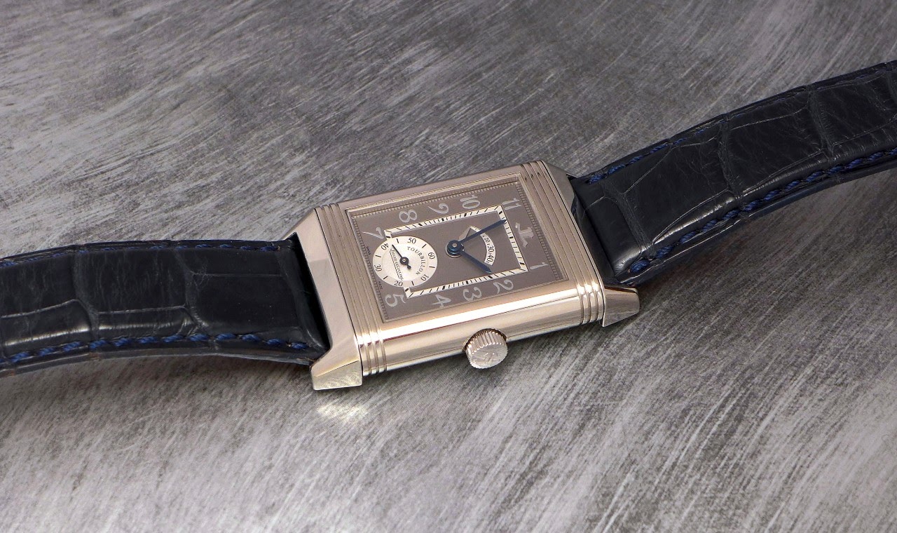
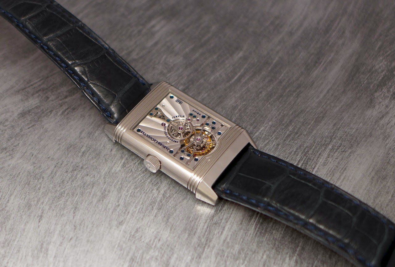
The Reverso Platinum Nr 2 Tourbillon:
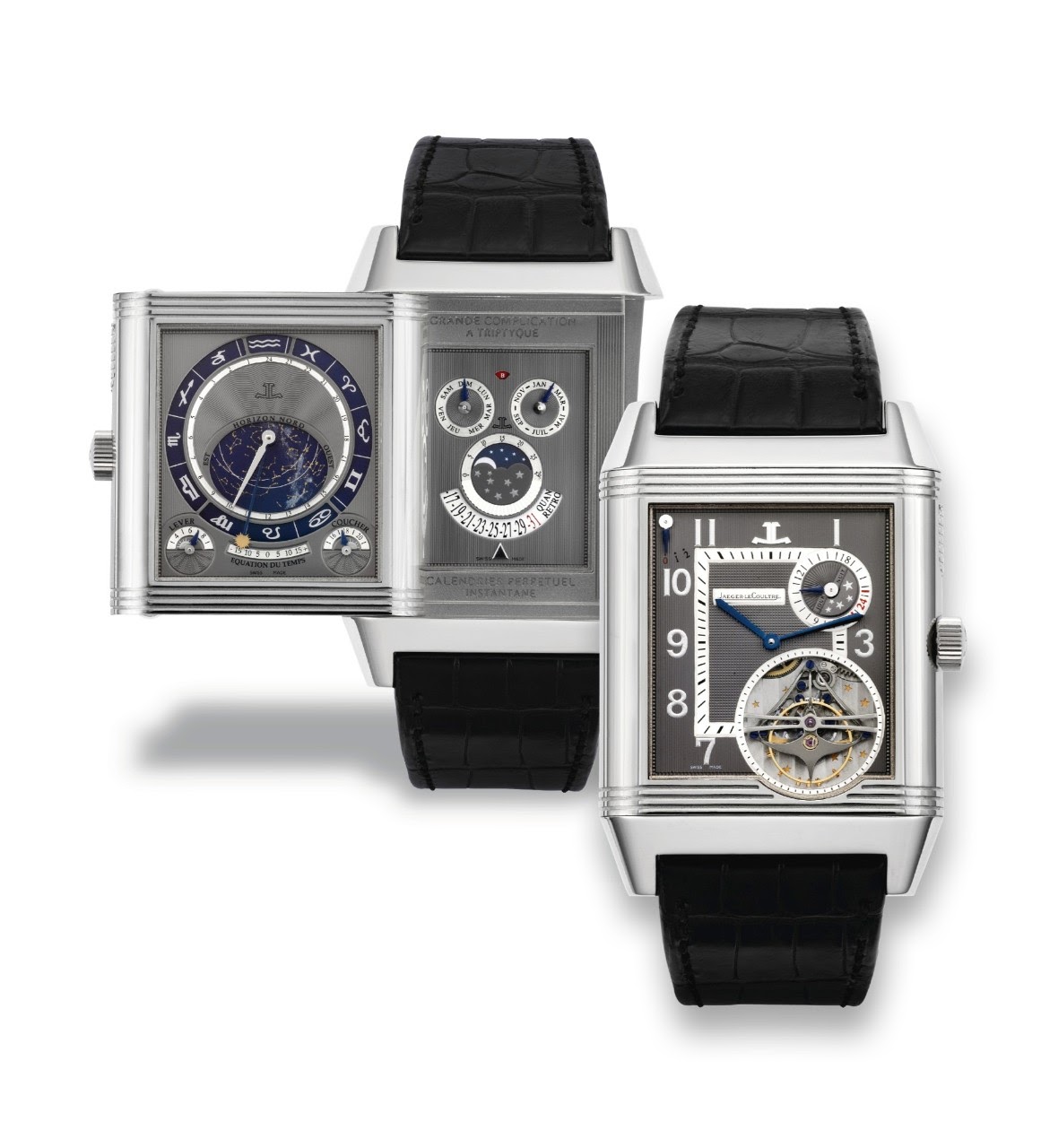
Let's not forget the Reverso à Triptyque, which came with a sublime hobnail grey dial, too.
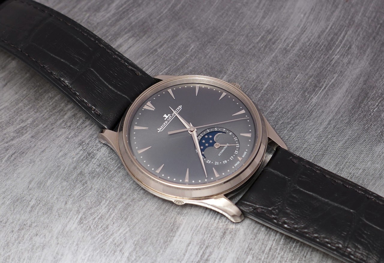
If my memory serves me well, Jaeger Lecoultre gave up Grey for a bit less than 10 years, associating this color with white or rose gold watches.
The Master Ultra Thin Moon came with a rose god and a white gold case, both with a grey dial.
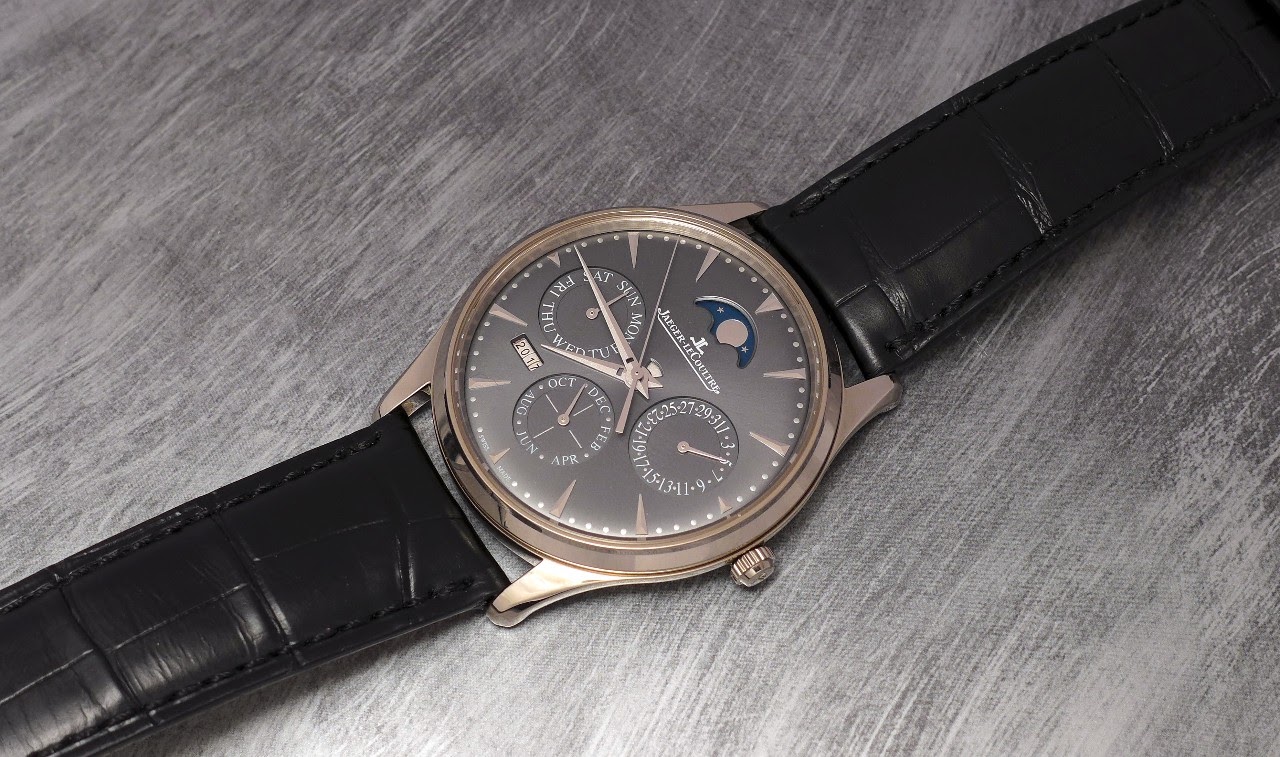
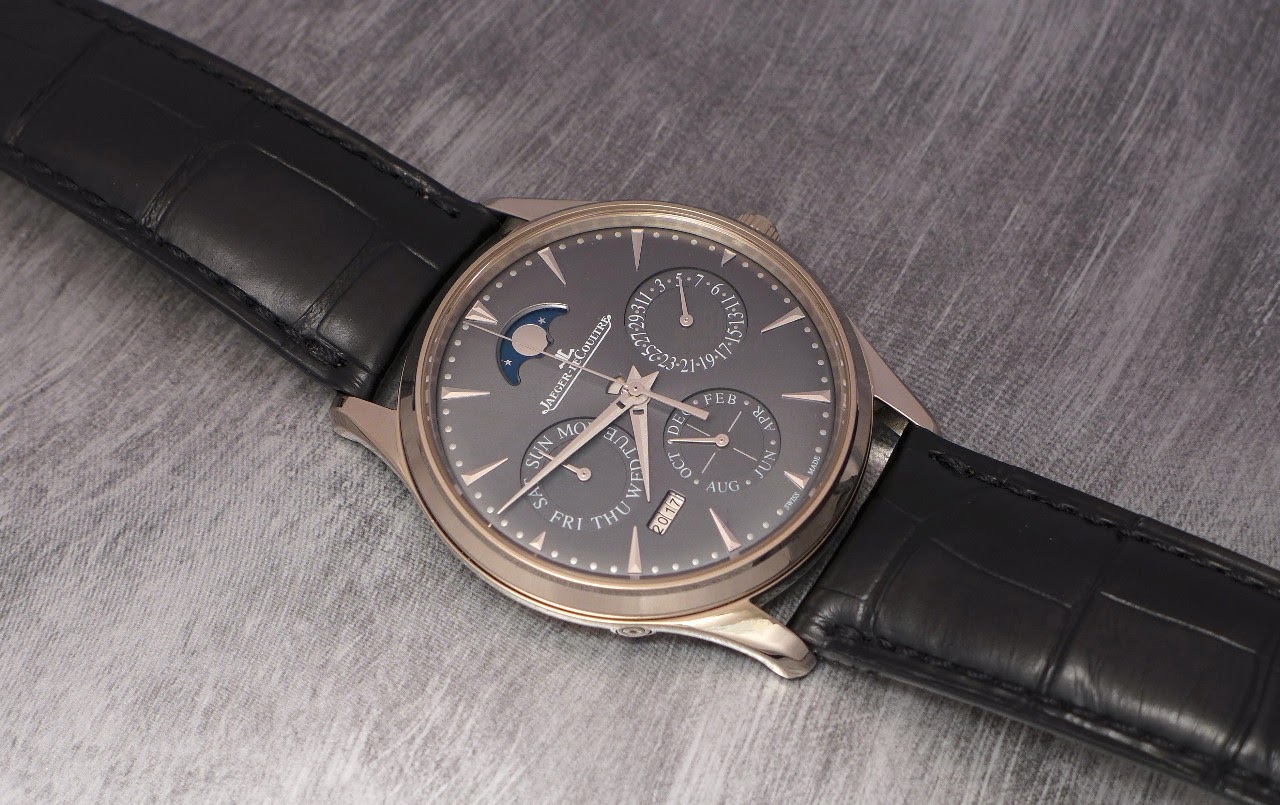
The Master Ultra Thin Perpetual Calendar opted for a white gold case / grey dial.
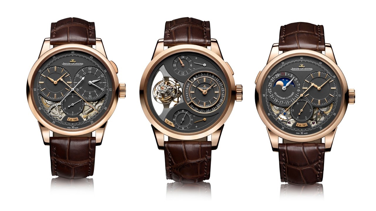
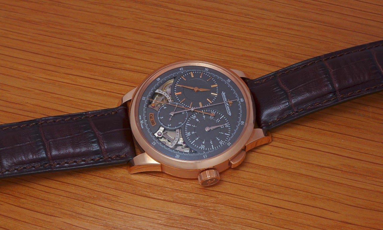
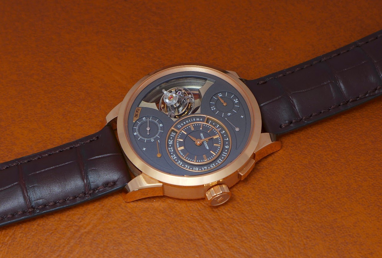
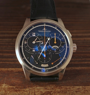
The Duomètre, too, housed a magnetite grey dial for the Quantième Lunaire, here with the Chronograph and the Spherotourbillon:
The Chronographe,
And the Spherotourbillon.
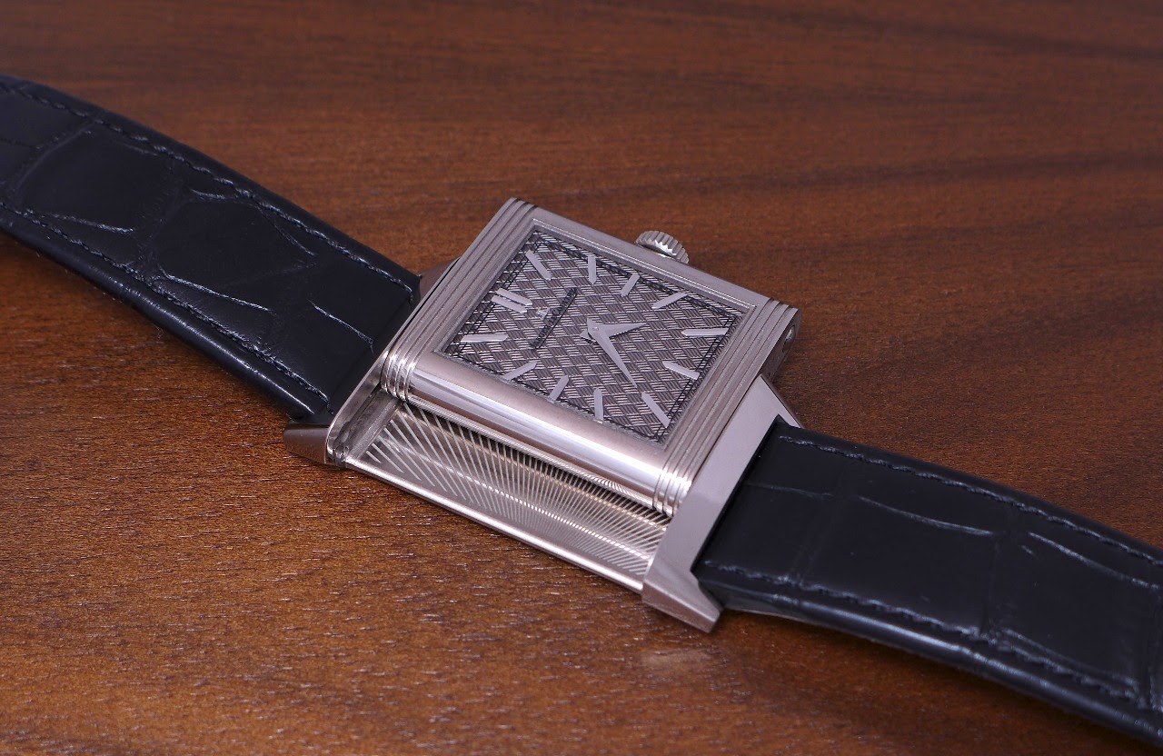
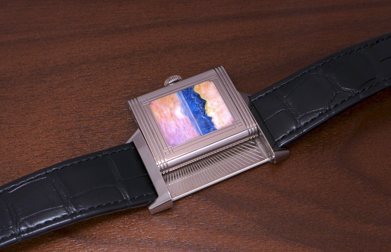
And let's not forget that the Reverso, too, received a grey dial, which is also made in enamel and guilloché, one of the three Tribute to Holder, made in 2018.
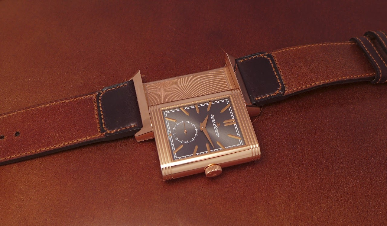
And the Reverso Tribute Duoface Rose Gold Fagliano 100 pieces issued in 2018, too.
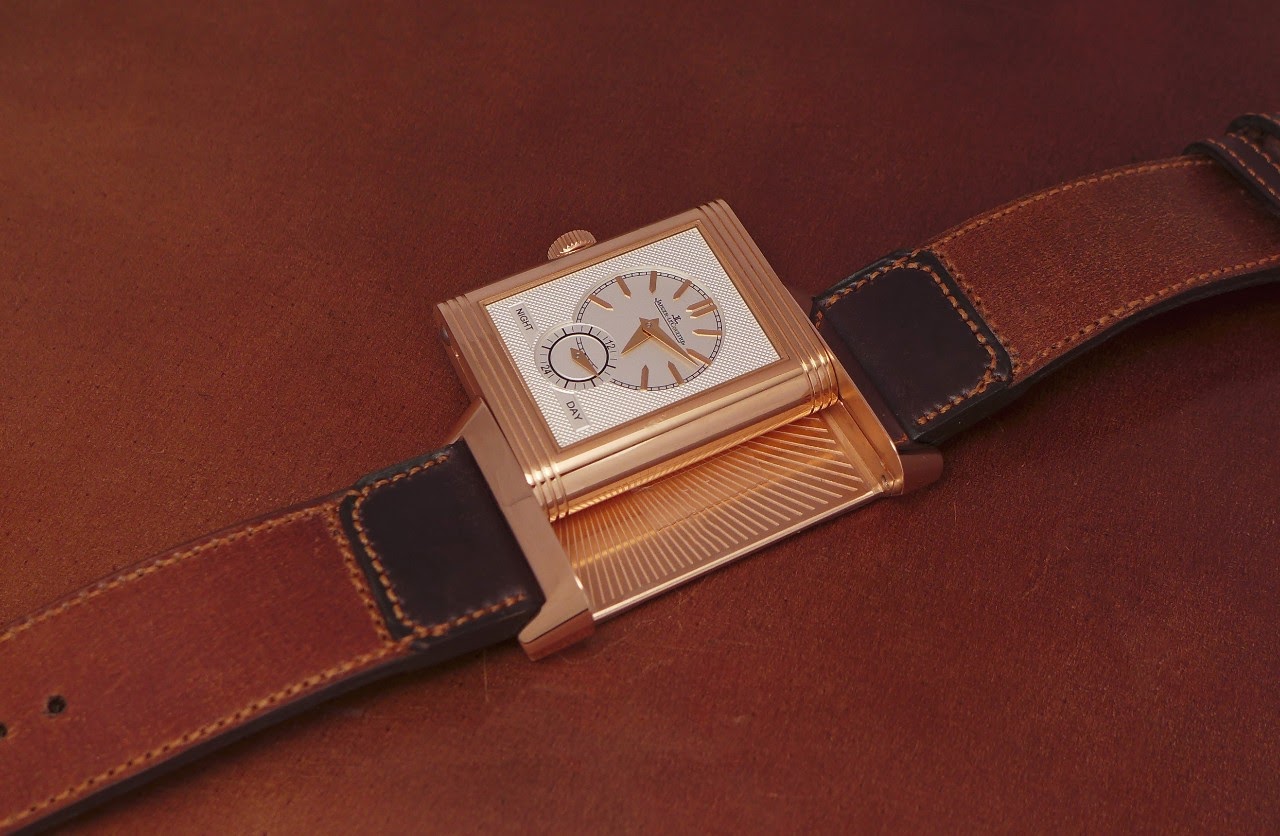
So, from 2016 to 2018, we had a new wave of grey dials, at Jaeger Lecoultre...
A new trend?
Best.
Nicolas