Jaeger-LeCoultre Reverso Tribute Duo 2016 Review
Review

Jaeger-LeCoultre Reverso Tribute Duo 2016 Review

By amanico · Apr 18, 2016 · 57 replies
amanico
WPS member · Jaeger-LeCoultre forum
57 replies27368 views1 photos
f 𝕏 in 💬 🔗

amanico's comprehensive review of the Jaeger-LeCoultre Reverso Tribute Duo, introduced at SIHH 2016, delves into whether this model represents a true novelty or an evolution within the iconic Reverso Duoface lineage. His detailed analysis, accompanied by insightful comparisons to previous Duoface iterations, provides a valuable perspective for collectors considering this contemporary interpretation of a classic. This article offers a deep dive into the design nuances and functional updates that define the 2016 Reverso Tribute Duo.

57 collectors discussing this on the WatchProSite forumJoin the Conversation →


I briefly shared this 2016 novelty in the new collection preview, in December 2015 . 

THE question which comes to mind is this one: " Is this really a novelty "? 

I would immediately say that it rather is an evolution, since we had a Duoface in the " GT case era ", and, in 2013, these two Duoface in the Reverso Grande Ultra Thin Family.

The Blue, which was a Boutique Edition,


And the White, which was available through the Boutiques and ADs.


So, not a novelty, but an in depth evolution of the Reverso Duoface.

The most significative difference, on pictures, at least, is about the pusher, which was very discrete, in the first Duoface, more prominent, on the last one. 

Here, we have a very smart solution which doesn't spoil the purity of the case, since the pusher is now replaced by a small trigger, invisible when you don't flip the case, here illustrated by this technical draw:


This solution is a great aesthetical and technical improvement, in my opinion. And the price to pay, flipping the case when you want to set the second time zone, is not too high. 

Most of the time, you don't have to set the second time zone, indeed. 

As you could guess, to change the second time, you slide the trigger. Push it once per hour.

So, this is the first good point of this new Reverso Tribute Duo. 

The second difference is about the case size.

A difference you cannot see in picture, but which you will immediately understand if I give you the following figures:

- The 1st Reverso Duoface, with the GT case, was 42, 2 x 26 x 9, 4 mm big. A GT case. 

- The Grande Ultra Thin Duoface, was 46 x 27 x 8, 9 mm big. 

- The new Reverso Tribute Duo is... 42, 8 x 25, 5 x 9, 15 mm.

So, it is much smaller, narrower, and it has almost the same thickness. The proportions looses in millimeters what they gain in elegance. That is the second good news. It seems that JLC heard those, and they are many, who wanted to see a nice Reverso with a GT case.

The third difference is more subtle: The recto and verso dials. 

You will find the nice finely grained dial of the Tribute to Reverso 1948, or of the white Grande Reverso Ultra Thin Duoface from 2013 but with blued applied indices, and with some other differences, such as the new hands, more modern, more curved, shorter, too, blued on recto, silver on the verso, and the now round small seconds which seems to be larger than the rectangular one in the former White G.R.U.T.


The verso dial is very close, if not similar with the 2013 edition, with its hobnail decoration, but in a nice navy blue hue, now. 

Some close ups of the dials:


A detail about the blue indices and hands, on the recto dial:

The applied indices are painted in blue, while the hands are heated blue.

Stephane Belmont explained me that they tried the solution of heated blue indices, but the outcome was not satisfactory, so they painted it in blue. 

The fourth difference, the decoration of the inside part of the carriage, where the case lies. 

No perlage anymore, but a soleillé finish:

 
As for the movement, The main difference between the former Cal 854 and the now referenced Cal 854 A/2 is that the latest movement includes the quick setting of the second time through the trigger. Other than that, the vibrations per hour are the same ( 21 600 ), it is also manual winding movement, and the power reserve is identical ( 45 hours ). 

The other difference is that the new Reverso Tribute Duo is available in steel, only. Not in gold, like it was the case for the 2013 version. 

Let's see some real pictures of this model, now: 


You already guessed it, this is my favorite Reverso from the 2016 collection. Ok, the new Reverso Tribute Gyrotourbillon is certainly more exclusive and " horological ", but this one is very much my taste. 

I applaud the choice of a smaller case ( smaller than the name suggests, since the Tributes to Reverso were all big ( 46 x 27 mm ), the treatment of the dials and the choice of the hands, even if, and it will be one of the rare reserves I will express here, I find those in the recto dial too short.

Two shots to show you the difference between the former Tribute case and the new one:


The other reserve I have is that it is not, in the absolute, a real novelty. But with the Duos, we are used to see evolutions, not revolutions. And here we have quite a lot of evolutions.

Looking forward to reading your comments and thoughts,

Best.

Nicolas

This message has been edited by amanico on 2016-04-18 00:47:33


Key Points from the Discussion

Advertisement
The Discussion
ES
Esharp
Apr 18, 2016

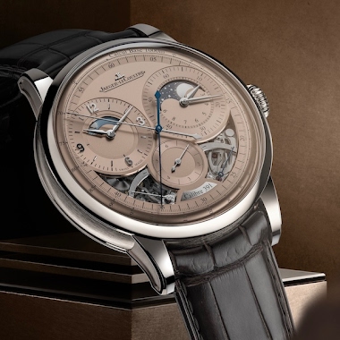
I have been waiting for this. An elegant, classical, dual time-zone watch which features my favourite colour on both dials and the strap. It is practically screaming my name (I guess I would like to be classical and elegant...). There is one thing only that bothers me: the location of \'night\' and \'day\' on the verso dial. They don\'t quite make sense. I assume they are supposed to remind the wearer of the function of the subdial, but wouldn\'t it make more sense and be much more legible at a

WA
watchme
Apr 18, 2016

One complaint that I've had for a few years now is that the original Duo and it's update (with the pusher) (271 reference), had the "Day/Night" subdial correctly oriented, so that night ran from 18:00 hours to 6:00 hours, and day ran from 6:00 hours to 18:00 hours. The Ultra Thin Duos AND the Grande Reverso Duos had it place 90 degrees, so that it didn't make visual sense, and the "Day" and "Night" printing was basically a "filler" of the empty space. I hope in the final version that JLC would r

TH
TheMadDruid
Apr 18, 2016

accompanied by great photos. Great job, Nico. The short hands on the verso do not bother me as they seem to fit the smaller dial. The "day" and "night" placement does seem rather arbitrary, but a minor distraction. All in all, I think this is a great addition to the Reverso line-up. I agree with you that this model is the most attractive, for several different reasons, of the 2016s.

RO
robsallnow
Apr 18, 2016

They had this new model in the JLC boutique when I went in the weekend before last....I'd just bought the Ultra Thin version from elsewhere having waited to see what they'd release for the 85th birthday. While I love the blue applied markers and hands I'd want sword hands on the recto dial, the type and length of the ones supplied don't suit the dial in my opinion...they look fine on the other dial however. I also don't like the second subdial at all, it's circular and too big requiring shortene

AM
amanico
Apr 18, 2016

As for the hour hand, yes, I find it a bit too short, I am more disturbed by the fact that it is blue painted, though... Best, my friend. Nicolas

AM
amanico
Apr 18, 2016

As for the picture of the trigger, those I took were not good. I will do it when I visit the Manufacture, promised! Best, Dean. Nicolas

Advertisement

Continue the conversation

This thread is active on the Jaeger-LeCoultre forum with 57 replies. Share your knowledge with fellow collectors.

Join the Discussion →