Reference Guide
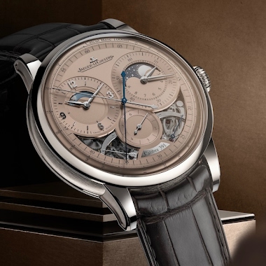
Nicolas (amanico) shares his personal experience with the Jaeger-LeCoultre Reverso Tribute Moon in Steel, a reference he initially misjudged based on specifications. His stunning natural light photography from the Maison D'Antoine highlights the watch's proportions and the striking applied blue indices, inviting fellow collectors to reconsider its on-wrist presence and aesthetic appeal. This article delves into why this 2017 release continues to captivate the community.


The Reverso will, for me, be the toughest watch to choose which one to buy first! There are simply so many excellent ones.... Barring spending $50K on a Septantieme, both the plain classic line, as well as the newer tribute line are massively cool.... Remains to be seen, thanks for the pictures, Filip
This wears really well, even for my small 6.75" wrist. Only gripe I have is that the date hand is very hard to see in regular use, but since I usually know the date and use my phone for it, it's not a problem. I don't even set it most times as I can't see it anyway ;-) The dial texture is really nice, depending on the light, Richard
Which is understandable, since they share the same case proportions and the same aesthetics.
Was not a huge fan of this ref when JLC launched it… But the dial is well balanced and JLC succeed to create a modern/design version of one icon… It’s hard to do that so… it’s a really good job up to me. Unfortunately as usual the so special pusher is not shown 😬 Best Ø
But i have a couple more reference at the top of my list to get first so need to prioritize
I also thought it would be too large for my wrist based on the published specifications but was surprised at how it looked and how comfortable it sat on my wrist. The details are exquisite, it is appropriate for day and evening wear, and is at home in both casual and formal settings. For my purposes it is an ideal travel watch.
This thread is active on the Jaeger-LeCoultre forum with 30 replies. Share your knowledge with fellow collectors.
Join the Discussion →