Unveiled in April 2021, it took me some months to discover the Reverso Tribute Nonantième, which is now done.
I already quickly reviewed it, and shared my first impressions with you, here:
I suggest we discuss this new Reverso with a different angle, now, and wonder if the Reverso Tribute Nonantième is a true Anniversary watch, compared to the Soixantième ( 1991 ) and the Septantième ( 2002 ).
I will sum my thoughts this way: The Tribute Nonantième has the class and the originality of a " Reverso Anniversary ", but it doesn't go as far as the former ones.
It is time to elaborate my point of view.
I/ The class and the originality of the Reverso Tribute Nonantième:
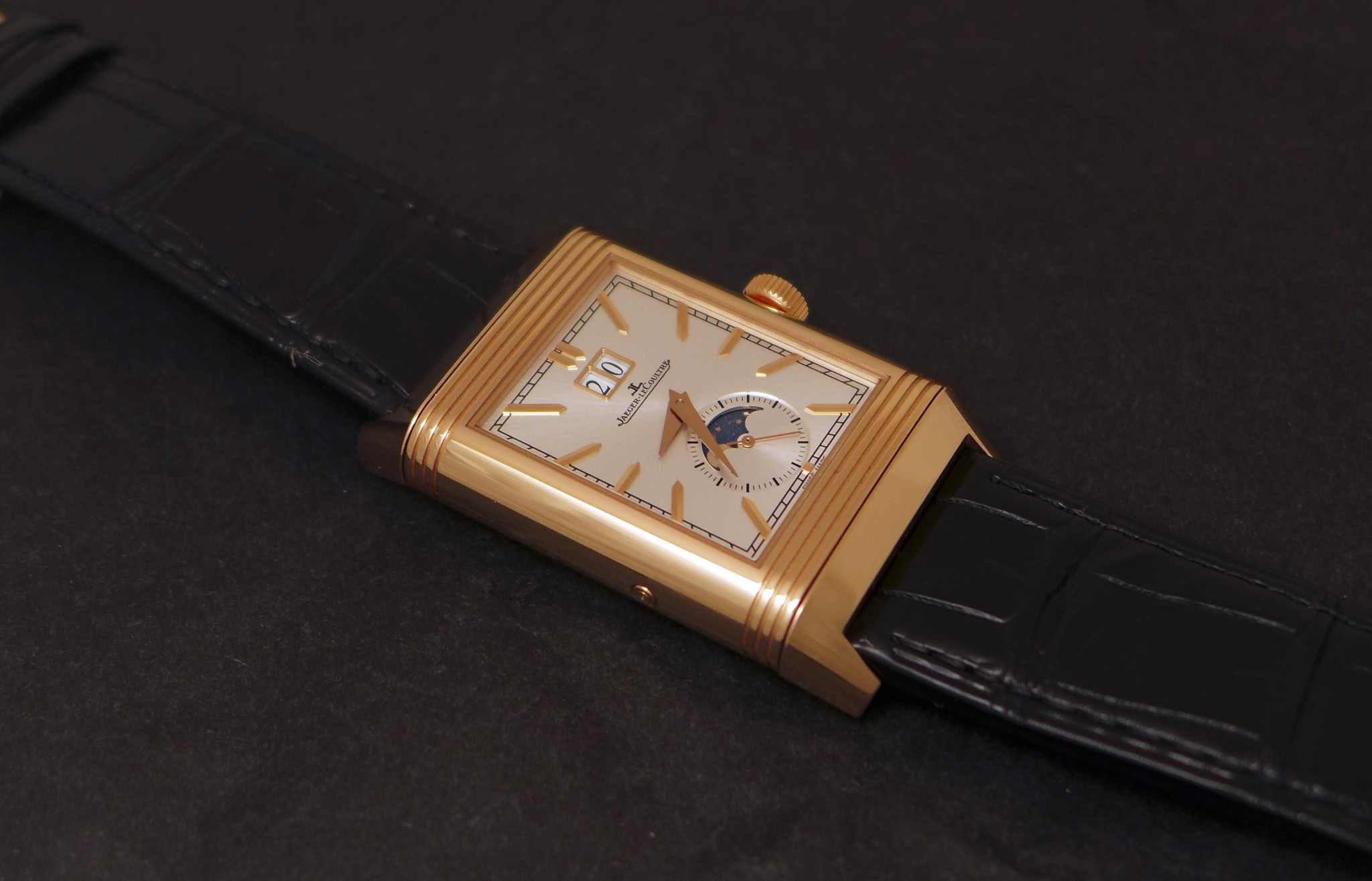
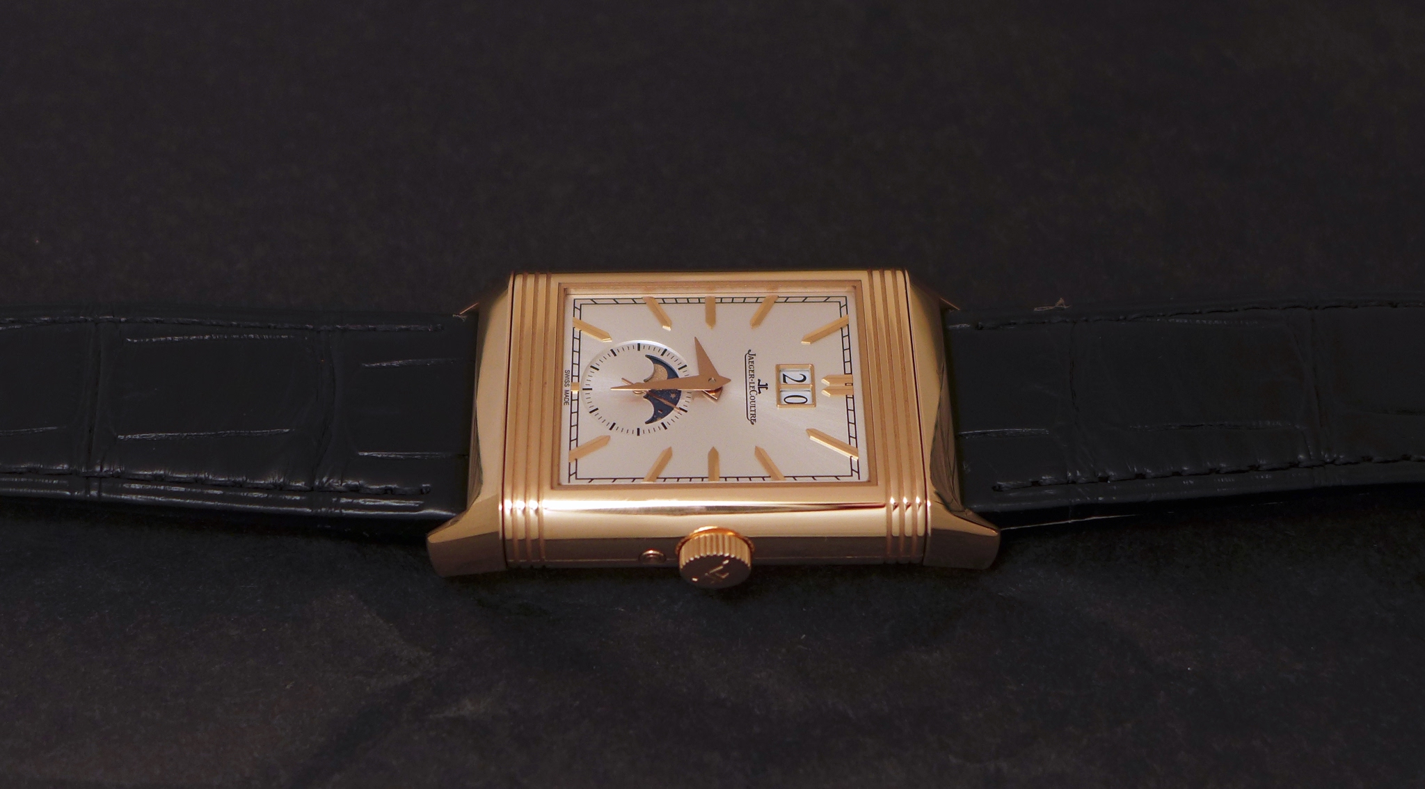
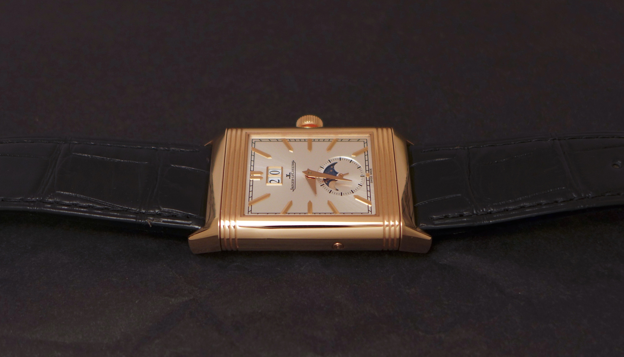
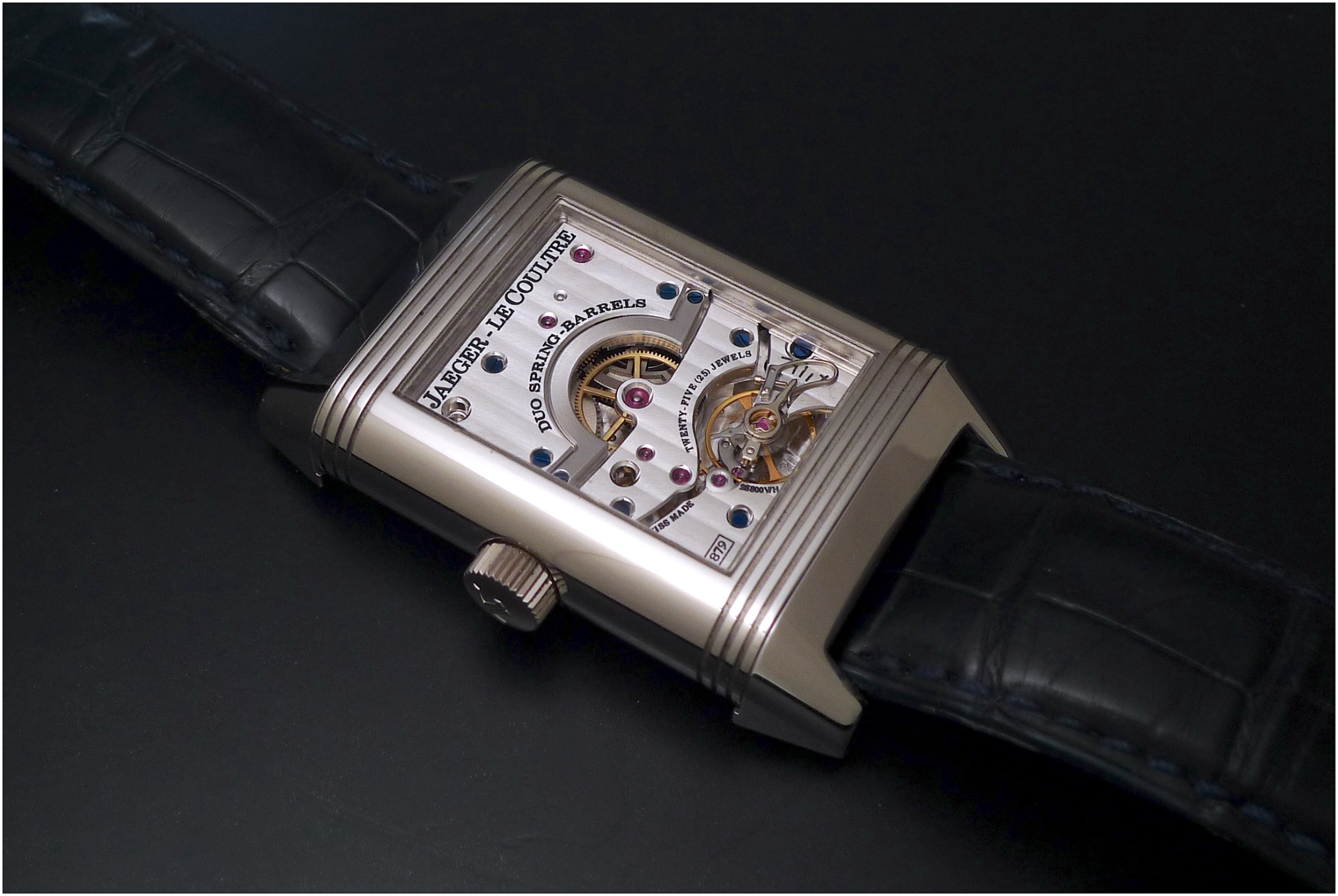
The Reverso Tribute Nonantième oozes Class and Distinction, on both sides.
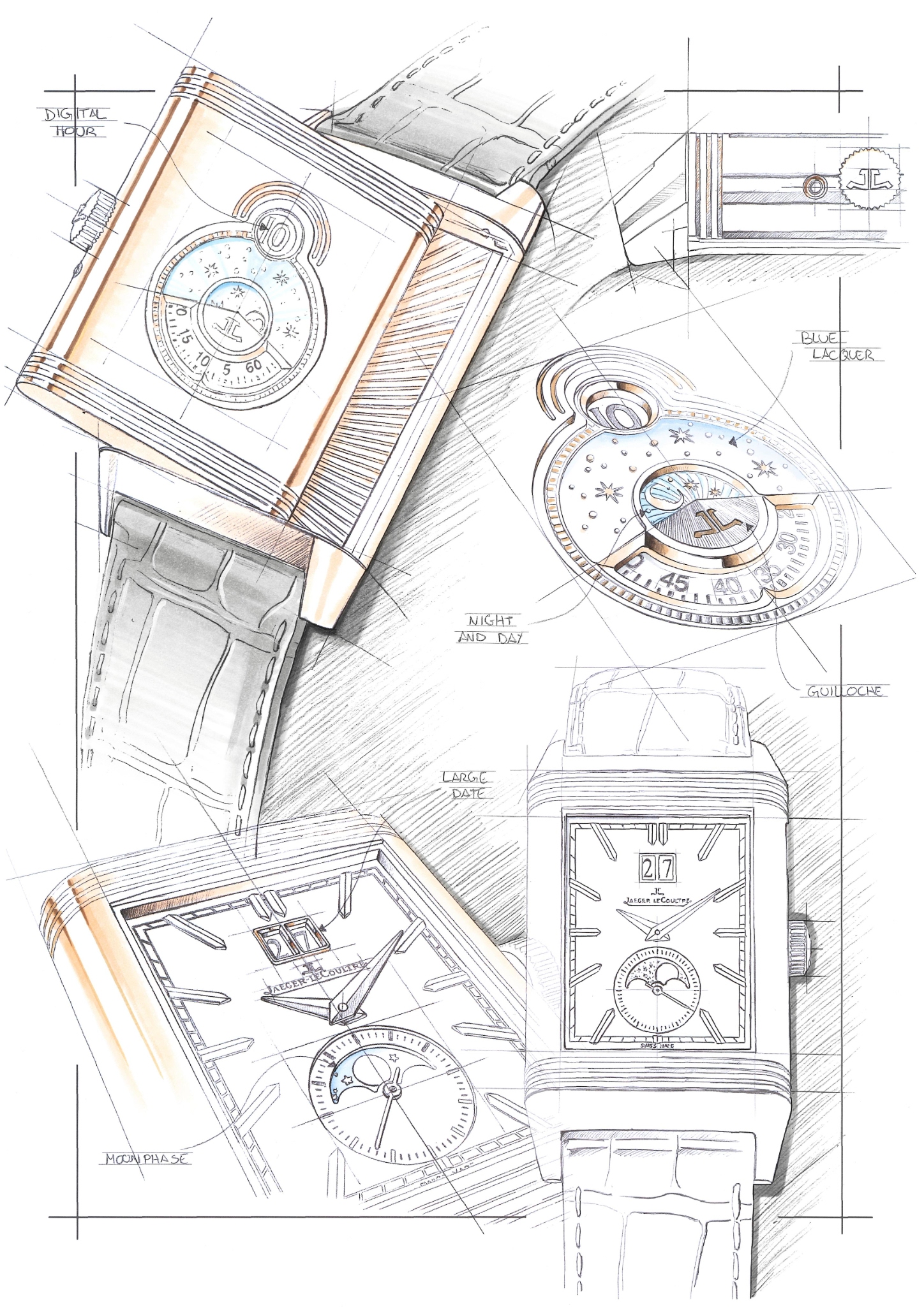
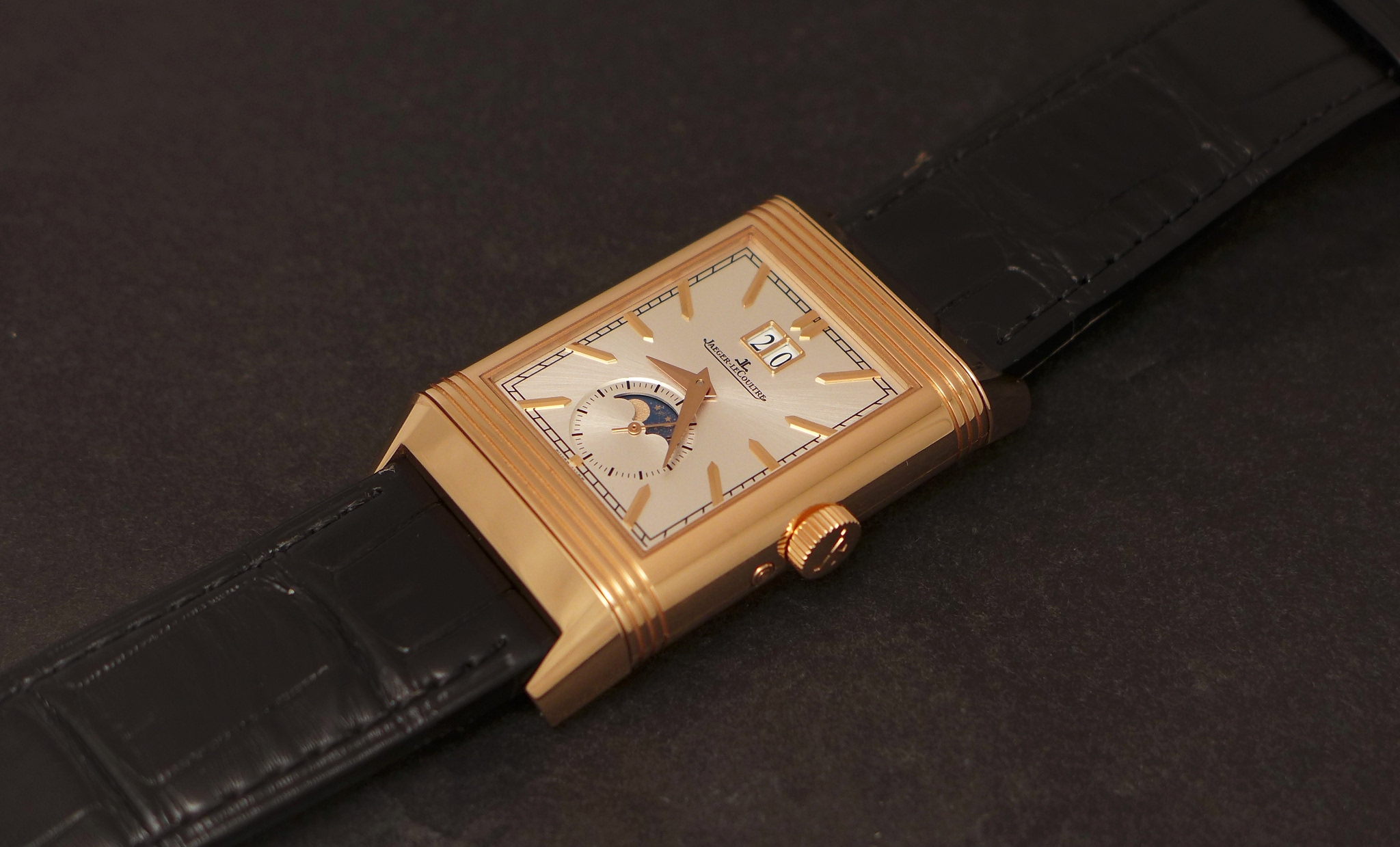
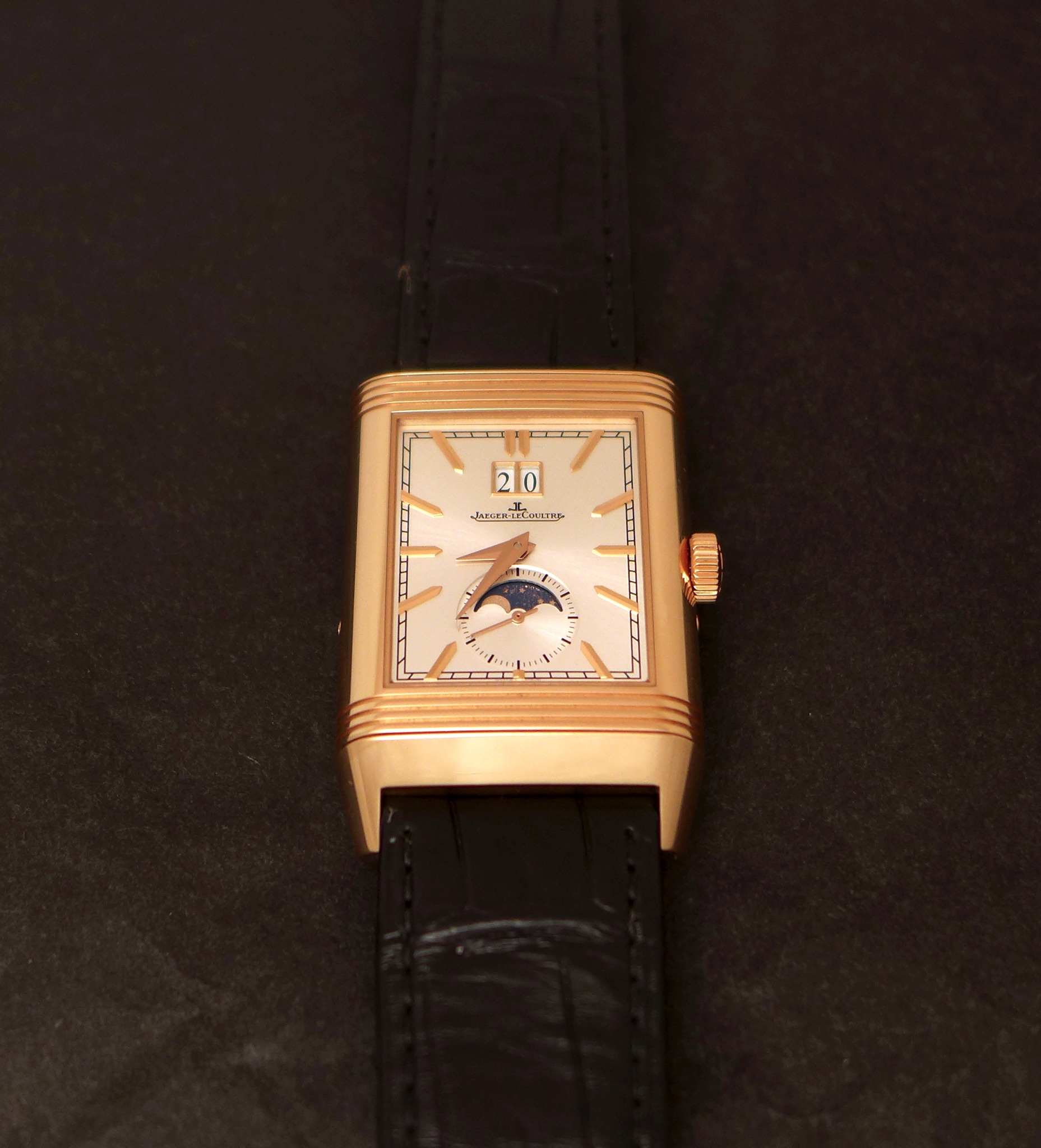
The recipe works here. On the recto, we have a superb silver sun ray dial, rose gold applied hour markers, and a very nice moon phase. The big date adds symmetry and balance to the dial. Class, Classic, Formal, Elegant... These are the key words to describe the Recto of this Reverso, for sure.
The proportions of the case can be judged big " on the paper ", but in reality, the size / height ratio ( 49, 4 x 29, 9 mm / 11, 72 mm ) is convincing and not as big as you might think.Good points.
The rose gold case contrasts in a warm and pleasant way with the dial on the recto, which is another good point. I would also add that there is some legitimacy to use rose gold for such a watch, as the Soixantième and the Septantième also came in this metal. I would only say that I would have preferred having the choice between a colored gold and a white metal version, like they did with the Septantième, which came in rose gold and in platinum, too.
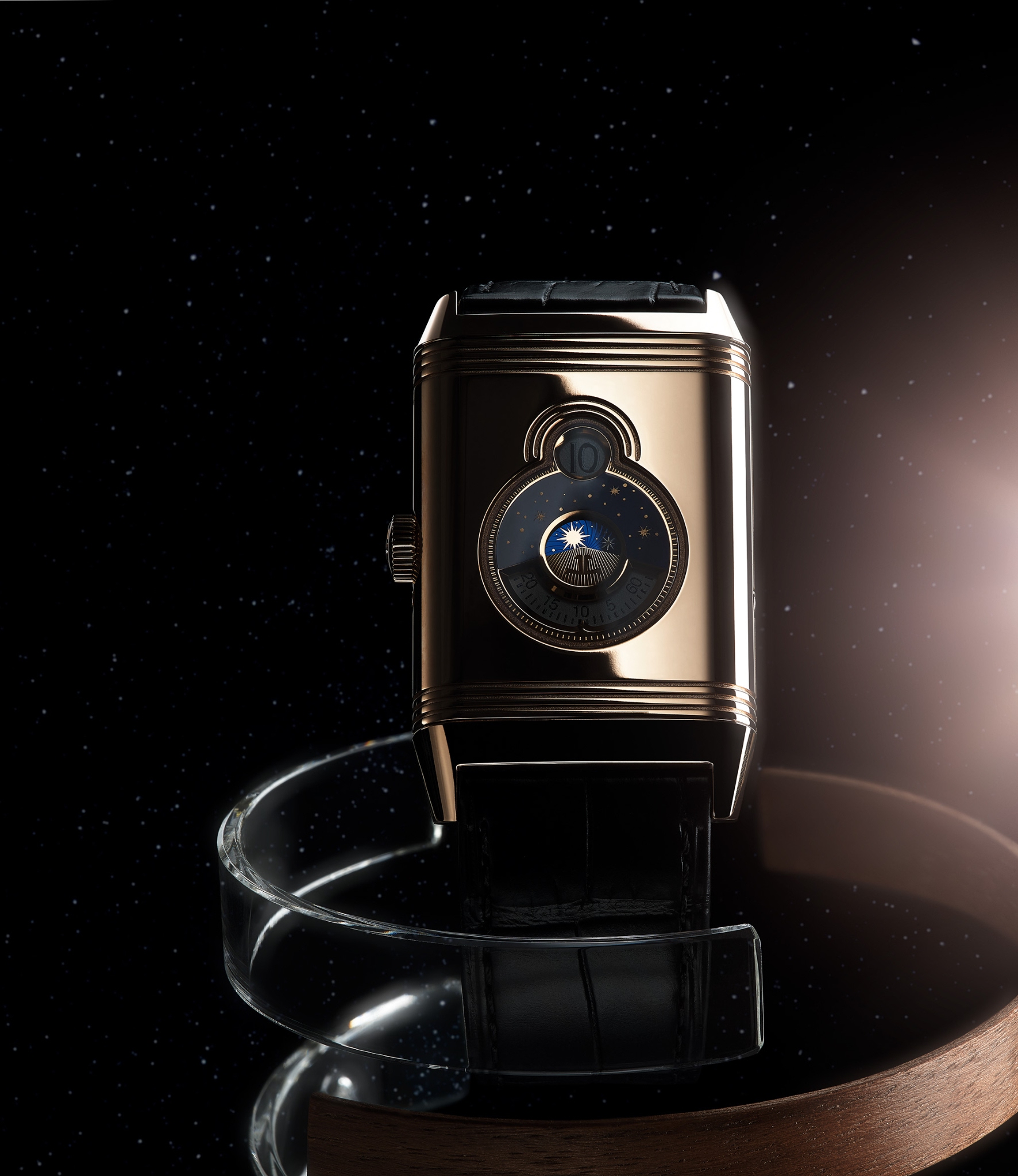
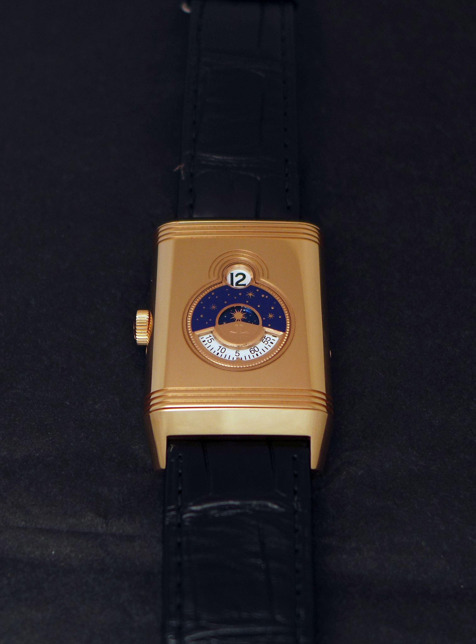
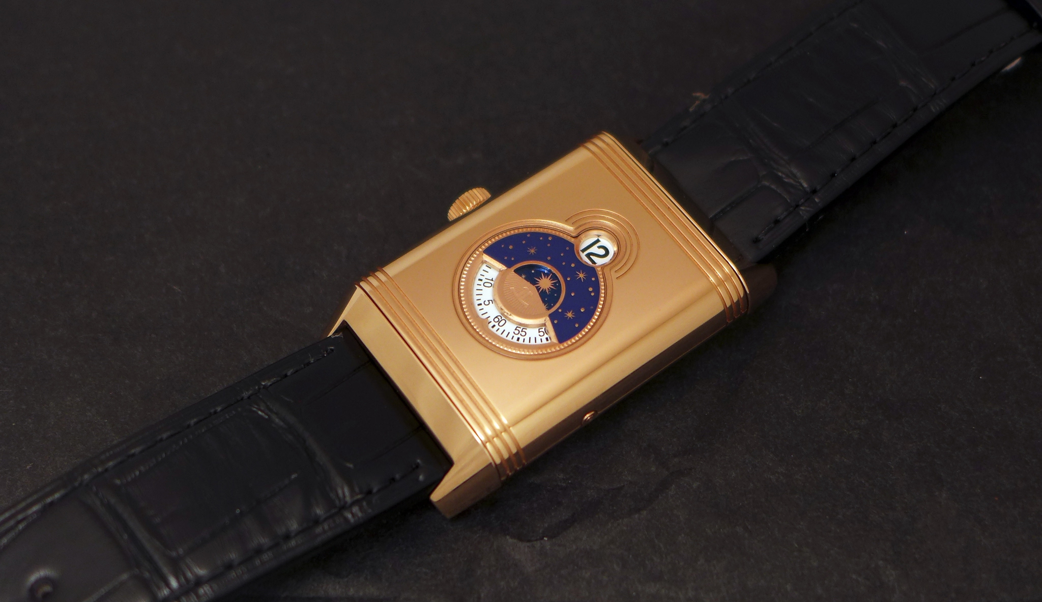
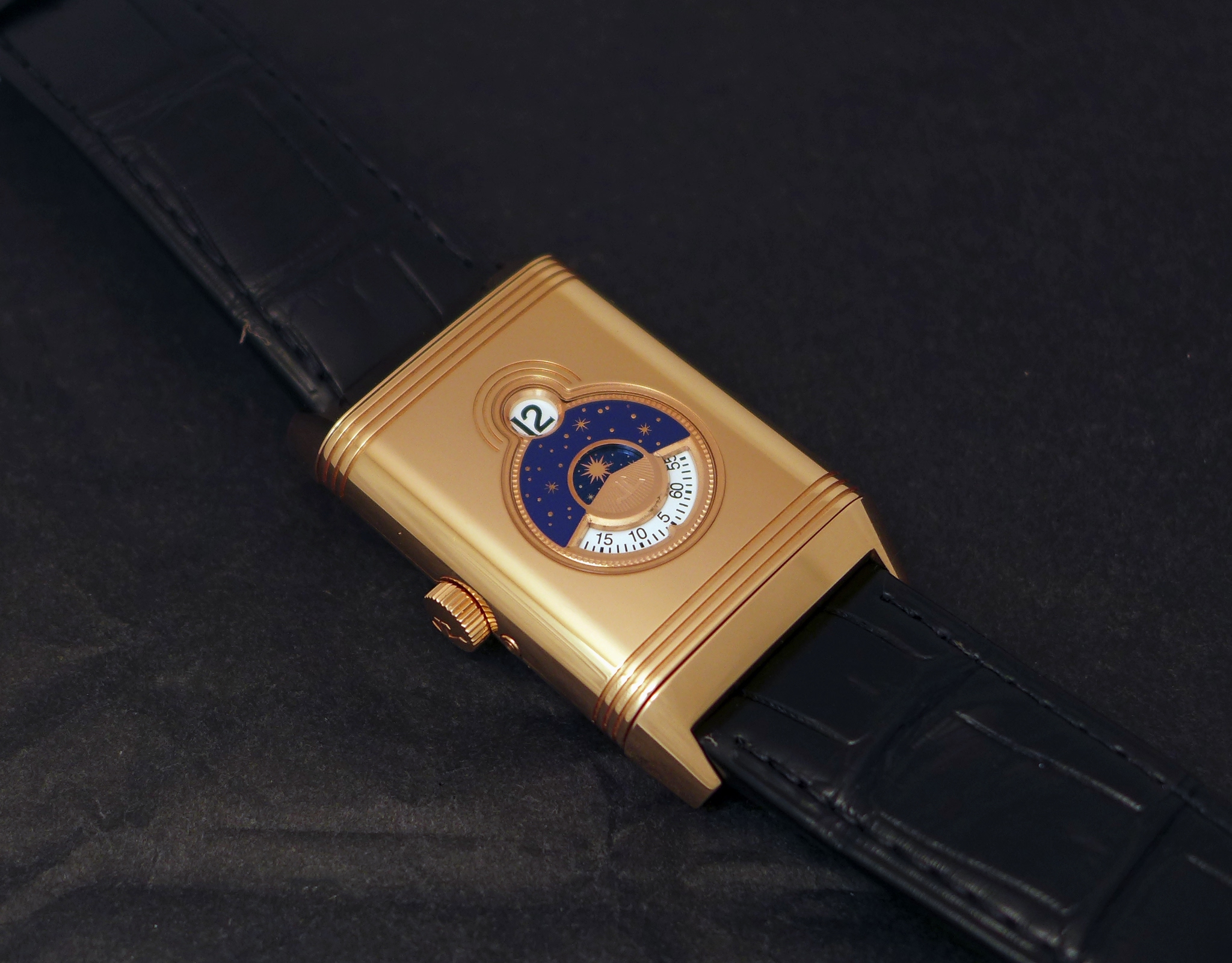
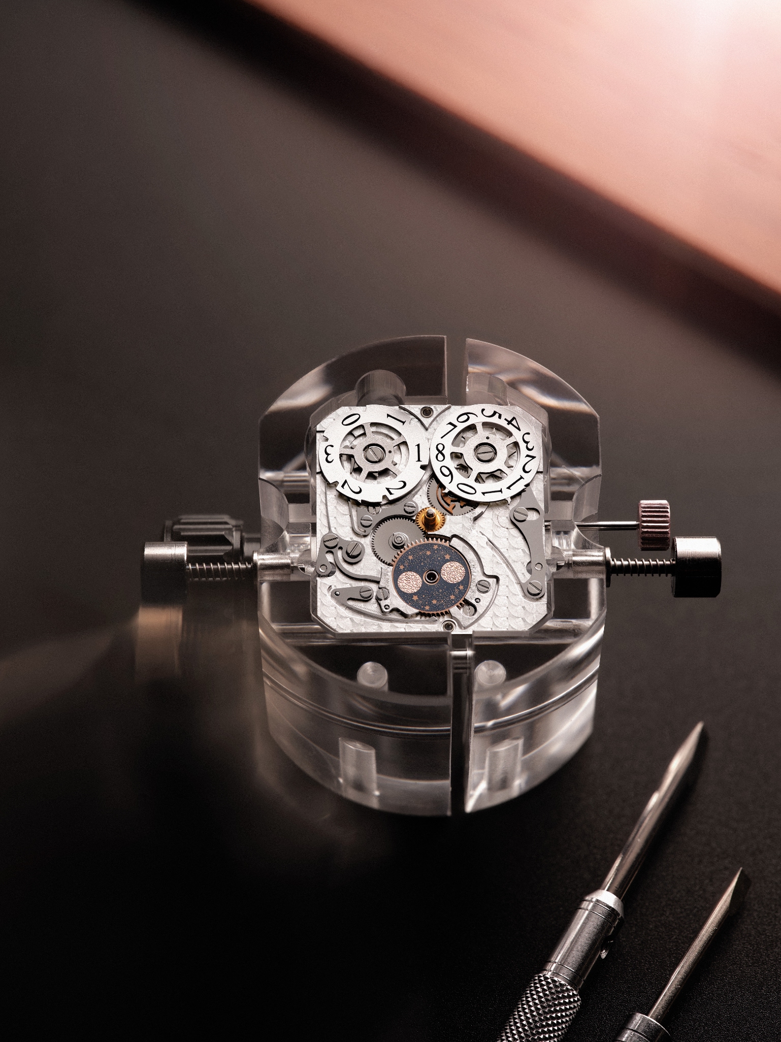
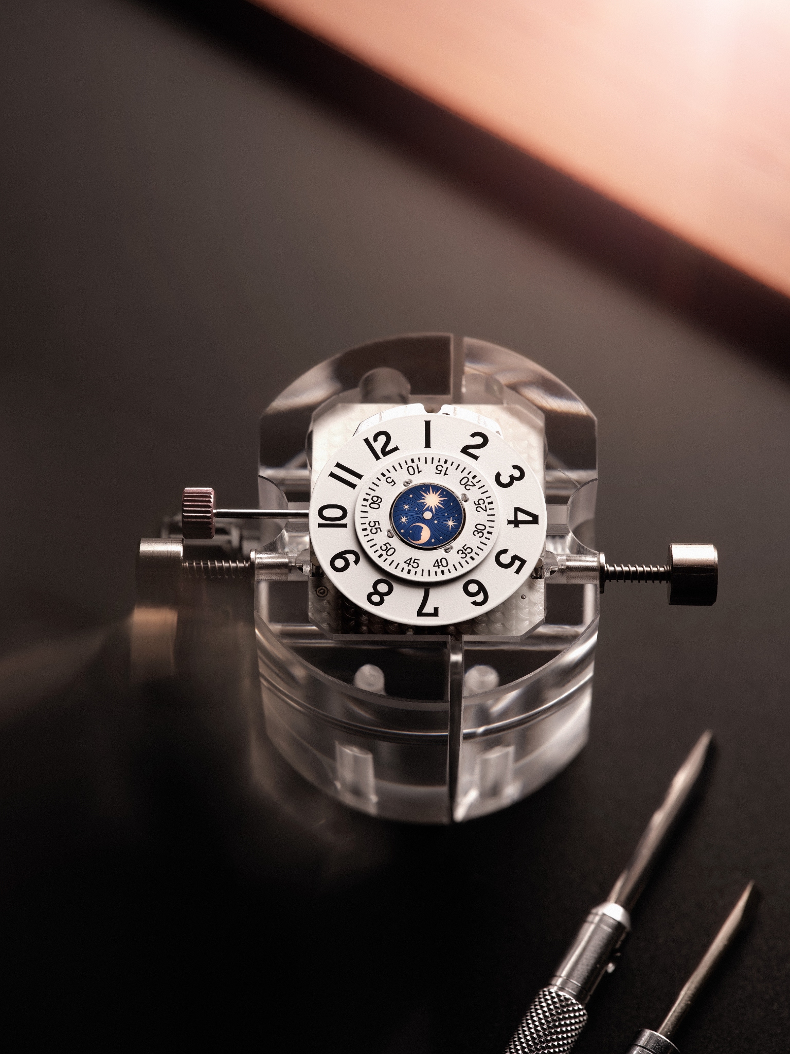
The Verso of the Reverso Tribute Nonantième plays a totally different partition.
This " face " reminds me of some old creations we saw on pocket watches, or from some Independents, more recently, with the blend of digital hours and circular minutes displayed on their own rotating disc, separated by a night and day indicator allowing the owner of the watch to know if the time is AM or PM.
The visual outcome is just sublime, in my opinion. The chromatic combination of blue ( lacquer ) rose gold and white is totally bewitching, and the gadroons surrounding these time indications add something very class, matching with the gadroon of the case. The designers did a great job, in my opinion.
2/ Is the Reverso Tribute Nonantième truly innovative?
THIS is the big question, especially when you have in mind all the features the Soixantième and the Septantième offered.
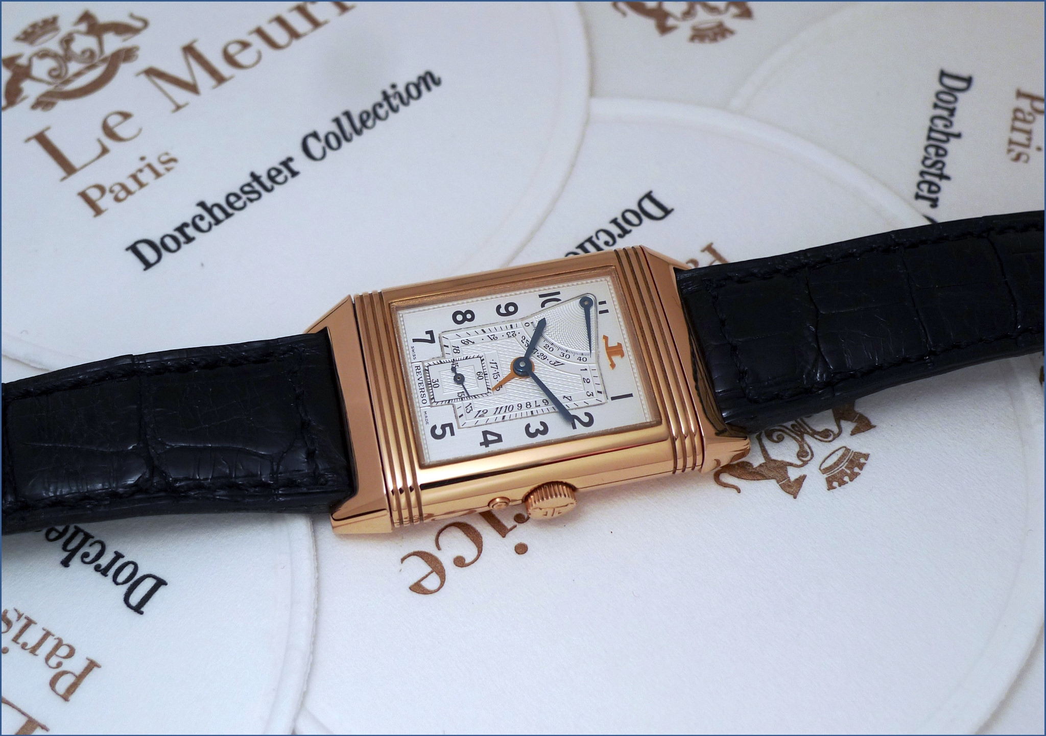
The Soixantième was the first complicated Reverso, with a power reserve, a date, and it also used, for the first time, a new case ( so called GT case for Grande Taille ) and a 14 Kt rose gold movement ).
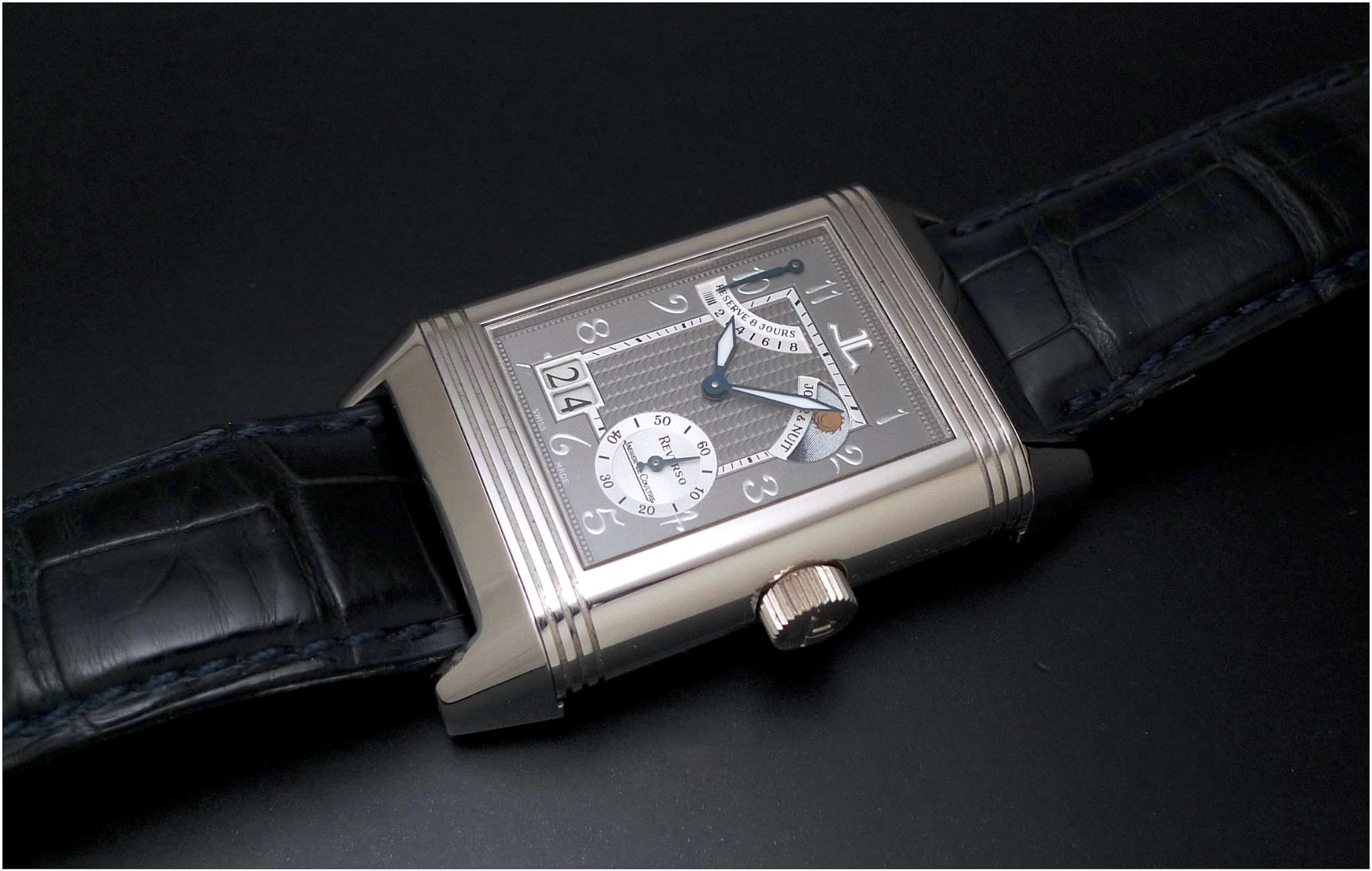
The Septantième used, for the first time, a XGT ( Very Big ) case, in platinum, with a Grande Date, a 8 Days movement in 18 Kt White gold.
The Nonantième offers rotating minutes and a digital hour, which are two firsts for a Reverso.
For this watch, Jaeger Lecoultre created a new movement, the Cal 826, which is manual winding, made of 230 parts and offering a power reserve of 42 hours.
I explained, in my first review, what is this digital hour, and I quote Jaeger Lecoultre, here, on the reason why we don't have a jumping hour, but a " sliding " hour:
" Our team of constructors and engineers have had the brilliant idea to integrate a blocking-lever between the arms of the hour starwheel. This allows for a jumping display of the hour, while guaranteeing the accuracy of the rotating hour disc. This blocking-lever is integrated between the arms of the hour starwheel through a small notch, which only frees the disc when passing from one hour to the next. This indentation system, however, does not allow it to be precise down to the second. This is why it is a semi-instantaneous display, which takes a total of 6 minutes to switch from one indication to the next. "
Some thoughts on this technical choice:
- The instantaneous jumping hour takes a lot of energy from the power reserve, so a sliding hour is less greedy, on that matter.
- Still, if I like and appreciate rotating minutes, I would even more enjoy having an instantaneous jumping hour. Indeed, here, for a few minutes ( two minutes ) you cannot tell the time, when the hour switches.
- I would have preferred having another time zone, on the verso, rather than having the same time, expressed in a different way.
That's why I have the feeling the Reverso Tribute Nonantième has the class and the distinction of its " anniversary predecessors ", but not the horological originality or innovation.
Between Compromise and Radicalness, I would favor the second for a watch like this.
I am very curious to read your thoughts and feelings on that one.
Best,
Nicolas