Jaeger-LeCoultre Reverso Tribute Tourbillon: A Collector's Design Critique
Review

Jaeger-LeCoultre Reverso Tribute Tourbillon: A Collector's Design Critique

By amanico · Dec 10, 2020 · 20 replies
amanico
WPS member · Jaeger-LeCoultre forum
20 replies2573 views2 photos
f 𝕏 in 💬 ✉ 🔗

Nicolas (amanico) brings a critical eye to the Jaeger-LeCoultre Reverso Tribute Tourbillon, inviting the community to explore its design nuances. His post, featuring striking photography, prompts a discussion on the watch's aesthetic appeal, particularly comparing its two distinct faces. This article synthesizes collector opinions on a significant JLC complication.

20 collectors discussing this on the WatchProSite forumJoin the Conversation →
Another Reverso, another tourbillon. 

Not my favorite, even though it doesn't lack charm nor interest. 


I find the verso more interesting... 


Don't you? 

Best,
Nicolas

Key Points from the Discussion

Advertisement
The Discussion
FA
FabR
Dec 10, 2020
I like the “chin”! In a dial like the verso it might actually make sense aesthetically to show a tourbillon! Interesting piece overall👍

AM
amanico
Dec 10, 2020
I can only agree on the verso.

BI
BigFatPauli
Dec 10, 2020
I find your photography the most interesting!

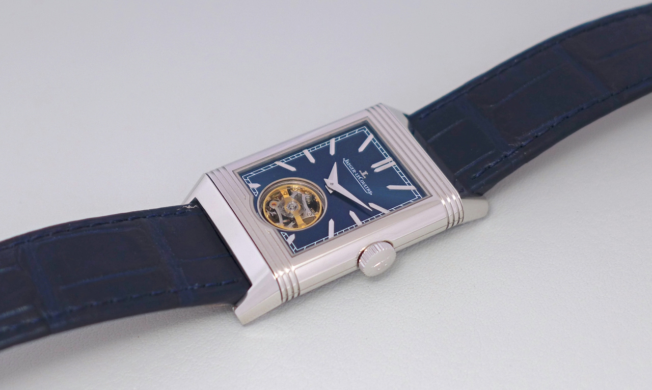
You ability to capture colour, I find, is unparalleled. Regardless of the subject, I enjoy your photos.

AM
amanico
Dec 10, 2020
You are too kind, mon ami. Thanks.

DE
dedestexhes
Dec 10, 2020
Not to my taste, would take the previous one you posted in a jiffy

The original Reverso tourbillon

AM
amanico
Dec 10, 2020
Me too. Even if the one I posted yesterday is not my favorite, either.

Continue the conversation

This thread is active on the Jaeger-LeCoultre forum with 20 replies. Share your knowledge with fellow collectors.

Join the Discussion →