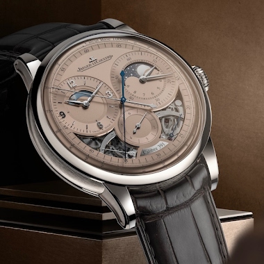
Collection
Nicolas (amanico) brings to light a fascinating nuance within the Jaeger-LeCoultre Tribute to Polaris 1968 collection, highlighting the existence of two distinct dial variations. His post prompts collectors to consider the aesthetic and historical implications of these 'normal' and 'wrong' dials, particularly their color and luminous properties. This discussion remains relevant for enthusiasts seeking to understand the subtle yet significant details that define specific references and contribute to their unique appeal.

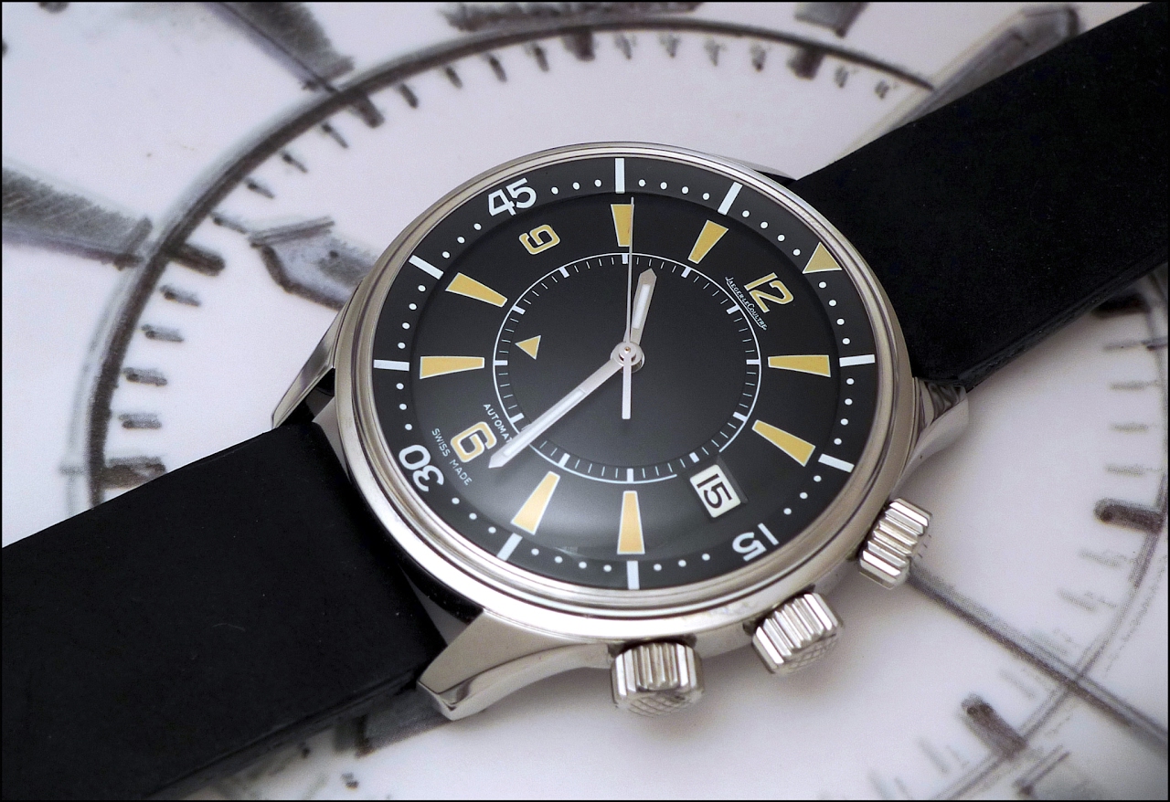

The Jaeger-LeCoultre Memovox Polaris 1968 is a notable iteration of the Memovox line, distinguished by its multi-crown design and internal rotating bezel. This particular reference is recognized for its robust case construction and the integration of an alarm function, a signature complication of the Memovox series, presented in a sport-oriented configuration. It represents a specific period in the development of the Memovox collection, offering a distinct aesthetic and functional profile.
This timepiece features a stainless steel case, measuring 42mm in diameter. It is powered by an automatic movement, specifically the Jaeger-LeCoultre Caliber K825, which provides the time, alarm, and an internal rotating bezel function. The crystal protecting the dial is acrylic, contributing to its period-correct appearance. The movement offers a power reserve suitable for daily wear.
For collectors, the Memovox Polaris 1968 holds interest due to its unique design elements and its place within the broader history of alarm watches. Its three-crown configuration, with one crown for winding and setting the time, another for setting and activating the alarm, and a third for operating the internal bezel, makes it a distinctive piece. The watch appeals to those who appreciate mid-century sports watch designs with integrated complications.
😂🤣 ...as a joke but actually I would go for the "normal" one if one to choose
Two pics isn’t enough for me to decide. But I think the “wrong dial” has a bit more character. The fact that it wasn’t trying to be “non-matching” but ended up as such, makes it unique.
Did JLC mistakenly or intentionally switch the colors?
I love both but would choose the wrong, hands down. It has more character, a bit more funky maybe. Funny to have become a sub reference by accident. I really like luminous numbers. Does anyone have a lume shot og the model as it was designed?
where my being “wrong” is alright
But in this case I really like the "wrong" so it has my vote without hesitation
This thread is active on the Jaeger-LeCoultre forum with 32 replies. Share your knowledge with fellow collectors.
Join the Discussion →