Discussion
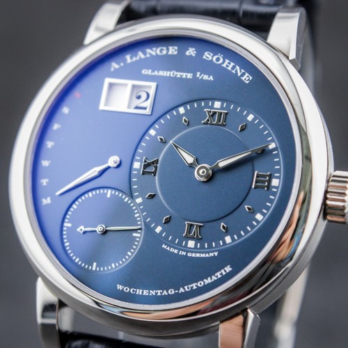
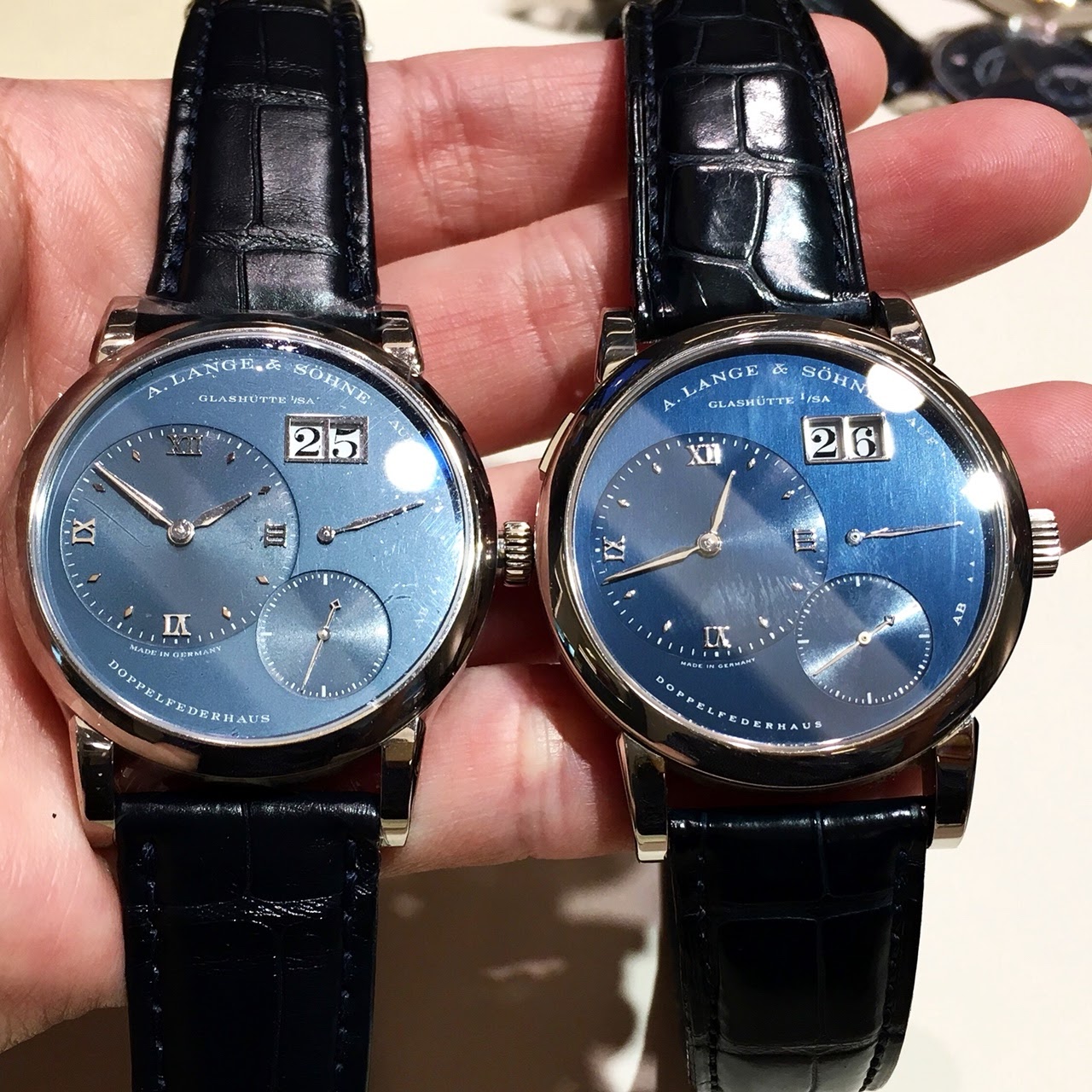
FanFrancisco initiates a compelling comparison of A. Lange & Söhne's new blue dials against older versions, providing a side-by-side visual analysis. His post invites the community to weigh in on the subtle yet distinct differences in hue and vibrancy between the generations of blue dials.


The A. Lange & Söhne 1815 reference 206.032, introduced in 1999, is a notable example of the brand's commitment to traditional watchmaking principles. This model is part of the 1815 collection, which pays homage to the birth year of Ferdinand Adolph Lange and emphasizes classic design elements such as Arabic numerals and blued hands, drawing inspiration from historical Lange pocket watches. It represents a more understated and purist aesthetic compared to some of the brand's more complex offerings, focusing on fundamental horological excellence.
This particular reference features an 18k rose gold case measuring 36mm in diameter and 7.5mm in thickness. It houses the manually wound L941.1 caliber, visible through a sapphire crystal case back. The movement provides a power reserve of 45 hours. The watch is fitted with a sapphire crystal on the front, protecting a solid silver dial. Water resistance is rated at 30 meters, suitable for everyday wear but not for immersion.
The 1815 206.032 appeals to collectors who appreciate classical proportions and a focus on fundamental watchmaking without excessive complications. Its smaller case size reflects a more traditional approach to men's wristwatches, making it a desirable piece for those seeking a discreet yet highly refined timepiece. The combination of rose gold and a silver dial offers a warm and legible presentation, consistent with the collection's historical inspirations.
Cheers and happy holidays F
I recently posted a similar comparison here , and I was hoping to see additional comparisons, like yours, with other older models such as the Lange 1 and 1815. The current version has a bit more of a metallic sheen. I have a slight preference for the older blue, which is darker and richer, but I thought both blue colors were really nice.
Both are actually nice, sometimes it is a matter of and down to individual taste imho Stefan
Well, I’m probably biased but I prefer the former version. From my recent memories, the new one doesn’t offer the same richness of blue hues than the former one, especially when it comes to the main and sub dials differences. Here a link to my post where I’ve tried to capture all the different blue hues of the “old” Lange 1: Best wishes Alkiro
This thread is active on the A. Lange & Söhne forum with 20 replies. Share your knowledge with fellow collectors.
Join the Discussion →