Montblanc Meisterstück Heritage Pulsograph Review
Review

Montblanc Meisterstück Heritage Pulsograph Review

By amanico · Jan 26, 2014 · 50 replies
amanico
WPS member · Montblanc forum
50 replies19964 views0 photos
f 𝕏 in 💬 🔗

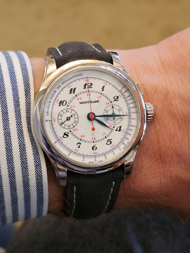
Amanico's insightful review of the Montblanc Meisterstück Heritage Pulsograph from SIHH 2014 offers a critical look at Montblanc's horological aspirations. His detailed analysis of the watch's design, movement, and branding strategy provides a valuable historical snapshot of the brand's efforts to establish itself in high watchmaking, challenging perceptions and highlighting the Villeret workshop's significant contributions.

50 collectors discussing this on the WatchProSite forumJoin the Conversation →


Montlblanc is an universe I discovered not a long time ago... Horologically speaking.

It all started with the Monopushers I had the pleasure to see it in the flesh during the IGOTT II in Las Vegas... It was 3 years ago.

PuristS P10 LE:


My vision of Montblanc immediately changed, and it started to speak very loud to my heart.

The case, the dial ( enamel ! ) the coaxial pusher, integrated to the crown, and... the movement, superbly finished, all these important details contribute to make a very serious alternative to the Kings of the category, which are the JLC Duometre à Chronographe, the Lange Datograph, and below, the Patek 5170, or the Vacheron Patrimony.

Yes, I dare say it, Montblanc Villeret Chronographs are among the most somptuous the modern production can offer. A look at the movement will convince you, definitely.

And I am pretty sure that if there was not some snobism to pay attention to- or to neglect- a Watch because of the name on the dial, these remarkable chronographs from Montblanc would already be at the pinacle of Chronographs.

Still, I don't get the necessity to say that it belongs to the Meisterstück Heritage Collection, while Heritage collection would be enough, from my point of view.

I well understood that this appellation was given in honor of the legendary foutain pen from the brand, but a Watch is a Watch, and a pen is a pen. If you want to reach a legitimity with watches, which is really deserved when you make such fine watches, you don't need to associate it to pens. But this is just my point of view.

That being said, let's see this Watch in the details, now.

1/ The case.


Less sophisticated than the Villeret, it has its own appeal and character, made of class and elegance, in a more sober way.

It makes me think to a Lange or JLC ( Duometre ) case, which is a compliment.

The proportions are another good point. Not too big, with a diameter of 41 mm and a height of 11, 8 mm.

The thin bezel is another nice detail, perfectly integrated to the case.

Maybe thinner lugs would have been nicer, if we want to be picky?


As there are two kind of monopushers chronographs, at Montblanc, I would also have preferred the version with the pusher located in the crown, rather than the rectangular one at 2 o'clock, but both are historically correct, and it is just a personal preference.

The see through case back allows us to admire the Cal 13.21. It would be a pity to hide it, don't you think?


To be complete, the case is water resistant to 30 meters. And the Pulsograph is only available in rose gold, in a limited edition of 90 pièces, only.

2/ The dial.


Once again, a very elegant part of the watch, a bit formal, dressy, serious.

The roman hour markers ( XII and VI ) enhance this formal look, as well as the slim and long applied indexes. I would have preferred leaf shaped hands, rather than the Dauphine hands, but that is not bad.

The applied indexes, hour markers and hands are all rose gold plated.

The dial is silver, with a sunray finish.

The pulsometric scale fills the dial, above the second scale which is divided into fifths of seconds to correspond with the balance frequency of 2, 5 Hertz, according to the press release ( which I didn't notice when seeing the watch. )

The two subdials ( seconds at 9 o' clock, Minute Chronograph at 3 o' clock ) are perfectly aligned, a tad centered.

The overall impression is a very nicely balanced dial, I must say.

3/ The movement.

The most interesting part of the watch, a feast for the eyes.

Cal 13.21:


This is a 29, 50 mm large movement, 6, 40 mm high, made of 239 parts, 22 jewels, a large balance Wheel ( 11, 40 mm ) with Philips Curve, beating at 18000 alternances per hour.

The plates and bridges are made of German Silver ( maillechort ) finely decorated with Cotes de Genève, anglages and perlages.

A sculptural beauty.

Let's remind that it is a monopusher chronograph, which means that when you first press the pusher, the chronograph starts, then a second pression will stop it, and a last pression will reset it to zero.

Conclusion and general thoughts.

At 27 000 Euros, this Chronograph is a very serious offer from Montblanc, in my opinion.

The price / quality ratio is excellent, compared to the competitors of the category.

There are some details which are perfectible, such as the typography of Montblanc, maybe in a more retro style, for example,or the arabic applied hour markers, but all in all, I can only applaud Montblanc and the whole team involved in such a project and realisation.

If only it was available in white metal, and with a black dial, it would be interesting.

A last point, the limited edition of 90 pièces... Linked to a fountain pen, by the name. That should be avoided.

Montblanc wants to show that they are very capable to do other things than leather products and pens, and they are. So, when it comes to watches, they should " cut ", radically " cut " this reference.

Looking forward to reading your comments and thoughts,

Best.

Nicolas 


This message has been edited by MTF on 2014-01-27 12:55:51 This message has been edited by amanico on 2014-01-29 09:16:46

Key Points from the Discussion

Advertisement
The Discussion
FR
Fricks
Jan 26, 2014

.... for many reasons. 1st because it feels like a 5170J had sex with a 5170G, a duometre ( for the case ), a 5205 (for the hands) and the diamond on the side is like a 3rd eye on the front of that alien. The dial is clearly inspired by the 5170J, pulsometer of the 5170G, the sunburst dial of the texture is a way of correcting that cold plaster feel of the patek. The duometre inspired case, is a very smart move, as its the nicest JLC case IMO, and slimmer here, which is one of the weak points of

AM
amanico
Jan 26, 2014

I really don't like the way the 2 subdials are located on the Patek, Under the 3 / 9 line. Therefore, the subdials on the Patek eat the pulosmetric scale, which is an aberration for a " doctor's Watch "... To end, are you sure Patek didn't find the " inspiration " of the 5170 dial on other vintage watches, and not only Pateks? I am sure that if we dig a bit, we could find some aesthically close dials on some VC, UN and other vintages... The diamond between the lugs at 6 o clock? That was not man

MA
Mark in Paris
Jan 26, 2014

Funny as I also thought the case looks like the Duometre. Which is of course, here, a compliment. As you did, I could also handle a Villeret not long ago and could then really understand what these timepieces represent and where they stand in the Chronographs' hall of fame. This is a very elegant oufit, inside a 50's styling package. I love it. The little doubt I have is about the look of the metalic dial. Only the real experience will tell more about that matter. There is still a little element

FR
Fricks
Jan 26, 2014

... we need a dial that cheers up, not sad lower sub-dials :) Now on the other hand, Patek is clearly inspired by her own vintage models, 130, 530, 1436.... Which is the logical when we have a long heritage. Its all legit here, its in every new Patek, always have roots in the past, and innovating, etc... you know the drill Now as you know, the fine line between being inspired by a model and copying it is always thin and debatable. Problem here, is that there is absolutely no reference in their p

MI
MichaelC
Jan 26, 2014

It's beautiful. The case is not to be underrated. I really like the size and proportions. Is the caseband brushed? I cannot quite tell but I think so; another detail I very much enjoy. I kind of like the pusher where it is instead of in the crown. There is a certain charm to it. But I see it perfectly acceptable either way. Your idea of a black dial with white metal... yes. I also agree on the need to disconnect from the pens in name. 10 more years like this for MB the watchmaker and I will forg

AM
amanico
Jan 26, 2014

They have two ways to take. The roots of an horological brand such as Minerva, with some very interesting things, and the mad way... They have to work on, but I am pretty confident Jérôme Lambert and the whole Montblanc Team will reach the identity point in a strong way. Best, Nicolas

Advertisement

Continue the conversation

This thread is active on the Montblanc forum with 50 replies. Share your knowledge with fellow collectors.

Join the Discussion →