Montblanc Reverso UNICEF Collection Cufflinks
Lifestyle

Montblanc Reverso UNICEF Collection Cufflinks

By KMII · Jan 13, 2018 · 22 replies
KMII
WPS member · Montblanc forum
22 replies3571 views10 photos
f 𝕏 in 💬 🔗

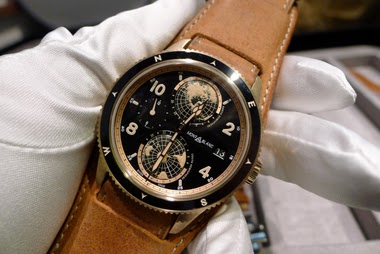
KMII introduces his unexpected acquisition of two Montblanc Reverso cufflinks from the UNICEF collection, marking his first 'Reverso' pieces. This post explores how Montblanc reinterprets the iconic reversible design, traditionally associated with its sister brand JLC, into a unique accessory that also supports a charitable cause.

22 collectors discussing this on the WatchProSite forumJoin the Conversation →
The Reverso is certainly one of the most recognisable lines of wrist watches and I cannot imagine many watch enthusiasts, who have never come across one. 

So I knew that there would be a Reverso or two at some point in my collecting and it turns out that it was both sooner than expected, different than anticipated and that I started with two at once. 


As many of you are aware (more here:  www.watchprosite.com  here:  www.watchprosite.com  and here:  www.watchprosite.com   ), Montblanc extended their co-operation with UNICEF last year, with the purpose of jointly battling illiteracy. This meant some new product lines, as well as that a certain share of the proceeds from the sale of any of those products were passed on to UNICEF for the mentioned purpose. 

As I find the goal highly worthwhile - and the products appealing - I decided to take the plunge and get my first Reverso pair from Montblanc. 

As Reverso is definitely more closely associated with Montblanc’s sister brand JLC, this may raise some eyebrows but all shall be revealed shortly. It seems like the DNA enrichment achieved by Jerome Lambert was deeper than anticipated. 

So here we go with my pair. The first picture showing the recto side of one and verso of the other. 

As can be seen, both are encased in stainless steel but reverse the typical Reverso size proportions, being possessed of a greater width than height. The dial - for lack of a better term - has the first character of the six most common scripts engraved on the one side, while the other one is a uniform glossy black. 


Anyone familiar with a Reverso will have no problem with the mechanism used for changing sides from recto to verso and vice versa. Exactly the same. 

On the other side the cufflinks are secured with cylindrical bars sporting the six sided glacier Montblanc logo at the ends. 


As far as I am concerned they will complement my Heritage Chronometrie Ultra Slim quite well adding a slightly playful element to its stark simplicity. 


Given first impressions I have to say I am more than happy with my two Reversos. The slick mechanism, the heritage and last but by no means least, the good cause behind it are all reasons for that. 

Which means more Reversos - and certainly also more conventional ones - will follow. 

Thanks for viewing!

Key Points from the Discussion

Advertisement
The Discussion
JR
jrwong23 (aka watchthebin)
Jan 13, 2018

I thought montblanc launched a Reverso watch from the subject line lol Congrats on your new Reverso cufflinks. Smart design from Montblanc Cheers Robin

KM
KMII
Jan 13, 2018

They were a bit unexpected for me, too

KM
KMII
Jan 13, 2018

Impressive mechanics for cufflinks 👌🏻👌🏻👌🏻

KM
KMII
Jan 13, 2018

Glad you like them, Robin!

CC
Cchris
Jan 14, 2018

...and nice cufflinks! I am considering them as well to complement a WT form the same brand and initiative. I tried these on a couple of time in the boutique, not feeling totally comfortable with them, once on they felt: -smaller than they are -too “one dimension” in terms of colour on the steel side (the same feeling I had with the JLC Geophisics WT despite the blue sea) -with the characters hard to see/read once on How do you feel about the above points? Plus can you tell us something more abo

KM
KMII
Jan 14, 2018

As tastes tend to differ, I can only give you my perspective. - Size: they Would be amongst the middle sized of my cufflinks. Not very prominent but also not minuscule. Obviously it will depend a lot on personal preference - Steel on steel: the contrast is slight but there, since the middle is brushed and the ‘lugs’ polished. Also the engraved letters present a contrast. Admittedly it is all rather subtle - Legibility: granted, with them on, it’s probably difficult for all but eagle eyed wearers

Advertisement

Continue the conversation

This thread is active on the Montblanc forum with 22 replies. Share your knowledge with fellow collectors.

Join the Discussion →