stevet
191

Lange Dual Time...
I very much like the complication that Lange has presented in the Lange Dual Time, albeit not unique to Lange as Peter has pointed out. However, I just thought I’d ask about what people think about the aesthetics of the dial layout.
I’ve collected a few photos from the other posts…forgive me, but I seemed to misplaced who should get credit for each photo. One is direct from Lange.
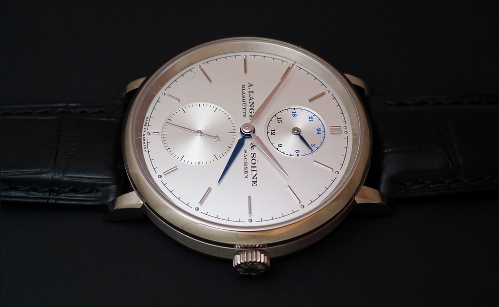
There seem to be 2 versions shown of the dial layout…check out the placement of the Lange logo on the following 2 photos.
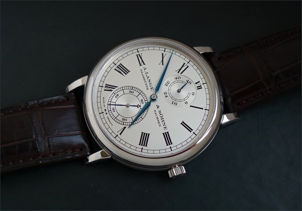
Personally, I prefer the second version…which reminds me of the lovely limited edition Langematik for Wempe (see 3rd photo below).
Just curious as to which version you think looks best? Having roman numerals on the dial certainly adds an element of interest that I find very appealing. The current version just seems a little bland. Gorgeous…but missing that Lange flare for the unusual.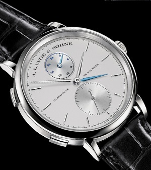
Lange Dual Time...

It is a nice addition to the range.
