MGMr
69

New 5396 >>>
with smaller lettering. The execution isn't exactly perfect but you get the idea.
As always your comments are welcome.
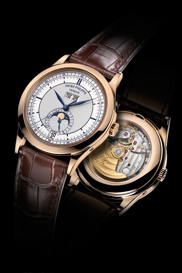
Mishko
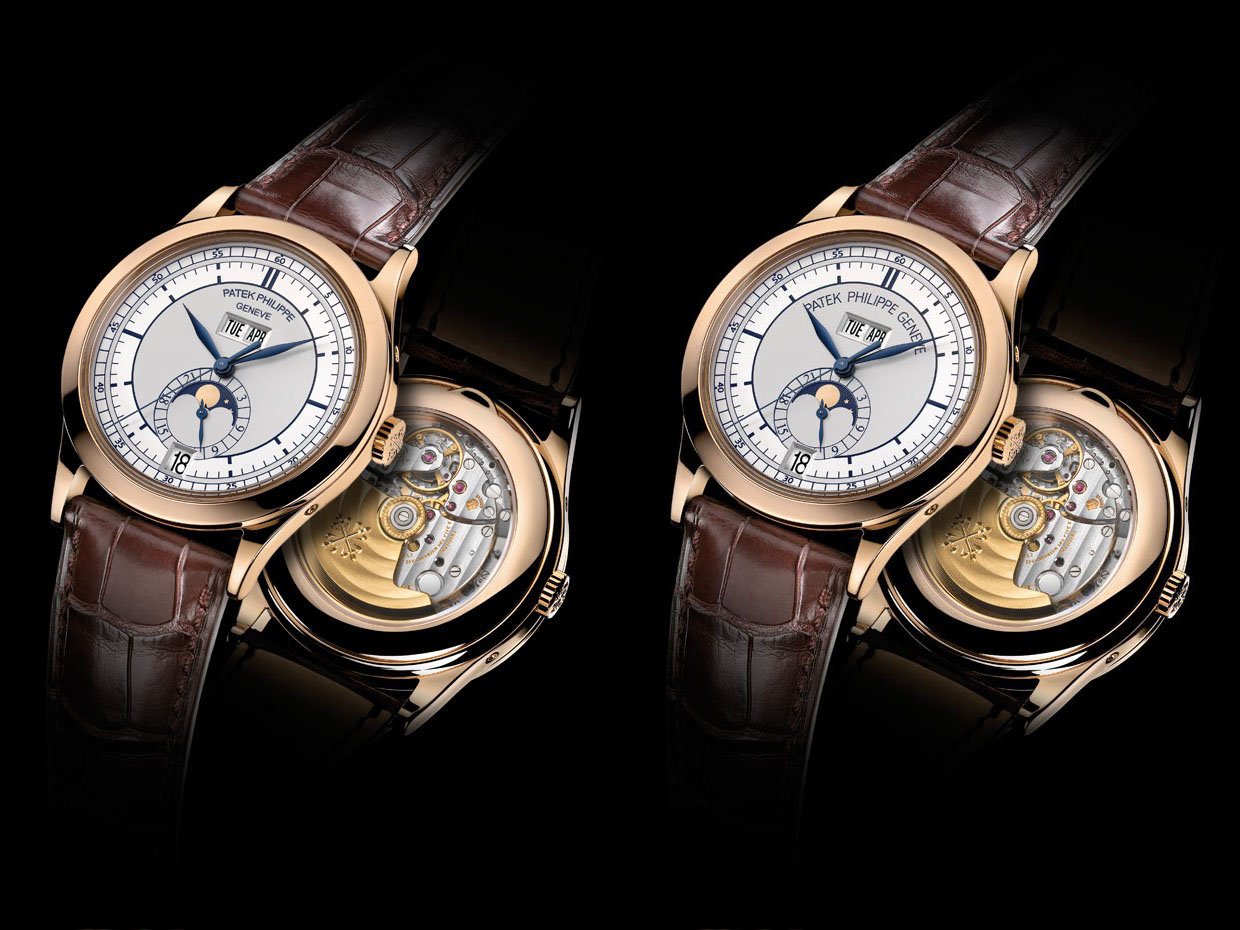
New 5396 >>>
with smaller lettering. The execution isn't exactly perfect but you get the idea. As always your comments are welcome. Mishko...
