Comments:


Huge congrats, Thomas!
Nothing to feel guilty about, quite the contrary, gotta feel proud!
Thank you for sharing and enjoy it to the fullest!
Alex
Thanks a lot, Alex!
You’re right – guilt has no place when it comes to our hobby and joy of life 🙏
Congrats!
I really like the idea of the new ring, and the increased protection of the winding crown, but I can't understand why they wanted to show the caliber, while on Le Mans models making an exposed caliber makes logical sense, because to bring the chronograph hours from 12 to 24 they had to radically change the caliber from 4131 to 4132. The previous reference 116506 also has a smaller case, inherited from the gold models of the mid-2000s, as well as having a much deeper blue dial. Have you ever noticed?

Thank you, alexxelor, for your kind words and your remarkably well-informed perspective.
Absolutely agree with you—especially on the logic behind exposing the movement in the Le Mans edition —it’s a mechanical statement, not just a visual one.
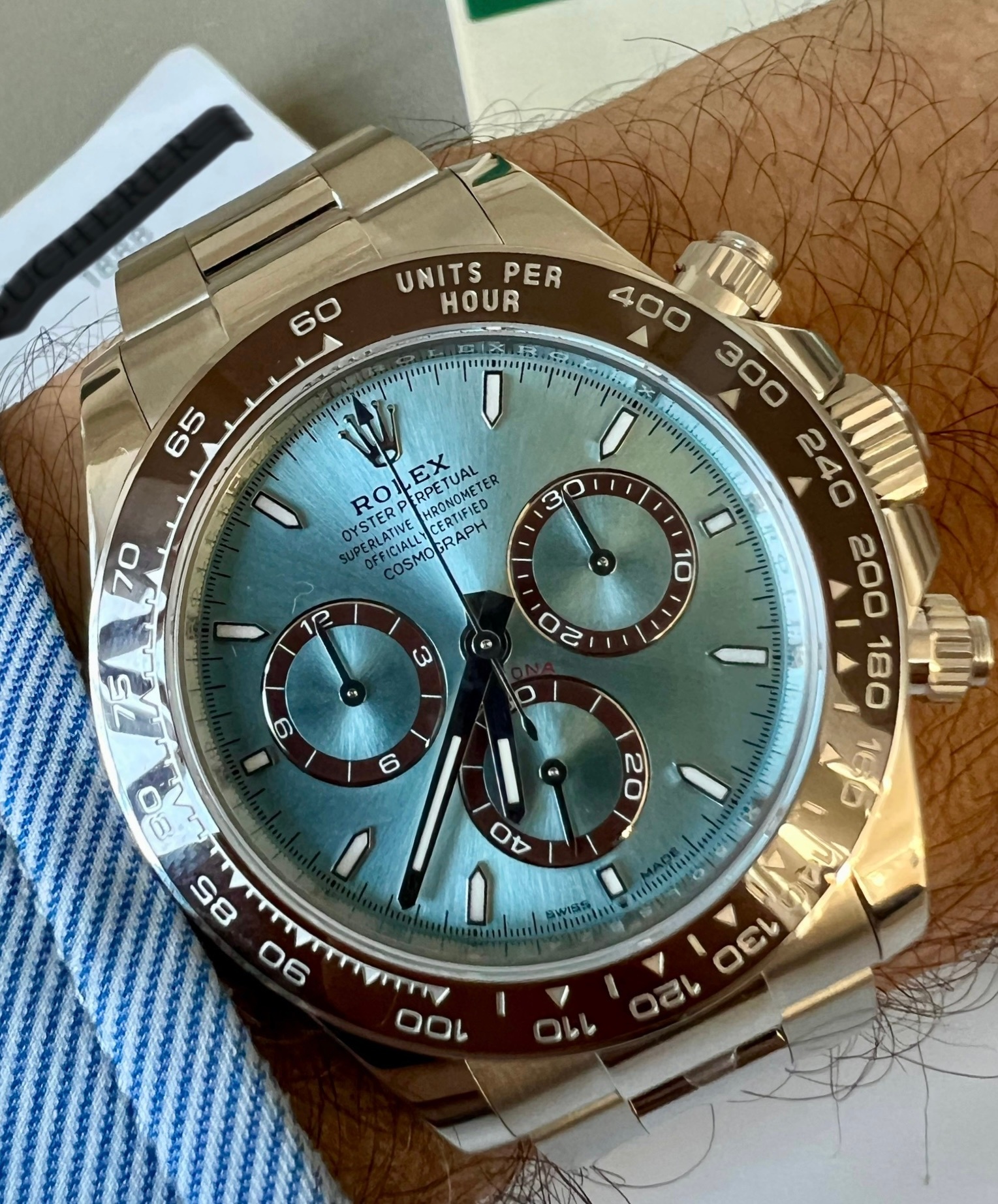
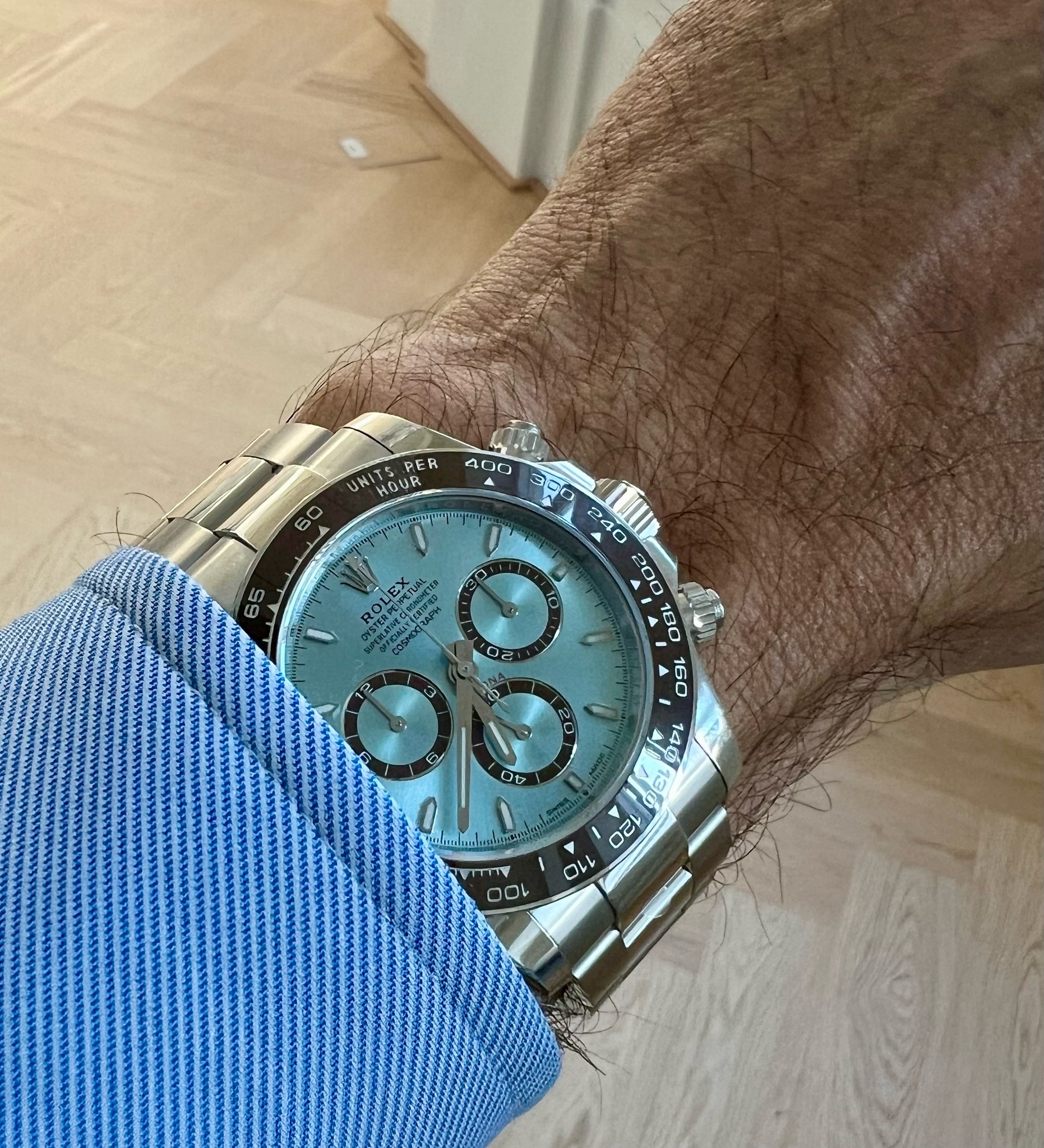
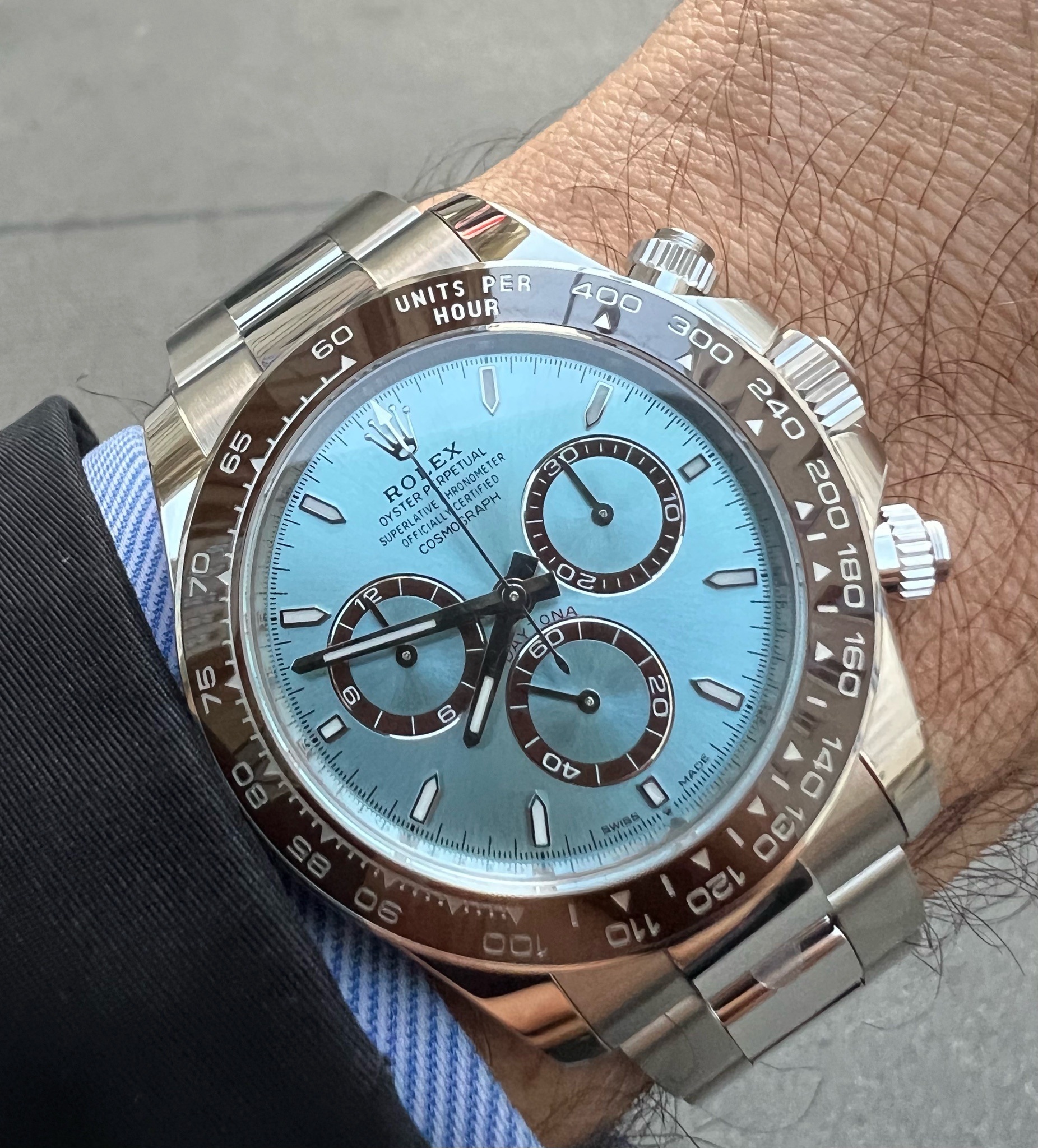
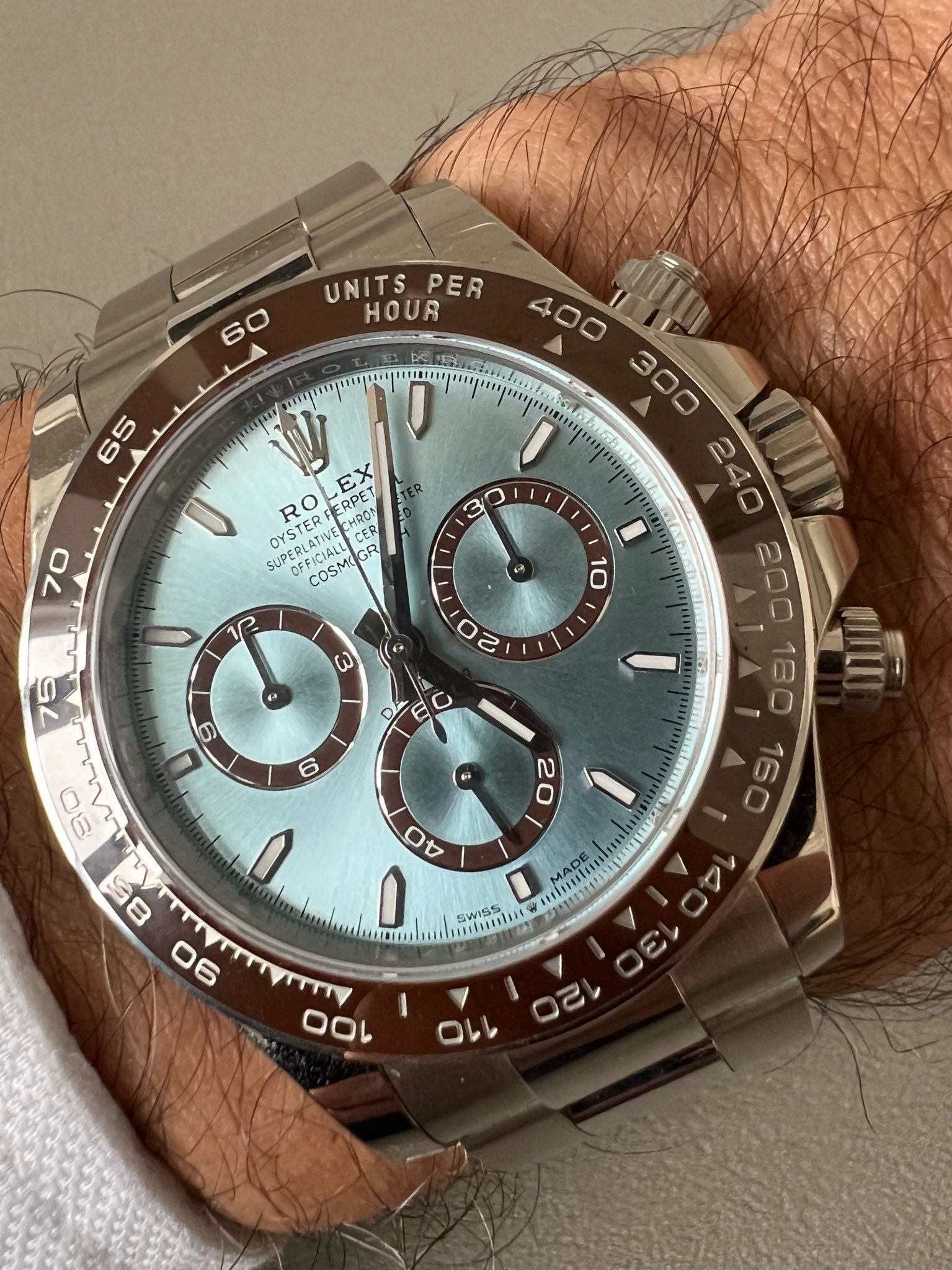
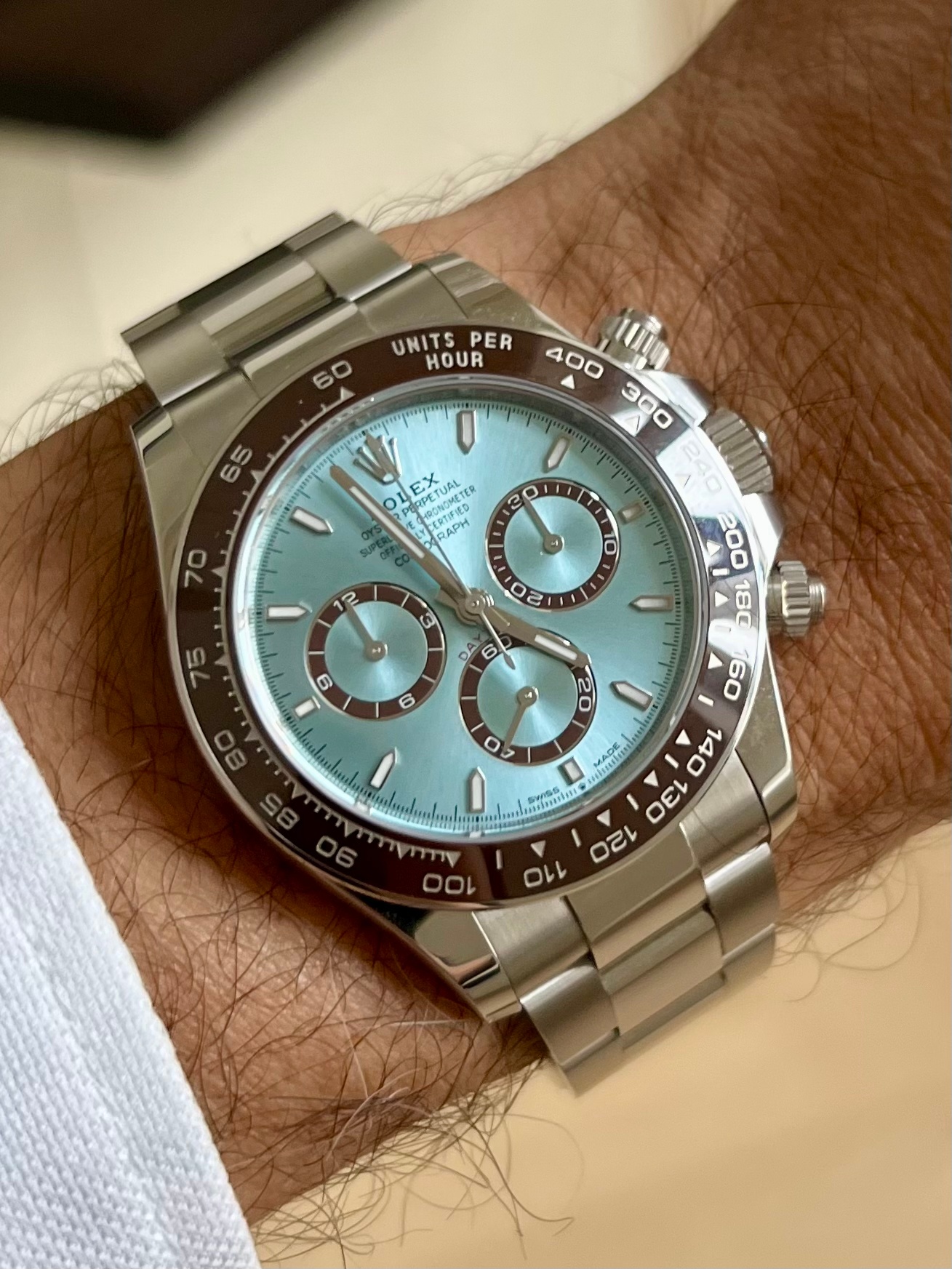
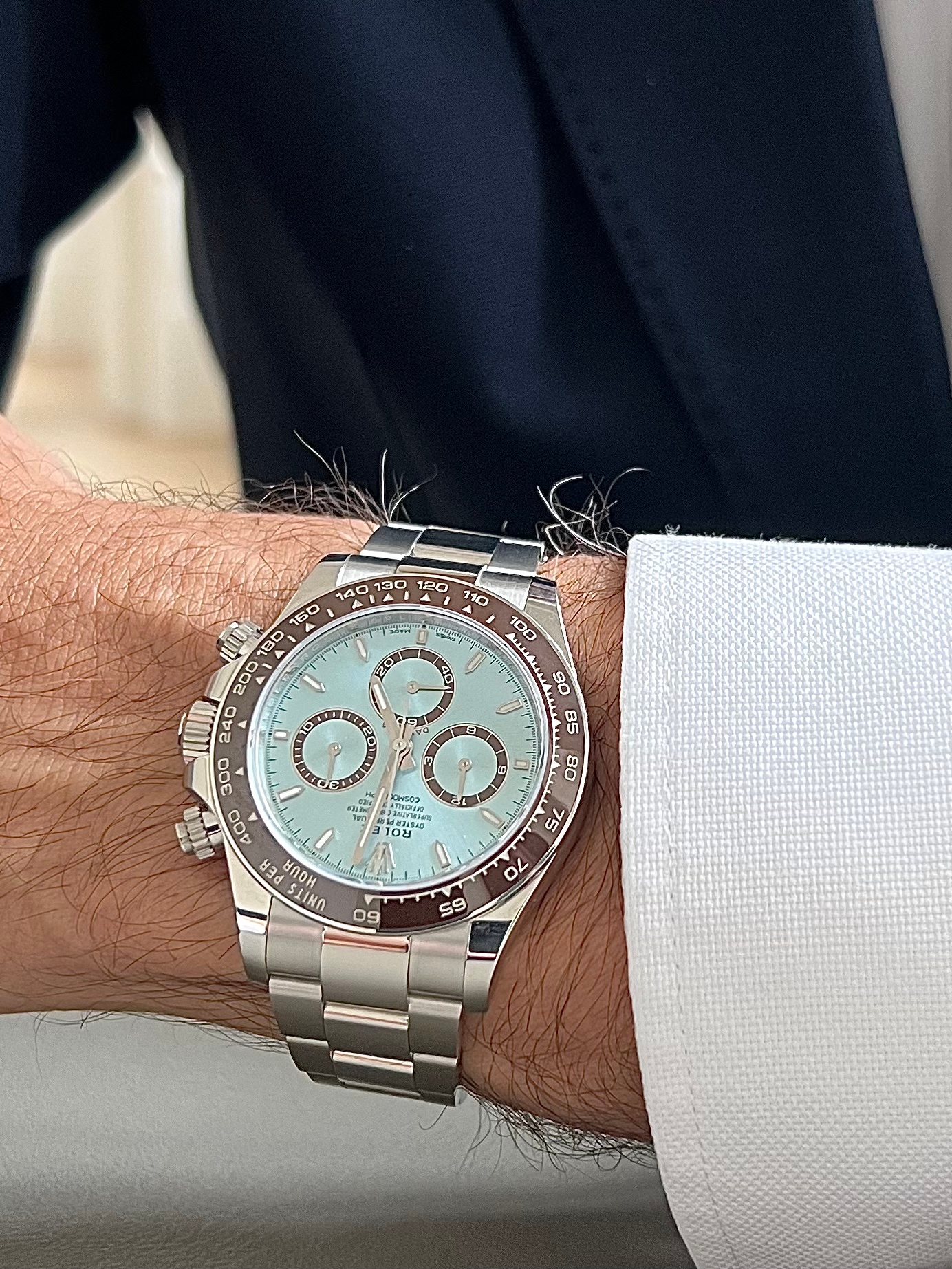
I now own the new 126506, and I’ll admit: at first, I also questioned the need for a sapphire caseback on a Daytona that didn’t need to show its caliber. But after wearing it for a few days, I’ve come to appreciate what Rolex is doing here. The 4131 isn’t revolutionary, but the finishing is noticeably more refined.
You’re absolutely right about the case. The 116506 has a solid, almost stoic silhouette and looks more like a sports tool.
The 126506 looks differently: the softened lugs, the reshaped crown guards… it‘s design is a little more contemporary and elegant for me.
Now the dial…
The 1165 seems to have a deeper, almost lacquered tone. As far as I can tell from Live Photos from the Internet and the few occasions where I could see the watch live.
But on the 1265, the interplay with the platinum and the bezel’s polished ring gives it more dimension. Sometimes lighter, sometimes cooler, but never flat. That‘s my personal impression.
Depending on the light in my apartment or at the street or at the lake, it shifts from cold ice to blue sky.
All the best
Thomas