
Review
Rogi shares his initial impressions of the Cartier Calibre de Cartier Diver Blue in two-tone, a piece that unexpectedly captured his attention. His detailed account, penned after just over a week of ownership, delves into the watch's aesthetic appeal, performance, and unique characteristics. Rogi's post offers valuable insights for collectors considering this versatile diver.
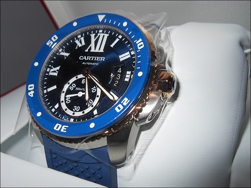
A recent and loved addition to the collection, the Calibre De Cartier Diver Blue in Two Tone. This is one of those pieces that wasn't going to enter the collection, but thanks to foversta's review and Cartier having come out with it during my birthday in June, I decided to go down to my AD and take a look, what harm could it do?
I have to say I was determined not to like the piece what I read about the different shades of blue not appealing to some friends and collectors a main feature that stuck out in my memory.
Gladly or Sadly, to me it was love at first sight. The Blue matches well, what I initially thought was going to be the Omega Seamaster 300M shade of blue turned out to be a dark navy blue, let's say Cartier's shade of blue 
The pink gold gives it great warmth and feeling to the piece, while I enjoyed having the opportunity to try the Stainless Steel the two tone with 18k Pink Gold stole my wrist

Unboxing it from the wrapping was by far a great experience.

It has lived up to and exceeded my expectations, a mix of everyday and dress up diver, for now I'll keep this short and maybe write a more detailed report later on but with comparing it to my usual atomic clock online (not sure if I am allowed to mention the name here) and an app I use to measure with as well, it keeps within -2/+2 seconds a day and as of today has lost a total of 7 seconds during the 8 days I have worn my piece.
Lume is good, it isn't a torchlight that blares throughout the night but it does give a good value of time spent in the sun vs. how long it will last through the night/in the dark. With a minimum amount of sun time (15 minutes) I've had the lume last 30 to 50 minutes in real world "dark" conditions. I had a day last week where I spent some time outside at the beach and it kept up through the night and well into the morning hours.
For those considering this piece a key element is to see it in person
The pros to this piece for me currently are:
Versatile Diver that looks great dressed up or dressed down
The in-house Cartier 1904 PS MC movement (finally, I felt so relieved that Cartier was moving in this direction and although some previous Cartier pieces used to have ETA movements (although modified) I couldn't justify the price differential at that time. This movement indeed Is something else and the rotor sound it makes when wearing is amazing a treat for the ears.)
The blue hue pairs well with the pink gold and adds that touch of flavour to the timepiece
Lume is long lasting with a good glow.
ISO 6425 certification is always a great thing to have for a Dive watch.
The blue synthetic spinel along with the Roman Numerals give Cartier fans an instant recognizable feature that this timepiece is Cartier.
Cons-
It doesn't photo very well and it is very hard to capture the right hue to the timepiece.
For now it only comes on two bracelet options, rubber or a rubber/leather combination.
I'm very curious to see if we'll be able to purchase the stainless steel or two tone bracelets as I'd love to have that two tone for my piece.
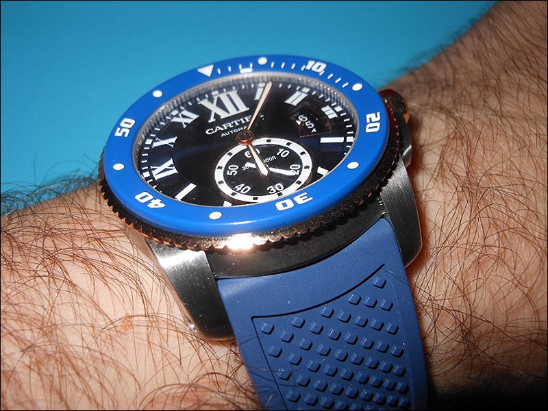
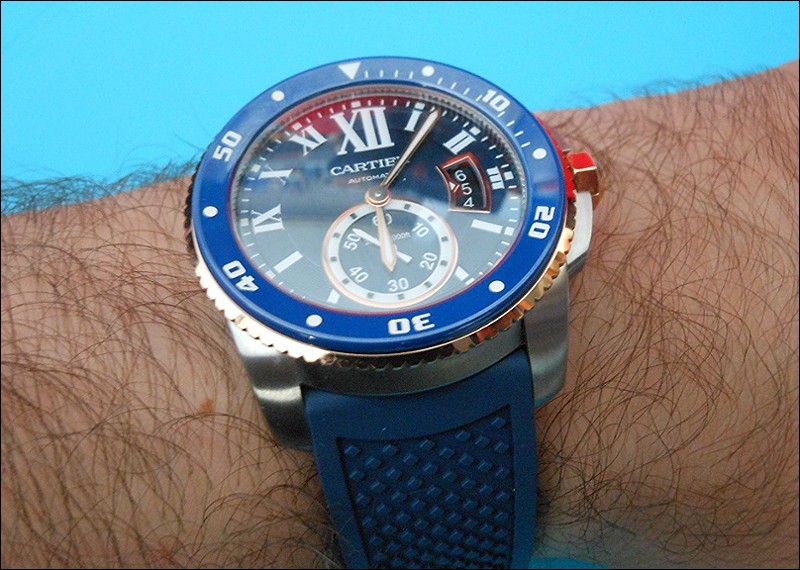
As an example and a good reason for more photos:
The bezel appears light blue here with a lot of sunlight

Same Conditions and less light:


Blue is definitely the colour of the day ;-) When I saw and read the FX review, the only thing which disturbed me with this watch was the blue cabochon. Of course, I know it is full part of the Cartier DNA but there is something wrong for a diving watch. In my mind, a diving watch must be efficient first and, if possible, nice. But, IMHO, there is a lack of "coherence" from Cartier between efficiency and luxury. What is your opinion about this (finally little) element? Best wishes Alkiro
The cabochon/spinel is one of those things that drew me to the piece, I guess it intrigued me at first and wasn't sure if I would like it. I think Cartier want to combine that luxury/utility into a dive watch and this was what they did with the Calibre De Cartier Diver lines the blue is in the DNA that's definatley why they keep it. In my opinion I love that detail, and changing the cabochon/spinel and not adding it is sacrilegious I'll give a good car example, when Jeep went from round to squar
It is always nice to discuss and debate about specific elements of a watch. Best wishes Alkiro
We all have different opinions and views on timepieces and what one loves another may not. Its just a pleasure to discuss in such excellent company as yourself and the rest of the forum, it makes collecting that much more special. Plus it fuels our addiction in adding more pieces which isn't that bad either hehe
I am always open to discuss and debate and, why not, change my opinion ) Best wishes Alkiro
This thread is active on the Cartier forum with 12 replies. Share your knowledge with fellow collectors.
Join the Discussion →
![Authentic [Unserviced - Value Price] Cartier Calibre de Cartier Diver W71000...](https://i.ebayimg.com/images/g/l6sAAeSwS1dqBOCq/s-l500.jpg)


