Reference Guide
Lavrentivs offers an exclusive look at a unique Patek Philippe Ref. 5070J-010, distinguished by its 'MSO' dial and brown coloration. This article provides a rare opportunity to examine a one-of-a-kind variant of a highly regarded chronograph, inviting collectors to consider the subtle yet significant differences from its serial production counterpart. Lavrentivs's hands-on review highlights the aesthetic choices that set this 'Michael Steven Ovitz' piece apart, sparking a lively debate among enthusiasts about its design merits.


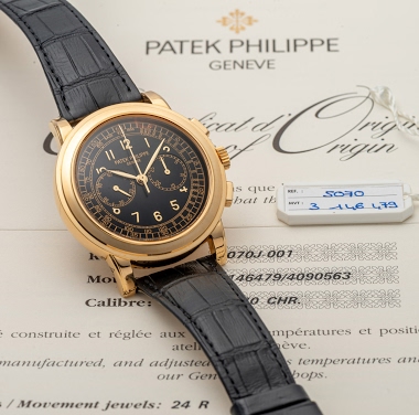
The Patek Philippe reference 5070, part of the Complications collection, marked a significant return for the brand to large-format chronographs. Introduced in 1998, it was the first non-perpetual calendar chronograph produced by Patek Philippe since the reference 1463, which ceased production in the early 1960s. Its design drew inspiration from a unique Patek Philippe aviator's watch from the 1940s, characterized by its prominent case and dial layout, yet reinterpreted for a contemporary audience. This reference established a new aesthetic direction for the brand's chronographs, moving towards more substantial case dimensions.
The watch features a 42mm case, initially offered in 18k yellow gold, housing the manual-winding Caliber CH 27-70. This movement, based on a Nouvelle Lémania ébauche, was extensively finished and modified by Patek Philippe, meeting the brand's stringent quality standards. It provides a power reserve of approximately 55 hours. The dial, in this specific configuration, is black, protected by a sapphire crystal, and the watch is water-resistant to 30 meters. The fixed bezel frames the dial, and the watch is typically fitted with a leather strap.
Reference 5070 appeals to collectors interested in modern Patek Philippe chronographs that combine traditional movement architecture with a more contemporary case size. Its limited production run and the subsequent introduction of variants in other precious metals contribute to its collectibility. The reference represents a distinct period in Patek Philippe's chronograph history, bridging vintage inspirations with a new era of larger watch designs.
I prefer without the cut numerals. Still a bomb of a ref either edition.
I really dislike lume directly applied onto dials. Because when the watch ages, the lume will degrade and flake off. Re-luming a dial is almost impossible for it to be done right. I advocate a sparse use of lume. And if lume is used, consider its use on an applied indice. The indice can withstand more re-luming and handling than the ultra-fragile dial itself. As for the design, I concur with Amanico, I definitely prefer the original more. The font and non-lume layout of the standard dial just lo
Although an all-original version with a brown dial might be interesting. I particularly dislike the dauphine hands which seem incongruous with the 5070 design. And the dots. I hate the dots
This thread is active on the Patek Philippe forum with 30 replies. Share your knowledge with fellow collectors.
Join the Discussion →