Collection
Baron - Mr Red explores the enigmatic allure of certain watch dials, likening their captivating quality to the 'Mona Lisa Smile.' This post delves into how light interaction and individual perception create a transient beauty in dials, particularly focusing on the Patek Philippe Ref. 5070P. It offers a philosophical perspective on horological aesthetics and the subtle artistry of dial finishing.
Leonardo da Vinci’s “Mona Lisa” is probably the most famous painting in the world. Most experts would say that, technically, it is not Leonardo’s finest work. Indeed, most experts would suggest that other artists have produced many works of a finer quality. Yet, if ever the Mona Lisa was put up for sale, it would almost certainly blast through prevailing world records. Further, if you asked art experts what they felt to be the world’s most famous painting, then almost certainly the Mona Lisa would feature prominently. And what has this got to do with horology?
Well, I would argue it is all about enigma. Mona Lisa’s smile. Scientists have attempted to understand why this specific painting has so captured the world’s imagination. And the answer is to do with that smile (dial). One minute Mona appears radiant and warm, the next minute she appears serious and sardonic. Scientists now claim to understand why her smile is so enigmatic. Her mood changes according to which signals our eyes receive first. The scientists believe Mona Lisa's smile depends on how the cells in our retinas receive the image and, crucially, what particular channel the image gets transmitted through to the brain.
“Sometimes one channel wins over the other, and you see the smile, sometimes others take over and you do not see the smile,” said Dr Luis Martinez Otero, a neuroscientist at Institute of Neuroscience in Alicante, Spain, who conducted the study. There almost seems to be a random element in how any specific individual interprets the painting. What science tells us is that different cells in the eye pick up different colours, backgrounds and foregrounds and contrasts. Certain types of image lend themselves more readily to varying interpretation. In other words, the enigmatic part of the Mona Lisa is a reflection of the fact that her “mood” appears transient.
Just like the dial on the 5070P!!
(Ok, Art…circuitous I know…..but the fact that Mona Lisa’s “smile” also rhymes with 5070P’s dial made it irresistible)
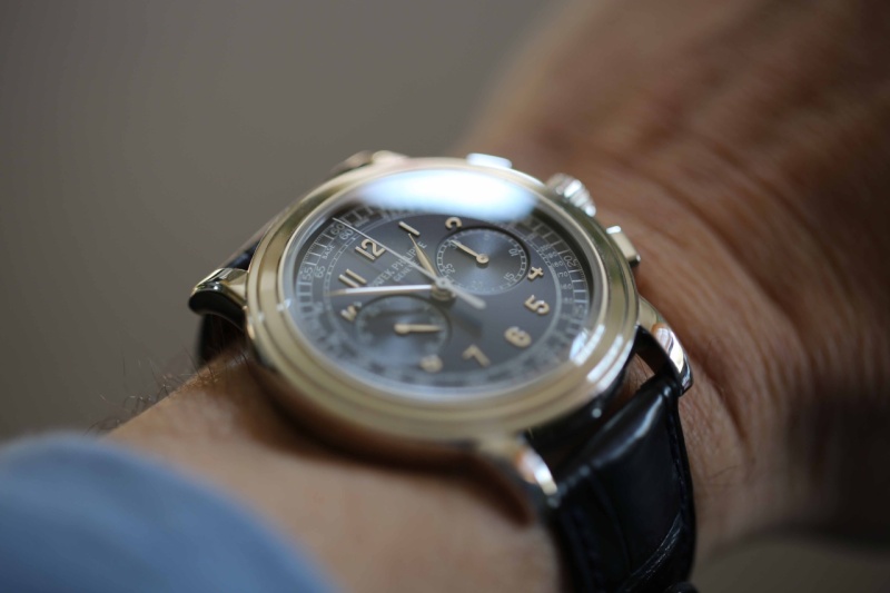
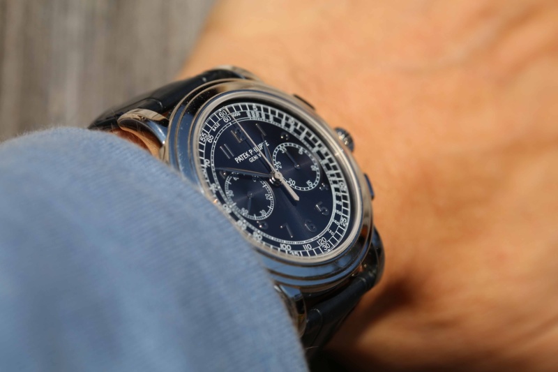
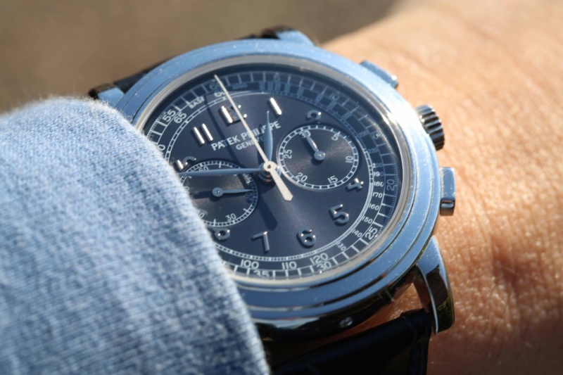
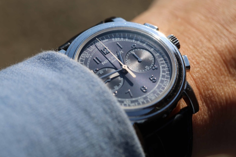
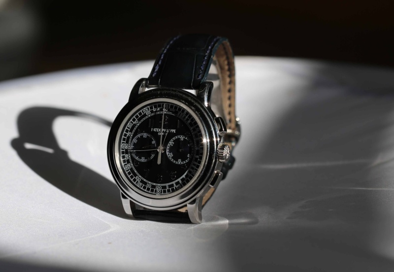
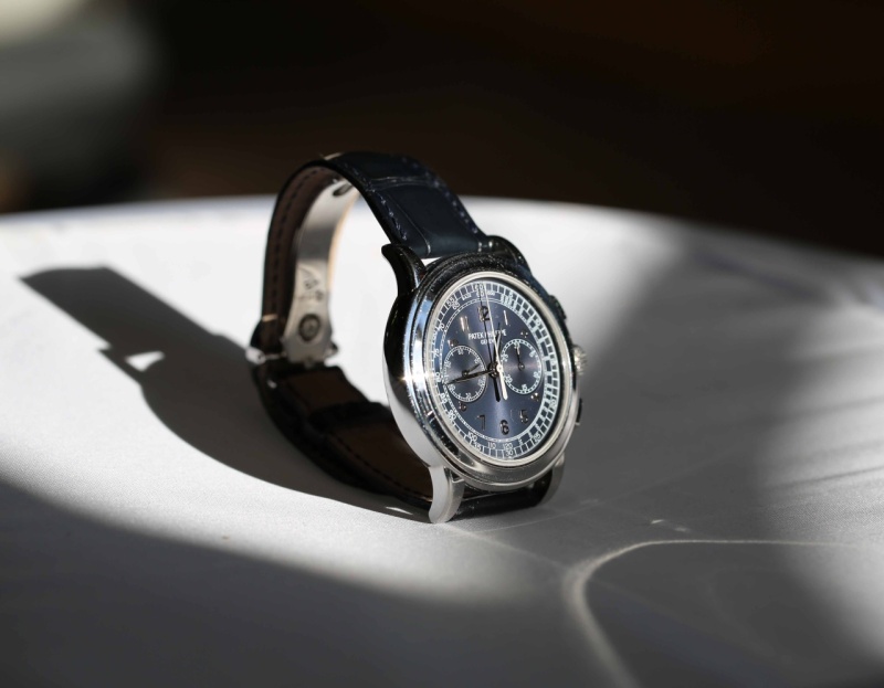
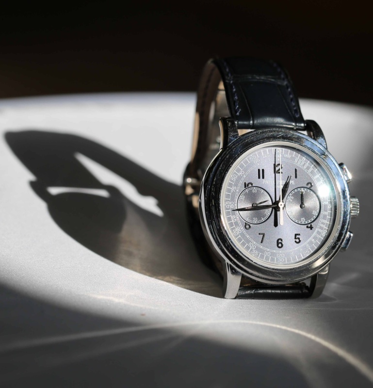
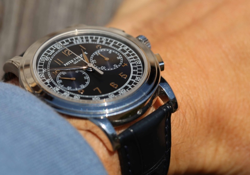
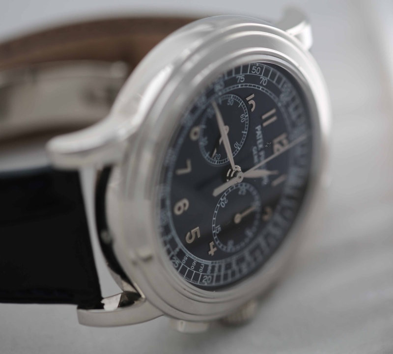
There have been a few posts on the 5070P in recent weeks and I certainly responded with a scan of my version. And I remarked to myself how badly I had captured the watch. In reality, most owners of the 5070P will know how impossible it is to capture the true enigmatic nature of the dial. I now know why. In reality, the dial is never one thing. Sometimes it catches this very dark, almost matt black persona. Other times it has this cheery and happy almost glossy blue appearance. Sometimes its numerals just leap out in a most distinct manner, and other times they are almost camouflaged. It is so hard to capture the personality well.
Well, with the sun out (and with my son home to help), I thought I would have a go at capturing some of the 5070P’s enigmatic personality. Apologies in advance for the fact that my watch case has more than a few scratches and blemishes. It gets a lot of time on…Also, I won’t use photoshop at all to alter the images.
Let's start with some customary wristshots.....


The Patek Philippe reference 5070, part of the Complications collection, marked a significant return for the brand to large-format chronographs. Introduced in 1998, it was the first non-perpetual calendar chronograph produced by Patek Philippe since the reference 1463, which ceased production in the early 1960s. Its design drew inspiration from a unique Patek Philippe aviator's watch from the 1940s, characterized by its prominent case and dial layout, yet reinterpreted for a contemporary audience. This reference established a new aesthetic direction for the brand's chronographs, moving towards more substantial case dimensions.
The watch features a 42mm case, initially offered in 18k yellow gold, housing the manual-winding Caliber CH 27-70. This movement, based on a Nouvelle Lémania ébauche, was extensively finished and modified by Patek Philippe, meeting the brand's stringent quality standards. It provides a power reserve of approximately 55 hours. The dial, in this specific configuration, is black, protected by a sapphire crystal, and the watch is water-resistant to 30 meters. The fixed bezel frames the dial, and the watch is typically fitted with a leather strap.
Reference 5070 appeals to collectors interested in modern Patek Philippe chronographs that combine traditional movement architecture with a more contemporary case size. Its limited production run and the subsequent introduction of variants in other precious metals contribute to its collectibility. The reference represents a distinct period in Patek Philippe's chronograph history, bridging vintage inspirations with a new era of larger watch designs.
It is true on the G , it is ven more true on the P. The finish of the dial doesn't work when the light is too strong. It will look harsh. A mild light will make it look better, IMO. I got the same conclusion when playing with a P for some hours. Here are my poor attempts: Best, and thanks for this nice post, Baron. Nicolas
your are like a magician! Yes, the 5070P has a very nice dial, I am not denying it, however, the beautiful contrast that one can observe and cherish with this dial can also be observed and cherished when it comes to other Brands, the Datograph and others like the VC Historique Chronograph for example, the very black shiny dial of some Girard Perregaux, I am sure there are few more. As for the Datograph, the brochure or the certificate of the watch says that the dial is black! More than once and
... in french they call it this "je ne sais quoi". Something you cannot put your finger on. Some call it magic or Voodoo :) , other call it charm. Some don't even know what to call it, but they express it with a smile on their face. I think you really caught this difference that makes Patek different. What you saw in the 5070P i saw it in 5070R, and it took me to other patek like 5960P and especially the 5270G that is a real devil hidden in monk cloth. Must to thank for some of the nicest pics o
Wonderfully put together For sure this reference will in future be pinnacle for PP aficionados Thank you for nice pictures Best Damjan
I like your modesty when blue is in question ;) Best D
Great post Baron and fantastic photos., totally agree with u this blue is nothing short of perfect ( if there is such a thing as perfect).. I will let the picture do all the talking! My favourite wrist shoot!
This thread is active on the Patek Philippe forum with 34 replies. Share your knowledge with fellow collectors.
Join the Discussion →


