Review
Mark in Paris delivers an insightful hands-on review of the Patek Philippe 5153R Calatrava, focusing on its rose gold iteration introduced in 2015. His detailed analysis delves into the case design, proportions, and the distinctive Officer's caseback, offering a nuanced perspective on this elegant dress watch. Mark's expertise helps readers appreciate the subtle yet significant elements that define the 5153R within the broader Calatrava collection.
Dear all,
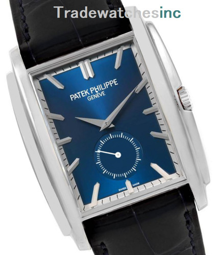
In 2015, a new version of the Patek Philippe 5153 was presented in a rose gold case. I didn't have the opportunity to make a review of this watch as I saw it late last year.
I think it is also nice to make a pause after the Baselworld 2016 novelties we discovered one month ago, and have a closer look at something different that we aren't used to seeing frequently. Don't worry, I'll continue to post some shots (after the new 5327R last week) during the next few weeks before I come to the hands-on reviews.
As it represents a very different Calatrava offer from the 5196 and 5227 current references or the 5127 (previous generations), and as this reference always had a very special flavor in terms of elegance, I think it is interesting to shed a little light on it. It is undoubtedly a very nice alternative in the world of simple Calatravas.
The model was already available in yellow gold (silvery dial) or white gold (silvery dial).


Yet, you perhaps have
noticed that the 5153G "Black dial" version has been discontinued
this year.

THE CASE
First, I'd like to say that I
particularly like seeing this R version. Though black dials are very popular,
the rose gold color from Patek Philippe is one of my favorite as it is not too
loaded in copper, thus the color remains lighter than most of the rose gold cases
I could handle in the past. It is hence a little more discreet and definitely
more refined that way. By the way, I often noticed that the work of a case
(curves etc...) is easier to observe, the details stand out better, on a
colored gold watch compared to a white metal one. These are two aspects of rose
gold that I appreciate a lot, especially from Patek.
This particular Calatrava reference is easily recognizable with its more poetic and rounder case enhanced by its Officer's caseback feature. This case makes an echo from the traditional pocket watches style and opening characteristic. The hinge is on the crown's side whereas on the newer 5227's it is placed on the opposite side of the case.
The 5153 is borrowing the case we find in other references as the 5159 for instance (both in 38mm) and lugs shape which is very elegant choice. As a three-hands watch, it is very refined although in a different interpretation from the pure style of the thinner 3-hands references? However, it gives rise to a more traditional style, following the beginning of 20th century's trend. This nice spirit is embodied in the case's shape but also its proportions thanks to a 9.7mm height versus 9.2mm for the 5227 which also provides a hunter-type caseback. I don't think that a thinner case of this shape would have left this impression as nicely.

To complete the picture, a detail I particularly love in this watch is the crown and its hinge display that serves as a "pedestal". It is a beautiful work and is one of the elements that distinguish the watch from any other model. This beautiful crown gives the final touch to a very homogeneous and well balanced design.

This hunter's
back cover is a lovely detail I always have a soft spot for as it reminds me of
older pocket watches but also because admiring a movement with the caseback
open is always a very unique moment. As I said before, while they bring poetry
and romanticism to a watch, they also can provide the beauty of a see-through
sapphire caseback together with an engraved plain model, if you wish
to.

THE DIAL
On the dial's side, it has hour applied markers only, without any kind of numerals. The dial is very legible that way and you'll notice also that these markers are perfectly matching with the Dauphine hands (antagonistic orientation).

Moreover, I find the minute dots (in the style of "Cabochons" nails) supporting the five-minute triangular markers very adequate. The fact they are on the rim side leaves a very clear dial in the middle.
In this reference, the silvery opaline dial reflects the warmth of rose gold and I must say this is something I like when dealing with colored gold watches. A combination that works perfectly together.

As you have noticed the center of the dial is decorated with a soft sunray hand-guilloché pattern (two kinds of rays) and a very nicely integrated Patek Philippe logo. I find the date window has a very proportionate size compared to the markers, it respects the visual five minutes sequence and its nice metal frame is a perfect addition to bring the same light reflecting aspect.
Finally, the date, perfectly integrated at 3 o'clock, gives the final touch to the dial with a refined frame (a decorating detail Patek masters very well as I mentioned in my 5227's review and when discussing about the 5960P lately).
THE MOVEMENT
It houses the 324 SC caliber (central sweep second) with the Spiromax balance spring made of Silinvar (Silicon-based). This is the very reliable automatically wound movement we already know about (45h power reserve, beating at 28.800 vph).

(legal mention:
the nail polish is not part of the complete set, sorry guys...)


It is equipped with a deploying buckle which is a very nice attention for a 3-hands Calatrava.
CONCLUSION
As I said, this reference is much more than a simple three-hands watch. It is a way to choose a simple and charming model in Patek Philippe's collection that I would put next to a 5124 Gondolo model. Yes, they are from two completely different worlds in terms of style but their uniqueness and strong character; the fact they are not the most obvious choice but how much they can bring to someone who knows how to understand and read it, makes them cousins. Like the Gondolo, its unique style and caseback are a kind of "complication" on its own (maybe not but you see the idea...).
It is priced at 31 400 € in France.
So, what do you think of this model? Not
the most consensual but certainly, to me, a very appealing and poetic model I
have a tender look at when I see it.
Cheers, Mark
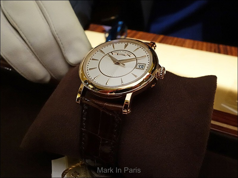
The Montblanc Calatrava reference 5124 is a notable example of the brand's dress watch offerings, characterized by its restrained design and classic proportions. This reference was produced during a period when Montblanc was expanding its horological presence, offering timepieces that emphasized traditional watchmaking aesthetics. It represents a more accessible entry point into the brand's mechanical watch collection, appealing to those seeking a refined and understated wristwatch without excessive complications.
Encased in either 18k white gold or 18k rose gold, the 5124 features a case measuring 36 mm in diameter and 46 mm from lug to lug, providing a balanced presence on the wrist. It is powered by the manual-wind caliber 25-21 REC PS, offering a power reserve of 44 hours. The watch is fitted with a sapphire crystal, ensuring clarity and scratch resistance, and has a water resistance rating of 30 meters, suitable for everyday wear.
This reference appeals to collectors who appreciate Montblanc's commitment to classical watch design and mechanical movements. Its availability in different precious metals and dial colors (silver or black) provides options for individual preference, while its lack of complications underscores its identity as a pure time-only dress watch. The 5124 fits within a lineage of watches that prioritize legibility and timeless style.
I have seen all variants of it except this RG version but I am sure it is a knock out for any modern classic watch fan! The black dialled is not to my liking, the white dialled in G and J are better but this one is beyond any competition in its league. As you mentioned it is a very poetic and romantic watch in a very sensible size. Next to the lovely 6000 RG it is maybe the best RG model on the market from Patek for little money, by Patek standards ! Thank you for the pictures of it. Best Moritz
The black dial versions are often my favorite ones, but I must say this reference is one of the few exceptions. I'm also a fan of the 6000 reference in RG or the G blue dial we discovered last year. Definitely Calatravas of the modern era I would consider seriously. Thanks Moritz Cheers, Mark
I have the white gold with white dial. I think the black dial might have been the way to go. I would love to see the black in the flesh and suspect it has the greater all around wear. What I like about the rose is the name plate is lighter as in the white dial as opposed to the yellow gold which has a dark yellow plate. I think the dark plate creates too much contrast on the dial and detracts from the center pattern. Although 38mm these watches wear on the small side which I like very much. The
and I must say that on the pictures it looks very nice (maybe you could share a little picture when you have time? I'd love to see it). The black dial looks as a more dressy watch and, even if it can be worn with everything, I wouldn't say it is the one suiting best the casual wear. I would prefer your WG version I think. Thanks for mentioning the YG details about the name plate. As I didn't see the J one either, it is interesting to know for people interested in such a move. I think the size is
I have a very soft spot for RG watches but as a full white metal/silver dial model, I must say this one is stunning. The style of this version I think helps making white metal even more exciting than other thinner and more classical references. Thanks for the nice picture Bob and I hope you enjoy it well Cheers, Mark
The 324 sc movement a great automatic. Gives accurate time. I guess with further innovations of Patek like the spiromax and silinvar even more accurate and durable. Thanks for the review Mark. Much appreciated. Cheers. Geross.
This thread is active on the Patek Philippe forum with 16 replies. Share your knowledge with fellow collectors.
Join the Discussion →