Patek Philippe Ref. 5170 Review
Review

Patek Philippe Ref. 5170 Review

By small-luxury-world · Nov 18, 2012 · 37 replies
small-luxury-world
WPS member · Patek Philippe forum
37 replies19319 views0 photos
f 𝕏 in 💬 🔗

Small-luxury-world provides a comprehensive review of the Patek Philippe Ref. 5170, questioning whether it is a new classic or already established. His detailed analysis, accompanied by personal photographs, delves into the watch's aesthetics, wearability, and the nuances of its in-house CH 29-535 PS movement. This post offers a critical perspective on the 5170's initial reception and its place within Patek Philippe's chronograph lineage.

37 collectors discussing this on the WatchProSite forumJoin the Conversation →
or already a classic?

The movement (CH 29-535 PS) was already introduced in 2009 ...


... and the watch itself in 2010. We can´t call it a classic after a few years only, can we?


For a better (common) understanding we have to look at the watch, in detail. Therefore I used the opportunity to handle the watch and to take pictures of two pieces, at a very kind Patek Philippe AD. It took me so long to see one and now I was lucky enough to see two - even better smile


My first impression, from "official" pictures only, was: Nice, but somehow cold and boring. That it was (and still is) only available in "old fashioned" yellow gold didn´t help.


First impression in the metal: Better, much better!

I was positively surprised about the solid weight of the watch - very balanced, not too heavy and not too light. Just perfect for a classical chronograph.


The readability is just fine and meets all my expectations if we talk about classical chronographs.

Sometimes the dial looks a bit cold, but it depends on the light and if you look closer it gets totally different.
It is far from beeing cold, it is outstanding - if we look in detail.


The watch and especially the dial is full of sublime details and a real feast for the eyes of a connoisseur.

But have a look on the pictures I took for you and tell me afterwards what you think about the grainy dial, the polished indexes, the undestated but sophisticated hands ...


The details of the case are very well known from any Patek Phillipp admirer. Nothing new in general, but a  lot of attention to the details and nothing is missing at the end.
E.g. the crown is slightly bigger than former ones, without being too big for the case or uncomfortable on the wrist and it is a pleasure to use.


The lugs and the pushers are well known and close to be perfect.


Is there anything I would improve on the case? Yes, it is slightly too shiny for my taste.

Easy to solve as it just has to be worn smile

The first scratch will hurt, even when it is a small one, but after some time it should look perfect when wearing frequently.
It definetly belongs on the wrist - frequently.


The movement was topic of several discussions before. Quite often there is a comparison between the CH 27-70, the CH 29-535 PS and the chronograph movements from A. Lange & Söhne.
Which one is superior or more beautiful? Well they all have slightly different approaches, but all of them are among the best you can get when you look for a manual winding chronograph.

The approach and some technical features of the CH 29-535 PS are described by Patek Philippe in the next two pictures:


Does it fit to the approach you ask for? Well, only you can give the answer!

Before we look at some movement pictures, I would like to talk about the chronograph pushers. Their feeling when you push them, to be exact.
Personally I prefer it smooth, very smooth. The pressure point and the smoothness is very important to me, if we talk about chronographs on that level and not all the manufacturers take care of it.

Only had the pleasure to try two examples and that is maybe not enough for a final judgement. One pusher was less smooth but you could feel the pressure point very well and one pusher was smooth like warm butter. It was the same feeling on both watches I tried. Why are they different? I don´t know at the moment.

Are other examples different? Please give us a note if you have your own experiences.


(Note: There was no tripod with me and the light was far from beeing perfect, but I tried my best.)

The layout of the movement is very classical and the finishing was what I would expect from Patek Philippe.
Almost perfect, but something like the CH R 27-525 PS is superior.
Nothing is wrong with that, because we talk about different approaches and totally different price tags.


You think you saw all the details the dial offers, above? No, there is more to show ... smile


As I didn´t take a proper picture from the side, I have to choose this official one - even when the colour looks wrong.

Very classic, well balanced and top notch I would say.


How does it feel on the wrist? On mine (17cm) it feels almost perfect. I would not mind if the watch would be a bit smaller,
but only a bit and at the end it is far from being a show stopper.

How does it look on my wrist? Well, have a look ...


Because of understatement and comfort below the sleeves of my shirts, I would go for a simple buckle.
The Calatrava Cross is nice and impressive, but just not me.


A classic, yes or no? It shows superb details from the Ref. 130, 530, 533 ... it comes with some good improvements and interesting innovations ... it is not a top-seller from the beginning (like the 5070 and some others) ... .

It will be great (one day, for sure smile ) in white metal ...


... and then it will be a classic, at the latest.

Hope you liked my personal views and I am looking forward to your experiences and comments.

Oliver

About the Patek Philippe Complications Ref. 130

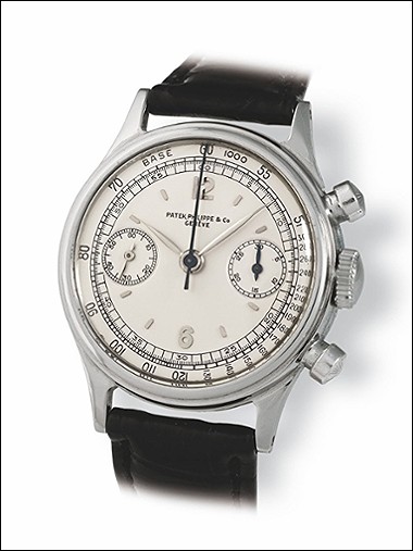
The Patek Philippe Reference 130 is a significant chronograph model, notable for its classic design and the various configurations in which it was produced. While many examples feature a standard chronograph layout, specific iterations, such as those with split-seconds functionality, represent a higher echelon of horological complexity within the reference. The model is recognized for its balanced proportions and the legibility of its dial, making it a favored choice among collectors seeking vintage Patek Philippe chronographs.

This particular example of the Reference 130 is distinguished by its yellow gold case, measuring 33mm in diameter. It houses a manual-winding movement, typical for chronographs of its era, and is fitted with a crystal, likely acrylic or sapphire depending on the specific production period and any subsequent servicing. The case construction and movement finishing adhere to Patek Philippe's high standards for precision and durability.

Collector interest in the Reference 130 is driven by its historical importance as an early chronograph from the brand and the rarity of certain dial and complication variations. The presence of unique characteristics, such as Breguet numerals, specific dial signatures, or the absence of a tachymeter scale, can significantly influence its appeal. The reference appeals to those who appreciate the foundational designs of Patek Philippe's chronograph lineage.

Specifications

Caliber
13'''
Case
Yellow gold
Diameter
33mm
Dial
Silver
Water Resist.
30m
Crystal
Sapphire

Key Points from the Discussion

Advertisement
The Discussion
AM
amanico
Nov 18, 2012
I saw three since it was released, and played with 2.

I am not convinced at all... The 2 subdials which are below the 3 and 9 o clock line, which, therefore, eat the minute indexes ring, the hands, the combo of colors ( that may change with the further versions, though ), the finish of the movement ( I much prefer the 5070, go figure why! ), the prifle of the case, the bezel.... All these details make me much prefer the 5070 to this 5170. For me, the 5070 has much more soul, at least. Very nice post, actually! Best, Nicolas

SE
serali
Nov 18, 2012
It won't change

Due to the caliber design, the position is very hard to change :(

SM
small-luxury-world
Nov 18, 2012
Thanks, Nicolas for your ...

reply. I see what you don´t like, but most of this is typical for PP if you look at the old ones. Can we blame PP for being PP ;-) It is the 5070 which is "uncommon" for a PP, isn´t it? Maybe that´s one of the reasons why you like it that much. Oliver

AM
amanico
Nov 18, 2012
Maybe it is the reason. BUT...

Look at the 5960 and the 5980... These are Chronos I love a lot, and these are modern Pateks! ;) Best, Nicolas

MA
Mark in Paris
Nov 18, 2012
Epic!

and really breath taking pictures. I thought it was a quick packshot but it is fantastic. I think, as I mentionned in my post some weeks ago, that we arrive to the same assessment: a great Patek Chronograph, so elegant, classic and desirable. Funny how I also have a little problem with Patek deployant buckle's round Calatrava clasp. Thanks for the beautiful picture that I'll carefully keep on my HD :p Cheers, Mark

SM
small-luxury-world
Nov 18, 2012
Mark, thanks for your kind reply ...

and I have the feeling that we are brothers in mind when it comes to watches - quite often :-) Oliver

Continue the conversation

This thread is active on the Patek Philippe forum with 37 replies. Share your knowledge with fellow collectors.

Join the Discussion →