Patek Philippe 5170G vs. 5170J Chronograph
Review

Patek Philippe 5170G vs. 5170J Chronograph

By foversta · Jul 7, 2013 · 31 replies
foversta
WPS member · Patek Philippe forum
31 replies25979 views7 photos
f 𝕏 in 💬 🔗

Foversta provides a detailed comparison of the Patek Philippe Ref. 5170G and its predecessor, the Ref. 5170J, highlighting the aesthetic evolution of Patek Philippe's in-house chronograph. This insightful review explores how a change in case material and dial design can dramatically transform a watch's character, from formal elegance to contemporary versatility.

31 collectors discussing this on the WatchProSite forumJoin the Conversation →
3 years after the release of the 5170J yellow gold chronograph, Patek Philippe took the opportunity of the 2013 Basel Fair to present its white gold reference. This new version is not just as a mere change of case material. It incorporates an aesthetic change that greatly influences its style when compared to the original version.

When the 5170J was unveiled in 2010, it created some surprises. Indeed, it contrasted sharply from the previous "simple" men's chronograph, the 5070, due to its size (39mm),  its strong "vintage" inspiration reinforced by Roman numerals and the yellow gold case. This big  aesthetic change was obviously an objective. After all, the 5170J was the first men's watch who used the new in-house chronograph movement, the CH 29-535 PS. It was therefore necessary that the transition between the movements based on the  New Lemania ebauche and the  manufacture movement was accompanied by this break which symbolizes the beginning of a new page in the history of Patek Philippe.

The 5170J features a yellow gold case, two Roman numerals and stick-shaped hour markers:


 The 5170G features Breguet numerals applied on each available area:


The 5170J is a very elegant chronograph, perfect in a formal context. The need to propose within the collection a more "casual" and versatile classic chronograph  has maybe emerged subsequently. This is in my opinion the main purpose of the 5170G.

If we forget its more discrete case color, the main changes brought by the white gold reference can be found on the dial. Its color changes from opaline-white, perfect with the yellow gold case to a brighter silvery-white. And more importantly, both Roman numerals and hour markers were replaced by applied Breguet numerals. This change literally transforms the watch.


While 5170J is clearly inspired by Patek Philippe chronographs of the past, the 5170G, despite a similar basis, falls much more in a contemporary approach. If both Roman numerals of the  5170J which define a vertical axis clearly stand out, the distribution of the  seven Breguet numerals of the 5170G along the scale of the chronograph creates a more homogeneous and balanced dial. The applied figures are very refined. Their shape is very elegant and reinforce the perceived quality of the dial.


Finally we are facing two almost opposite watches but that are consistent with their objectives and respective atmospheres. The choice between the two is not easy. I must admit that the discretion, the sober style, the balance and the contemporaneity of the  5170G are very attractive. The warmth and the elegance of the  5170J are also seducing. At the end, I have a slight preference for the latter because the layout of the dial and the pulsometric scale seem to my eyes more faithful to the "vintage" spirit. Maybe Patek Philippe could have used the opportunity of the aesthetic change of the 5170G dial to insert a tachymeter scale instead. This would have reinforced even more the differences between the two chronographs.


The 5170G obviously remains a superb chronograph which takes advantage of the strengths and assets of the original version: the movement diameter that corresponds to the case diameter, the pleasure to use it on a daily basis thanks to a nice winding experience and to the smooth pushers, the instantaneous jumping minutes hand of the chronograph, the 65 hours of power reserve and I will  not forget to mention the beautiful architecture of the CH 29-535 PS. The see-through caseback makes us enjoy the curves and the feeling of depth of the movement. I just regret that Patek Philippe has removed some difficulties and I would have liked to see some inward angles.


It is a real pleasure to wear this chronograph. Its moderate size and reasonable weight make it very comfortable. Its simplicity allows us to appreciate the beauty of the applied figures. I also love the dark color of the two hands dedicated to the chronograph function.

5170G on the wrist:


And the 5170J:


Even if it is a complete novelty, the 5170G has convinced me with its own identity which differs from the yellow gold version one. The use of Breguet figures and the change of case material put this classic chronograph in a more contemporary context and also makes it more versatile.

Pros:

+ the use of Breguet numerals
+ the sober and discreet style
+ the performances of the in-house movement
+ the comfort on the wrist

Cons:

- the shapes of the bridges were cleverly designed, avoiding some decoration difficulties

Thanks to the Patek Philippe team.

Fx

This message has been edited by foversta on 2013-07-07 13:53:52

About the Patek Philippe Ref. 5070

The Patek Philippe reference 5070, part of the Complications collection, marked a significant return for the brand to large-format chronographs. Introduced in 1998, it was the first non-perpetual calendar chronograph produced by Patek Philippe since the reference 1463, which ceased production in the early 1960s. Its design drew inspiration from a unique Patek Philippe aviator's watch from the 1940s, characterized by its prominent case and dial layout, yet reinterpreted for a contemporary audience. This reference established a new aesthetic direction for the brand's chronographs, moving towards more substantial case dimensions.

The watch features a 42mm case, initially offered in 18k yellow gold, housing the manual-winding Caliber CH 27-70. This movement, based on a Nouvelle Lémania ébauche, was extensively finished and modified by Patek Philippe, meeting the brand's stringent quality standards. It provides a power reserve of approximately 55 hours. The dial, in this specific configuration, is black, protected by a sapphire crystal, and the watch is water-resistant to 30 meters. The fixed bezel frames the dial, and the watch is typically fitted with a leather strap.

Reference 5070 appeals to collectors interested in modern Patek Philippe chronographs that combine traditional movement architecture with a more contemporary case size. Its limited production run and the subsequent introduction of variants in other precious metals contribute to its collectibility. The reference represents a distinct period in Patek Philippe's chronograph history, bridging vintage inspirations with a new era of larger watch designs.

Specifications

Caliber
Cal.CH 27-70
Case
18k yellow gold
Diameter
42mm
Dial
black
Water Resist.
30m
Crystal
Sapphire

Key Points from the Discussion

Advertisement
The Discussion
MO
moc
Jul 7, 2013
Beautiful report Fx,

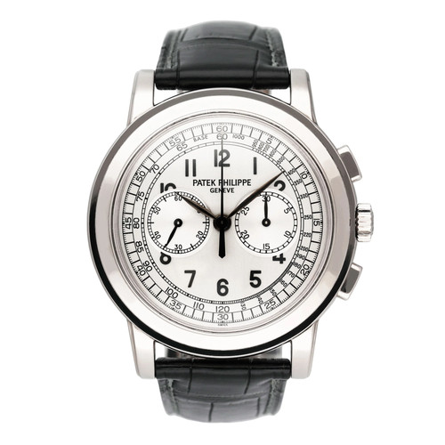
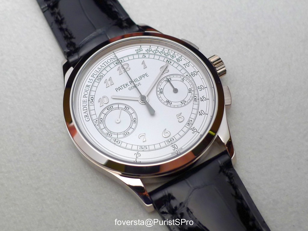
Whilst I like the J more for its elegant spirit,I must say that theG is very appealing too. Can we expect a 5170p with blue dial? Modern classics already. Mo

FO
foversta
Jul 10, 2013
Thanks Mo!

I tried to imagine a 5170P with a blue dial. I think that this combo works much better with the 5070... it will be difficult to do better! Fx

FL
flamenco
Jul 7, 2013
The breguet

Numerals are to die for. Still warming up to the 5170 as a whole ... The 5070 has a very special place in all of horology and is hard to replace. FX, in terms of refinement, how would u rate the movement vs the previous lemania ? Never been able to have this and the 5070 side by side. Thanks again for the great write up.

FO
foversta
Jul 10, 2013
As I said to Sandgroper...

The new movement brings a lot in terms of performance. But there was something very charming in the previous movement: the shape of the bridge, the layout of the movement... Fx

FR
Fricks
Jul 7, 2013
Nice report...

... What we don't really get is the difference of texture with the yellow. On pics feels like a "dead" white that doesn't change with different light situations. Good looking watch though

FO
foversta
Jul 10, 2013
Thanks for your comments Fricks.

Yes, the subtle differences of the dials are difficult to catch... Fx

Available on the marketplace

Continue the conversation

This thread is active on the Patek Philippe forum with 31 replies. Share your knowledge with fellow collectors.

Join the Discussion →