Dear Patek fellows,
Before being able to
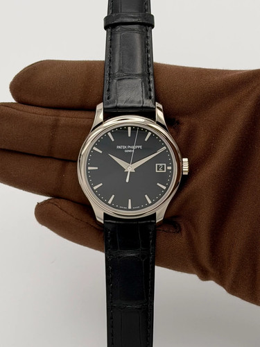
have a look at the new 5227G with black dial presented earlier this year
at Baselworld, I could try the
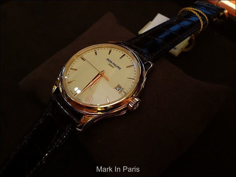
Patek Philippe 5227R
version. Let me tell you that it has been a memorable experience for
me.

As
you have certainly experienced, we often feel that we are not 100%
satisfied after a try and think we would make a mistake purchasing this
or that watch, even if we are a little excited. However, some other
times, you feel very excited at a point you think about it for several
days (or more) without finding any downside.
Well,
this is what the 5227R is doing to me.
The 5227 is a
classy and elegant Calatrava with a little modern
touch compared to the 5127 for instance. The main visible
evolutions compared to the previous model are the crown guards removal,
the grooves in the lugs, and the Officer's case back feature. These are
the most visible differences.
Each Calatrava
is a witness of its time and comprises specific aesthetical
elements. Hence, each new generation evolves and includes the
current style characteristics. The elements I listed in the previous
paragraph are the trademark of today when the lines are less made of
round movements only but add an opposition between curves, orientations
or concave and convex shapes.
THE
CASE AND HINGED CASEBACKThe case has grown
up from 37 to
39mm but, in spite of the
new
very thin "Savonette" caseback, the watch remains thin (9.2mm).
This is what I was afraid of, before holding it, as Officer's case back
usually brings an additional thickness which wouldn't have matched with
what I think a 3-hands Calatrava should
be.

Moreover,
the hinged caseback is
brushed and looks beautiful
that way. It won't get hairlines as much as a polished cover. I would
really like to emphasize the fact that, from the side (picture I didn't
take from that angle) the back cover looks 1mm thick, which is nothing
compared to more curved and deep ones I could see in the past. This is a
huge asset of such a feature in this 5227
reference.

Speaking
about the
hinge, it is a
different version
from the one we know for instance in the 5159 reference: the
hinge is placed on the crown side in the 5159 whereas
it is
placed on the opposite one in the 5227. Even if it is very
cleverly integrated in the 5159 as it brings charm to the watch and is
part of the case's decoration, the 5227's hinge is
very
discreetly integrated into the case and remains much less
visible from the side.
Now, the case number and stamps are engraved into the case and not in the inner side of the cover. This was made to leave the polished surface free from any mark.
Once you've opened the cover, the view is breathtaking: the reflection of the movement in the inner side of the cover brings a lot to this beautiful impression. The caliber is here the
324 SC which is equipped with the Silinvar spiral
"Spiromax" (better resistance than steel and amagnetic).

I
love this case. As I said above,
the lugs are grooved in a
very nice way. The grooves are something we see also (though
with a different shape) in the 5205 for instance. I find they bring
lightness and a little touch of modernity compared to very classical and
plain ones.
Furthermore, when looking at the front
side of the watch, the
lugs are very sensual, without
bringing feminity to the case, and are a model of beauty: on the
exterior side, the curve is pure perfection to me. Certainly one of my
favorite lug shape from the whole Calatrava
cases.

The
concave bezel goes the same way and, logically,
brings the same modern touch, keeping the elegance we want to find in
such a model. A concave bezel helps making the watch look less thinner
than with a rounded one.
The crown has the perfect
size to be manipulated with comfort and it is not too large either in
order not to unbalance the right side. As usual, the Calatrava cross is
still a very nice decoration element of the
crown.
 THE
DIAL SIDE
THE
DIAL SIDEThe
lacquered dial (12 layers) dial is something that
pleased me a lot when I discovered it. When dealing with light color
dials, we usually have only silvery or Opaline ones. I sometimes would
like to see warmer colors or material, hence the eggshell, crème or
ivory colors are something I like a lot in that
field.
Thus, the
ivory one we find
in the 5227R (and also the little different one we have in the G
version, though still crème-like color) is a wonderful choice to me.
This is one of the major elements which make this Calatrava stand out
and appeal that much to me.
The
Dauphine hands are perfect with this case as they
bring a little more dynamism and character compared to stick hands or
more classical leaf ones. Another detail I like very much is the fact the hour hand is very very close to the dial: that way, it doesn't look thick or heavy. It is really impressive as I'm not sure there is room to introduce the piece of paper.

Hands
design (as any other element in fact) can bring contrast, lightness or
presence to a watch. The choice should depend on what the watch is
already made of (bezel, subdials, printings etc....). Hence, simple or
straight hands (stick) or refined and classical ones (leaf) can suit
respectively modern or busier references. I think that on a Calatrava,
the Dauphine hands bring a little more character and strength (plus a
little 70's touch I like a lot).

The
applied markers and minute-dots complete this dial masterpiece. I like
this combination and prefer it to a "railway" printing as it is more
refined. The single marker at 12 o'clock is enhancing this
homogeneity.
You will notice here below that the applied markers are not flat but they have 2 levels or "steps". this is more difficult to make than flat or round ones. This is a question of going into details.

I'm usually not a fan of gold frames in
busy dials, especially when there are several registers. However, the
single gold frame added to the date register brings a
little luxurious touch I find perfect. It animates the dial in a very
nice manner. I wouldn't imagine the dial without
it. You'll notice that they are not "just a frame" but that the top side is also shaped with a little step. It would have been much easier not too but it looks pretier that way.

 CONCLUSION AND
THOUGHTS
CONCLUSION AND
THOUGHTSWell, as you certainly can feel
from my post, I fell in love with this reference. It has made the
Calatrava evolve in a splendid way, keeping what this iconic family must
bring.

I
was able to have a distant look at the new 5227G black dial unveiled
this year but couldn't hold it yet and see how I like it. I'll update my
thoughts when I can try it.
However, for someone who
is looking for an exciting but purer watch, which won't seem too
discreet because of a white metal, this version is one of the best as it
brings color and a very nice addition to your wearing outfit, whether
it is casual or a suit.
Elegance, refinement,
design... the Patek Philippe 5227 (and especially the rose gold version)
is a great reference for me and represents what makes Patek Philippe such a legendary watchmaker, even though it is not a complicated model. This shows that a watch doesn't have to be complicated to be a masterpiece.
This is usually the
kind of understated models we don't review that much but I wonder what
would be your thoughts about this recent reference of
Calatrava?
Cheers,
Mark
__________________________________
This message has been edited by Mark in Paris on 2015-11-08 09:46:52