Discussion
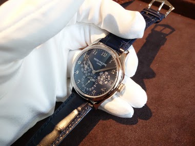
Descartes1 initiates a critical discussion on Patek Philippe's dial aesthetics, specifically addressing the placement and sizing of numerals between subdials on references like the 5270 and 5140. This post delves into a nuanced aspect of watch design that often sparks debate among collectors, questioning whether these design choices align with Patek Philippe's reputation for meticulous execution.


The Patek Philippe Reference 5140 is a perpetual calendar wristwatch, succeeding the highly regarded Reference 3940. It maintains the classic Patek Philippe perpetual calendar layout, featuring day, date, month, leap year, and moon phase indications. The 5140 was introduced with a slightly larger case diameter than its predecessor, reflecting contemporary preferences while retaining a traditional aesthetic. This reference was produced from 2006 to 2019.
This reference is powered by the ultra-thin self-winding Caliber 240 Q, known for its micro-rotor construction which allows for a slender case profile. The movement provides a power reserve of 48 hours. The watch is presented in 18k white gold, rose gold, or yellow gold cases, measuring 39 mm in diameter and 8.5 mm in thickness, and is fitted with a sapphire crystal. It offers water resistance to 30 meters. The bezel is concave and polished.
The 5140 appeals to collectors seeking a modern perpetual calendar with a direct lineage to Patek Philippe's established complications. Its production run saw various dial configurations, including opaline and silvery finishes. The watch is typically paired with a leather strap and a deployant clasp, consistent with Patek Philippe's classic offerings. It includes a 24-hour indication as part of its perpetual calendar display.
For the volume patek philippe sells and the strength of their market position i would expect to movements that are fully harmonious with the watch. in addition to these examples, i've harped on it many times but the lack of an appropriately sized movement in the 5196 is disappointing. FA
2,889 Patek Philippe listings are live on the eBay market and 1722 collector listings on the WatchProSite marketplace.
This thread is active on the Patek Philippe forum with 22 replies. Share your knowledge with fellow collectors.
Join the Discussion →