
Discussion
Patrickh initiates a discussion on the Patek Philippe 5320G, a perpetual calendar that blends vintage inspiration with modern design choices. His detailed observations highlight the watch's unique dial aesthetics, case construction, and overall wrist presence. Patrickh's post invites the community to weigh in on Patek Philippe's creative direction for this new reference.


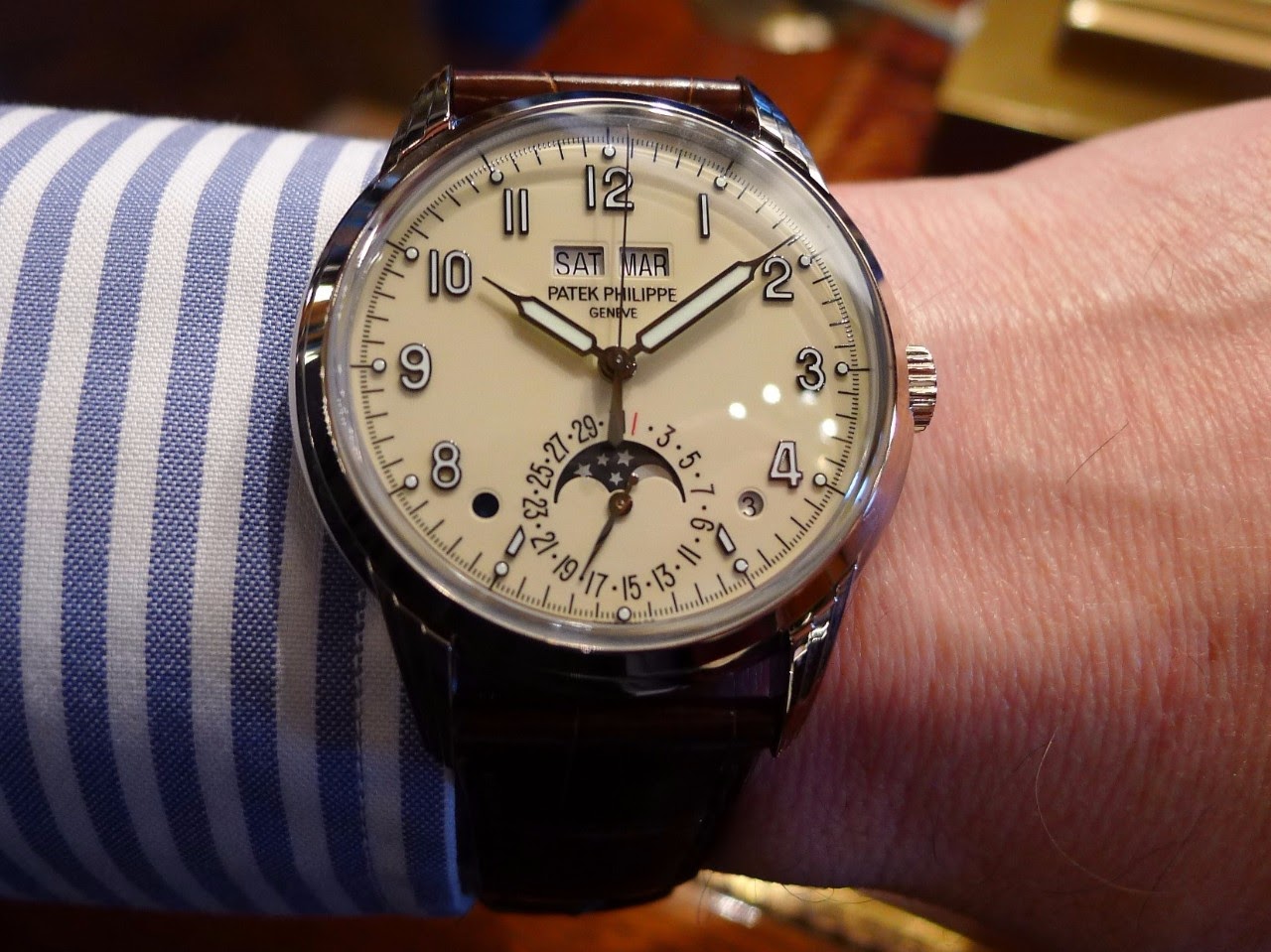

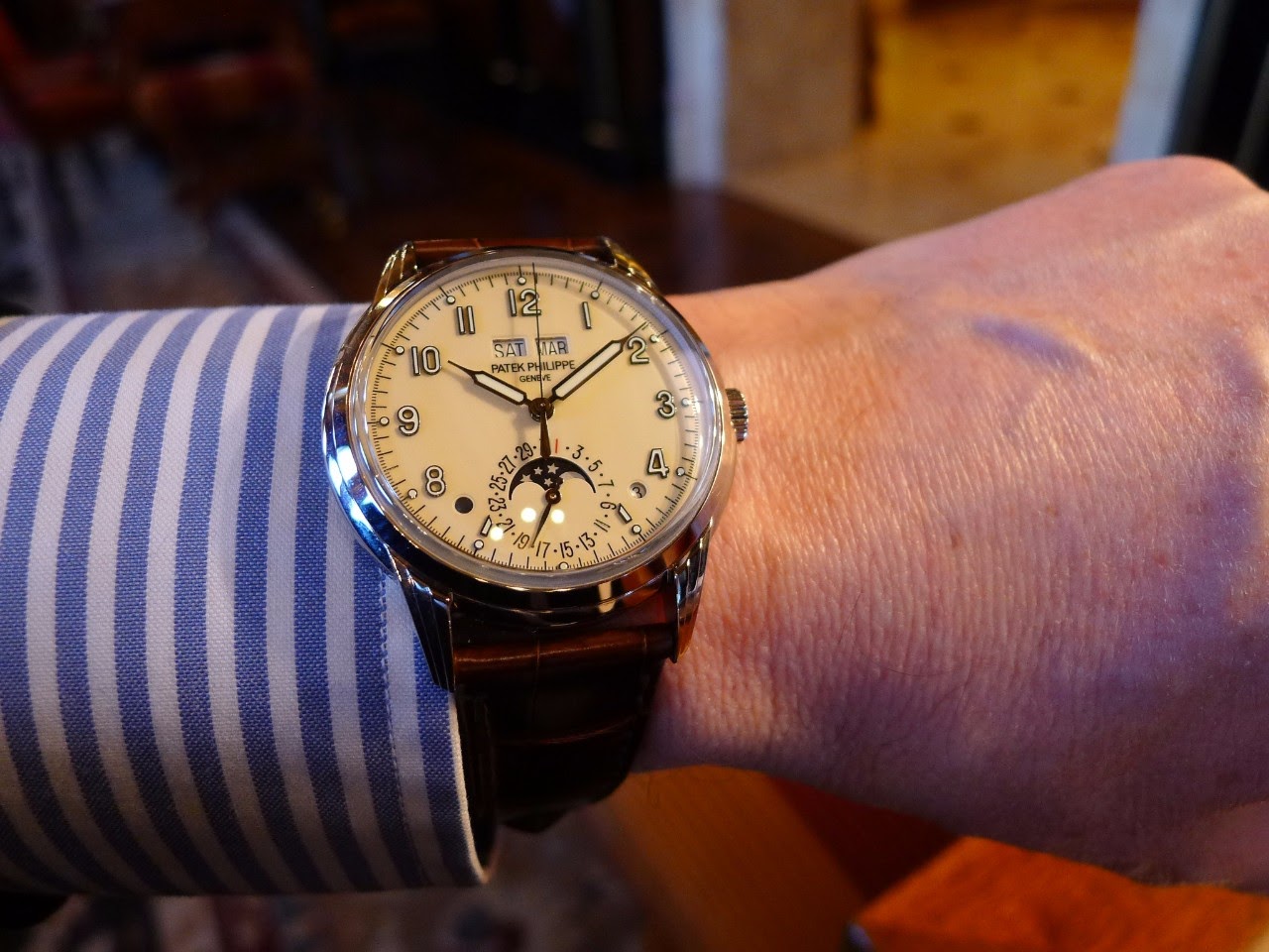
The Patek Philippe Reference 5320G is a perpetual calendar wristwatch distinguished by its vintage-inspired design elements, particularly the stepped lugs and the syringe-style hands. It represents a contemporary interpretation of classic Patek Philippe perpetual calendars, integrating historical aesthetic cues with modern watchmaking standards. This reference is notable for its clean dial layout and the harmonious integration of its various indications, appealing to collectors who appreciate traditional complications presented with a refined, understated elegance.
The watch features a white gold case, measuring 40mm in diameter and 11.13mm in thickness. It houses the self-winding caliber 324 S Q, visible through a sapphire crystal case back. The movement provides a power reserve of approximately 35-45 hours. The front crystal is made of sapphire, ensuring durability and clarity for the dial, which displays the perpetual calendar functions with precision and legibility.
This reference appeals to collectors seeking a sophisticated perpetual calendar with a distinct vintage character, yet executed with modern reliability. Its white gold construction offers a subtle alternative to more common yellow or rose gold perpetual calendars. The 5320G fits within Patek Philippe's grand complications lineup, offering a blend of technical mastery and design heritage that resonates with enthusiasts of classic horology.
I am just waiting for the platinum version - hopefully with grey or salmon dial. Best Kari
Regarding the Pt 5320 in the future: grey or blue dial for me. Salmon is very nice but I finally sold a VC Historique Chronograph in Pt with salmon dial as too boring with time. My 2 cents, Patrickh
I read more negative than positive.
Coloring seems to ruin the holistic look and feel of continuity. Perhaps one day Patek will make things right.
It shouts Sekonda more than Patek to me and it's such a good job we don't all like the same watches. I just couldn't live with a modern watch which is trying to be something different and those hands don't belong on a watch from 2017. For those that love it though I am very happy for you and hope it makes you happy. Wear and stare in good health. M.
Of course, can't really know till see in metal, but feels forced retro, especially the hands. And too large at 40mm. Patek seems fresh out of ideas.
This thread is active on the Patek Philippe forum with 71 replies. Share your knowledge with fellow collectors.
Join the Discussion →


