
Photography
GLau shares a unique experience from Art Basel Hong Kong, pairing a Patek Philippe 6000R with a Picasso painting. This post invites the community to identify the artwork and sparks a discussion about the aesthetic qualities of the limited edition 6000R, particularly its dial design and the elegance of its rose gold execution compared to other variants.


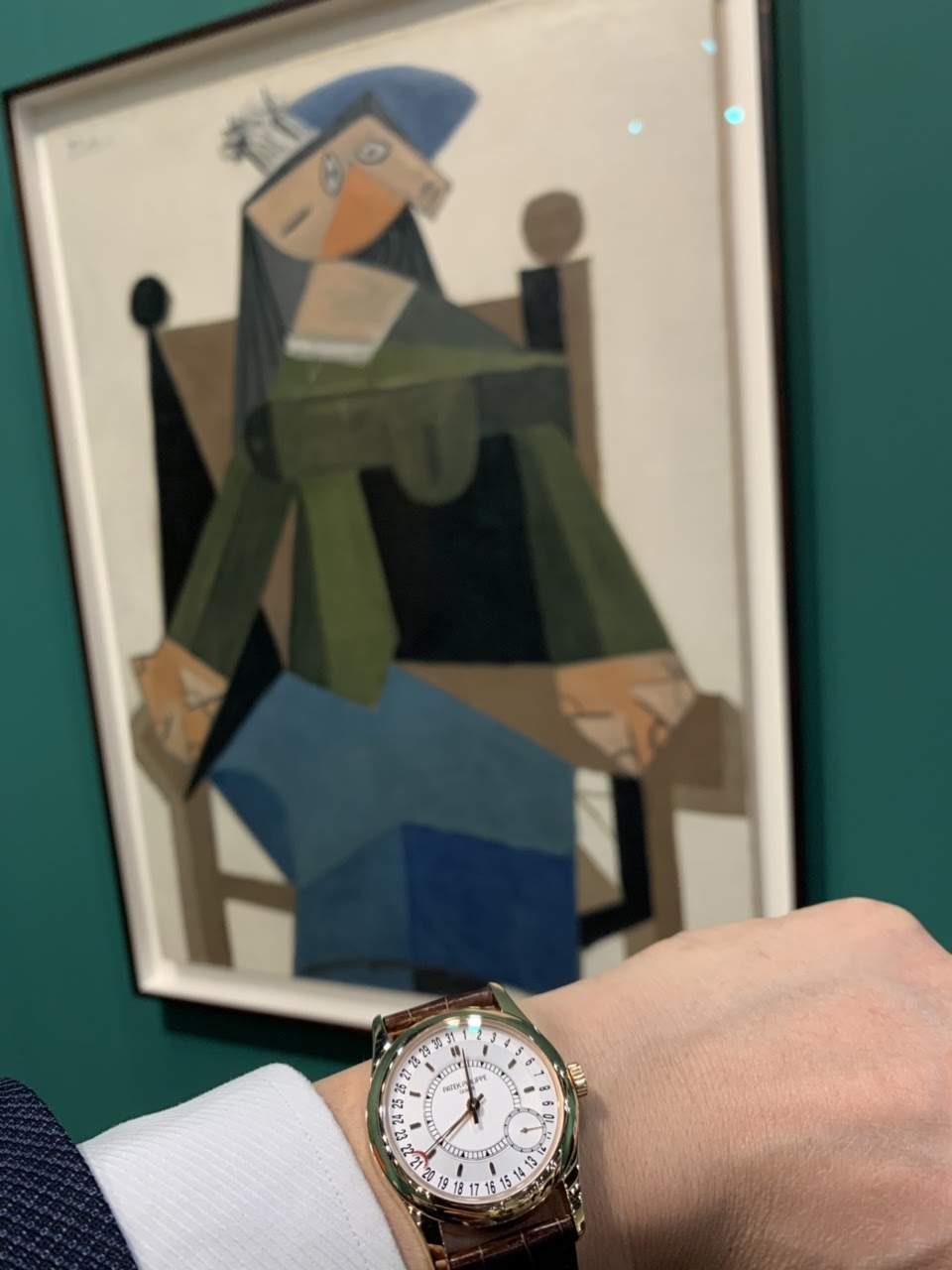

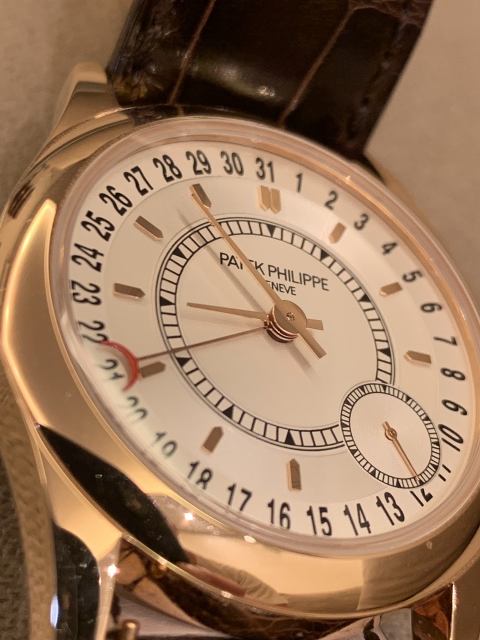


The Patek Philippe reference 6000 was introduced in 2005 as a distinctive Calatrava model. It features an off-center dial layout and a date indication around the periphery, setting it apart from more traditional Calatrava designs. This reference offered a contemporary interpretation of a classic dress watch, appealing to collectors seeking a Patek Philippe with a unique aesthetic while retaining the brand's horological standards.
This reference is housed in a 37 mm case, available in 18k white gold or 18k rose gold. It is fitted with a sapphire crystal and is water-resistant to 25 meters. The watch is powered by the self-winding caliber 240 PS C, which provides a power reserve of 48 hours. The movement is visible through a sapphire case back.
The 6000 series appeals to collectors interested in Patek Philippe's modern production that deviates from conventional layouts. Its design, with the off-center time display and pointer date, offers a different character compared to other Calatrava models. The reference was produced until 2009, making it a relatively short-lived model within the brand's catalog.
Not really a fan of the painting, but very much a fan of your Patek!! NickO
Special and attractive ! If it was the regular version, I would not have bought it.
...and it’s love at first sight 😍
on the red date indicator, I hope it’s the photo lighting and not the paint discoloring and fade?
scary question about the red “half moon” date inductor !! Immediately I went for the loupe and examined it under bright lighting !! Conclusion: it was a lighting effect only ! Now I can sleep. You have a sharp eye Raymond.
it has its own language in this version. I am on-off with the white gold version. I find it quite attractive, but quirky and quite un-Patek. This pink-gold version has more of the elegance that I admire with Pateks, while retaining its own special character. Much better than the Picasso (whoI love, but he's done much better than this painting).
This thread is active on the Patek Philippe forum with 30 replies. Share your knowledge with fellow collectors.
Join the Discussion →


