Reference Guide
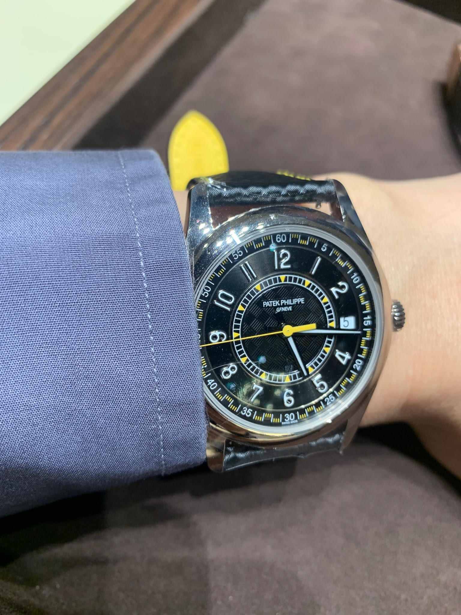
GLau's hands-on review of the Patek Philippe Ref. 6007G offers a vital perspective for collectors considering this contemporary reference. By sharing his experience trying on the watch and comparing it to the 6007A, GLau provides invaluable insights into its design nuances and wrist presence. His post sparks a broader discussion on the watch's aesthetic appeal and its place within Patek Philippe's modern offerings.


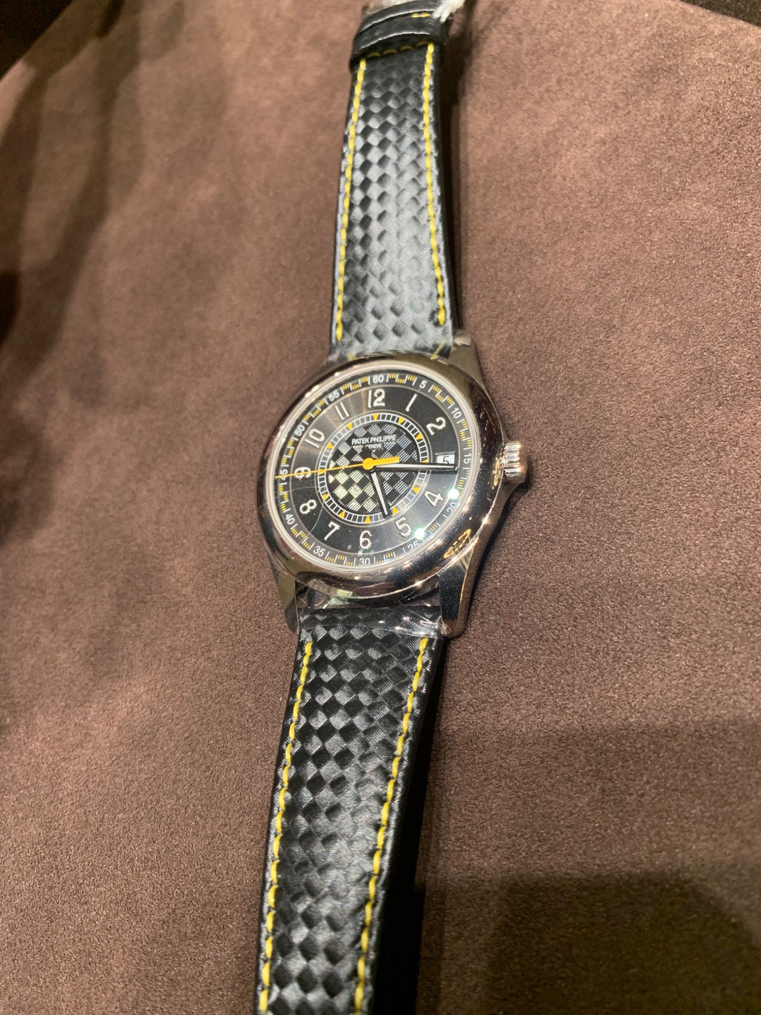
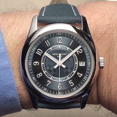
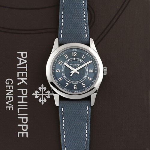
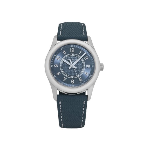
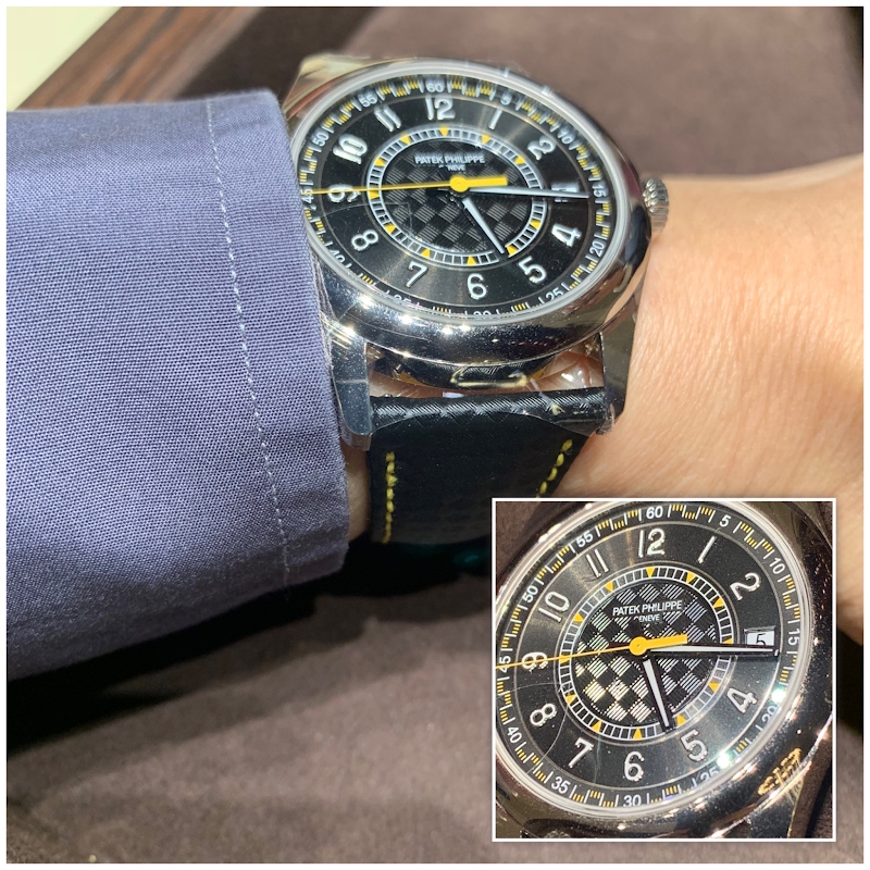
The Patek Philippe reference 6007 is a contemporary Calatrava model, distinguished by its unique aesthetic that diverges from the more traditional interpretations of the line. It was introduced as a limited edition to commemorate the inauguration of Patek Philippe's new manufacturing building in Plan-les-Ouates, Geneva. This reference showcases a sportier and more modern design language compared to its predecessors, appealing to collectors interested in Patek Philippe's evolving design philosophy within its classic collections. Its design elements, such as the dial texture and strap, set it apart within the Calatrava family.
The watch features a round case crafted from stainless steel, a material less common for Patek Philippe's Calatrava line, especially for commemorative editions. It houses an automatic movement, visible through a sapphire crystal case back. The dial is characterized by a distinctive texture, often described as a carbon-fiber pattern, and features applied Arabic numerals. The sapphire crystal protects the dial, ensuring clarity and durability.
This reference holds particular interest for collectors who appreciate commemorative pieces and those seeking a Calatrava with a contemporary edge. Its limited production run and specific celebratory context contribute to its collectibility. The 6007 represents a moment in Patek Philippe's history, marking a significant operational milestone while offering a fresh take on a foundational model.
no trigger to be pulled It was a display piece only :-(
Sometimes I feel that this watch only gets recognized because it has a famous name on the dial - if it didn't have a famous name on the dial, would we still like it as much? But then again, it's perfectly okay that I don't like every single watch. And it's perfectly okay that someone else buys something that they like. I just like to remind people that they should like it for the design - even if it didn't have this brand on the dial. Buy what you like - but be honest with oneself why you like i
there is nothing ground breaking about this release, and I actually don’t like the font of the numbers. I found myself comparing it to certain Omega Speedmasters, and those are easily more impressive in many respects, IMHO…but, they aren’t PP. Still, it’s important to stress that this just my opinion and therefore never intended to begrudge anyone. Comparisons aside, I do like the color ways and sporty nature of the release, which I’d go for if in steel, cheaper, and perhaps also without the num
I'm okay with the font of the numbers on this piece. But the whole dial just looks off putting to me. It's not beautiful. And the date isn't beautiful neither. The 6000G - another sporty automotive inspired piece - had a slightly similar font. I liked that watch - even though I'll admit - it was overly busy with all those date numbers written on the dial. Probably not beautiful in many people's eyes. But oddly, I liked that 6000G, I found it quirky. And almost nobody liked the 6000G, some said i
Me too prefer both the 6000G black dial and the 6006G over the 6007G…. Personally the date window and the larger size is what I like less… but I think the 6007A looks quite appealing but mostly as it is in steel and the color choice is the main draw. Great nevertheless that Patek adds flavors as different strokes for different folks is the song to go by…
This thread is active on the Patek Philippe forum with 24 replies. Share your knowledge with fellow collectors.
Join the Discussion →