Review
Mark in Paris shares his hands-on impressions from the Baselworld 2017 press presentation in Paris, offering a detailed review of Patek Philippe's novelties. His report goes beyond initial pictures, providing nuanced feedback on how these watches appear and feel in person, and highlighting unexpected favorites. This article is essential for collectors seeking in-depth analysis of Patek Philippe's 2017 releases, particularly the Aquanaut 5650G and Chronograph 5170P.


Hi everyone,
Finally, I could handle most of the novelties that were presented during Baselworld 2017 and make a first feedback to start with. It was already ready but with work and holidays I waited until now to post it.
As far as I’m concerned, I must say that it confirmed the positive opinion I had from some first pictures but also was very interested in some pieces I didn't expect to like: overall, it is a very good year and I really invite you to have a look at them if you can.
Here are just a few pictures to share with some of my first thoughts as I'll try to emphasize what is not that obvious on pictures.
_____
Well, I’ll start with a big surprise for me as I’m not really an Aquanaut guy. However, I was very surprised to see that the 5650G Advanced Research is maybe my favorite from the new collection. As simple as that.
I knew the colors would work very well (like they do on the 5168G) but the size, contrasts, overall design and even the open dial (that I didn’t really appreciate from the first pictures we could see) make the watch very attractive. I still remember when I approached the table reserved to the 5650's presentation: the nearer I walked toward the watch, the more I realized how nice it looked. The overall blue strap and darker dial together with the white gold color (very different from a greyer steel case) was fantastic, it remains discreet but no fade colors.
Furthermore, I had a detailed presentation from M. Philip Barat, head of the Patek Philippe Development department, about the new Spiromax spiral and the new pushers’ activation feature: they represent as very interesting, clever and significant evolution, much more than we would think, and they will have a significant influence in terms of innovation for the future. It is tradition and timekeeping in a smart and simple way that I’m sure will show a lead. Smart, simple and efficient as Patek did already in the design of the 29-535 caliber. I’ll develop that subject later.
To those who didn’t find it to their taste but who might have a chance to get one, I would just suggest to at least have a look at it.
_____
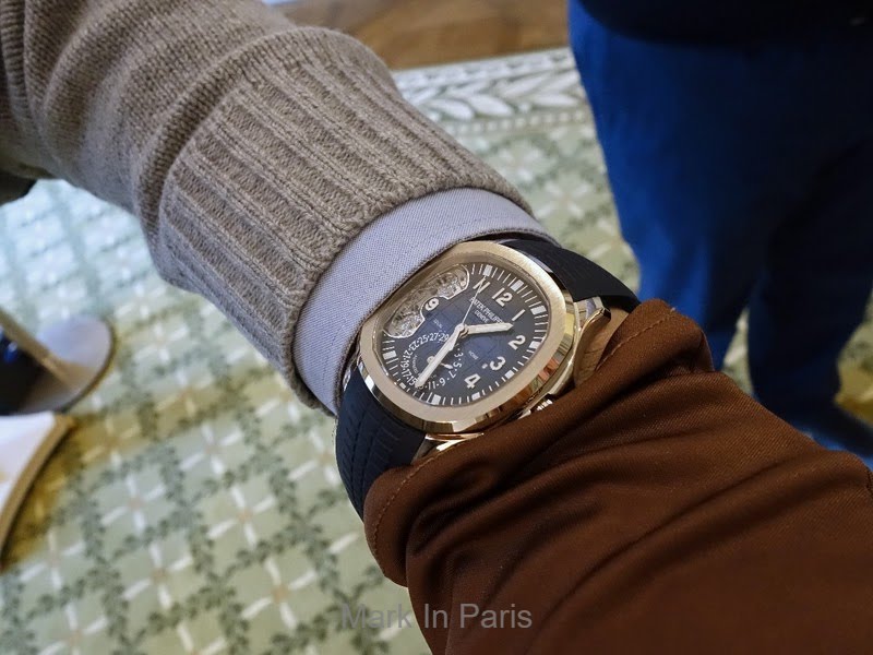
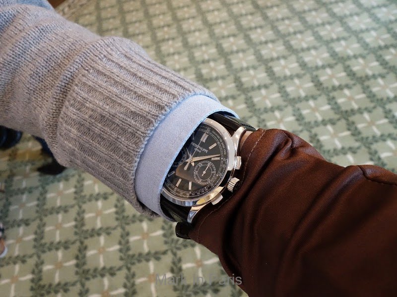
Next to the Aquanaut, I’ll add the gorgeous 5170P Chronograph. Everything is as discussed here: fantastic blue dial and combination with the printings and overall decoration. It is made with a lot of taste… especially with these markers. Indeed, they are very discreet (you can wear it outside easily, this was something I wanted to check) and they bring this touch of uniqueness and “fun” that makes it more interesting than “without” and that only you will know about. Not “I can do with them” but “it looks better with them”. I love it and it will bring a significant change in our taste in the next few years I’m sure.
What is positive with such a classical and traditional case is that you can bring a touch of audacity that can combine very nicely. A very clever and daring move from Patek that I think we'll fully recognize in the future.
_____
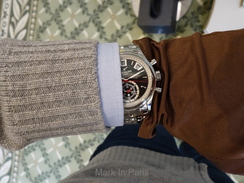
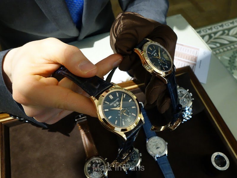
Another one I liked really much is the 5960G Chronograph and Annual Calendar. You know that I love the 5960P models but that they are a little too heavy considering what I like experiencing as an everyday wearer and thus I would have liked to have a gold version instead. In this context, I wanted to give the new G version a chance, even if the sportier dial layout (hands and typo especially) were very different from the very refined and elegant Platinum and rose gold versions that attracted me at first. I wasn’t very sure I would like it from the pictures as not enough “luxurious” (not for the “bling” side but more the kind of higher finished work style, the kind of light reflection that doesn't work the same on a gold watch and a sportier steel one) and too “normal” sporty maybe.
However, in the metal the watch is very nicely balanced and perfectly designed: my opinion is that it is the perfect casual elegant Patek, in a different direction from the Nautilus design that usually plays that role. It will be very successful imho, just like the 5168G. It is the watch that will push people who currently think that classical watches are too traditional (read “old school”, not young enough) and would not think about visiting Patek Philippe boutiques to consider very seriously exploring the collections, either with a casual wear or a business suit.
I must say I love it too.
_____
The 5960A black dial is nice too as the dial is a little matte and works perfectly with the bracelet if you like it. It is a good addition to the white dial version (for Nicolas, less depth indeed, even if the red hands bring a kind of “volume”, less racing-like as well). The white dial version is much more "expressive" and sportier while the black dial model is still a sporty watch but a little more on the "classic" side. I assume this is mainly due to the black color.
_____
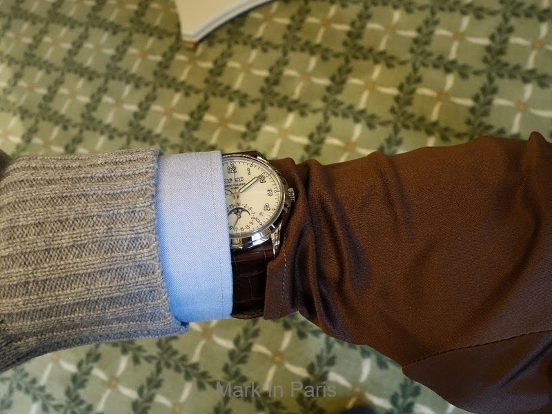
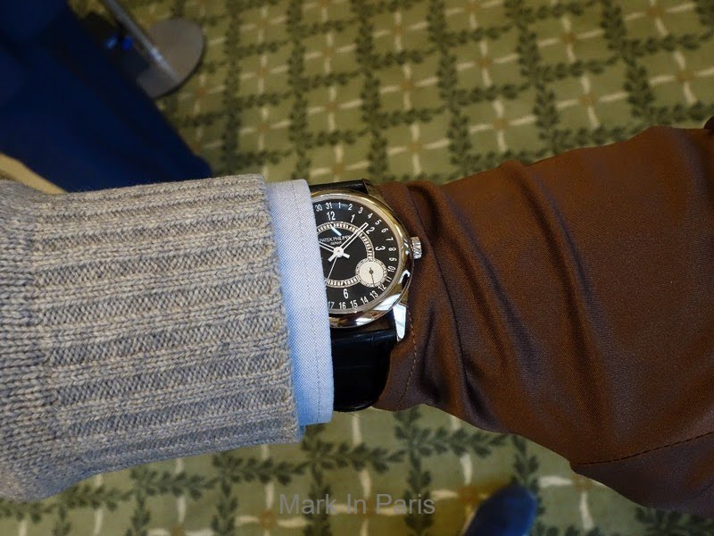
Then, I could try the new 5320G Perpetual Calendar that opens a new family of PCs in the collection, next to the more traditional 5327, with a different PC module (seen in the 5270).
It is not really a vintage-like watch but rather a modern watch which is inspired by Patek’s history. That's why it doesn't feel as if Patek wanted to make a vintage watch that looked made today, hence leaving an artifical, less natural impression. It is more a very distinct PC interpretation that an owner of a previous PC reference will add or that a younger client will enjoy more. It is something really cool, classical but that is not too traditional. It is the Patek spirit in the finishing and style but in a modern outfit. Thus, a modern piece that brings a contemporary intepretation of vintage ingredients.
The dial is “creamy” (not a yellow creamy that would make it look like vintage) but it has a lighter color. It is not the kind of balance that we find with traditional gold cases. The way the numerals are crafted (and especially the thin blackened glossy sides) make it very interesting and up-to-date regarding the dial construction. The glass is also something that brings a lot to its unique look compared to the flatter ones.
However, it will not be picked by everybody here on the forum, mainly because used to more traditional models. Nevertheless, the younger half of Patek’s clients as well as newer generations, or clients who don’t have a Patek yet, may find it very appealing and modern. On the short term, it will work or it will not. No real middle position. I think that on a longer run, people who won’t like it may also change their mind in the future. This is not the easy one at the beginning but might show all its potential when we evolve. A question of generation but also the need to give it some time to accept for many older fans, used to more traditional designs. We’ll see.
I tried to show how it could look on the wrist, from a longer distance, in a further overall picture (I would change the strap personally but with black it would look really cool for my taste):
_____
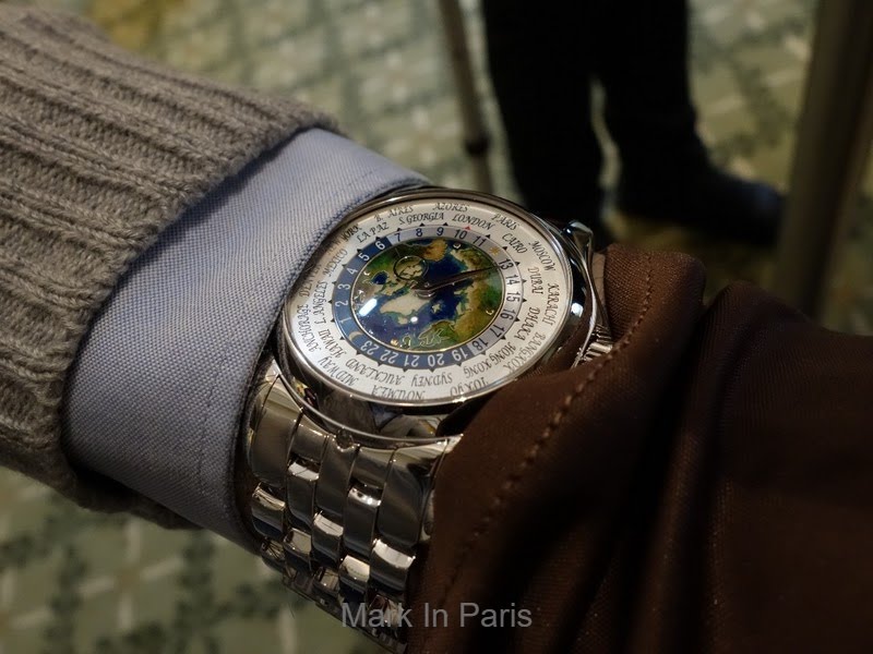
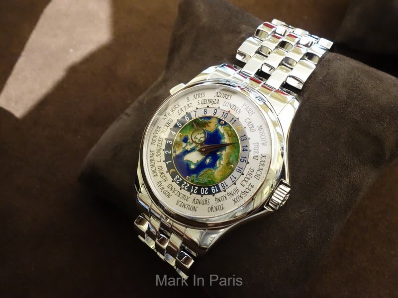
The 5131P World Time with enamel dial is just unique. I would like to especially emphasize the work of coloring and how detailed it is compared to the method used. The colder colors compared to previous versions match perfectly the Pt whiter tone and the location that is represented on the dial. Truly, it is absolutely superb.
The watch is heavy (like the 5711P) but very comfortable as it sits very well on the wrist as the caseback and bracelet are smoothly designed. As usual, comfort is something I appreciate a lot about Patek and is something that should always be a concern for a brand.
_____
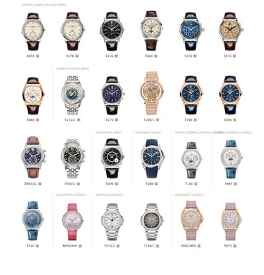
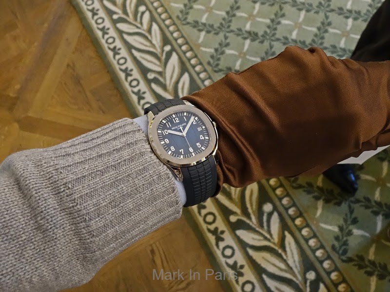
The 5168G Aquanaut is another very appealing novelty. I thought the color combination (strap and dial blue tone and white gold) would look great and this was totally confirmed in the metal. From my point of view, I feel that white gold works better with the blue dial than a steel material would have and, as I said in the 5164R review, the material matches very well the way a lot of clients use these “sporty” models today. The heft and the hue of white gold are other pleasures people have wearing a gold case.
The 42mm case, aside from being the right offer for bigger wrists and areas where the standards are different, looks smaller than a classical rounder reference. Frankly, I didn't feel it was 42mm.
This one will have a lot of success imho.
_____
The 6006G is a very nice modern version of the Calatrava and a discreet evolution from the 6000 previous generation I reviewed in the past (blue dial). The hands are finally the detail that makes it the most different and bring a very nice touch to the watch. Indeed the older baton hands weren't "opened" and these new ones maybe make the time easier to read. This is the main visible difference and the new 39mm (compared to 37mm before) is certainly a very good size for today, especially with a black dial that makes a watch usually look smaller.
It is very different and more modern than a usual Calatrava model. I imagine this is the kind of Patek that one can very well wear for work and would fit a wide array of attire.
_____
Finally, I enjoyed very much the original layout and spirit of the rose gold and blue dial 5396R versions (with or without baguette markers). It has this “fun” touch and color combination that makes them very appealing and original in the metal. A nice watch to handle and consider in an existing collection.
I could again experience the diversity of case shapes, decoration, hands style, craftsmanship and design research from the brand. That was a great experience and I would really suggest you have a look at them, even the ones you may not have liked from the first pictures. You may be happily surprised.
More infos about them on the official website: http://www.patek.com/en/collection/new-models-2017
I hope you enjoyed this first little feedback and I’ll come back to them later.
Please share your thoughts if you wish 
Best, Mark
The Patek Philippe Complications reference 5711/1A is a specific configuration within the Complications model line. This particular reference is identified by its serial number 5914840, with a movement number 6084863.
The watch is presented in a stainless steel case, indicated by the "/1A" suffix. No specific details regarding the crystal material or movement architecture are provided.
This reference appeals to collectors seeking a Patek Philippe Complications model in stainless steel. Its specific serial and movement numbers are documented for identification purposes.
Many were waiting for the 5131P and some real pictures. On leather strap I would have been very sad to not be able to get one... Now my targets are more the 5960s... The WG Blue dial is cool, the steel black too. Have to see these two in the real. Still, I think I prefer the steel white. Once again, thanks for this thread. Best, nicolas
I think I feel the same as you do about the 5131P, it helps not being disappointed about not being awarded one :p Btw, I think that any of the 5131 is nice. The Pt of course has something that many will like better but considering the enamel work, they are all on the same level imho, when talking about craftmanship and how it looks like. I know you'll make the right choice concerning the 5960s as you will see them all. From what I feel from your previous posts, I would say the 5960/1A white dial
Do you think the 5131 would be better without the integrated bracelet? Julian
Well, this is a tough question Julian as I still have the 5960/1A white dial pictures I made when I tried it one or two years ago (here below). I'm still not a fan of the bracelet style and design but I found that, with the right attire, it can look nice (especially with a grey pullover). This is something I could confirm on some pictures new owners have shared here lately. This one from Small-Luxury-World when it was launched: Hence, I don't think I would yet accept to wear it with the bracelet
Out of all the ones you tried, which was your favorite one ? Cheers, Gordon
Well Gordon, as always, the presentation of new models, versions etc... is always bringing a change. Sometimes we like the watches right away and sometimes it requires a little more time. And it is not because it takes more time that it means it is not the best offer in the end. When I saw the first pictures, I'm like everyone, there are things that attract me and others I don't feel as excited. However, I know after a few years of experience that some of the less exciting ones from first offici
This thread is active on the Patek Philippe forum with 36 replies. Share your knowledge with fellow collectors.
Join the Discussion →