ling5hk
1708

The dial is too busy.
I find it difficult to read. May be it would be good to simplify the minute markers and take away some unneccessary wordings. Not to use white/silver colour on black dial because the colour contrast is too big. This aggravates the difficulty to read on the already busy dial.
Kond, this is just my observation on your photos.
Regards
Ling
Quick Impression : MM GT XL Chrono Speed Black 3, Ref :168459-3008
This Speed Black 3 (Boutique Exclusive and limited to 1,000) excited me when I saw the visual and the Press Release materials just before Basel 2008. I believe many of our friends here were attracted to it too. Though knowing the design and movement are t...
Any comments/opinions?
I guessed some of you would like to know the extra information ..... Please comment for those who've seen it. Thanks. Kong...

Thanks for the Extra Information....
Hello, Speaking frivolously and not having met these watches in person but observation from your photos only, I suppose the "busy-ness" of the dial add to the "complicatedness" of the watch? I see it more like a "fashion" or "trend" watch (with a price ta...

hmmm...........
I noted some comments: "..... if there could be a touch of bright colour like red, orange or yellow....." and thought to myself that it would not be Speed Black if it had colour. it would be Speed Red or Speed Orange or Speed Yellow Oops - I just revealed...
The dial is too busy.
I find it difficult to read. May be it would be good to simplify the minute markers and take away some unneccessary wordings. Not to use white/silver colour on black dial because the colour contrast is too big. This aggravates the difficulty to read on th...
just wondering is it powered by it's own L.U.C.?
just wondering is it powered by it's own L.U.C.?
Excellent review Kong
I have to say that this watch is growing on me. At first, I didnt like the blacked out dial, but now I find it very stealthy, almost like night rider a television series from the 80's. Im still most fond of the GT XL 2007 LE, of which I own. Overall the M...
Now I'm Confused...
I've paid my deposit on the Speed Black and have been anxiously looking forward to its delivery...now I feel like I've been sold a dud and am thinking about how to back out of the deal, maybe switching to a 2008 Limited Edition. Help!
As beauty is in the eye of the beholder...
Kingrizia, have a look at the Speed Black and try it on then you decide. I don't think the Boutique will not allow you to switch to another model. Kong
Distance is the problem...
...I live in San Francisco and have placed my order with the Boutique in NYC, so I won't get to see it until it arrives, so I'm making this purchase on faith. Now my question is: will I love it? I thought I would, but from the reports by the people who've...
Wow...that's a challenge...
So far 5 of my friends have seen the SB 3. 2 like it very much, 2 likes it but not pleased with the date region (including me) and 1 likes it, but have issue with the price. It is a tie..... see if I can take some pics of the MM 2008 for your comparison. ...
MM 2008 v Speed Black
Thanks Kong, it's a difficult choice, especially when I haven't seen either in the steel...my feeling at the moment is to go with the 08 Limited Edition. Any photos of the actual piece (as opposed to the promotion photos) would be very interesting to see.
Provide you with one pic first.....
Hi Kingrizia Will post the rest later ... hope this gives you something to chew on ;-) Kong...
Thanks Kong...
That's great to see them together, and I don't agree with some of the negative impressions being expressed...I think they both look great. Choosing between them is the challenge. If you have any other pictures I'd love to see them side by side. Many thank...
Its my pleasure
Kingrizia Will post them tomorrow.... Trust your own judgement, as you will be wearing it. The rest of our friends can only give their opinions. For comparison....I think you've to open 2 browser-windows Kong
Thoughts from a I guy got a SB3.....
Hi All! I'm a new-bee to this website and am looking forward to digging in deeper. Anyway, I just picked up a SB3 and was trying to do some research (after the fact) and came across these posts. Many excellent comments, the one that really hit the nail on...

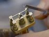
A few cool pics of the Speed Black 3 ...
Speed Black 3 from another angle, and lower lighting. It looks pretty interesting! Glare-proofed sapphire crystal (with transferred white 12 and 6 o’clock numerals)) If the Superluminova is properly charged, it will be a spectacular shot! A pseudo- lume s...

Pics are cool, Kong, but the watch is less
Nice than your pics... IMHO. Best. Nicolas
Ha....you must be kidding... with my P & S camera...always trying harder:-)
The Mille Miglia line of watches are mainly for the sporty segment. Whereas the L.U.C is the high-end watchmaking line. If you have a chance, try on a MM...it is nicer on the wrist. Kong
Kong, there was only one MM I considered
And not sure it was a MM..This was the Grand ¨Prix de Monaco Chrono Hisotirque, or something like that, in WG, and with only 2 counters... This one was great! Best. Nicolas
Wow...Nicolas, that is another range...
Grand Prix Historique de Monaco Series. Chopard sponsored this biennial race since 2002. The particular watch you mentioned should either be the pioneer 2002 version or the 2004 version with just 2 counters, Hmm ...the GP Historique is cross between sport...