
jporos
2327

Tudor Grantour: A case for habillage
The Tudor Grantour Chronograph: A case for habillage
I’ve had the Grantour Chronograph several weeks now so time for a review. To me, the great attraction of the watch is its habillage, the case, bracelet, crowns and dial. The movement of the watch plays a very small role in the appreciation of this watch, it is all about the outside.
Background
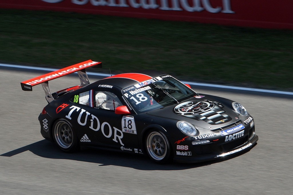
The Grantour line was introduced in 2009 in conjunction with Porsche designating Tudor as the timing partner for Porsche Motorsports. From Porsche’s website:
With the timepiece brand “Tudor” Porsche has won another strong brand for Porsche motorsport. As “Timing Partner Porsche Motorsport” the timepiece company has committed to a long term alliance with Porsche. Tudor, a brand of Rolex, is the official partner of the Porsche Mobil 1 Supercup, and is present at all Formula 1-supporting Carrera Cup races. The partnership was timed to coincide with Tudor’s market launch of a new high-end collection of watches with the name “Grantour”. The first presentation of the new creation, where images of road-homologated Porsche sports cars are utilized in its communications, could be seen at the Basel World Trade Fair from 26 March to 2 April.
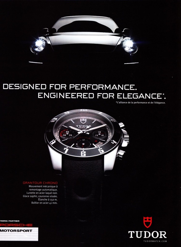
The Porsche influence can be seen in the typography of the watch, the numerals (except for the date wheel) all show the iconic Porsche typography:
But this is all product placement and tie-in, let’s look at the watch itself.
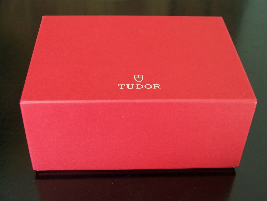
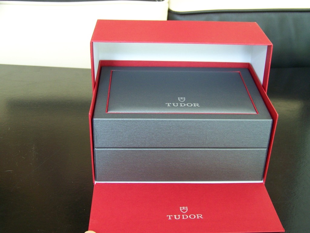
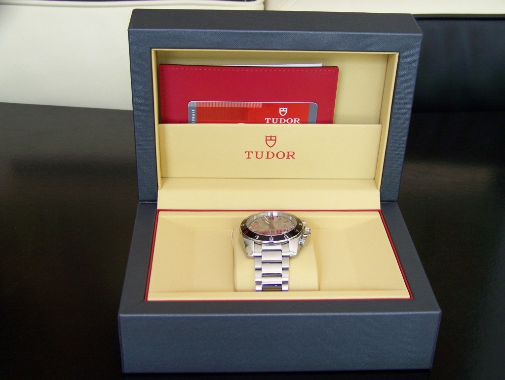
The Box & Papers
Yes.
The Case
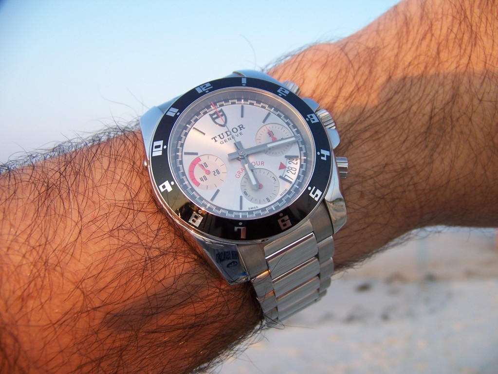
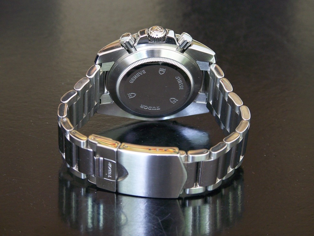
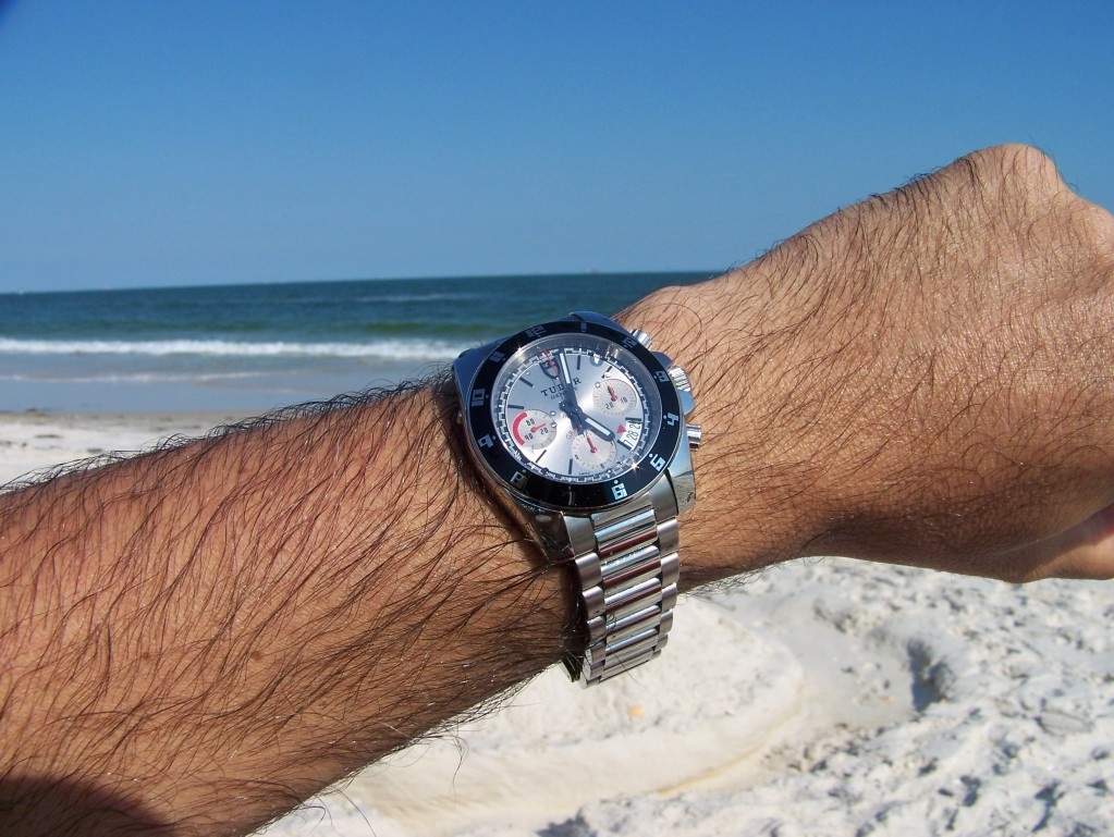
I have to admit that the draw of this watch from photographs was the dial for me, but once I owned it, the case design has become a main attraction. The oyster case with the blending between the case and lugs was a revelation. The blending of the two geometries, the round bezel and the downward lugs as a single piece just seemed like the most logical form I had seen for a case. Then the fitting of the bracelet right to the bezel is a harmony I had never experienced before. This transformation of geometry makes the case sit flat on the wrist and allows the bracelet to adapt immediately to the changing curve of the wrist, a great design. Actually one of my favorite parts of the case is on the 9:00 side of the case where the cylindrical bezel geometry does not quite transform into the flattened side of the case, so there is a seam between the two. The seam was really the detail that allowed me to understand the three dimensional manipulation happening here, the way that the cylinder of the bezel/dial insets into the downward sweep of the case/lugs.
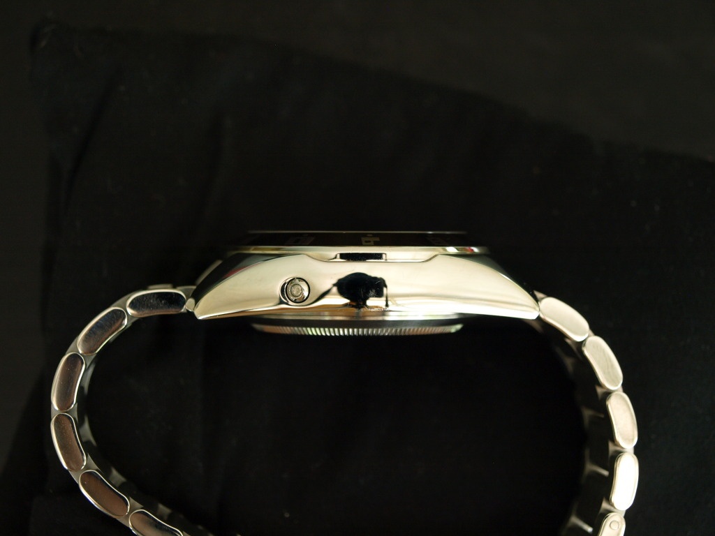
The finishing of the case is very straightforward, polished on the top, brushing in the direction of the case circumference on the bottom. No fancy brushing on one plane of the case and polishing on the other. I am sure that this keeps costs down.
The Dial
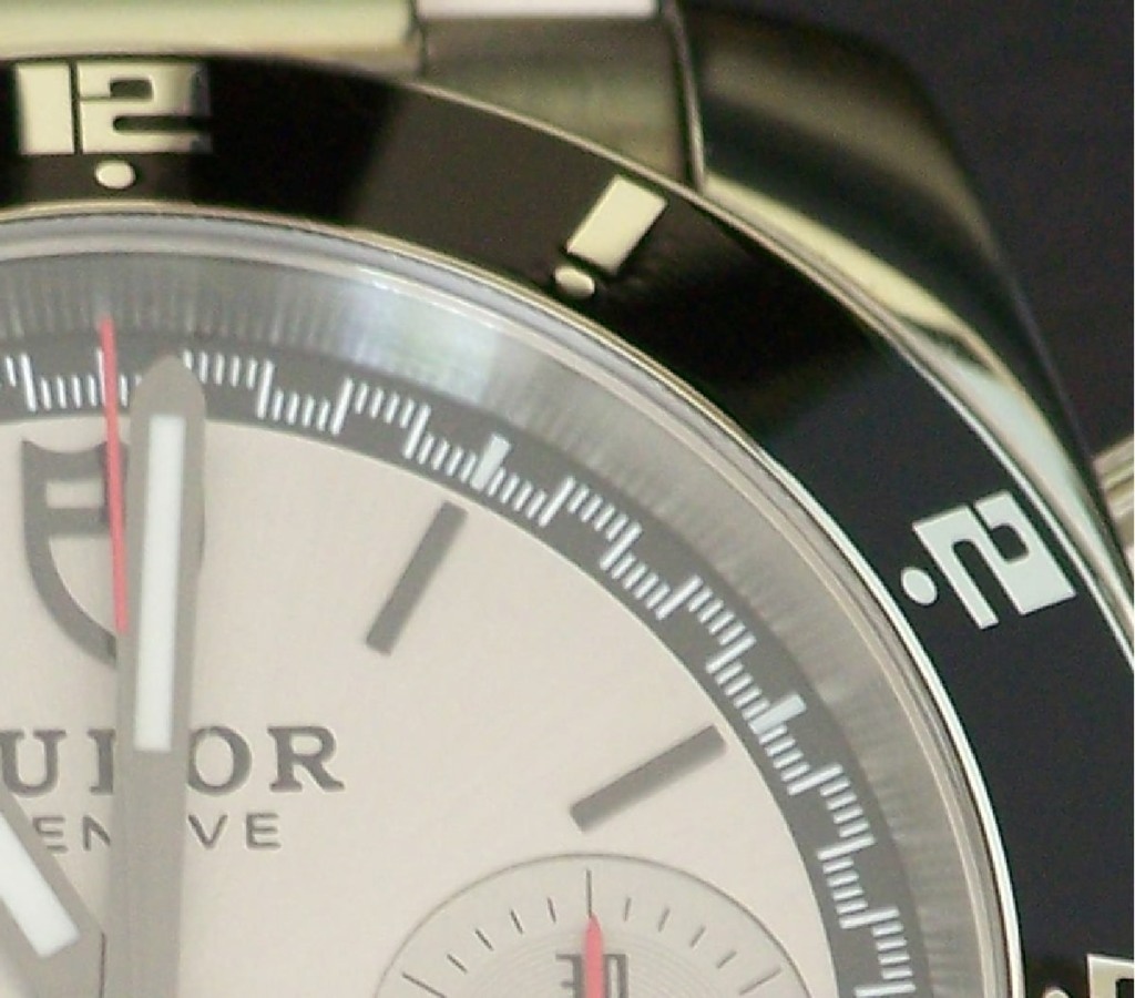
As I stated before, the dial and bezel are what initially drew me to this watch. The upper dial is silver colored, with radial (sunburst) brushing. Hour markers are applied elements as well as the Tudor shield. On a lower level are the three subdials and the minute/second track. The subdials have brushed interiors with matte chapter rings for legibility. The subdial hands are red and the running second subdial is red from 40 to 60 seconds. (I would think that this is an aesthetic decisions and does not have anything to do with timing auto racing). The hour and minute hands are stick hands both with luminous material and the chronograph second hand is counterweighted by a tiny Tudor shield and is painted red on the indicating end. The aperture for the date window extends from the 4:00 to 5:00 hour markers and the date is marked by a red triangle.
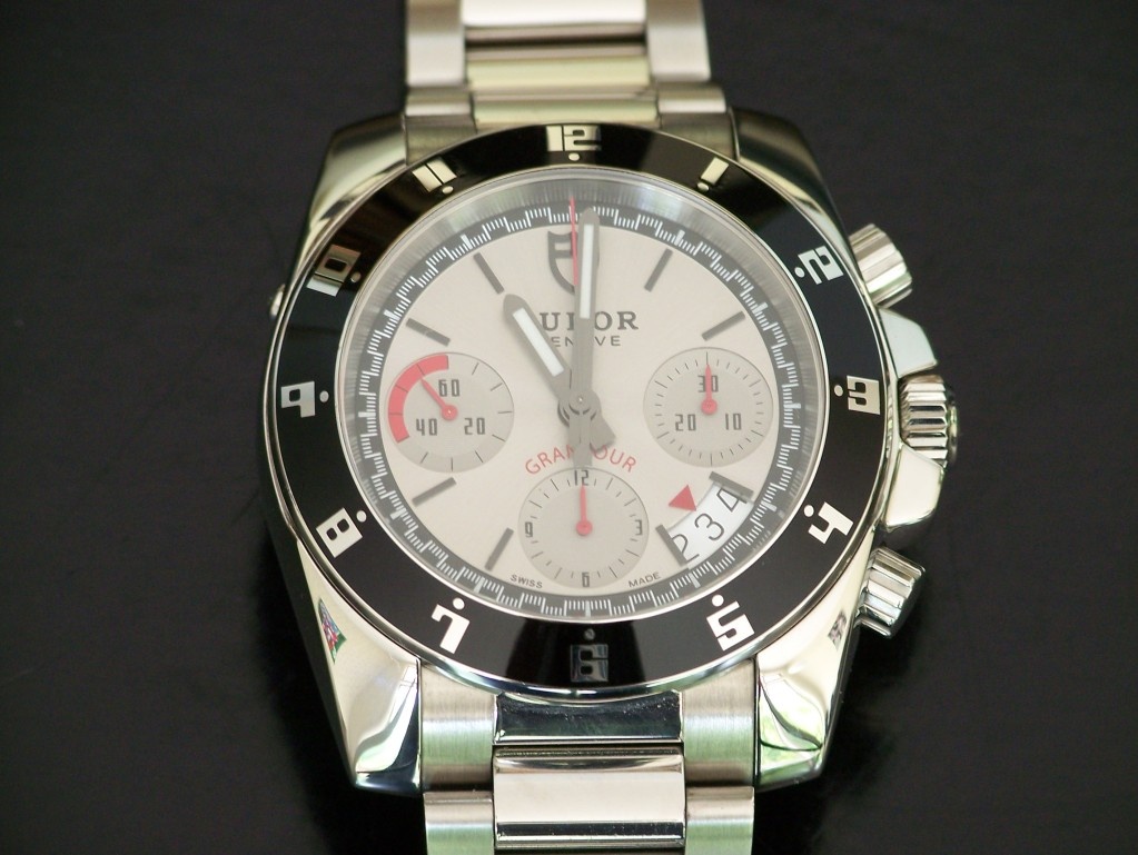
On the whole, the dial is well balanced with enough red accents for interest. Proportionally, the subdials are just a little small in diameter for the dial, but I can live with that. The Tudor shield is just mesmerizing to me and I like the simple statement of ‘Geneva’ right under the Tudor name. The Porsche typography really appeals, although with the serif Tudor font, the cool Porsche font, and the ordinary san serif date wheel font, there are too many competing font styles. I try not to think about it too much.
The seconds track was one of the first details that interested me. The track does not have subsecond tick marks all at the same radius as is typical, but the marks alternates between one radius and another radius. This alternation I have found allows for greater legibility of the seconds and subseconds. At the hour markers, the subsecond tick marks to both sides of the hour marker are at the same radius, visually reinforcing the location of the hour markers. The tick marks at the hour markers are also printed with luminous material.
The Bezel
The bezel also drew me to this watch with its Porsche font (I am really not a car racing fan, I am just a sucker for that 60’s & 70’s aesthetic) The bezel, unlike its modern Rolex cousins with ceramic, is simply lacquer filled, so I am just waiting for the scratches. I hope that they add character to the watch.
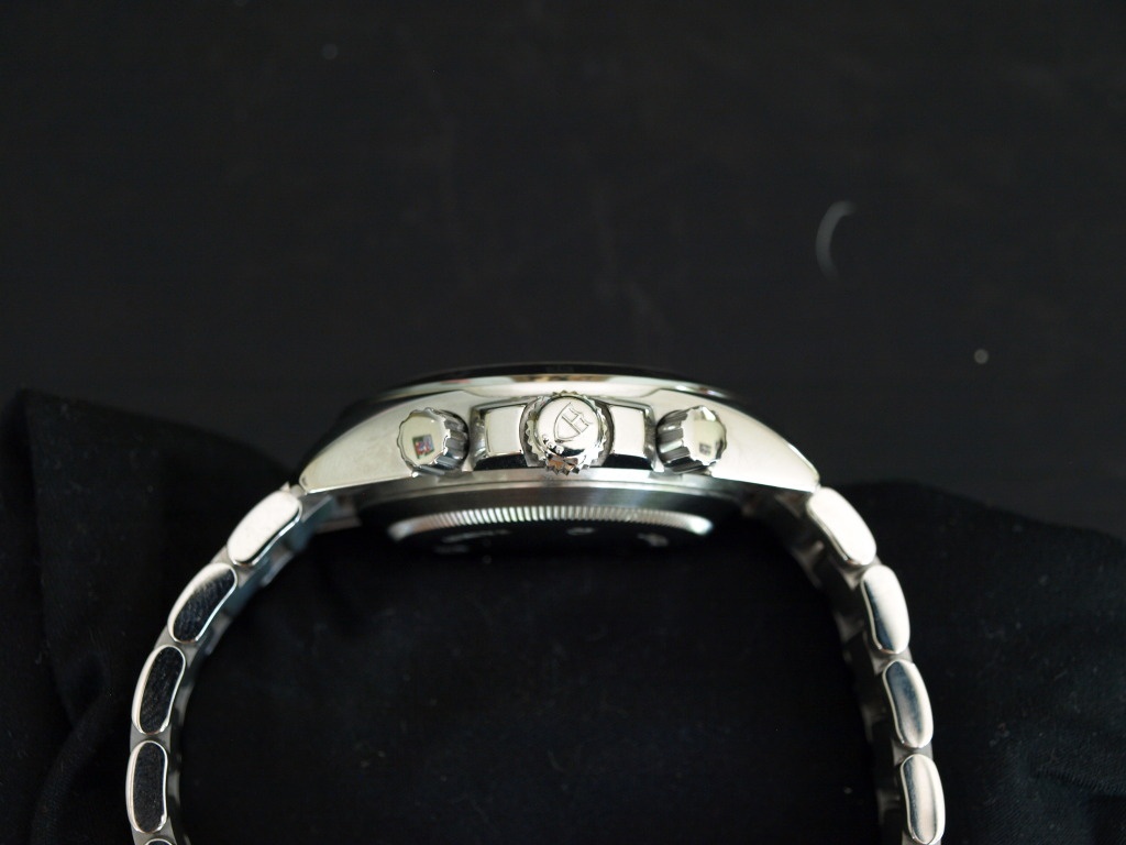
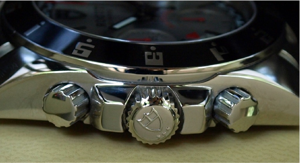
The Crown & Pushers
The crown was the other revelation about the Grantour. In addition to the Tudor shield on the crown, three small dots underneath reveal that it is a Triplock crown. What a substantial crown and tube system! The tube is a substantial size and the crown screws in like butter. Of course, all of you with Rolex/Tudor already knew this…
The pushers screw in, but it only requires a 1/8 turn to engage or disengage them. This is very easy to do on the wrist and I appreciate the added security.
The Bracelet
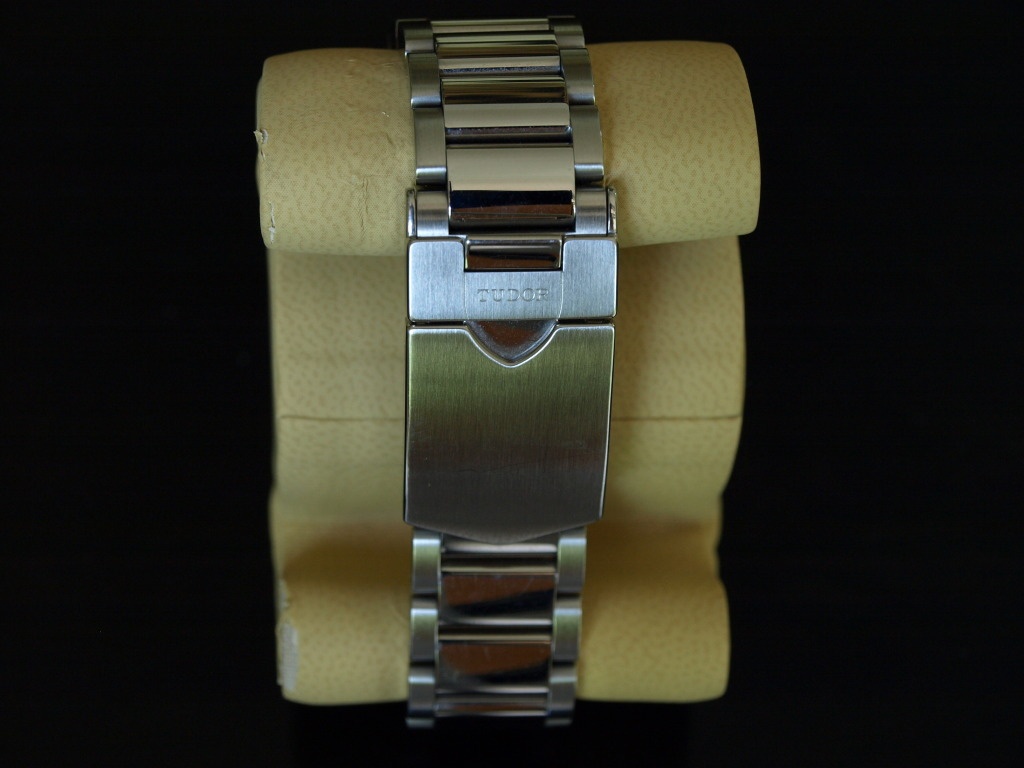
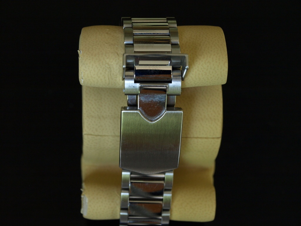
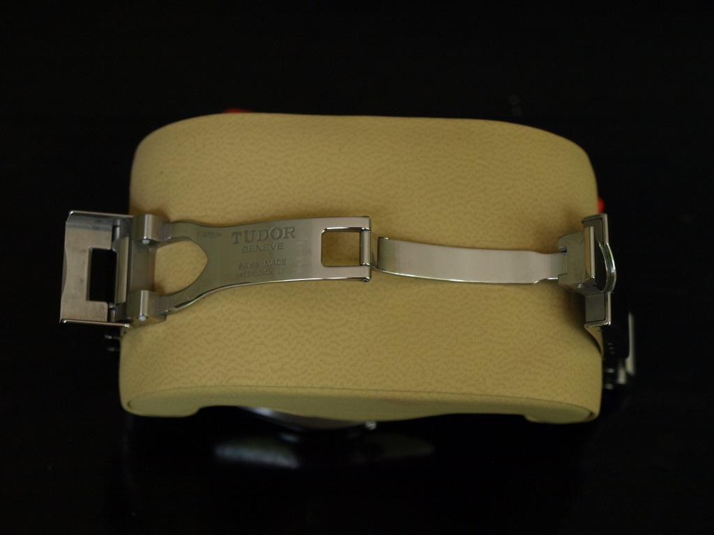
The bracelet is essentially a new model Oyster with Flip-lock clasp. Solid links with screwed end links, the center links are brushed while the outer links are polished. The clasp is something else though. The Tudor shield on the clasp flips up from the bottom of the shield, and then the top of the shield has a lip which when pulled on, releases the clasp. A really nice integration of the Tudor logo and the operation of the clasp. The clasp construction is with heavier pieces as with all the new Tudor/Rolex bracelets and includes a length micro-adjustment through a springbar. Note the Tudor shield cut-out on the folding leaf.
The Movement
The movement is an ETA 7753. Nothing to see here folks, let’s move along.
Overall Perceptions
The watch has a substantial heft to it, but feels comfortable on the wrist due to the case design. The diameter (42mm) and height (I measure 14mm) do not seem excessive and it works fine under a shirt sleeve. Reading the time and the date is very easy, reading the chronograph subdials a little more difficult. The chronograph seconds track as mentioned before, could not be easier to read. The watch has been in two different oceans and a number of pools, no problems especially with a reasonable 150m water resistance.
Does the Gran Tour have extraordinary detail and refinement? No, but enough detail to make it interesting and make me smile every time I put it on. Does it have a manufacture movement? No, but the ETA movement is reliable and tough; as long as I do not have to look at it I am happy. Overall, the watch does what it sets out to do, be a good sports chronograph with a design nod toward auto racing.


Tudor Grantour: A case for habillage

An excellent..
Thanks Fernando!
Fantastic....
Modern Tudors really caught my eye...

Superb review, my friend.
Really enjoyed your review